Actions are triggered when the event for which they were configured is triggered. Available actions are:
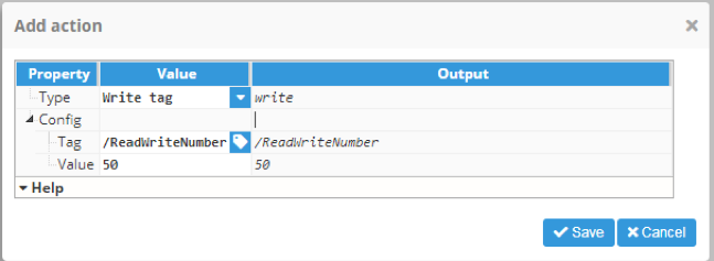
Write tag
Write tag allows a value to be written to the selected tag. It has two configurable fields:
- Tag: Tag to write value to.
- Value: Value to write to tag.
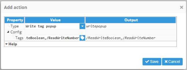
Write tag popup
Write tag popup allows a list of comma separated tags to be set. When the event is triggered, a popup will open that allows users to write values to selected tags.
Write popup
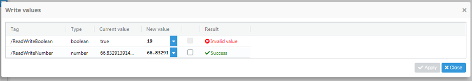
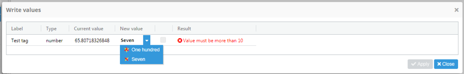
Write popup is a popup that presents information about the selected tags in a table and also allows values to be written to the tags. The table includes the following columns:
- Tag: Tag path.
- Type: Data type of the concrete tag.
- Current value: Current tag value.
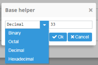
- New value: New value that we want to write to the tag. If the tag is a number type, a popup will appear with a helper to translate between numerical bases. This popup can open a new value dropdown option.
- Select field: Allows tags to be selected. Only new values for selected tags will be written.
- Result: Result of writing operation.
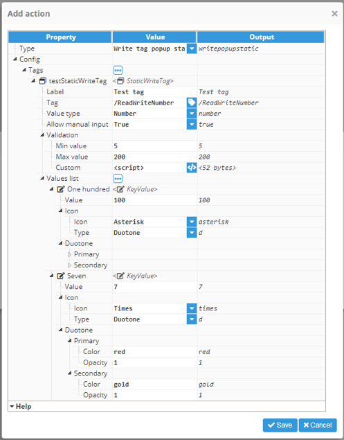
Write tag popup static
This action is very similar to Write tag popup, although here the tag properties are static and use action options instead of the Write tag popup (where they are read from the tag dynamically). Write tag popup static allows multiple elements to be added to represent static tag definitions. Each tag definition has the following properties:
- Label: Label shown in Write popup instead of showing the tag path.
- Tag: Tag path.
- Value type: Permitted value type for writing to tags.
- Allow manual input: Allows a personalized value to be written to a tag or simply values inside the value list.
- Validation:
- Min value: Only if value type is a number. Minimum value accepted to write.
- Max value: Only if value type is a number. Maximum value accepted to write.
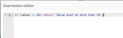
- Custom: Optional expression that allows tag values to be filtered based on an expression. Within the expression, the value to be written can be accessed using the "value" variable. If a message is returned, this message will be shown as an error message instead of allowing it to be written.
- Users can define a predefined values list, which will be shown in the write popup as options in the new value dropdown.
Write popup static
Write popup static is a popup that permits values to be written to tags with much more control over the values the operator can choose from. Each tag offers the following possibilities:
- Label: The text used to describe the tag.
- Type: Type of value (Boolean, number, or string).
- New value: New value can have a static values list defined during action creation. Input on this field can also be disabled.
- Result: Result will show the writing results and action validation values (Custom and min/max).
Reload historical DataSet
Using this action, a historical DataSet will reload its values independently of whether its needed or not. It allows users to input a list of comma separated historical DataSets.
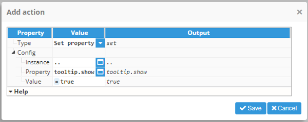
Set property
Allows a value to be set to the selected instance property. There are 3 properties:
- Instance: Instance proprietary for the property to be set.
- Property: Property to set.
- Value: Value to set to the property.
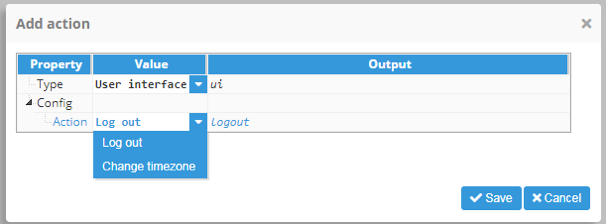
User interface
Allows user interface actions to be triggered: Logout and change timezone.
Change password
Shows a popup so the user can change its own the login password.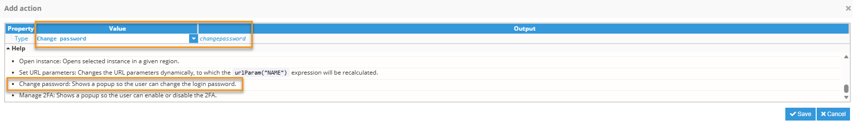
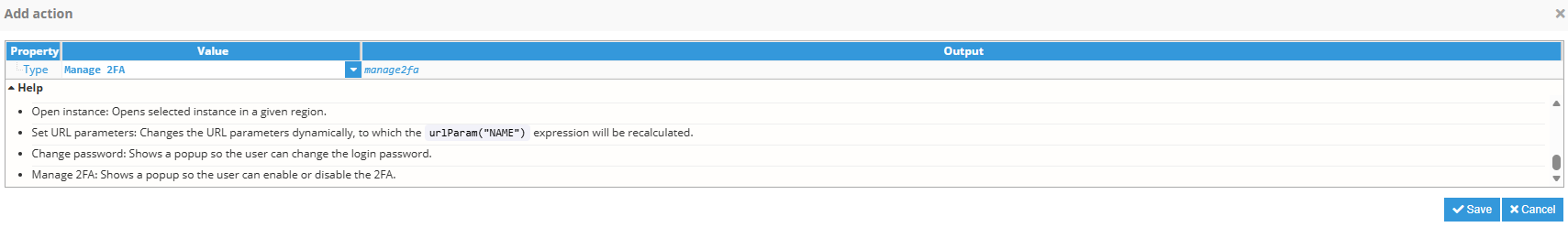
Manage 2FA
Shows a popup so the user can enable or disabled the 2FA.
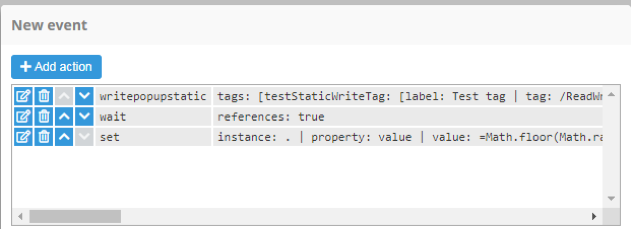
Wait for completion
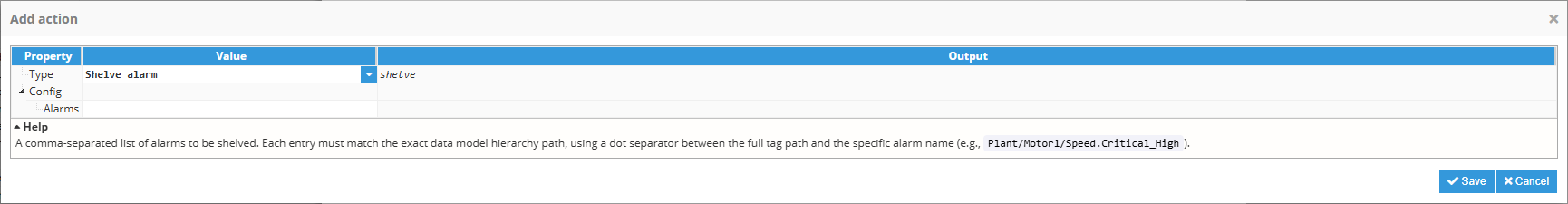
Wait for completion forces all actions before it to be completed before continuing with the next action. It can be applied to any property, depending on the completion of actions. For example, the following image shows a wait for completion example that forces the writepopupstatic action to wait until the end before executing the specified action.
Wait for timeout
Wait for timeout forces a wait time of a predefined number of milliseconds before executing the next action.
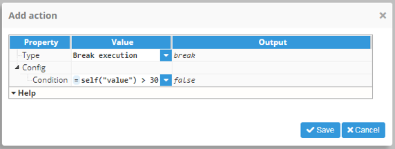
Break execution
Break execution allows the actions chain to be stopped for the selected event using a Boolean condition. This condition can be a simple true or false value but it can also be a reference to another property or expression.
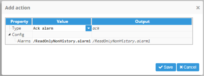
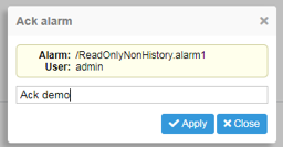
Ack alarm
Ack alarm allows a comma separated alarms list to be added. When the event is triggered and the action executed, a popup will open showing info for the selected alarms and allowing them to be acked with a message.

Alarm Shelving
Shelve Alarm
The Shelve alarm action temporarily shelves one or more alarms, preventing them from generating notifications or appearing as active alarms until they are manually unshelved or the shelving period expires, depending on the alarm configuration.
- Alarms: List of alarms to be shelved, separated by coma. Each entry must match the exact data model hierarchy path, using a dot (.) as separator between the full tag path and the alarm name.
Shelve Alarm popup
When the Shelve alarm action is executed, a dialog is displayed allowing the operator to configure the shelving period and provide an optional reason before applying the action.
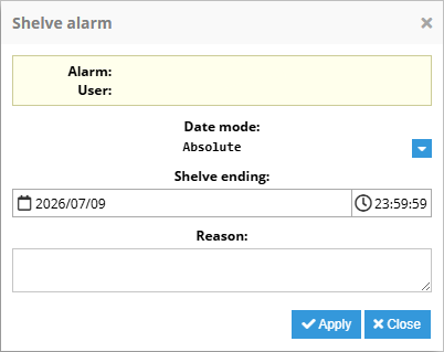 | 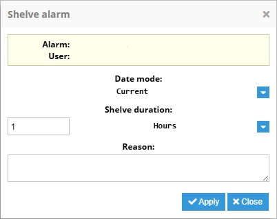 |
- Alarm: Displays the name of the alarm being shelved.
- User: Displays the user performing the shelving operation.
- Date mode: Specifies how the shelving expiration is defined. Absolute , and Currentuses the total amount of time.
- Absolute: Uses a fixed date and time when the alarm will be unshelved.
- Shelve ending: Defines the date and time when the alarm will automatically leave the shelved state.
- Current: Uses the amount of time the alarm will last shelved.
- Shelve duration: Defines the number and units of time of the shelve duration.
- Absolute: Uses a fixed date and time when the alarm will be unshelved.
- Reason: Optional text describing the reason for shelving the alarm. This information can be used for auditing and operator traceability.
Unshelve Alarm
The Unshelve alarm action unshelves one or more alarms, that were previously shelved. If any specified alarm was not shelved when action is triggered, this action has no effects.
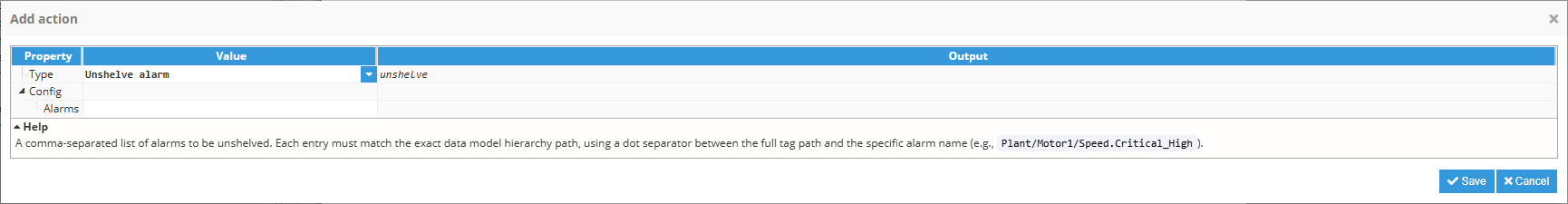
- Alarms: List of alarms to be shelved, separated by coma. Each entry must match the exact data model hierarchy path, using a dot (.) as separator between the full tag path and the alarm name.
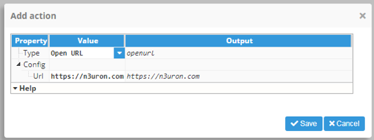
Open URL
Open URL allows a url to be added that will be opened as a new tab when the action is executed.
Open File
Open File opens a file in the /config/<WebVision instance name>/docs/ folder. You must create the folder manually if doesn't exist. Example; manual.pdf.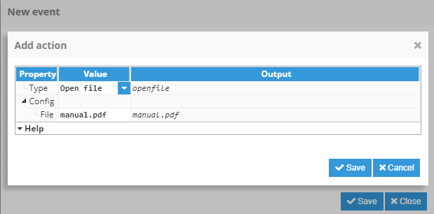
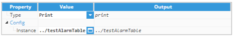
Print allows preview windows to be opened or a navigator to be built in print preview dialogs to show and print selected instances. Overflow (the content area inside the element that overflows the element size. For example, rows hidden in a table and only reachable using scroll) will be shown when printing.
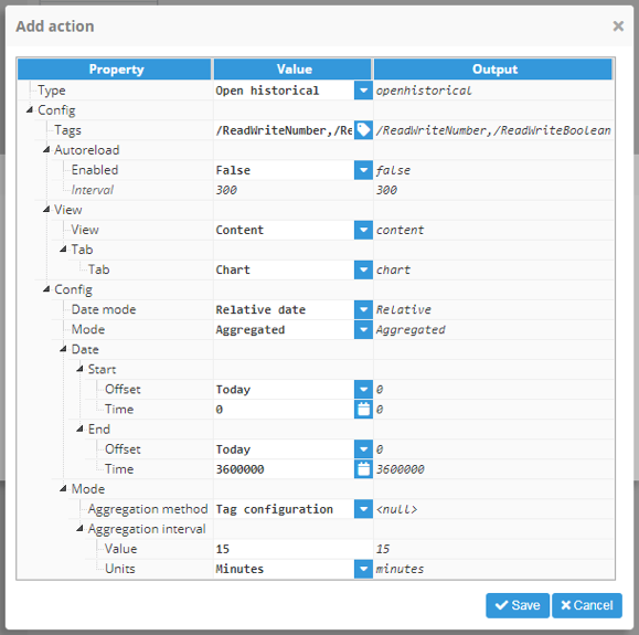
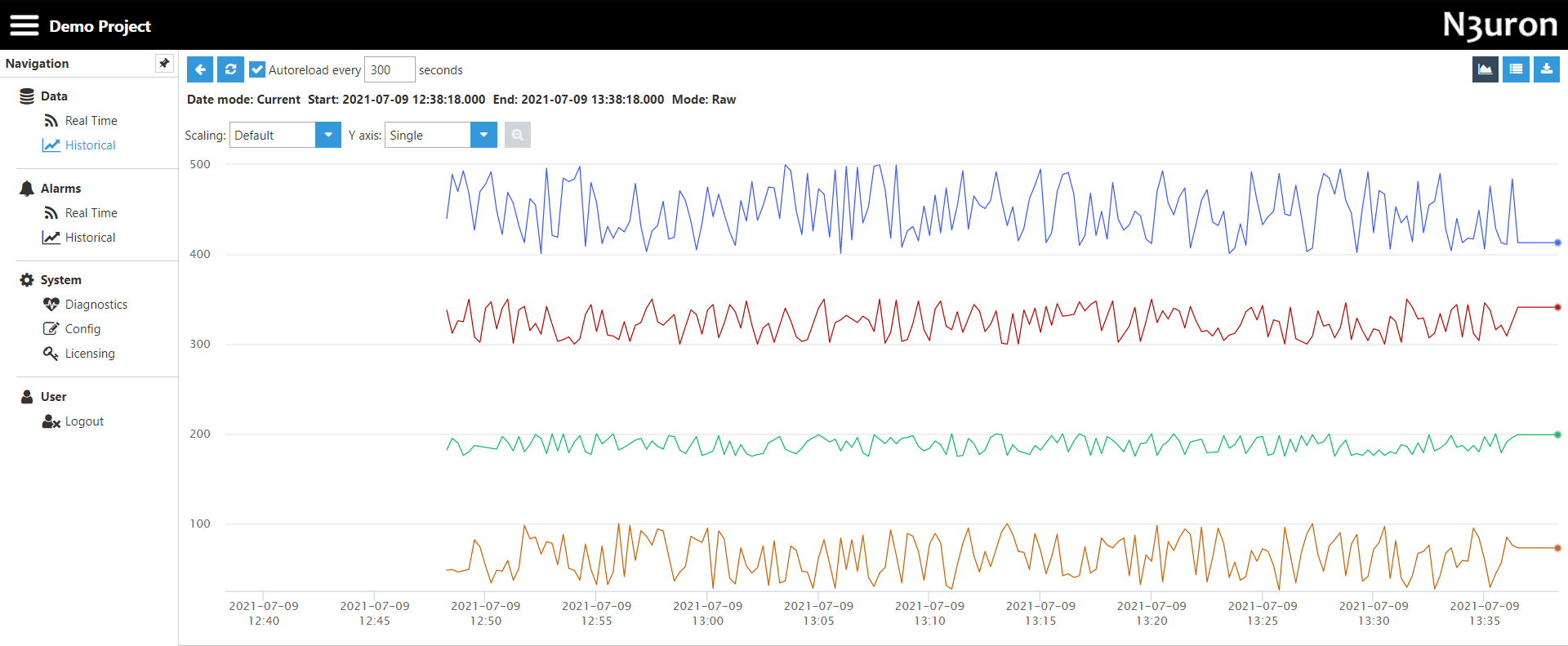
Open historical
Open historical opens a popup for visualizing historical data. This popup allows different tags to be selected and their data with different parameters to be shown. Action configuration properties can be preselected when opening the popup and changed by the end-user in runtime. The following properties can be configured with default values:
- Tags: Comma-separated list of tags to be displayed.
- Path: Path to point to as root.
- Filter:Note:This feature is available from N3uron version 1.21.5.
- Path: Filter the tags that appear when a group is selected.
- Tag: Filter historical tags from the tag list.
- Autoreload: Manages historical data autoreload.
- Enabled: Boolean value for activating/deactivating autoreload.
- Interval: Reload interval, in seconds.
- View: Configuration of view to be opened by default.
- View: Config or Content.
- Tabs: Only on Content view, Chart, or Report.
- Config: Configurable parameters inside Config view.
- Date mode: Allows different ways of specifying the start and end dates for displayed data.
- Relative: Allows users to select the start and end date according to the current date.
- Absolute: Allows users to select a start and end date as absolute dates.
- Current: Allows users to select an interval between the current moment and a previous moment defined by the offset.
- Date: Configuration for the different Date modes:
- Relative: Start and end dates are configured using an offset in days or weeks and a time offset in milliseconds
- Offset: Offset relative to current moment.
- Time: Absolute offset over the relative offset.
- Absolute: Allows dates to be specified as absolute values.
- Start: Absolute start date.
- End: Absolute end date.
- Current: Allows the date to be specified between a selected negative offset and the current moment.
- Offset: Negative offset from current date.
- Units: Offset units (seconds, minutes or hours).
- Current: Allows the date to be specified between a selected negative offset and the current moment.
- Relative: Start and end dates are configured using an offset in days or weeks and a time offset in milliseconds
- Date mode: Allows different ways of specifying the start and end dates for displayed data.
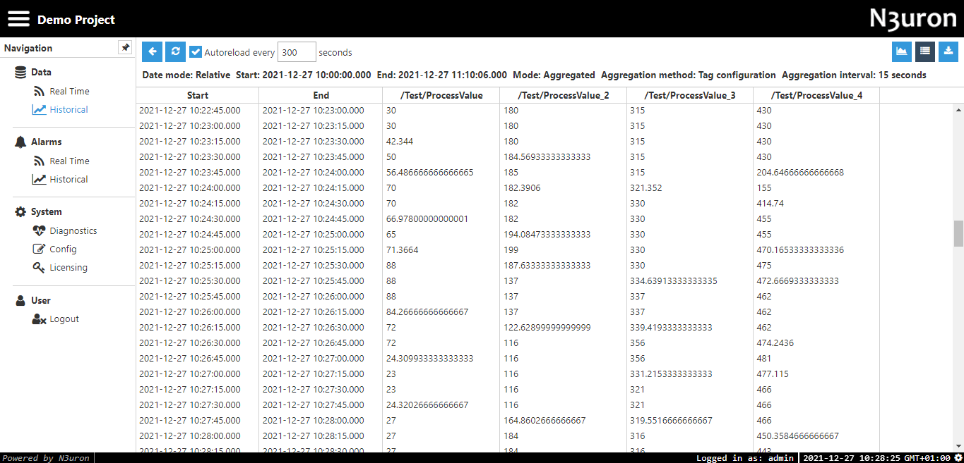
- Mode: Configuration of data representations.
- Aggregated: Allows users to aggregate data using different methods.
- Raw: Presents data as per it is stored in the historical database.
- Delta: Only presents values when they have changed more than the deadband value. Includes all values after the change.
- Filter: Only presents values when they have changed more than the deadband value. Includes all values before and after the change.
- Mode configuration: Configuration properties for the different modes.
- Aggregated:
- Aggregation method: Type of aggregation applied to data. Choose between:
- Tag configuration: Value configured within the tag.
- Average: Returns the weighted time average during the aggregation period.
- Minimum: Returns the minimum value in the aggregation period.
- Maximum: Returns the maximum value in the aggregation period.
- First: Returns the first value in the aggregation period.
- Last: Returns the last value in the aggregation period.
- Delta: Returns the difference between the first and last sample during the aggregation period.
- Standard deviation: Returns the Standard deviation during the aggregation period.Note:Delta and Standard deviation aggregates are available from N3uron version 1.21.10
- Aggregation interval: Interval for the aggregated data:
- Value: Interval value.
- Units: Value units.
- Aggregation method: Type of aggregation applied to data. Choose between:
- Raw: No special configuration, raw values.
- Delta and Filter:
- Deadband: Defines the data change threshold.
- Aggregated:
Historical popup
Historical popup allows users to configure the historical data displayed and view it either as a graph or a data table. The following popup viewing options are available:
- Config: This view enables users to configure the data visualization. It’s similar to setting the config in action configuration but offers a less compressed layout.
- Content: Content view allows historical data to be displayed. There are two key areas offered:
- General: Enables multiple options:
- Return to config view.
- Reload selected tags.
- Configure autoreload.
- Download data as csv.
- Toggle between different data visualizations.
- Data visualization: Can be one of two types: a graph or a table with date/value representation.
- General: Enables multiple options:
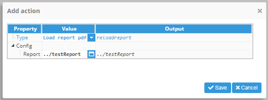
Load report pdf
The Load report pdf action allows reports in PDF to be loaded from the backend. It does exactly the same as the load button inside the Report pdf viewer
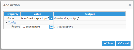
Download report pdf
The Download report pdf action allows users to download a PDF report from the backend. It does exactly the same as the download button inside the Report pdf viewer. If the report hasn’t been loaded prior to the event, it will be loaded before downloading.
Download table CSV
The Download table csv action allows users to download selected table data in CSV format.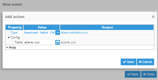
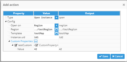
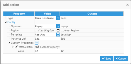
Open instance
Open instance allows users to select a template and create an instance for it, which can then be opened inside a region or as a new popup window. There are two different possible behaviors, depending on the Open target (Region or popup):
- Region: When action is executed, an instance will be added to the Region children and the displaying child will be set as the new instance. If the uid is specified, it will share the same instance name as the Region child. If not, an automatic name will be assigned. If the child displayed in Region is changed manually, the instance will be removed from the region children instance list.
- Popup: When action is executed, an instance will be created and opened in a new popup window.
This action offers the following configuration properties:
- Open on: Instance open target. Region or Popup.
- Region: Region for inserting the instance. Disabled if “Open on” is a popup.
- Template: Template to instantiate.
- Instance UID: Unique identifier for the instance. Unless left null, when executing an action for the first time the UID will be added to Region or opened in a new popup. For all executions thereafter, the same instance will be refused and instead, only existing custom properties will be applied.
- Custom properties: Instance elements list. If named the same as any of the custom properties inside the selected template, the value inside the value property field will be set as the instance custom property value.
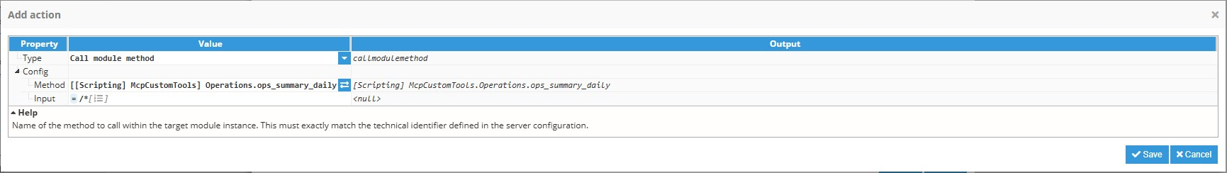
Call Module Method
Call module method allows users to execute a Scripting method from WebVision. This action is used when the use case of an interaction needs to delegate the execution logic, using a Scripting function for this purpose.
- Config
- Method: Specifies the name of the method to call within the target module instance. This value must exactly match the technical identifier defined in the server configuration. An input helper is available, showing all available methods for this purpose.Note:Only Scripting method which task type is configured as 'Method' can be used on this Action type.
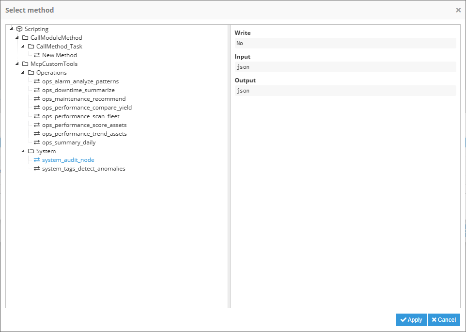
- Input: Optional input payload sent to the selected method. Use this field when the method requires parameters from the action execution. The input sent to Scripting method is the returning value of the expression configured on this property, the value assigned or null if left empty. The input type must match the configured on the module.
- Method: Specifies the name of the method to call within the target module instance. This value must exactly match the technical identifier defined in the server configuration. An input helper is available, showing all available methods for this purpose.
Expressions
JavaScript expressions can be used on each custom property or data entry to calculate the value. They allow for dynamic configuration by creating custom properties within templates and using different values for each instance in the template. Custom properties can also be changed dynamically using events, or by linking them to other tags and properties. Moreover, Web Vision has added an extra set of functions, which can be used in Expressions to augment its capabilities.
Syntax
When using an expression, instead of writing a static value to a field, the field must start with ‘=’. JavaScript code can then be used and the expression return value will be used as the value for the field. As expressions are evaluated as JavaScript code, all strings must be enclosed in either single or double quotes. The following examples show a number of different valid and invalid expressions, as well as their values when evaluated:
= 5 -> 5
= “This is a string” -> This is a string
= The value is 5 -> INVALID, the string needs to be enclosed in quotes
= “The value is” 5 -> INVALID, 5 needs to be concatenated to the string
= “The value is ” + 5 -> The value is 5
Expressions can also use custom properties, which is done by using the property, self or parent functions, depending on the custom property origin. This will be substituted by the value of the custom property when resolving the expression. This can be seen in the following example:
//Assuming a basePath custom property with the value /Group1/Inverter1/

= self(“custom.basePath”) -> /Group1/Inverter1/
= “self(“custom.basePath”)” -> self(“custom.basePath”)
= self(“custom.basePath”) + Power -> INVALID, power needs to be enclosed in quotes
= self(“custom.basePath”) + “Power” -> /Group1/Inverter1/Power
Since expressions are JavaScript code, they can resolve conditionals. This allows the color of a component to be changed based on the value of a tag or a custom property:
//Assuming there is a “valid” boolean custom property set to true

= if(valid === true) “green”; else “red” -> green
//Valid changes to false -> red
Besides conditionals, other JavaScript features such as JavaScript functions, can also be used in expressions. This includes Date, Math, or String functions.
//StringCustomProperty is a string with a value of “2”
=parseInt(self(“custom.stringCustomProperty”))*2 -> 4

=Date.now()+3600*1000 -> Date one hour from now, in Epoch

//fullTagPath is a string with a value of “/Group1/Inverter1/Power
= self(“custom.stringCustomProperty”).split(‘/’).slice(-1)[0] -> Power
Tag function
WebVision adds the tag() function to expressions. This function is used to obtain information about a tag from N3uron, which can be the value, quality, engineering units, etc…
The syntax for this function is tag(“tagPath.propertyPath”). If the propertyPath is left blank, the tag value will be returned. Otherwise, the property value will be returned (if it exists) or alternatively, it will be left as null if no such value exists. See below for examples of this function, which assumes the following tag is being used:
Tag:{
	fullPath: “/Group1/Inverter1/Power”,
	config:{
		engUnits: “kW”
	},
	data:{
		value:150,
		quality:192,
		ts: “2018-09-25T14:56:52.460Z”,
	}
}
//tag is a custom property with value “/Group1/Inverter1/Power”
= tag(self(“custom.tag”)) -> 150

= tag(“Group1/Inverter1/Power.engUnits”) -> null (engUnits path is config.engUnits)

= tag(“Group1/Inverter1/Power.config.engUnits”) -> kW

= tag(self(“custom.tag”).data.quality) -> INVALID, .data.quality needs to be a string

= tag(self(“custom.tag”)+”.data.quality”) -> 192
Alias function
The Alias function adds alias functionality to tag path transformations for any property. For example, for the following alias structure:
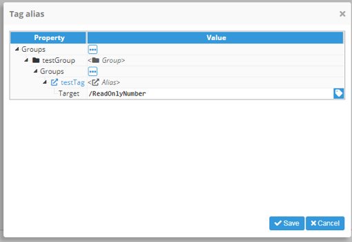
the testTag path will be: @testGroup/testTag. Using the alias function allows it to be translated to the original target path.
// Generic function definition
=alias(“<alias path>”)
// Example
=alias(“@testGroup/testTag”) => /ReadOnlyNumber
Property function
Just like the tag function, the property() function has been added by Web Vision to augment the functionality of expressions. This function is used to obtain the value of a property for a different element to the one that has this expression. For instance, it can be used to change an element width based on the width of another element. This function is implicitly called when linking a property to a different property in another component.
The syntax of this function is property(PathToElement.pathToProperty). The pathToElement must be a relative path from this element, using ‘..’ to refer to the parent element and separated by backslashes. The pathToProperty uses the internal name of the property, which may be different than the label used in the configuration window. In order to find the internal path, the link property helper can be used.
The following example creates a rectangle that occupies 10% of the parent container and a label component centered inside the rectangle. It uses the following components (properties are simplified for this example, this is not the real internal structure of the properties):
Container:{
	width:1920,
	height:1080,
	components: {
		Rectangle:{
			x:500,
			y:450,
			width:Expression 1,
			height:100
		}
		Label{
			x:Expression 2,
			y:Expression 3,
			width: Expression 4,
			height: Expression 5
}
With this structure, the following expressions are used (these are valid expressions using the correct internal name of the properties):
//Expression 1: Width of the rectangle is 10% of the parent container
=property(../.width)/10 -> 192
//Expression 2: Width of the label is the same as rectangle
= property(“../Rectangle.width”) -> 200
//Expression 2: Height of the label is the same as rectangle
= property(“../Rectangle.height”) -> 100
//Expression 3: X position of the label is the same as the rectangle
= property(“../Rectangle.container.left”) -> 500
//Expression 4: Y position of the label is the same as the rectangle
= property(“../Rectangle.container.top”) -> 450
Self function
The Self() function has the same functionality as the property() function, except it is used in a component to refer to itself. As such, it can be used as an alias of property(“./.property”). The syntax for this function is self(“property”).
This function can be used in events to obtain the value of this component, especially in input, toggle, or dropdown components.
See the below example. Assuming the following component is used:
Dropdown:{
	width:200,
	height:100,
	dropdown:{
		options: Power, Temperature, Speed
		selectedValue: Temperature
}
}
A custom property is set whenever the dropdown value changes. This means that an action is attached to the value change event, with the following expression as the value that the event sets:
//Using property
=property(“./.value”) -> Temperature
//Using self
=self(“value”) -> Temperature
Parent function
The Parent() function has the same functionality as the property() function, except it is used in a component to refer to its parent. As such, it can be used as an alias of property(“../.property”). The syntax for this function is parent(“property”). This function can be used in events to obtain the value of this component.
See the below example. Assuming the following component is used:
Container:{
	width:1920,
	height:1080,
	components: {
		Rectangle:{
			x:Expression 1,
			y:Expression 2,
			width:100,
			height:100
		}
in order to set the rectangle position in the middle of the parent container; x/y values must be set to half of the parent width/height, minus half of the self width/height.
//Expression 1
=parent(“width”)/2 – self(“width”)/2
//Expression 2
=parent(“height”)/2 – self(“height”)/2
Dataset function
Just like the tag function, the dataset() function has been added by Web Vision to augment the functionality of expressions. This function is used to obtain the value of a DataSet element instance, or a manual dataset [[key1,value1],[key2,value2],…,[keyN,valueN]]. For instance, it can be used to populate a Chart series.
For inputs such as the DataSet input in the Chart series, the input will automatically obtain and use the dataset value. However, for normal inputs such as the example of a Label input in the Label component, a <dataset> placeholder will be displayed. This placeholder represents the dataset object, which has a very similar functionality to a javascript array. It also has a loading property, which allows users to see if the dataset has been loaded or not.
DataSets can be operated using standard javascript arithmetical, logical, and bitwise operators.
// Generic function definition
=dataset(“<dataset path | manual dataset>”)
// Basic example (using manual dataset syntax for example simplicity)
= dataset(“[[1,2],[3,4],[5,6]]”) => <dataset> (if used in a dataset property the values will be automatically loaded and used)
// Join example
=dataset(“[[1,2],[3,4],[5,6]]”).join(“, ”) => 1,2, 3,4, 5,6
// plus operation example
=(dataset([[1,2],[3,4],[5,6]]) + dataset([[1,2],[3,4],[5,6]])).join(“, ”) => 1,4, 3,8, 5,12
// Zero fill right shift bitwise operator
=(dataset([[1,2],[3,4],[5,6]]) >>> 2).join(", ") => 1,0, 3,1, 5,1
Func function
The Func() function allows users to reference a function defined in the Function system folder anywhere in the project. The syntax is the function name and a comma-separated list of parameters, which will be passed on to the function as an array called argv.
- For example, if a function is used to multiply every number inside an array by another number, as defined in the following image.
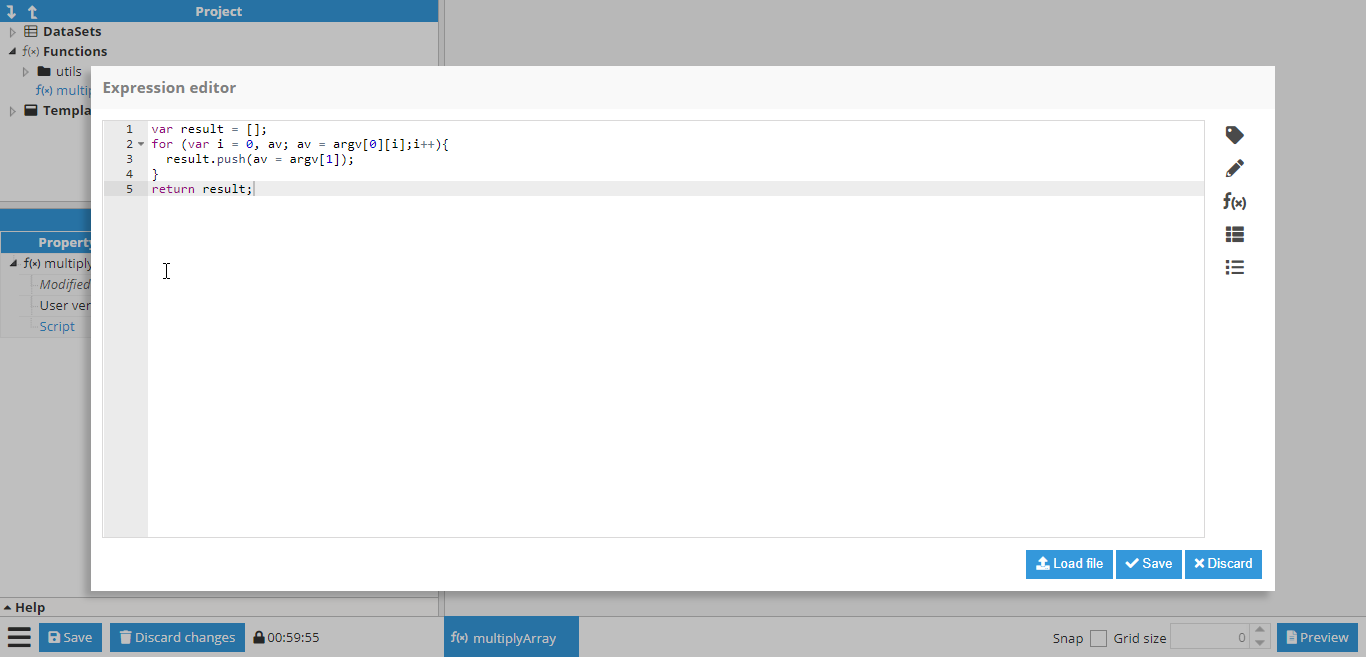
This function is expecting the first parameter inside argv to be the array and the second parameter to be the number. This function can be used by any property in the project:
// Generic function definition
=func(“<function name>”, parameter1, parameter2, …parameter)
//Example, multiply array by number and return multiplied array
=func(“multiplyArray”, [1,2,3,4], 5) -> [5, 10, 15, 20]
UI function
The UI() function adds an additional functionality for accessing multiple system functionalities and values in expressions, for example, data manipulation and user information. See below for example possibilities:
// Generic function definition
=ui(“<functionality>”)
// Current timestamp in milliseconds
=ui(“time”) => 1604664222188
// Current date with “<Year-month-day hour:minute:second format>”
=ui(“timestr”) => 2020-11-06 12:04:04
// Offset from GMT in millisenconds
=ui(“timeoffset”) => 25200000
// Offset from GMT in text format
=ui(“timeoffsetstr”) => GMT-07:00
// Currently selected timezone in text format
=ui(“timezone”) => America/Phoenix
// WebVision viewport width
=ui(“width”) => 1920
// WebVision viewport height
=ui(“height”) => 1080
// User name
=ui(“user.name”) => admin
// Returns true of false depending if the user has writing permission
=ui(“user.writePermission”) => true
// Returns information about the main and distributed nodes linked to the module, in array format.
=ui(“nodes”)
// Returns information about the main and distributed nodes linked to the module, in object format.
=ui(“nodes.object”)
Sprintf function
Allows values to be formatted using formatters, as specified in the Sprintf format specification appendix. This function accepts a format string and a value as parameters and returns the formatted value.
// Generic function definition
=sprintf(“<format string”, <Value1>, <Value2>, …, <ValueN>) => <Formatted value>
// float decimals specification
=sprint(“%.1f”, 50.522) => 50.5
// Modify parameters order
=sprintf(“%2$s %3$s a %1$s”, “cracker”, “Polly”, “wants”) => Polly wants a cracker
// Add positive/negative sign
=sprintf(“%+.1f”, -54.4) => -54.4
=sprintf(“%+.1f”, 54.4) => +54.4
// Add padding character
=sprintf(“%'.09d”, 54) => .......54
// Exponential formatting
=sprintf(“%.3e”, 54000000) => 5.400e+7
Moment function
The Moment function enables direct access to moment.js, allowing for advanced date manipulation and adding multiple additional helpers for date manipulation. More information about the Moment functionality can be found on the moment.js docs page. The Moment date format specification can be found in the Timestamp formatting appendix.
// Generic function definition
=moment(<optional date>)
// Initialize moment with custom Date object
=moment(new Date()) => Fri Nov 06 2020 13:19:56 GMT+0100
// Initialize moment with custom timestamp
=moment(Date.now()) => Fri Nov 06 2020 13:19:56 GMT+0100
// Initialize moment with date string
=moment(“2019-Feb-01 00:00:00”) => Fri Feb 01 2019 00:00:00 GMT+0100
// Date formatting as readable string
=moment(Date.now()).format(“YYYY-MM”) => 2020-11
Action function
This function is only available inside events configuration. Action function returns the value from the action specified in the parameter, inside the context of the event triggering the actions where the function is being called. Can be called as "action(x)", where 'x' is the number of the action sorted ascending and being '1' the first action triggered.
For any 'Call Module Method', the result of the function will be the result of the method called, or null if the method does not return a value; any other action called will return null.
// Generic function definition
=action(<action order number>)
Web Vision Full Product Details