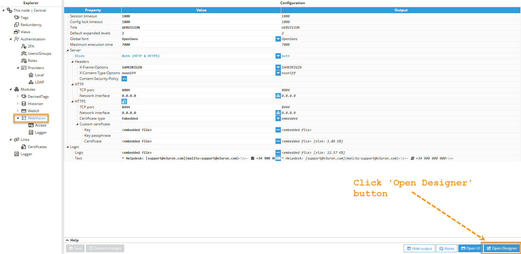
The Designer can be launched from the Web Vision configuration page in the WebUI, as shown in the below image. Alternatively, the designer can be launched directly from the web browser by adding /designer to the Web Vision url. For instance, https://localhost:8444/designer.
The Designer includes the following areas:
- Project tree: Contains all project elements.
- Properties tree: Displays the properties of the selected component.
- Visual area: Contains the graphical view of components.
- Buttons bar: Buttons bar with multiple functionalities:
- Burger Menu
- Save/Discard changes
- Opened elements tabs
- Snap grid
- Preview mode
More information on these items in the below chapters.
.png)
Key shortcuts
The following shortcut keys can be used when working in the designer:
- ctrl + s: save
- ctrl + x: cut
- ctrl + c: copy
- ctrl + d: duplicate
- ctrl + v: paste (when selecting the paste destination)
- ctrl + drag: duplicates and drags the new element
Move controls - Designer canvas
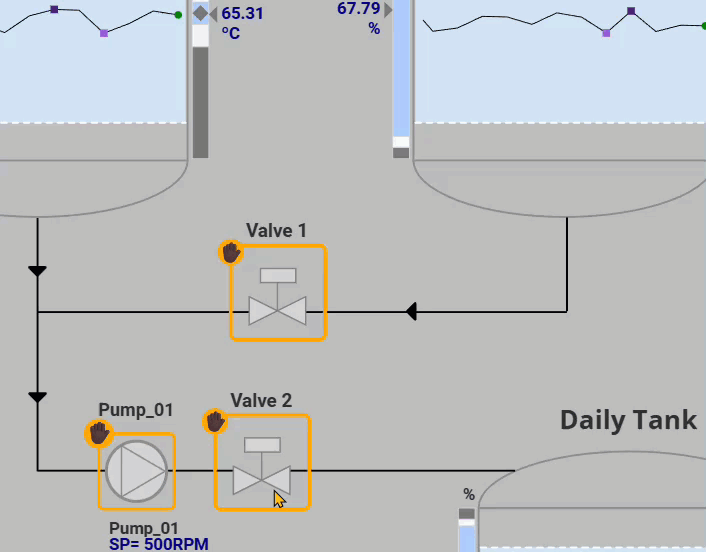
The Designer supports direct manipulation of components using the mouse. You can select, move, resize, rotate, and (where applicable) adjust anchors and line endpoints by dragging the corresponding handles. Modifier keys (Shift/Ctrl) change snapping or constrain the operation.
- Select
Click a component to select it (handles become visible).
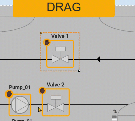
- Move
- Click and drag the component to reposition it.
- Shift + drag: toggles snap-to-grid for the component’s anchor.
- Resize
- Drag a corner/edge handle to resize.
- Shift + drag: toggles snap-to-grid for the dragged corner.
- Ctrl + drag: toggles orthogonal resize (constrains to width or height only).
.gif)
- Rotate
- Drag the rotation handle to rotate the component.
- Shift + drag: toggles rotation snapping in 15° increments.
.gif)
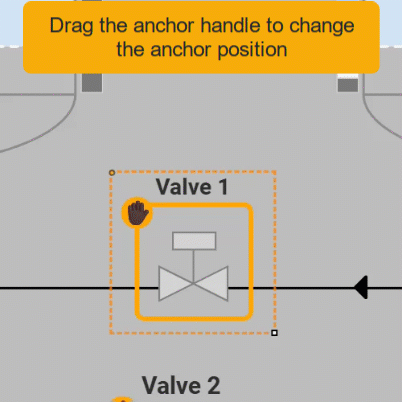
- Anchor (for components that expose an anchor/origin)
- Drag the anchor handle to change the anchor position.
- Shift + drag: toggles snapping by half width/half height.
- Ctrl + drag: changes origin only (moves the anchor without repositioning the element).
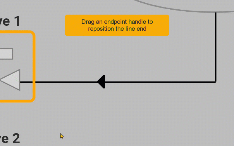
- Line Endpoints (for line/connector elements)
- Drag an endpoint handle to reposition the line end.
- Shift + drag: toggles snap-to-grid for the endpoint (and snaps line size to the grid step).
- Ctrl + drag: changes endpoint position only.
 Note:This feature is available from N3uron version 1.22.0.
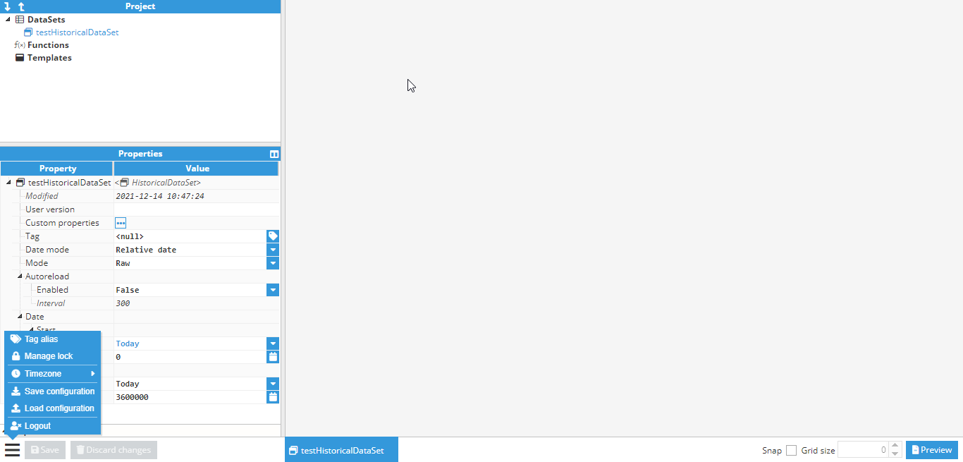
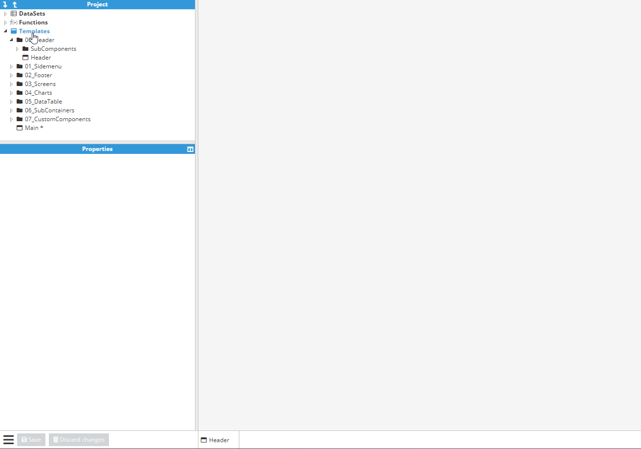
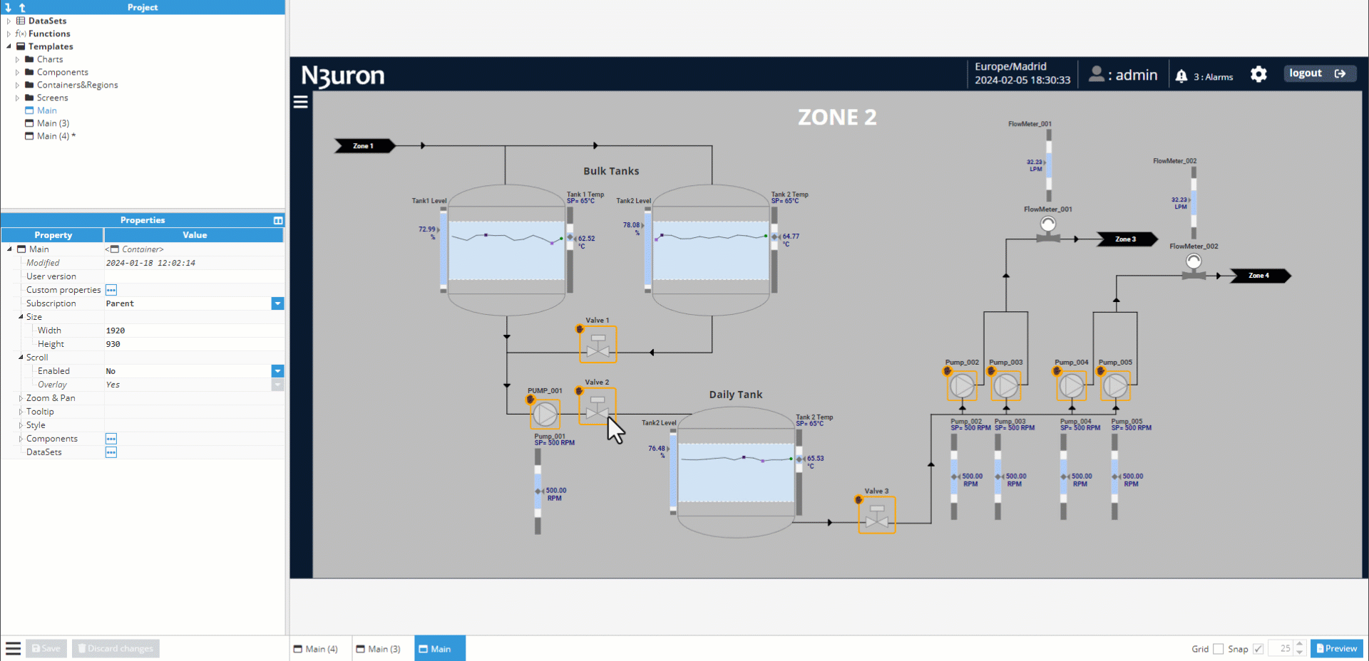
Project tree
The Project tree contains all project templates, organized into a tree like structure with “system” folders for distinguishing between the different element types.
DataSets
Datasets are elements that represent a collection of related information sets. There are two types of datasets:
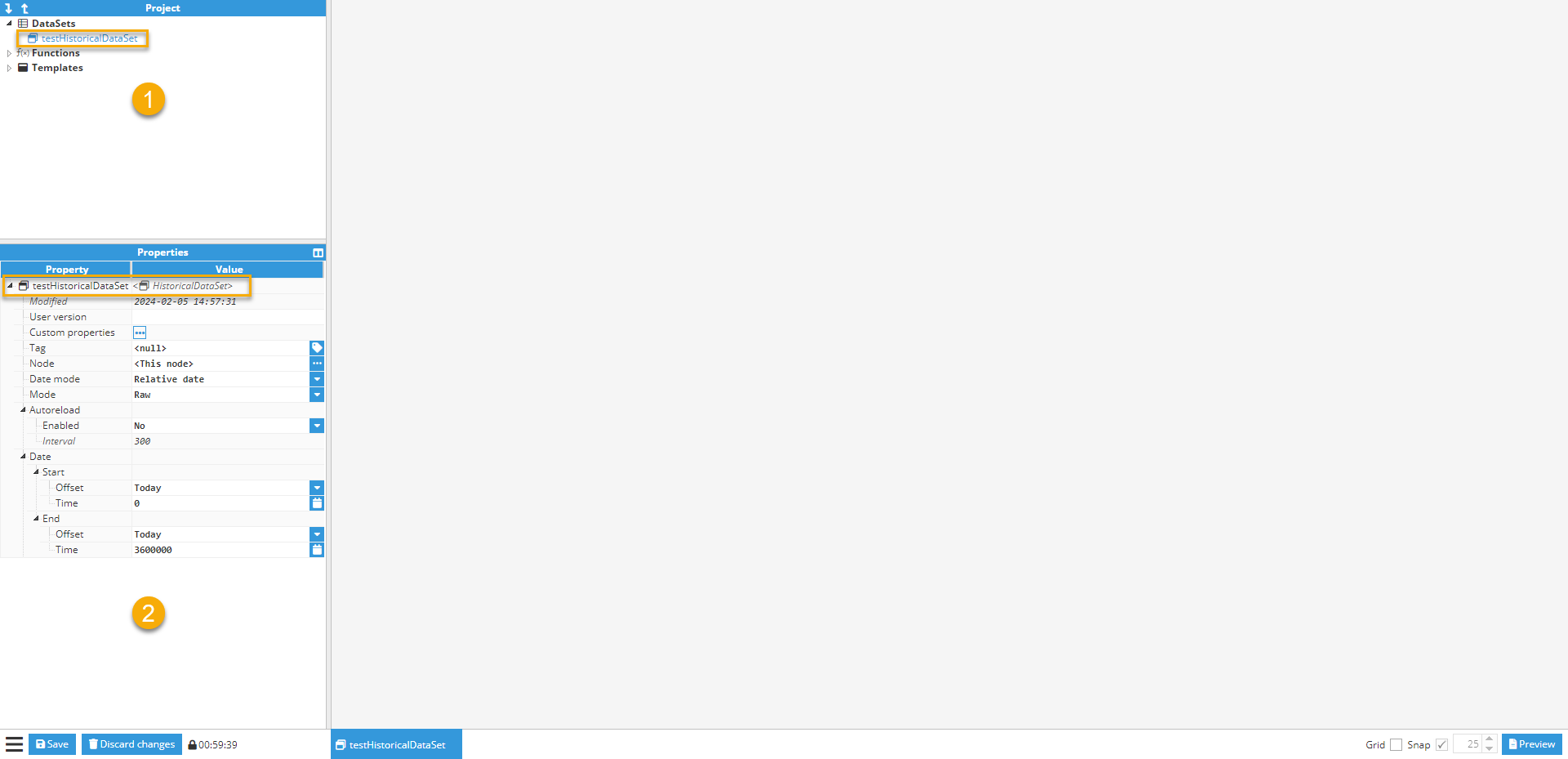
Historical DataSets. Historical datasets present data organized into [date, value] pairs, where the date is a timestamp and the value is the associated value to a given date. The data for Historical datasets is retrieved from N3uron Historian.
- Project tree: DataSet templates are created in the project tree under DataSets tab.
- Properties tree: Displays the properties of the selected Historical DataSet template.
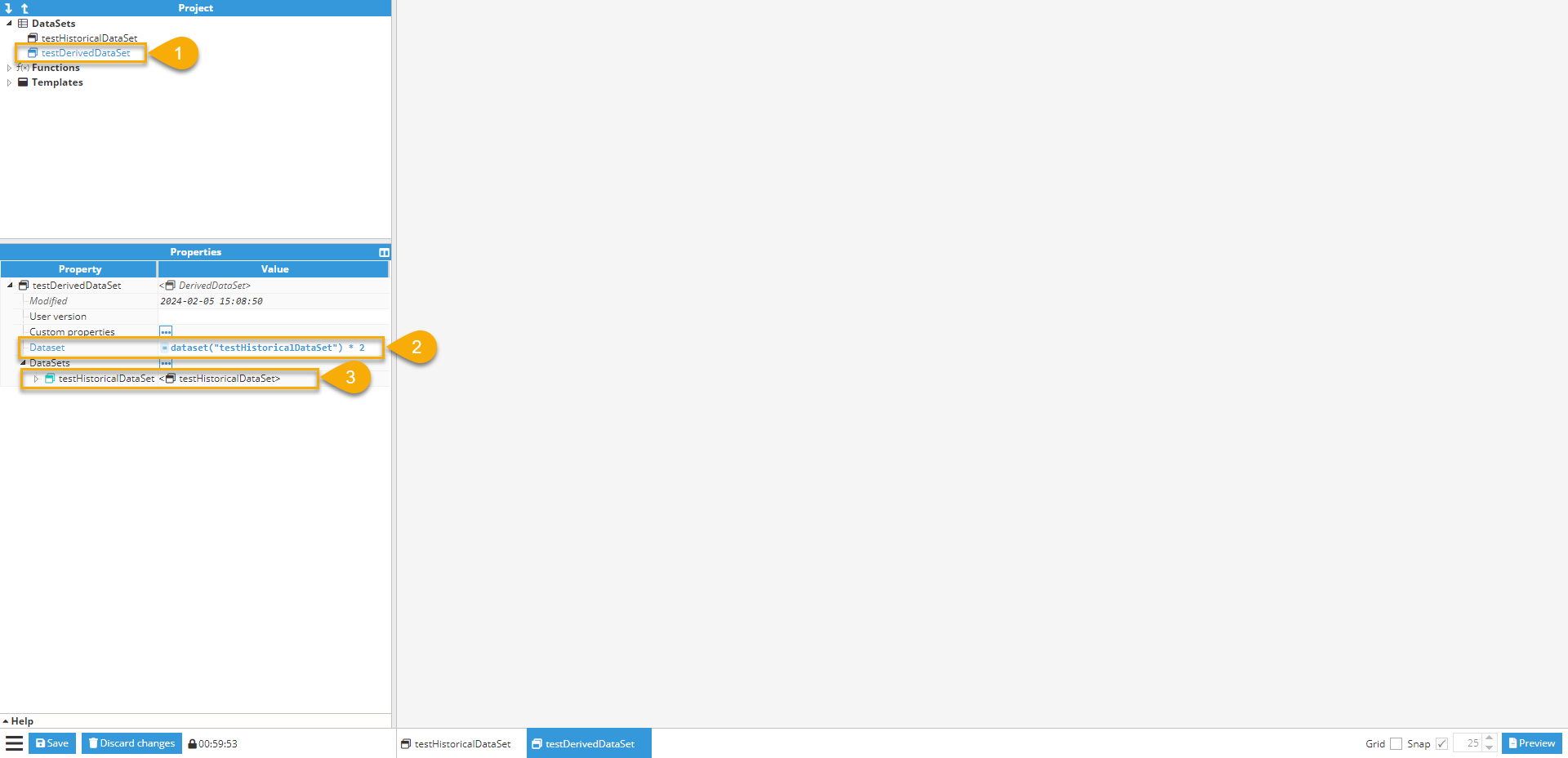
Derived DataSets. Derived DataSets can contain any type of data organized into pairs, but they are mostly used for allowing modifications to the data returned by other DataSets. For example, to multiply all values by two or to sum all values from two different DataSets.
- Selected 'Derived DataSet' template.
- Dataset: Utilizing 'Expressions', the Derived DataSet acquires data from 'testHistoricalDataSet,' instantiated within this template, and multiplies each element of this dataset by 2.
- DataSets: List of all the DataSets instantiated within this Derived DataSet template.
 We will provide a more in-depth explanation of DataSets in a later chapter.
Functions
Functions are elements with only one field (Script) where an expression can be specified using n parameters, for use inside any other property on Web Vision. The format of the parameter argv[n] is the nth command-line argument passed to the script. More information on this in later chapters.
- List of functions.
- Display of properties for the selected function.
- Editor for expressions where the script's actual code is modified.
- Input assistance menu.
.png)
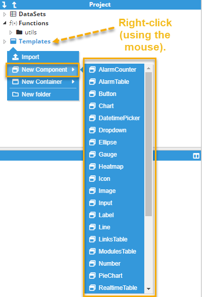
Templates
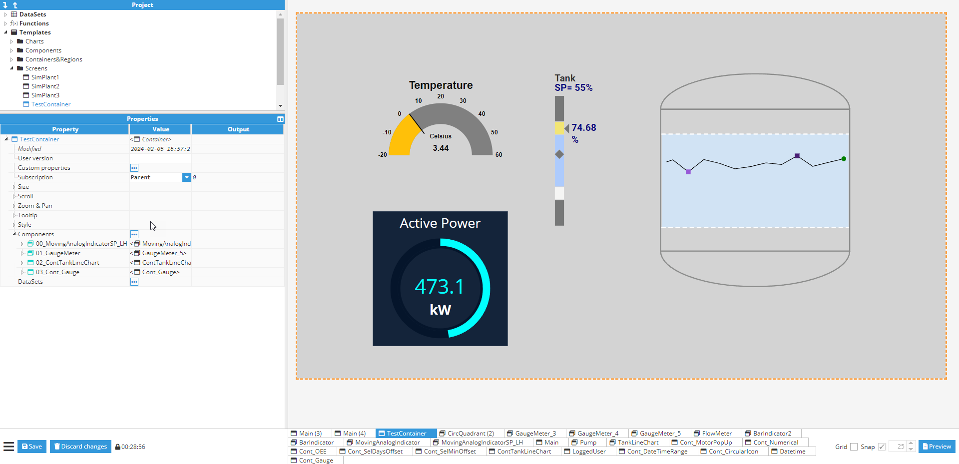
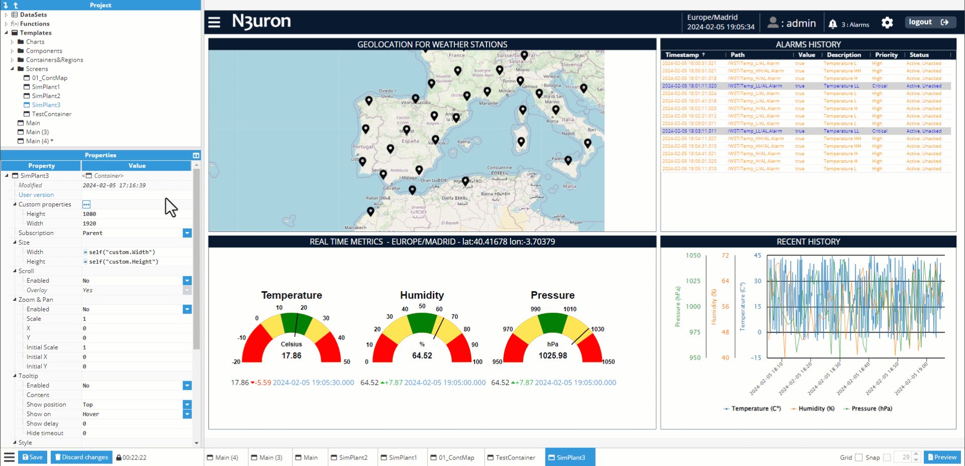
The Templates folder contains all visual elements when a visual element is an element with a graphical representation, for example, a gauge or an input. Visual elements have a unique set of properties that can be set and modified in the Designer. An element property is a named variable of a distinct type that affects an element’s behavior or appearance, such as size, color, name, or visibility. They are divided into two main groups:
- Containers: Visual elements capable of holding other visual elements within themselves. They are categorized into Container, Layout, Map, and Region.
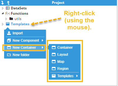
- Components: Visual elements with a graphical representation that cannot hold other visual elements within themselves. They have children but any children are either an element without graphical representation or non-visual elements, for example, a Report component in a Report.
The following chapters will explain these different visual elements in more detail.
Exporting and Importing Templates
Templates can be exported or imported for code reuse. To export a template, simply right-click on the template and choose the export option. To import a template, right-click on a folder and select the import option. You will be prompted to choose the destination folder when exporting a template or to select the file location when importing a template.
Properties Tree
The Properties tree shows the different personalization options available for each element type (DataSets, Functions, or Templates). It includes 3 columns:
- Property: Tree representation of the element property.
- Value: Editable field for an element property, which is categorized into two main types:
- Input: A field where users can write different types of values (text, number, Boolean) and different expressions. Inputs have an additional feature that can be seen when hovering over the input field: a feature called links, which will be explained in detail in another chapter.
- There are also other special inputs called controls, which have special features such as a tag picker input or file picker input.
- Input: A field where users can write different types of values (text, number, Boolean) and different expressions. Inputs have an additional feature that can be seen when hovering over the input field: a feature called links, which will be explained in detail in another chapter.
- Output: Result from the value field after its processing. For example, in the Size property, an expression of = 960 * 2 will give an output of 1920. The Output can be hidden using the button to the right of the Properties Tree header.
- Custom properties: Since all elements in Web Vision are essentially N3uron templates with some added extras, users have access to the same options as they would in other N3uron templates. This allows for custom properties to be added to certain elements.
- Components: List field, which allows users to add sub-elements to the selected element, for example when adding components to a container.
.png)
Help viewer
Most properties (at least those that have an associated input) include a context help entry. This help section can be accessed through the help viewer, which only appears when the selected property contains a help entry. When selecting a property with a help entry, a bar with the title “help” will appear at the bottom of the Properties Tree area. Click on the “help” title to display this information in a resizable area. 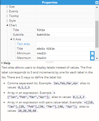
Visual area
The Visual area is the area located to the right of the Project and Properties Tree. The Visual area displays a graphical representation of each different visual element and enabled users to manipulate these elements:
- Select and manipulate elements.
- Pan, drag, & drop elements.
- Zoom elements.
- Trigger different mouse events.
- Modify editable visual elements, such as inputs or dropdowns.
Select and manipulate elements
When selecting an area, an orange-colored dotted rectangle will appear to completely surround the selected element. If the selected element is located inside a container, the Properties Tree will display its root node as selected. The selection tool also allows users to drag & drop elements to change their position within a container (if such a container supports drag & drop functionality).
Pan, drag, & drop
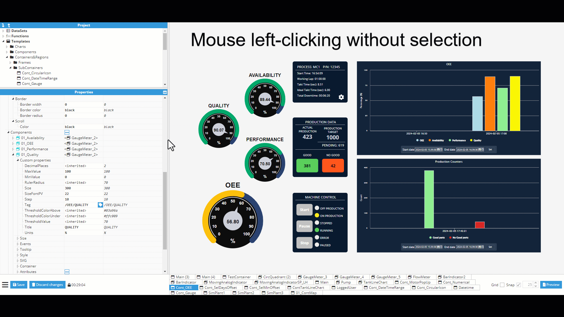
Left-clicking an element with your mouse will activate the drag & drop functionality, allowing users to drag & drop a selected element or an unselected one, resulting in different behaviors:
- Dragging a selected element inside a container: Users can drag & drop to set its position within the container. If the selected element, surrounded by an orange-colored dotted rectangle, has its own internal pan, like for example a map, dragging it will result in the internal pan being modified. Therefore, in these cases, the control key must be pressed before dragging the element in order to move it.
.gif)
- Dragging an element without selection: If the element has an internal pan, the pan will also be moved. Pressing the control key will move the parent element (if possible). For example, when in viewer mode, we cannot move the root container.
Zoom
The mouse scroll wheel can be used to change the zoom on an item. The designer permits two kinds of zoom functionalities:
- Designer zoom: Allows parent visual elements to be manipulated (root container or component). This zoom function is only intended as a visual aid for large elements where the user may need to zoom in order to edit the visual element, but where minimal changes are required.
- Container zoom: This zoom is internal for some containers (Container, Map, and Layout). It can only be fixed if set on initial zoom.
Pressing the control key while zooming will deactivate the zoom for the selected element, passing the zoom functionality to its parent, or changing to a designer zoom if no parent exists.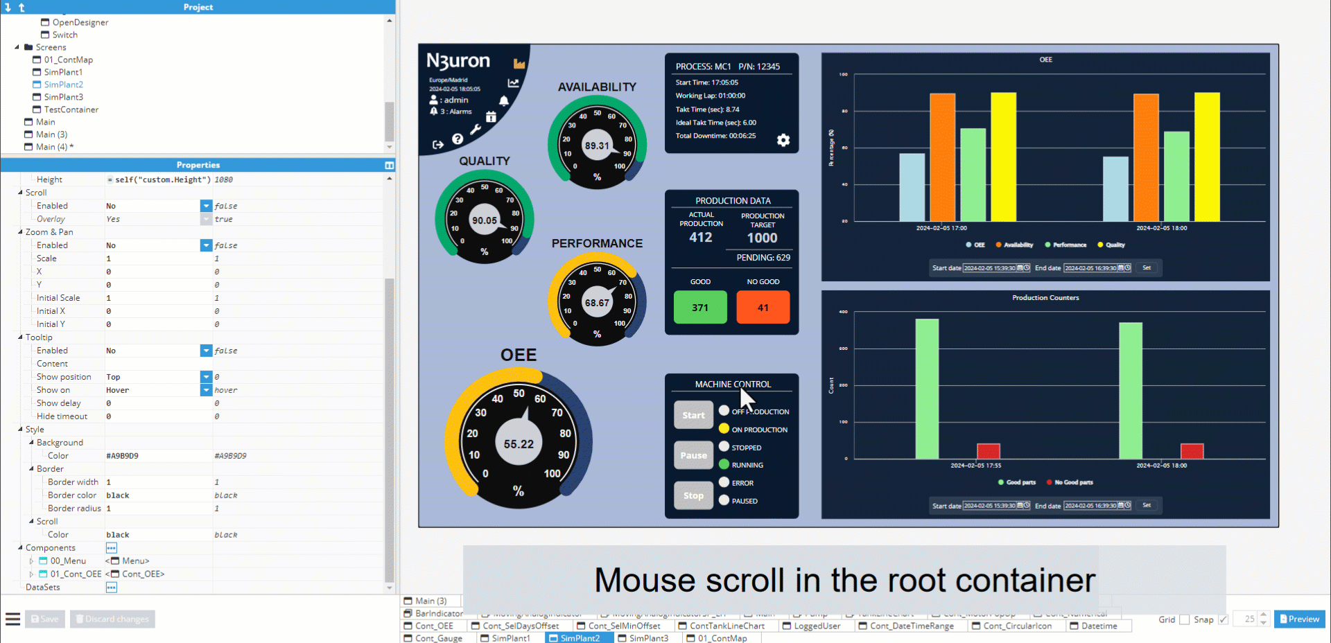
Mouse events
Multiple mouse events can be triggered from the visual area. In order to do so, the user must be in preview mode, or deselect the element (if already selected) and then press the control key:
- Mouse enter: When the mouse enters visual element boundaries.
- Mouse leave: When the mouse leaves visual element boundaries.
- Mouse down: When the mouse button is held over a visual element.
- Mouse up: When the mouse button is released over a visual element.
- Mouse click: When the visual element is clicked on.
Multiple actions can be attached to these events; we will explain these in detail in another chapter.
Modifying the state of visual elements
If when in the designer, the user activates preview mode or deselects the element (if selected) and presses the control key, the element can be interacted with as if in production mode. For example, setting a value to a visual input or selecting a value in a dropdown component.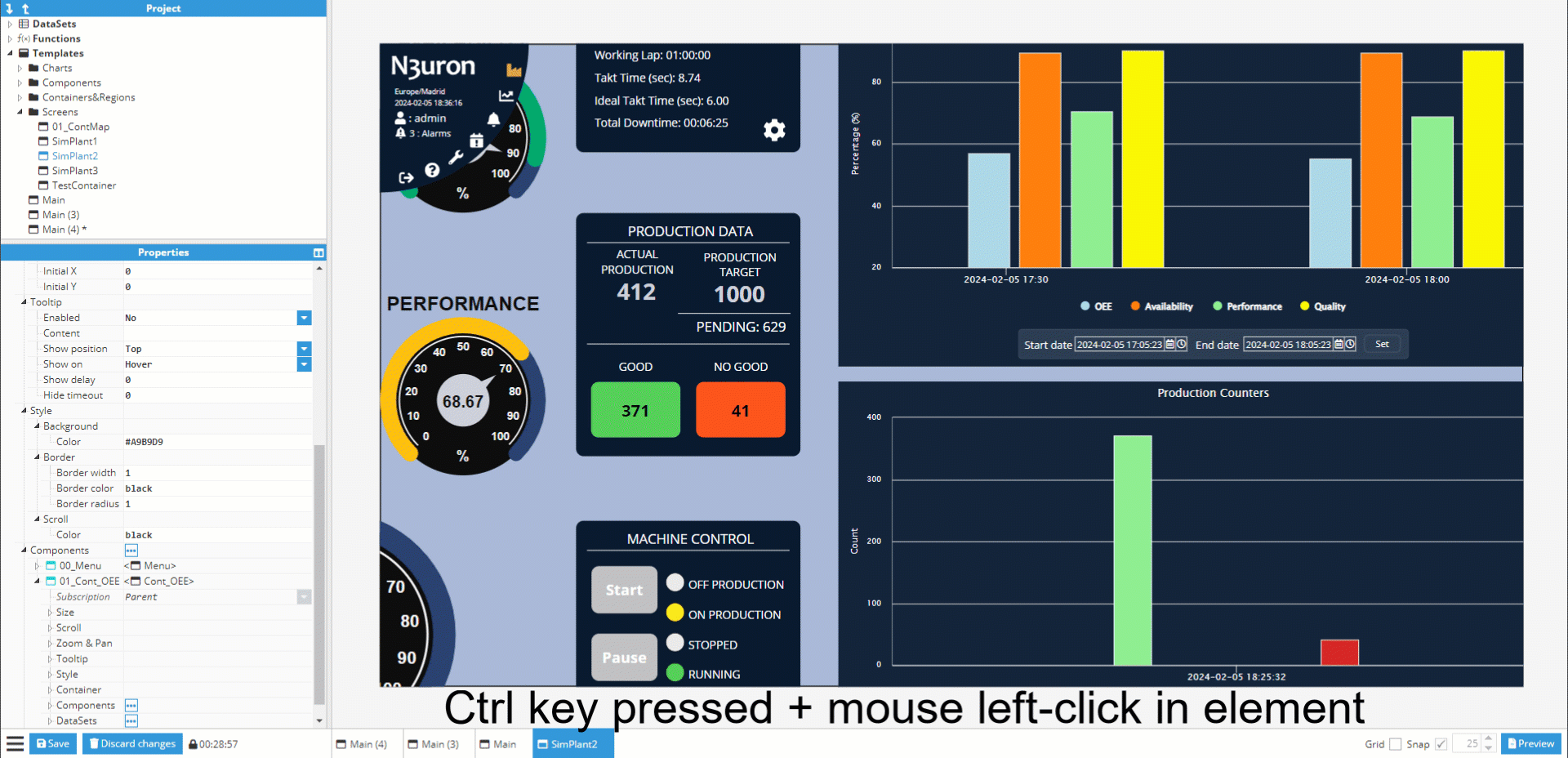
Buttons Bar
The Buttons Bar features multiple functionalities for interacting with the backend, user interface, and even visual elements.
Save/Discard changes
The Save and Discard changes buttons, allow users to send changes to the backend to be saved or discarded and reload the most recently saved changes. These buttons will remain disabled when there are no pending changes to save in the configuration. If pending changes do need to be saved, a timer will display the remaining inactivity period that the configuration is locked for other users.


Opened elements tabs
Opened tabs allow users to navigate between opened tabs and close them using the central mouse button or by clicking on the close (X) button.

Snap grid
The Snap grid is used to fix positions when dragging a visual element inside a visual element container. When the snap is activated and the grid size is more than zero, a dotted grid will be applied over the root visual element currently displayed. This grid fixes dots as unique valid points to drop the dragged element to. The element drop position will be determined by the position of its origin.
.gif)
Preview mode
The “preview” button is located to the right of the buttons bar, which can be used to toggle between the “editor” and “preview” modes. When in preview mode, any selections will be deactivated and any mouse interactions, modifications to visual elements, or trigger events, will not require the control key to be held down for launch. The only visible interface displayed will be an “edit” button in the bottom-right corner for toggling back to the “editor mode”.
Burger menu
The burger button located to the left of the buttons bar displays multiple available actions (these actions will be detailed in another chapter). These Burger actions include:
- Tag alias
- Manage lock
- Timezone
- Save configuration
- Load configuration
- Logout