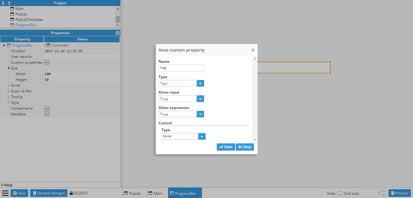
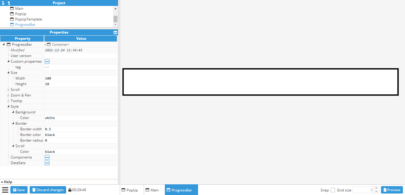
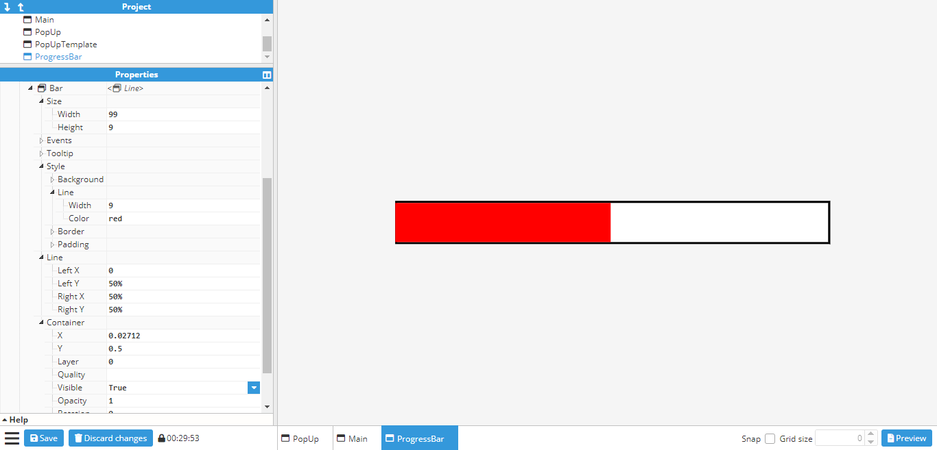
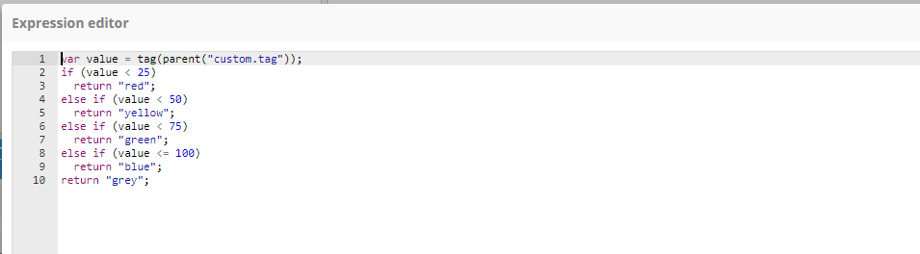
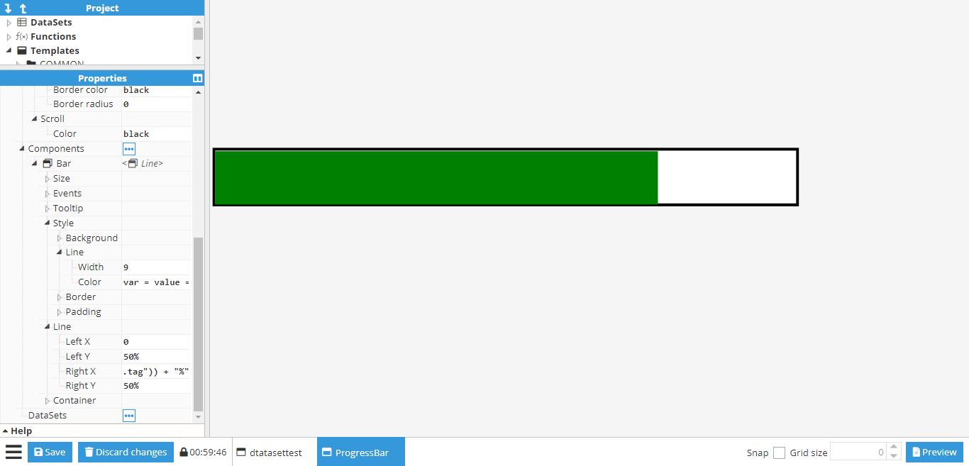
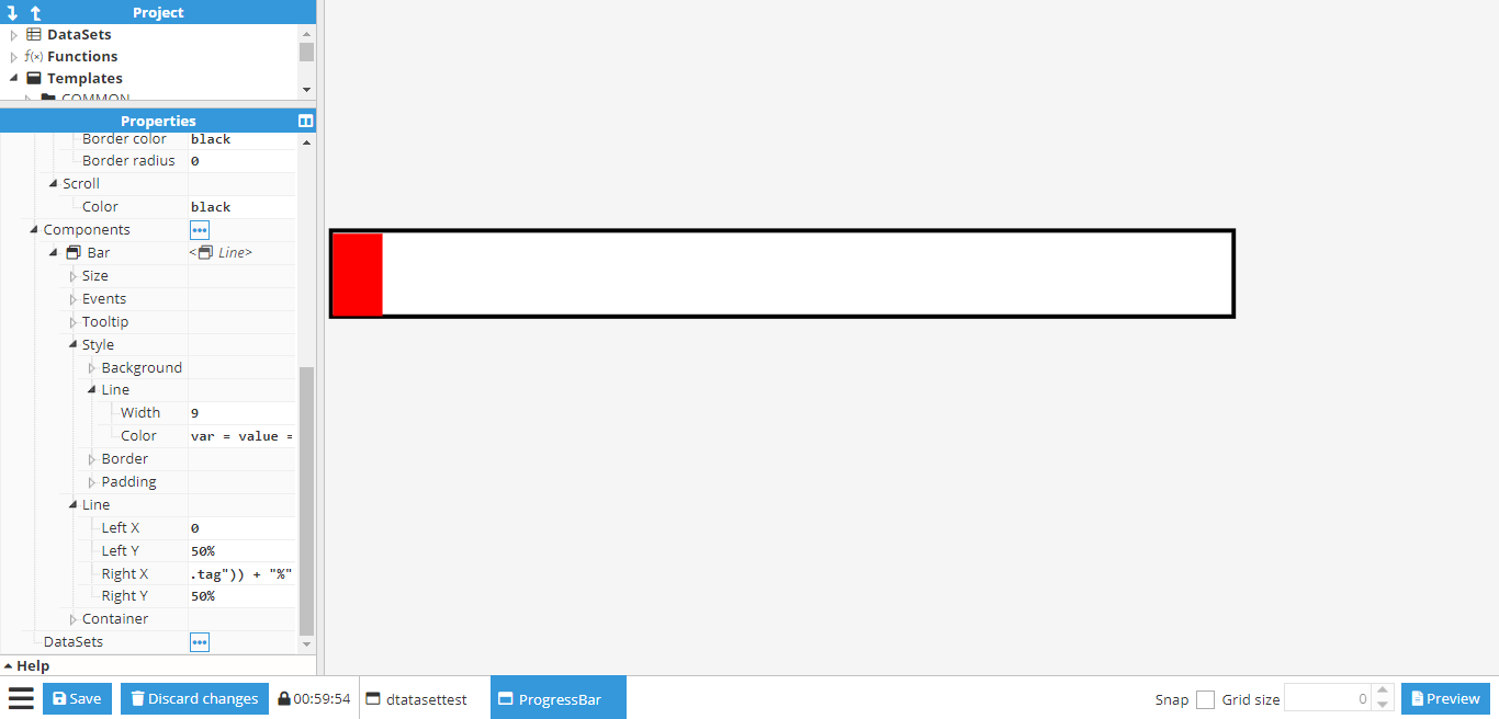
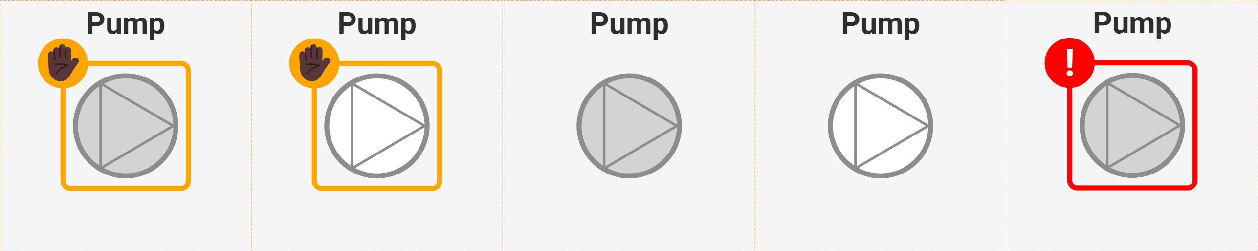
--- title: "Web Vision | Compound Elements Example | N3uron KB V1.22" slug: "web-vision-example-compound-elements" description: "Build a custom Web Vision progress bar by combining a container, a line component and custom properties, with tag-driven colors and animations." updated: 2026-10-08T10:32:14Z published: 2026-10-08T10:32:14Z canonical: "docs.n3uron.com/web-vision-example-compound-elements" --- > ## Documentation Index > Fetch the complete documentation index at: https://docs.n3uron.com/llms.txt > Use this file to discover all available pages before exploring further. # Creation of compound elements ## **Creating a progress bar** By default, **Web Vision** only comes with a Gauge for displaying tag values, as well as any labels, which can also be linked to a tag. However, links can also be used to create custom components. In this example, a progress bar will be created and linked to a tag. This first step is to create a new blank container. In this case, a 100x10 container is sufficient. Next, a custom property called **tag** is added to the container. This will be the tag that provides the value to the progress bar. Since this one will be a tag, the **tag picker control** will be used and limited to tag only. ![](https://cdn.document360.io/54093ab5-6b22-4542-a265-04377931f11a/Images/Documentation/Figure%20145.png) Afterward, a general styles border is added to the ProgressBar container. ![](https://cdn.document360.io/54093ab5-6b22-4542-a265-04377931f11a/Images/Documentation/Figure%20146.png) The next step is to create the progress bar itself. For this, a **line** component is used and set to a size of 99x9 (the same as the container, minus borders). The **line** **width** is also set to 9 in order to fill the entire container. The container X/Y is also set to 0.5 to avoid any overlapping with the border, which can be colored red (to contrast against the border) in order to make sure that the line has been positioned correctly. Its two points are then set to (0,0) and (50%,0), which gives the following result: ![](https://cdn.document360.io/54093ab5-6b22-4542-a265-04377931f11a/Images/Documentation/Figure%20147.png) Finally, the **Right X** (the x coordinate of the line’s right-side point) needs to be linked to the newly created tag custom property. For this, the following expression is used: ```javascript =tag(parent(“custom.tag”)) + “%” ``` “%” is also added to the end of the expression in order to transform the second point into a relative value, instead of an absolute one. The value of the **tag** custom property can be changed to a tag in order to ensure that the setup has been carried out correctly. In this example, “/ReadOnlyNumber” is used. If the line changes when the value changes, the progress bar is working as intended. While this is enough for a working progress bar, it can also be configured in a way that the colors change according to the tag value. Animations can also be added for smoother transitions between each change in values. First of all, it’s configured to **change color** from **red** when below 25, **yellow** until 50, **green** until 75 and finally to **blue**. To do this, a conditional expression needs to be added to the line **color** property by using the **expression editor** helper to make it easier to input the expression: ![](https://cdn.document360.io/54093ab5-6b22-4542-a265-04377931f11a/Images/Documentation/Picture148.png) If the expression is written correctly (no syntax errors), users can check that the colors work by changing the tag value: ![](https://cdn.document360.io/54093ab5-6b22-4542-a265-04377931f11a/Images/Documentation/Figure%20149.png) Finally, an animation can be added to the Right X coordinate for a smoother transition between values. To do so, the **Set animation** helper can be used on the Right X” coordinate to input the animation settings. Once configured, the icon next to Right X should indicate that the animation is enabled. More information about animations can be found in the animation section. ![](https://cdn.document360.io/54093ab5-6b22-4542-a265-04377931f11a/Images/Documentation/Figure%20150.png) ## [](/docs/web-vision-example-compound-elements#_Toc63160055) ## [](/docs/web-vision-example-compound-elements#_Toc63160050) ## **Using SVG component for custom components** **SVG custom components** offer a powerful means to incorporate **Scalable Vector Graphics** (SVG) images onto the screen. This format is highly convenient, as it allows for gradual resizing while preserving image quality. Moreover, the abundance of SVG graphics available online eliminates the need for users to create them from scratch. To import an SVG into the project, users have two options: 1. Utilize the Image component: Simply import the SVG image directly, just selecting the image you want to import from without the need for additional code manipulation. 2. Employ the SVG component: This option provides advanced functionality, allowing users to manipulate SVG attributes using CSS, XML, and JavaScript to customize the graphic to their specific requirements. In this example, we will explain the second option, using the SVG component. For instance, we are going to create an SVG component that represents a PUMP and its internal state. ![pumps](https://cdn.document360.io/54093ab5-6b22-4542-a265-04377931f11a/Images/Documentation/pumps.png) SVG is a markup language based on XML, so its structure follows XML conventions. Here is the code for this particular example: ```xml  Pump 1                                ✋🏿       ``` The following is a detailed explanation of the code: 1. **** This line initializes an SVG element with a width of 100 units, a height of 100 units, and a preserveAspectRatio attribute set to "xMidYMid meet". This attribute ensures that the SVG image is scaled to fit the viewport while preserving its aspect ratio and aligning it to the middle horizontally and vertically. 2. **Pump 1** This line creates a text element with the ID "textName", positioned at 50% of the SVG width and 10% of the SVG height. The text-anchor attribute is set to "middle", aligning the text horizontally at its center. The alignment-baseline attribute is also set to "middle", aligning the text vertically at its middle. The text is filled with the color #818180, using the Roboto font family, size 9, and bold weight. The text content is "Pump 1". 3. **** This line creates a circle element with the ID "innerCirc", positioned at the center of the SVG (50% of width and height). The circle has a radius of 20 units, a stroke color of #8c8d8c, a stroke width of 2 units, and is filled with the color "lightgray". 4. **** This line creates a line element starting at coordinates (40, 33) and ending at coordinates (69, 50). The line has a stroke color of #8c8d8c and a stroke width of 1 unit. 5. **** This line creates another line element starting at coordinates (40, 67) and ending at coordinates (69, 50). It shares the same stroke color and width as the previous line. 6. **** This line creates a third line element starting at coordinates (40, 33) and ending at coordinates (40, 67). It also has the same stroke color and width. 7. **** This line initiates a group element with the ID "message". Group elements are used to logically group SVG elements together. 8. **** This line creates an animation that changes the opacity of the element over time. The animation lasts for 1 second (dur="1s"), transitions from opacity 0 to 1 to 0 (values="0;1;0"), repeats indefinitely (repeatCount="indefinite"), and starts when triggered (begin="never"). 9. **** This line creates a rectangle element with the ID "messageRect", positioned at 25% of the SVG width and height. The rectangle has a width and height of 50 units, rounded corners with a radius of 3 units (rx and ry attributes), is filled with a transparent color, and has an orange stroke. 10. **** This line creates a circle element with the ID "messageCirc", positioned at 25% of the SVG width and height. The circle has a radius of 10 units and is filled with the colour "red". 11. **✋🏿** This line creates a text element with the ID "messageText", positioned at 25% of the SVG width and 30% of the SVG height. The text is horizontally and vertically centered using the text-anchor and alignment-baseline attributes. It is filled with the color "white", and uses the Roboto font family, size 15, and bold weight. The content of the text consists of a Unicode hand symbol and a star symbol. This SVG custom component includes 'Custom properties' to access the inner elements of the SVG, which are updated based on the values of these properties. We utilize CSS selectors to access elements by their 'ID' and attribute selectors to modify the elements' attributes with the provided values. These values can be constants or returned by JavaScript expressions within WebVision. ![](https://cdn.document360.io/54093ab5-6b22-4542-a265-04377931f11a/Images/Documentation/PumpSVG.gif) Next, we will explain a couple of attribute properties created specifically for this example; the remaining attributes will follow the same logic. These attributes in WebVision will modify the attributes of components inside the SVG based on their values. [CSS selectors](https://developer.mozilla.org/en-US/docs/Learn/CSS/Building_blocks/Selectors) will be utilized for this purpose.[](https://developer.mozilla.org/en-US/docs/Learn/CSS/Building_blocks/Selectors) - **CircInnerStatusFill**: This attribute controls the color of the inner circle. - Selector: #innerCirc. - Attribute: fill. - Value: Here a Javascript expression is used. ```javascript if(parent("custom.Status")===1 || parent("custom.Status")===3) return "white"; return "lightGray"; ``` ![innerAttribute](https://cdn.document360.io/54093ab5-6b22-4542-a265-04377931f11a/Images/Documentation/innerAttribute.png) - **TextStatusSymbol**: This attribute controls the symbol displayed to represent the status of the pump. - Selector: #messageText. - Attribute: innerHTML. - Value: Here a Javascript expression is used. ```javascript if(parent("custom.Status")===0 || parent("custom.Status")===1) return "✋🏿"; if(parent("custom.Status")===4) return "!"; return  ""; ``` The string "✋🏿" represents an emoticon in Unicode encoding. Specifically, it represents a combination of two Unicode characters: "✋" (U+270B) and "🏿" (U+1F3FF). Together, they may render as a single emoji on devices and platforms that support emoji rendering. ## **Animated Attributes and innerHTML for Dynamic Visual Effects** In this example, we aim to demonstrate how to dynamically control SVG animations using JavaScript and the **innerHTML property**. Our objective is to create a visual effect where specific zones within an SVG graphic blink based on their status. By doing so, we can highlight important areas or draw attention to certain elements within the SVG. The provided JavaScript code dynamically inserts an ** element** into the SVG based on the status of each zone. The **parent("custom.StatusZoneXX")** custom property represents the status of "ZONEXX". If the status is 0, indicating that "ZONEXX" should blink, an element is added to the ** element**. This element creates a blinking effect by changing the **fill color** between **#800** and **#f00** every 0.8 seconds. If the status is not 0, no animation is added, and the zone remains static. By using this approach, we can control the visual appearance of SVG elements in real time, making the graphics more interactive and responsive to data changes. This technique is particularly useful for creating dynamic dashboards, real-time monitoring systems, and interactive visualizations where certain areas need to be highlighted or animated based on specific conditions. Here is the SVG code for our custom component, which represents three distinct zones: ZONE01, ZONE02, and ZONE03: ```xml                                                                ZONE01                                                    ZONE02                                                    ZONE03             ``` 1. **Custom Properties:** This section lists the custom properties used to provide status values. These properties can be linked to attributes within WebVision, tag values, or alarm statuses. 2. **SVG Content:** This section contains the SVG code. 3. **Attributes**: 1. **Selector:** The ID of the component to be modified. 2. **Attribute:** The attribute of the component to be accessed. In this case, the inner HTML. 3. **Value:** The value of the inner HTML. We use a JavaScript expression to change the value based on the custom property status of the zone. Here is the JavaScript code. The only change will be the Custom Property being accessed: ```javascript if(parent("custom.StatusZone01") == 0){    return ``;   }else{    return ''; } ``` ![WebVisionSvgDynamic](https://cdn.document360.io/54093ab5-6b22-4542-a265-04377931f11a/Images/Documentation/WebVisionSvgDynamic.png) This animated GIF demonstrates the final result and shows how this logic will work in practice. ![WebVisionSVGInnerHtml](https://cdn.document360.io/54093ab5-6b22-4542-a265-04377931f11a/Images/Documentation/WebVisionSVGInnerHtml.gif) [Web Vision Full Product Details](https://n3uron.com/iiot-platform-modules/web-vision/)