Linking tags to a property
To display tag values using components, such as the gauge component, the value of the component must be linked to the tag that will be displayed. It is important to note that any tag property can be linked, not just the value. For example, to link the tag value of a specific tag, the EU of the same tag, and the quality of the tag to the value, EU, and quality of a gauge's container respectively, you can use the following code.
Firstly, a gauge component should be created in the container. Once created, the value field should be selected and the input options button clicked to select the “link tag” option, as shown in the below screenshot:
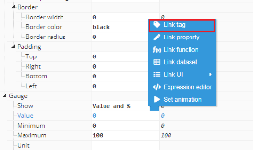
After clicking the link tag button, a popup will appear with a list of tags to link to:
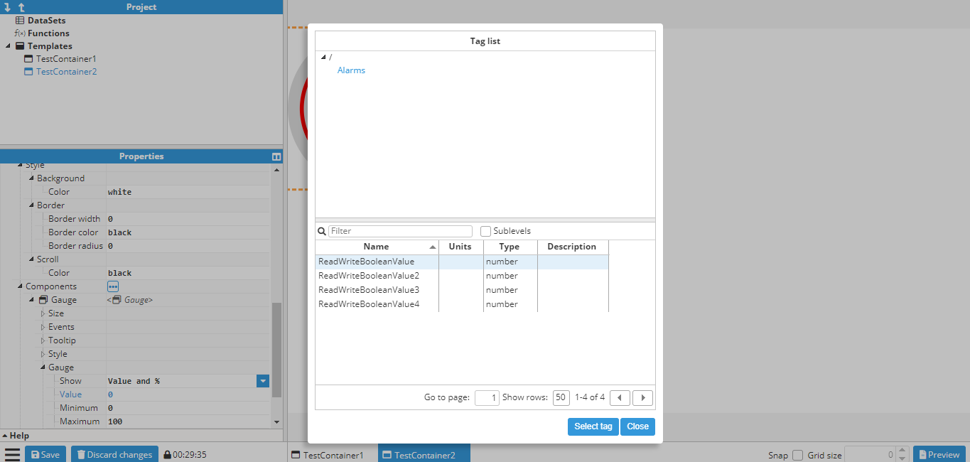
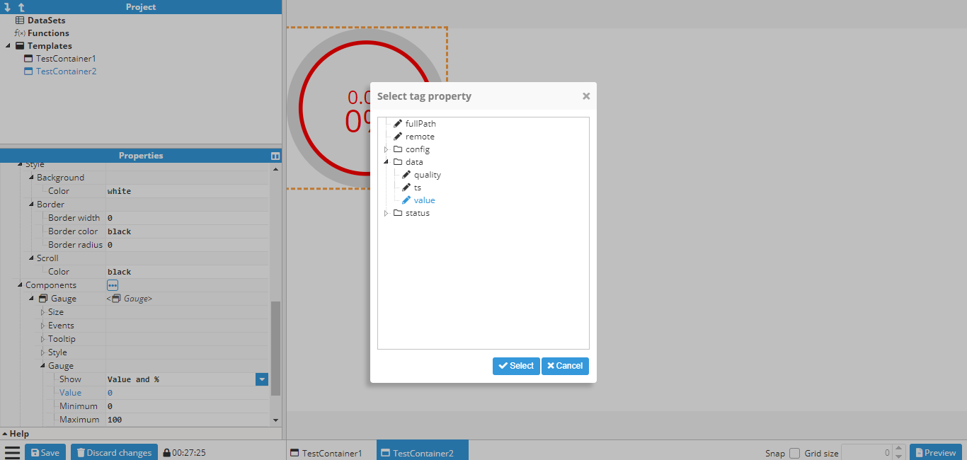
In this example, the tag is “/ReadOnlyNumber”. After selecting the tag, another popup allows users to select the property:
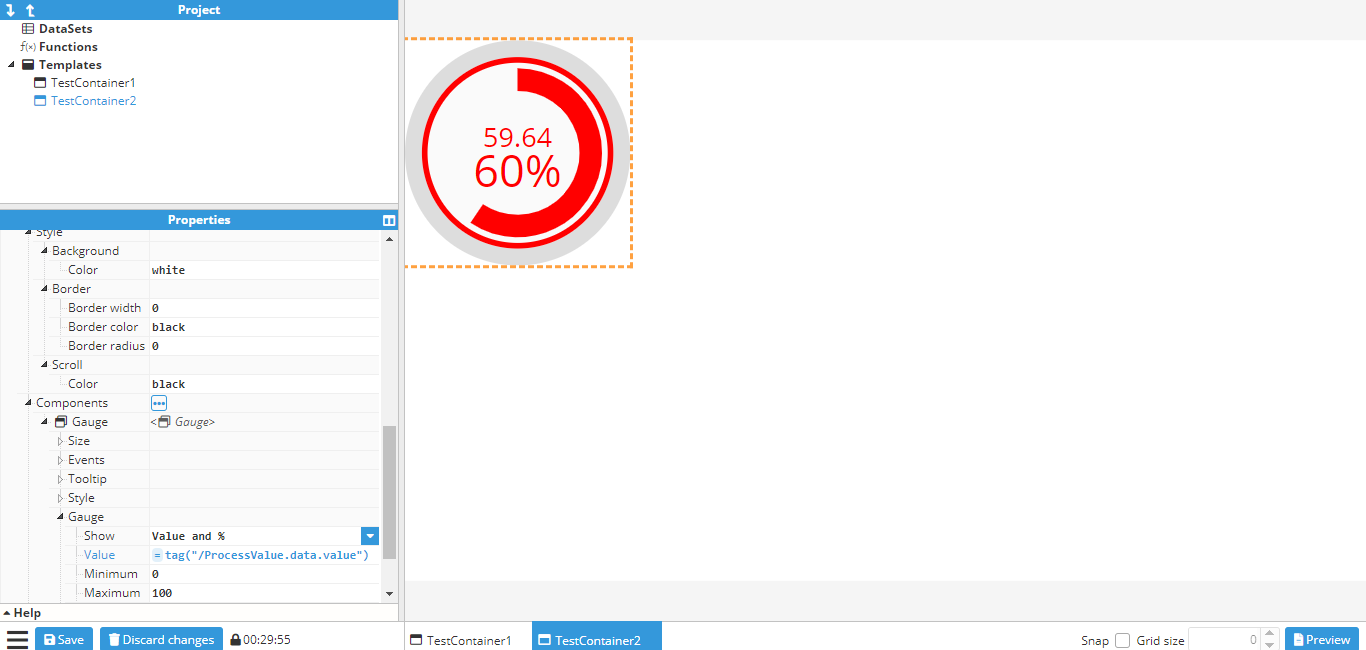
After selecting the tag value, the value field changes to =tag(“/ReadOnlyNumber”), which is how a tag is linked internally (More information in Tag function).
Follow the same procedure to link the engineer units to the tag’s engineer units and the same for the quality section (located in the container section) in order to link the tag. The resulting gauge will look like this:
Writing values to tags based on an event
The following screenshot shows the available events for an input component:
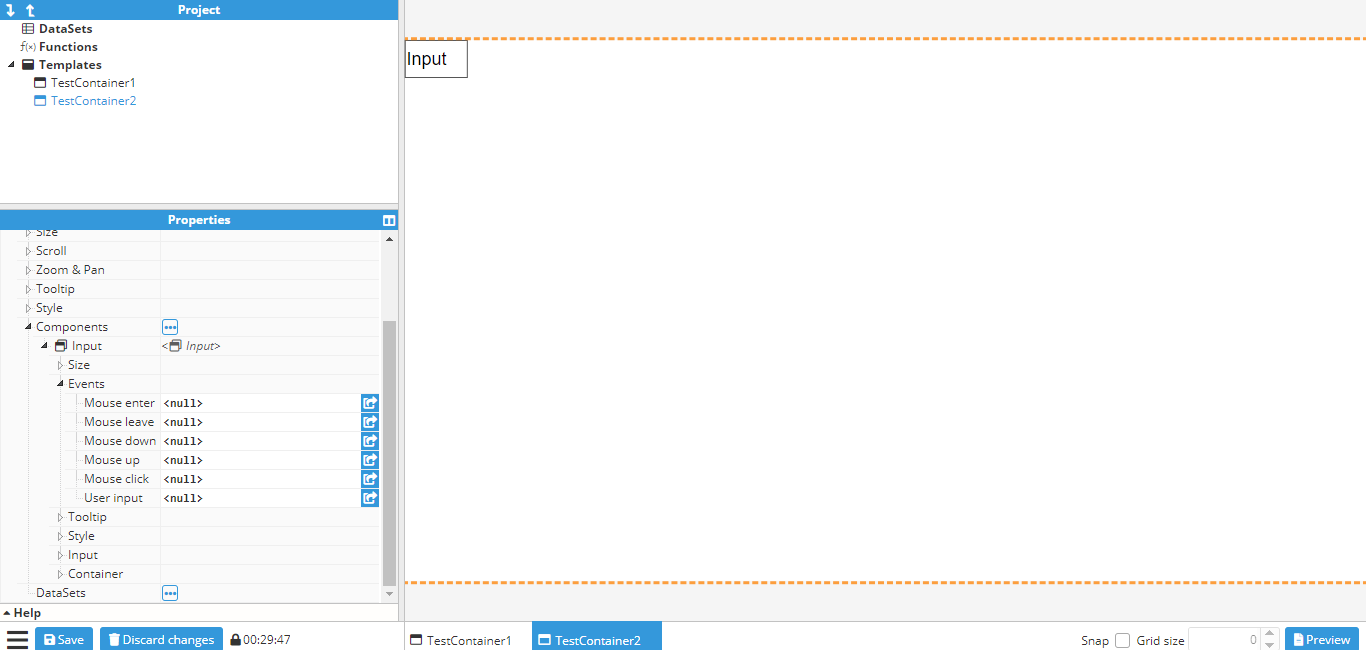
By clicking on the button indicated with an arrow, a popup is displayed to allow users to create actions for that event. In this case, for binding the User input event to a write tag action. By clicking on the “add action” button, a new popup will appear to allow the user to select which action to execute. In this case, write tag has been selected to bind the value to be written to the To display tag values using the gauge component, the value of the component must be linked to the tag that will be displayed. It is important to note that any tag property can be linked, not just the value.
For example, to link the tag value of a specific tag, the EU of the same tag, and the quality of the tag to the value, EU, and quality of a gauge's container respectively, you can use the following code.To display tag values using the gauge component, the value of the component must be linked to the tag that will be displayed. It is important to note that any tag property can be linked, not just the value.
For example, to link the tag value of a specific tag, the EU of the same tag, and the quality of the tag to the value, EU, and quality of a gauge's container respectively, you can use the following code.input text:
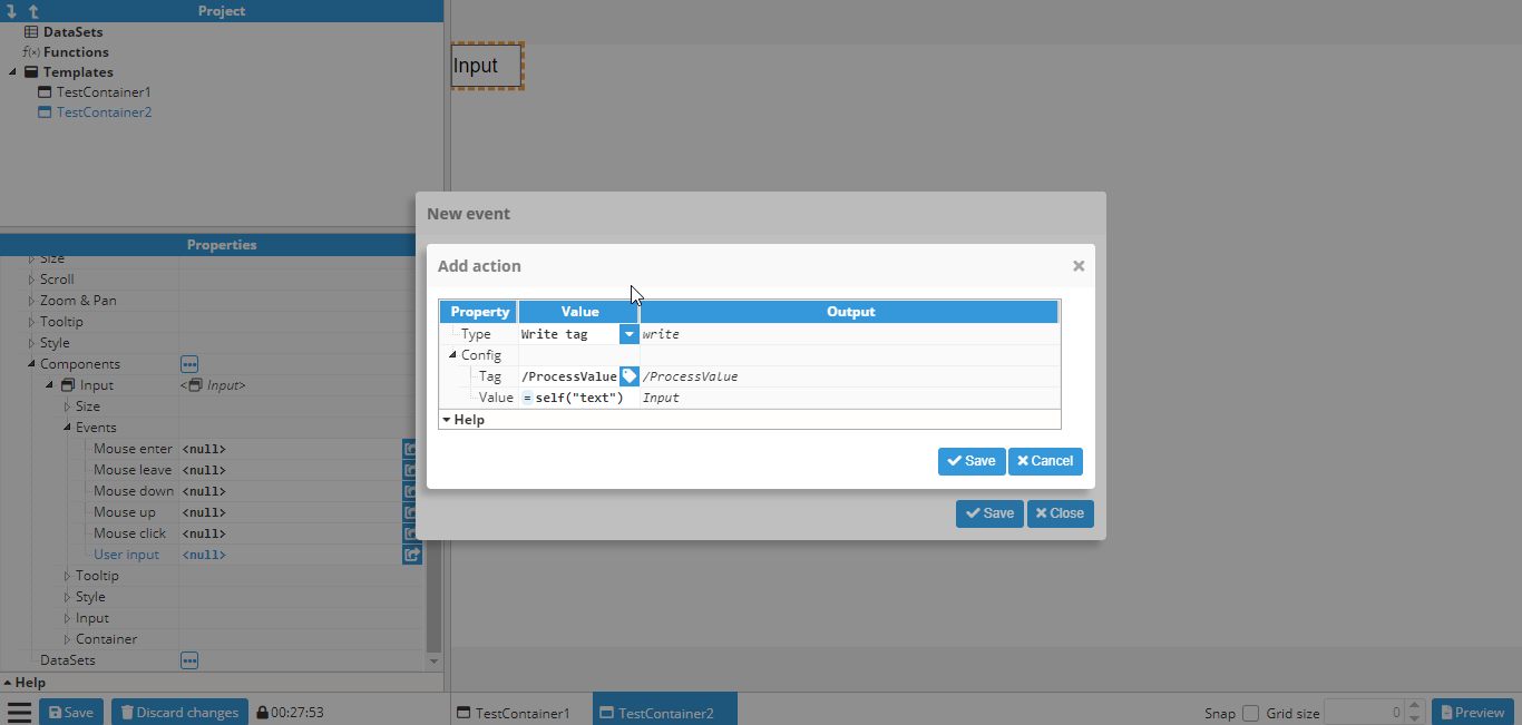
A write tag action is shown with “/ReadWriteNumber” as the tag and =self(“text”) as the value. More information about the “self” function can be found here.
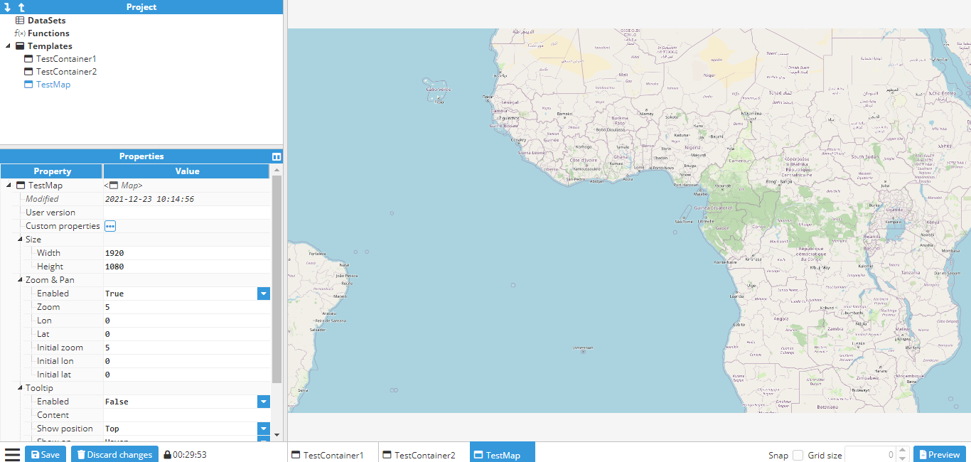
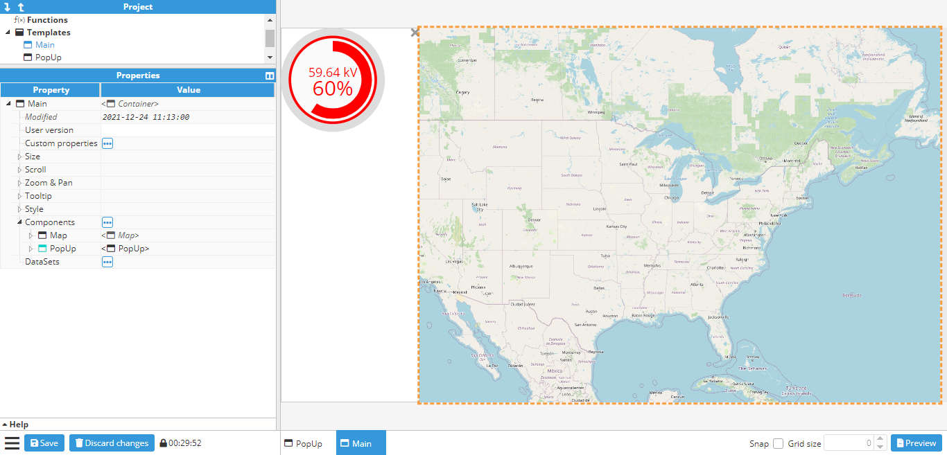
Adding markers to a map
The following example adds fixed markers to a map, which will always remain in the same coordinates regardless of the map’s pan or zoom settings.
Firstly, a map container should be created and if needed, the initial longitude, latitude and zoom levels should be set up.
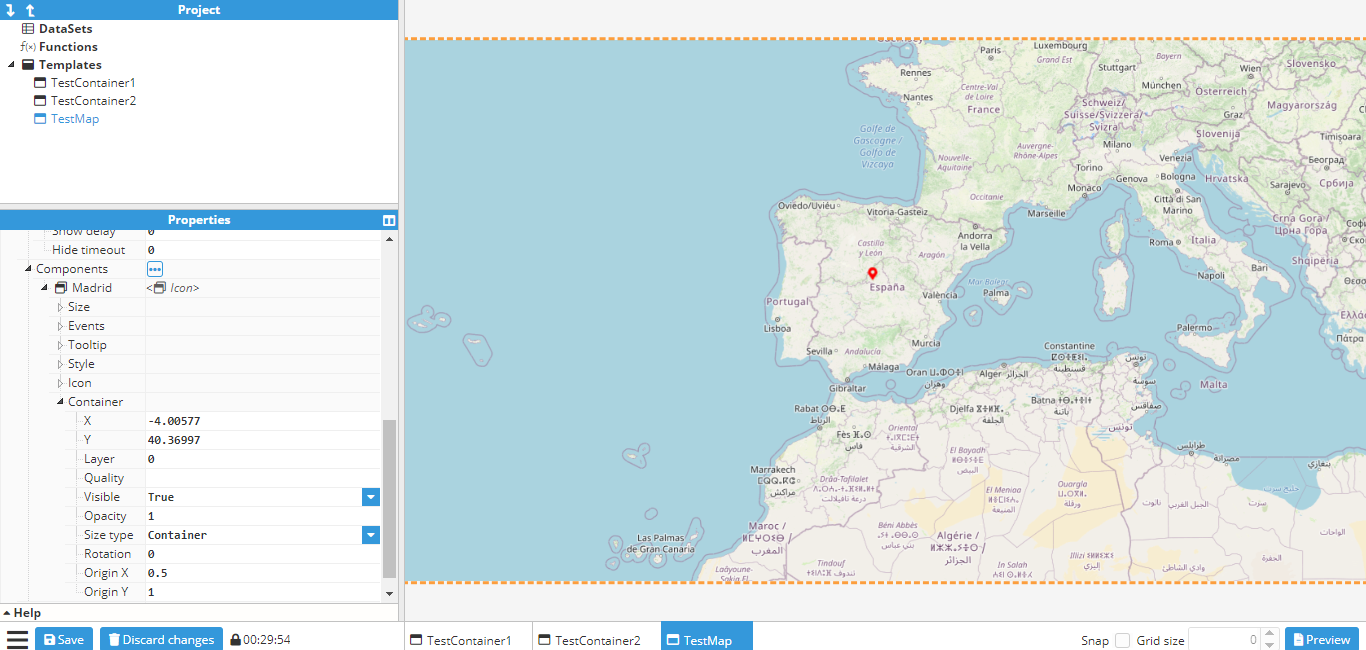
 Next, the markers are created. This requires the use of an Icon component, since an icon called a marker is available to use, which is perfect for this purpose. When creating new components, the origin is set to (0,0) by default, which means that it will be positioned using the top left corner as the reference point. Since the bottom of the marker needs to be fixed in position, the origin must be changed to the bottom center, which is (0.5, 1). The marker is now placed in its final location, which in this case is Madrid.
The icon can be duplicated by either right clicking and selecting duplicate, or alternatively, clicking on the icon, using CTRL+D and then placing it in the new coordinates. To finish this example, two more markers are created; one in Berlin and one in London. The final map will be as follows:
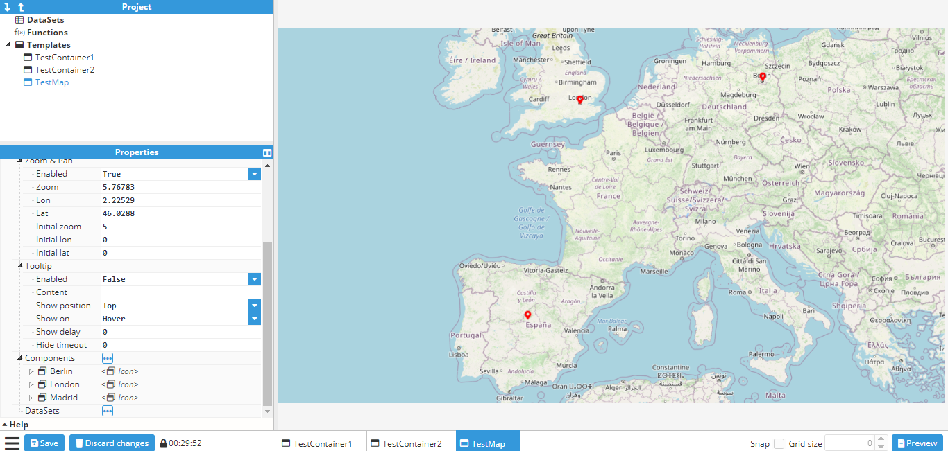
By default, these markers won’t do anything. However, just like any other component, events can be attached to them and as such, markers can be used to display a popup (as seen in the Creating a parameterized popup).
Click to display a popup
This example shows how to create a popup with a gauge that can be opened and closed by pressing a button. In order to do this, the first step is to create a popup template by creating a new empty container of 500x500 pixels and then adding a gauge and label inside the container. The gauge will point to a tag called /ReadOnlyNumber, which in this example is a memory tag. The label will display the tag name.
The properties of the container, gauge, and label can be seen in the following screenshots:
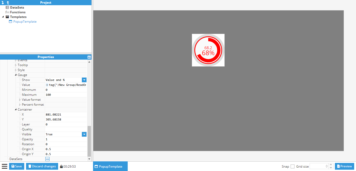
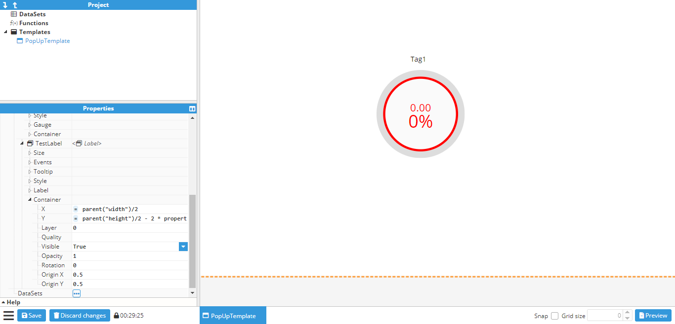
As seen in the example, the position of the gauge and the label are relative to the container size, this is achieved by using the property function to obtain the height and width of the container.
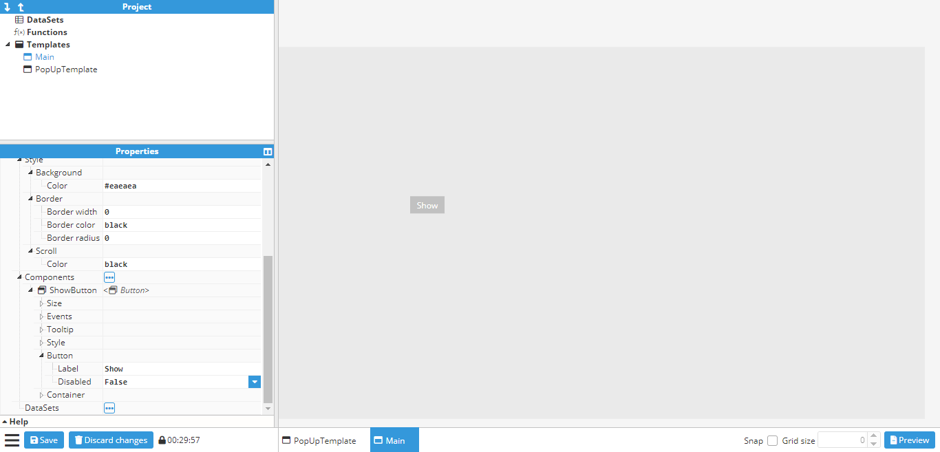
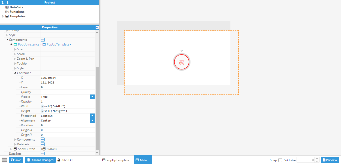
Once the desired popup has been created, it’s time to create the main window where the popup will be displayed. This window will be a 500x500 container named Main and will contain a button called ShowButton. To view the popup that has been created, the background color of the main window can be changed to gray, as shown in the following screenshot:
Next, an instance of the popup template needs to be added as a component. Once added, it can be placed in the desired position for display, before changing the visible property under the container to false. This will hide the popup, although the outline of its location will still be visible, as shown in the below screenshot:
To display the popup, an action needs to be attached to the click event on the button. This will set the visible property of the popup to the inverse value, which means it will be shown when hidden and closed when visible:
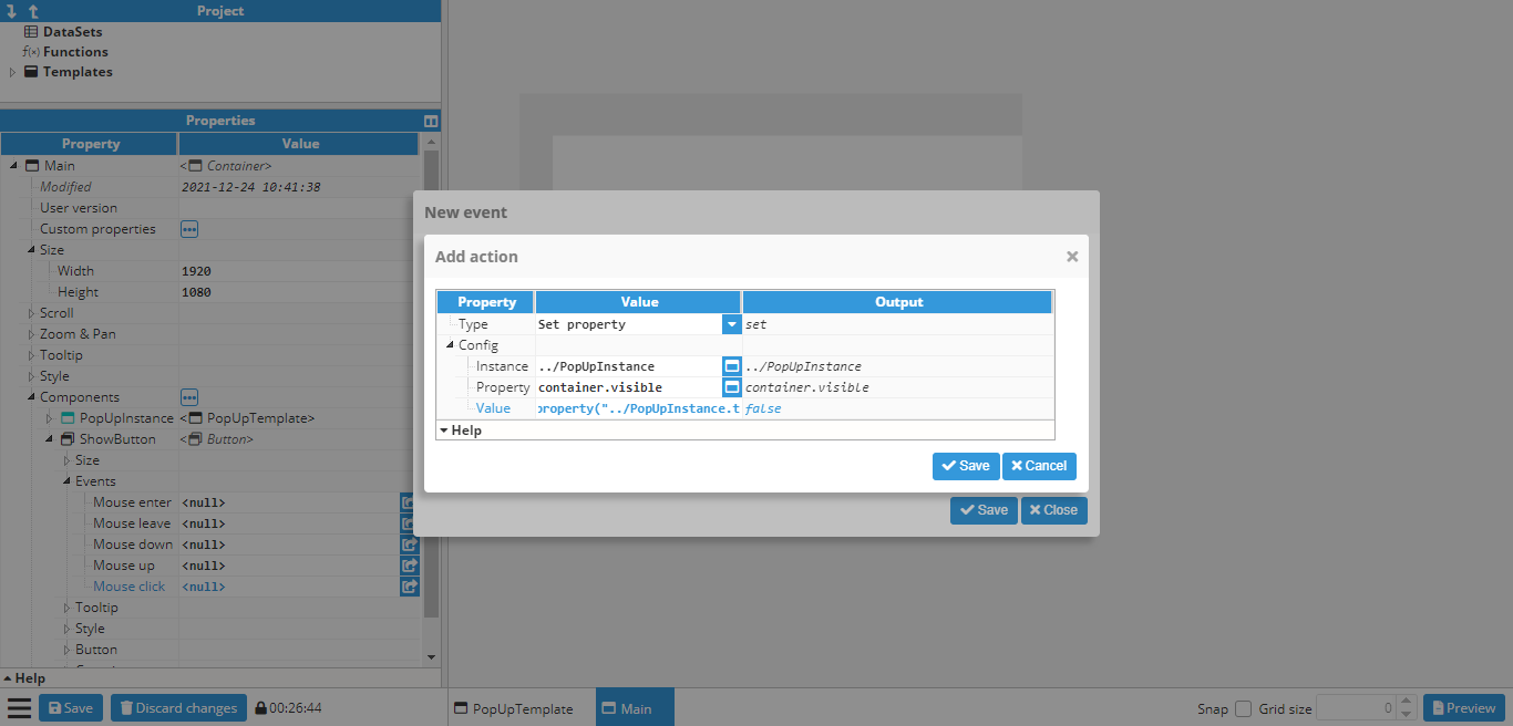
Since the value needs to be the opposite of the current visibility value, the following expression is used:
=!property(“../Popup.container.visible”)One more action still needs to be added in order to change the text property of the button to “Show” or “Hide”, depending on whether the popup is visible or not:
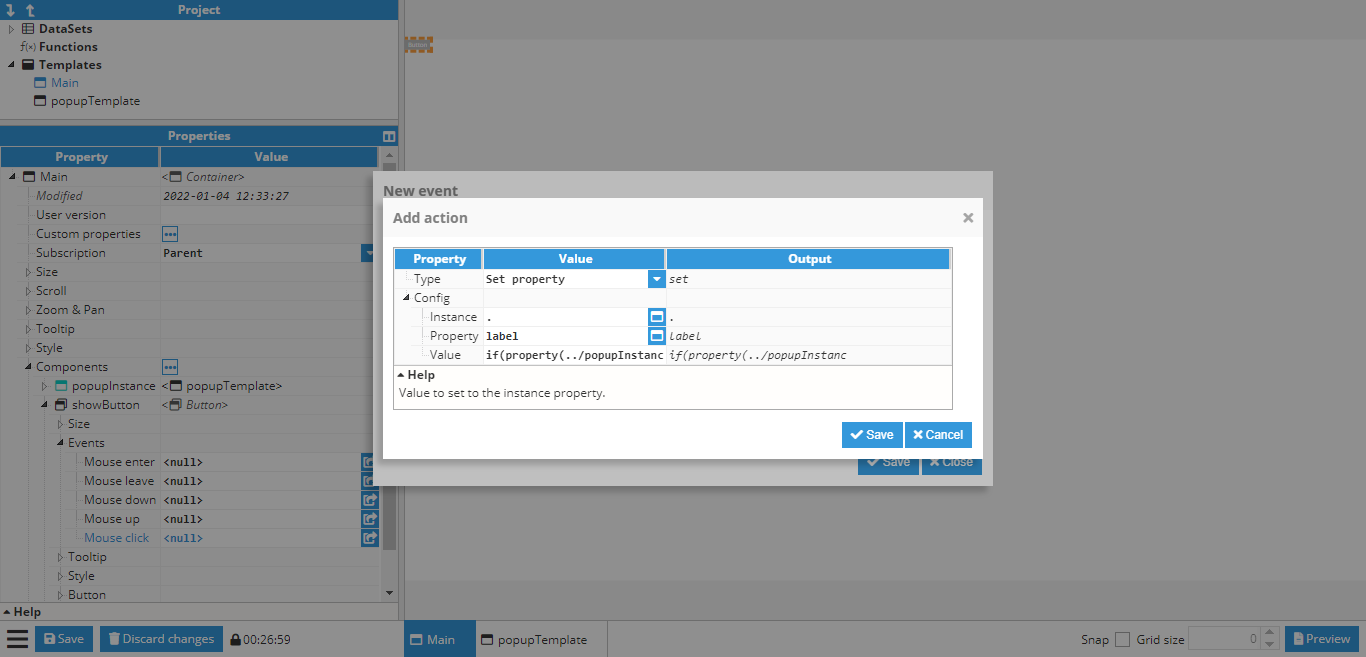
In this case, the value to be set to the following expression is as follows:
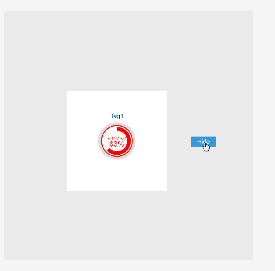
=if(property(“../Popup.container.visible”))“Hide”; else “Show”;Finally, the popup is ready to be tested, either by pressing CTRL+Click on the button while the button is not selected or by going to the preview mode and clicking the button:
Creating a parameterized popup
This is a follow-up to the previously shown examples. In the previous example, a popup was created and set to always display the value of the same tag using a gauge. In this example, a parameterized popup will be created to slide open by clicking on a map marker and show a different tag depending on which marker was clicked on.
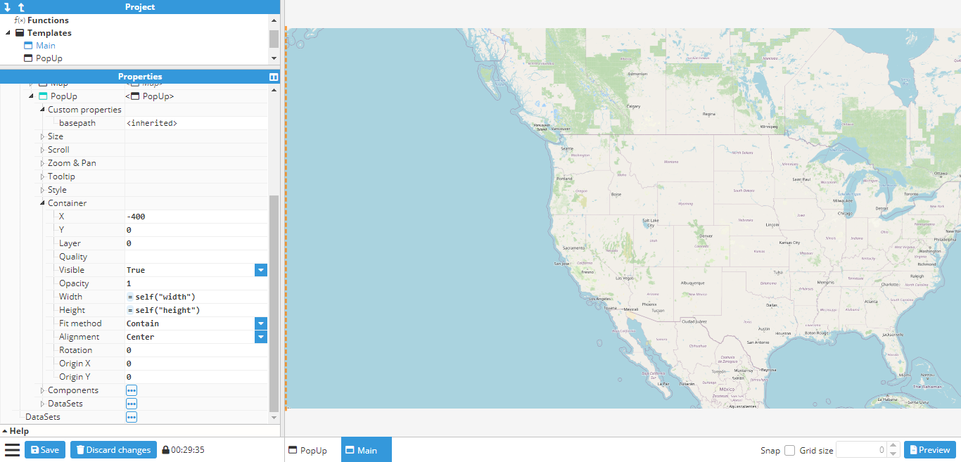
First of all, the popup window needs to be created. In this case, it is a 400x1080 window with a text custom property called basepath.
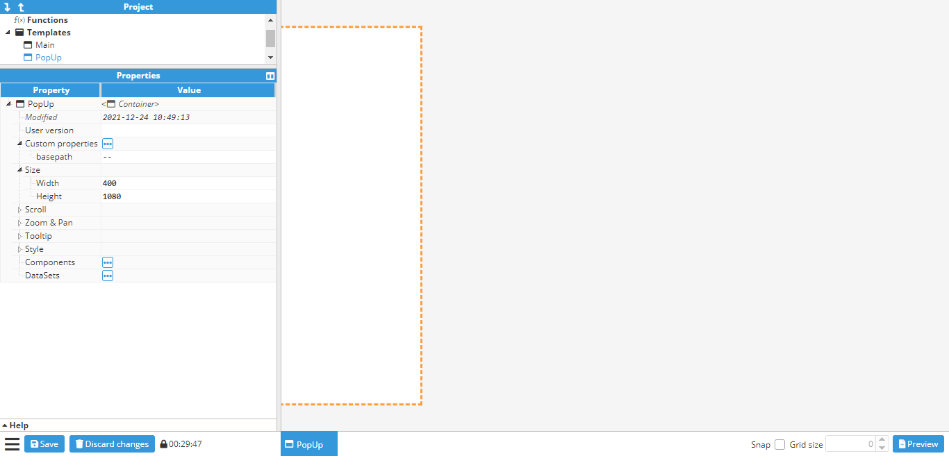
Next, a border is added to the container using general-style properties. After creating the border, the close button needs to be created in order to close the popup when clicked on. To do so, an Icon component should be used, which in this case will be the times icon. It is positioned in the upper right corner of the popup:
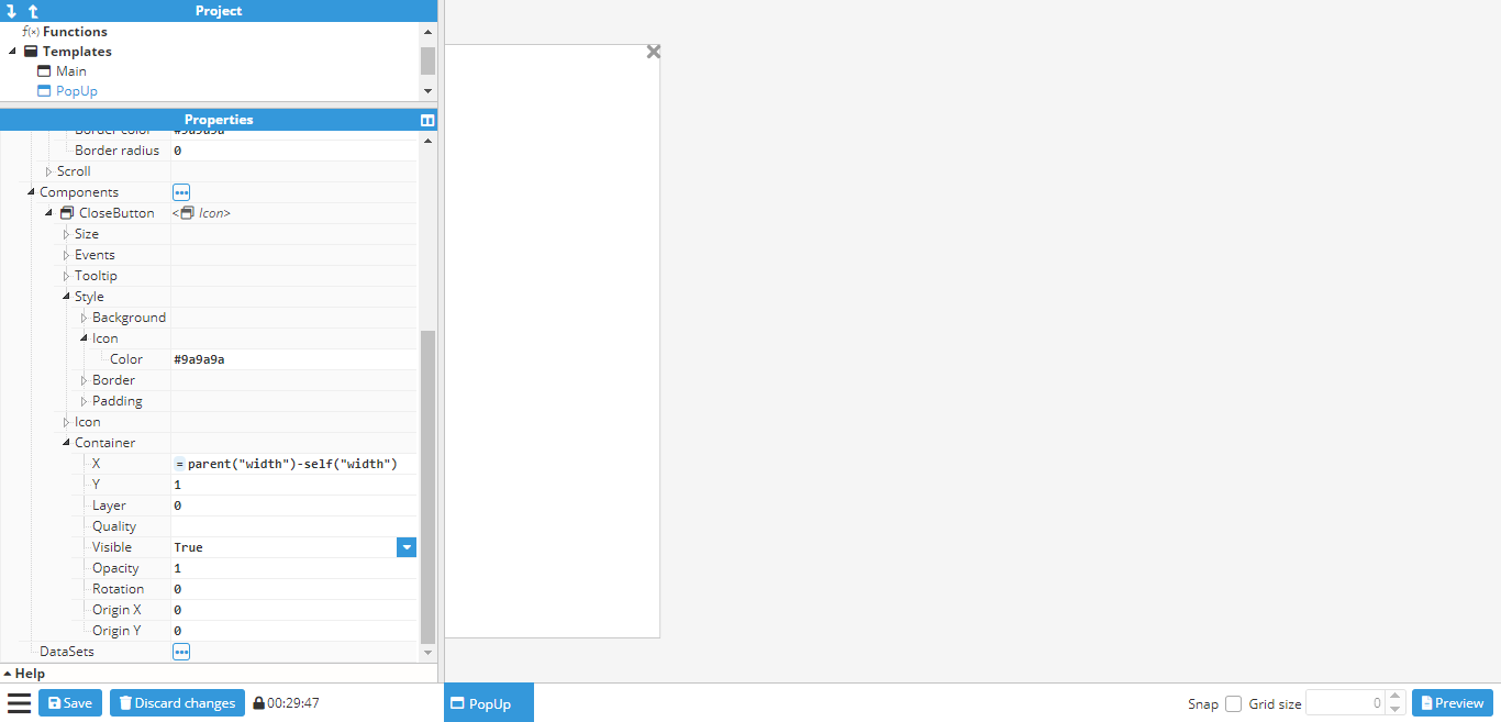
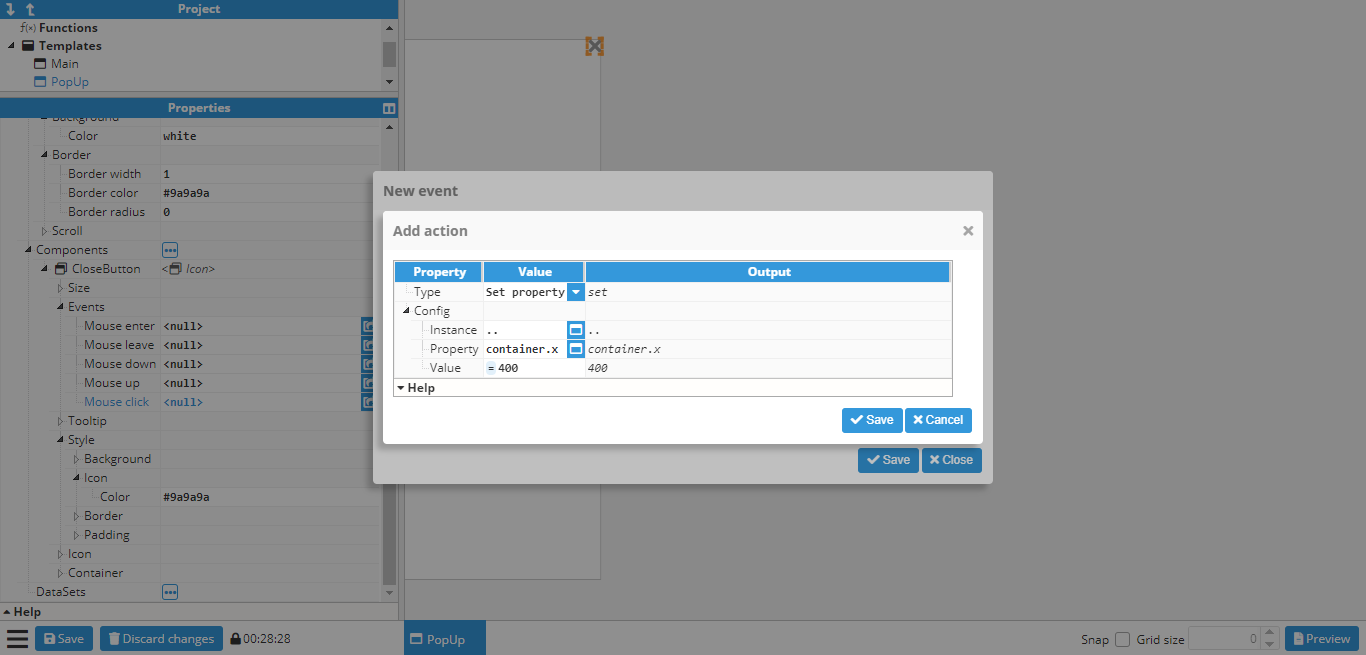
A click event needs to be attached to the close button in order to close the popup. However, the helper popup cannot be used to select the x property for sliding it out of view as there is no container section in the popup. This happens when the container is a template and not an instance. However, container properties can still be applied by inputting them manually. In this case, the x property should be set to -400 (since 400 is the width of the popup, meaning that -400 will set it out of view. Alternatively, the width of the container can be linked). To do so, the following settings are applied:
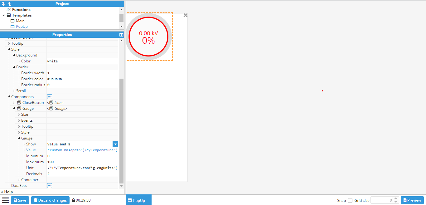
The last step is to add in the gauge and link it to a tag. However, in this case, the tag path is not static, as it depends on the basepath dynamic property. This example assumes the following tags are used:
/Madrid/Temperature
/London/Temperature
/Berlin/Temperature
Since the tags all follow the same structure (/<city>/Temperature), the basepath property can be used as the first part of the tag name, which corresponds to the city. To do so, the following expression is used in the gauge value (and in the units too, if the same EU and tag need to be used):
=tag("/"+parent("custom.basepath")+"/Temperature") -> Value of tag
=tag("/"+parent("custom.basepath")+"/Temperature.config.engUnits")-> Units of tag
The final popup will look as follows:
Now that the popup has been finished, the main container can be created. In this case, instead of the steps used to add markers to a map, the main container needs to be a blank container, rather than a map. The reason is that if it were a map, the popup would be instantiated as a component of the map, and would be positioned at a latitude and longitude, which is not the desired outcome in this example. In this case, the popup needs to be set in an absolute position on the screen. This can be accomplished by creating a blank container and adding a map and the popup as components, as shown in the below screenshot:
In this example, the popup will be shown by sliding from left to right using an animation. In order to achieve this, the popup’s initial X position needs to be set to -400 (since the popup is 400 pixels wide). An animation also needs to be added to the X property. In this case, it will be set to last 1000ms and ease in & out.
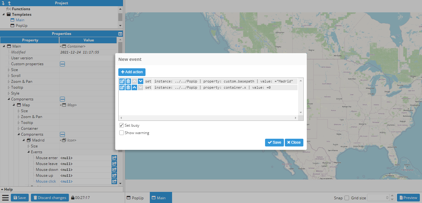
Once the popup is in place, markers can also be added to the map and events can start to be set up for opening the popup. Map markers are created for Madrid, Berlin, and London. After creating the markers, three actions need to be added to the click events for each marker:
One action to set the basepath custom property to either Madrid, Berlin or London, depending on which marker was clicked upon.
One action sets the X position of the popup to 0.
The event popup for the Madrid marker is shown in the following screenshot:
The same is done for the Berlin and London markers. To save time, since only one of the three actions needs to change, depending on the marker (the one that sets the custom property), this marker can be duplicated (CTRL+D after selecting the marker in the configuration window, or right-click and clicking the duplicate option) and the action deleted and created again with the new value.
The next stage is to test that everything works by clicking on a marker (either in preview mode or by using CTRL+Click while the marker is not selected). The different markers can now be clicked on to see if the value of the basepath changes accordingly. Finally, click the close button on the popup to ensure that it slides back off the screen.
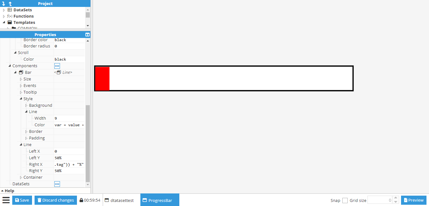
Creating a progress bar
By default, Web Vision only comes with a Gauge for displaying tag values, as well as any labels, which can also be linked to a tag. However, links can also be used to create custom components. In this example, a progress bar will be created and linked to a tag.
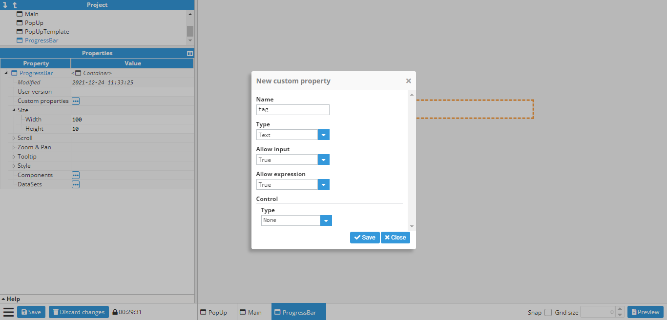
This first step is to create a new blank container. In this case, a 100x10 container is sufficient. Next, a custom property called tag is added to the container. This will be the tag that provides the value to the progress bar. Since this one will be a tag, the tag picker control will be used and limited to tag only.
Afterward, a general styles border is added to the ProgressBar container.
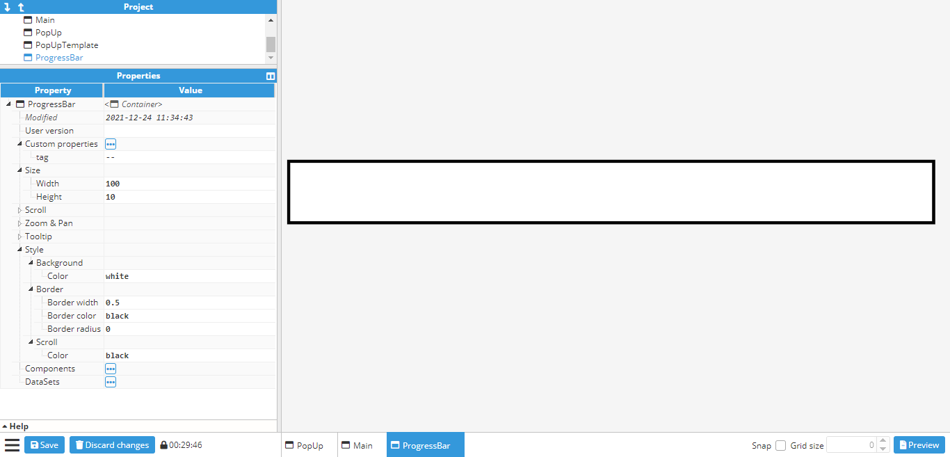
The next step is to create the progress bar itself. For this, a line component is used and set to a size of 99x9 (the same as the container, minus borders). The line width is also set to 9 in order to fill the entire container. The container X/Y is also set to 0.5 to avoid any overlapping with the border, which can be colored red (to contrast against the border) in order to make sure that the line has been positioned correctly. Its two points are then set to (0,0) and (50%,0), which gives the following result:
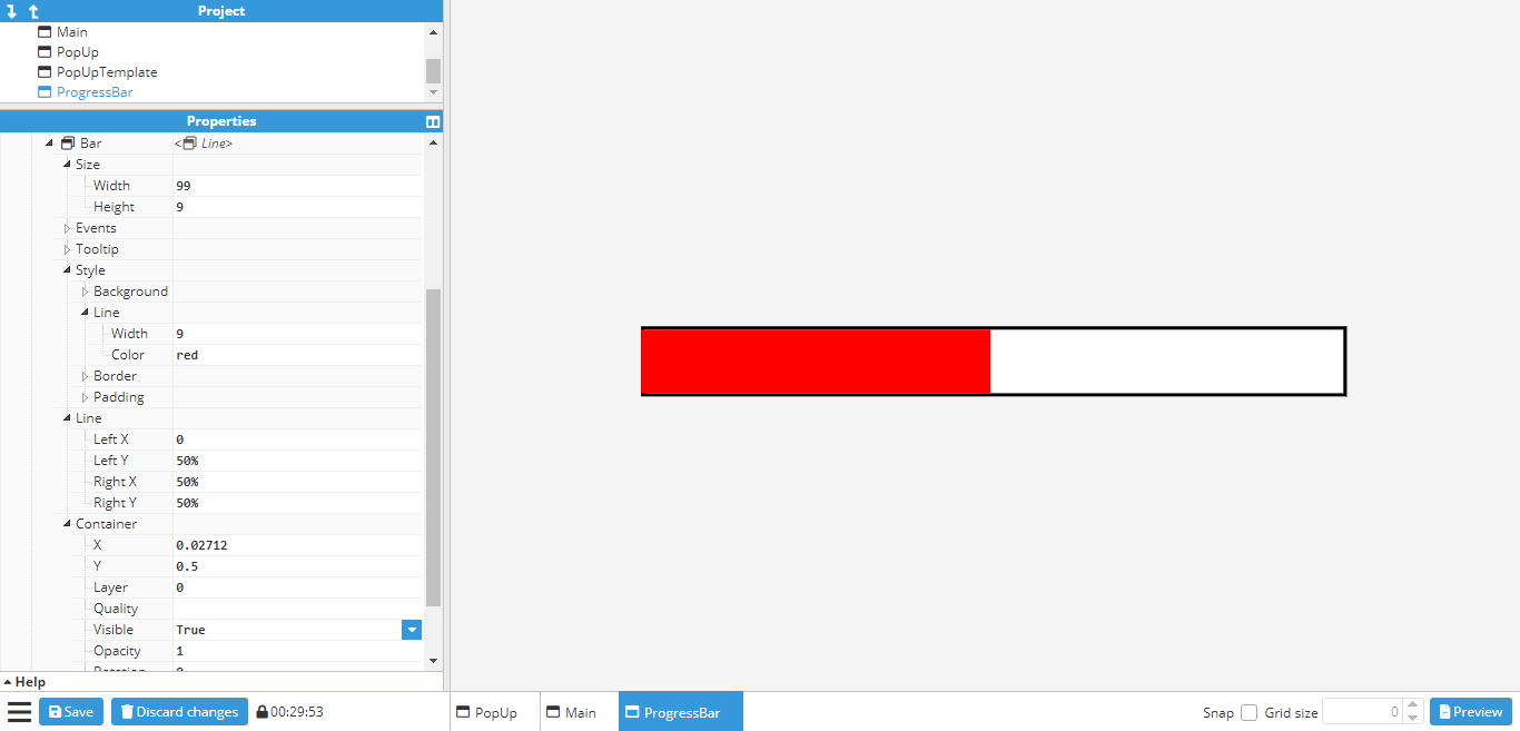
Finally, the Right X (the x coordinate of the line’s right-side point) needs to be linked to the newly created
tag custom property. For this, the following expression is used:
=tag(parent(“custom.tag”)) + “%”“%” is also added to the end of the expression in order to transform the second point into a relative value, instead of an absolute one. The value of the tag custom property can be changed to a tag in order to ensure that the setup has been carried out correctly. In this example, “/ReadOnlyNumber” is used. If the line changes when the value changes, the progress bar is working as intended.
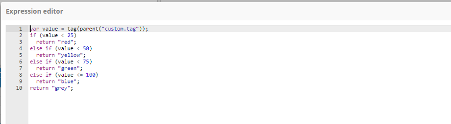
While this is enough for a working progress bar, it can also be configured in a way that the colors change according to the tag value. Animations can also be added for smoother transitions between each change in values.
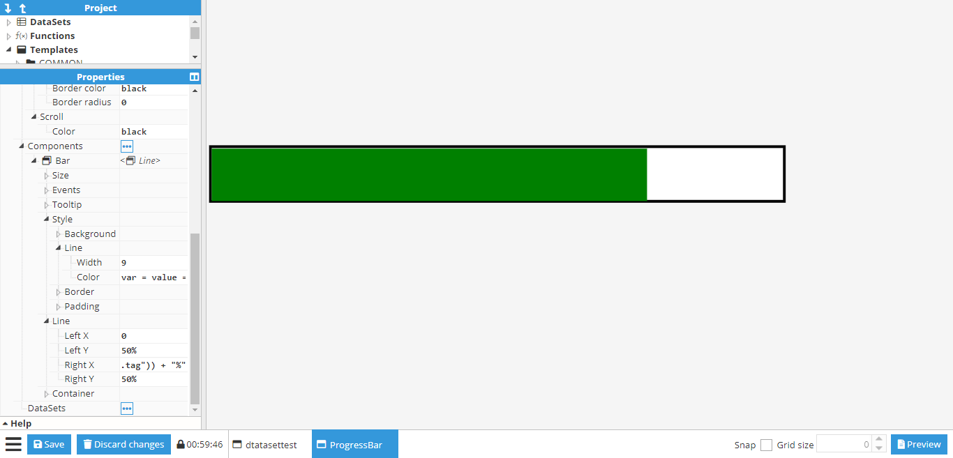
First of all, it’s configured to change color from red when below 25, yellow until 50, green until 75 and finally to blue. To do this, a conditional expression needs to be added to the line color property by using the expression editor helper to make it easier to input the expression:
If the expression is written correctly (no syntax errors), users can check that the colors work by changing the tag value:
Finally, an animation can be added to the Right X coordinate for a smoother transition between values. To do so, the Set animation helper can be used on the Right X” coordinate to input the animation settings. Once configured, the icon next to Right X should indicate that the animation is enabled. More information about animations can be found in the animation section.
Using SVG component for custom components
SVG custom components offer a powerful means to incorporate Scalable Vector Graphics (SVG) images onto the screen. This format is highly convenient, as it allows for gradual resizing while preserving image quality. Moreover, the abundance of SVG graphics available online eliminates the need for users to create them from scratch.
To import an SVG into the project, users have two options:
Utilize the Image component: Simply import the SVG image directly, just selecting the image you want to import from without the need for additional code manipulation.
Employ the SVG component: This option provides advanced functionality, allowing users to manipulate SVG attributes using CSS, XML, and JavaScript to customize the graphic to their specific requirements.
In this example, we will explain the second option, using the SVG component. For instance, we are going to create an SVG component that represents a PUMP and its internal state.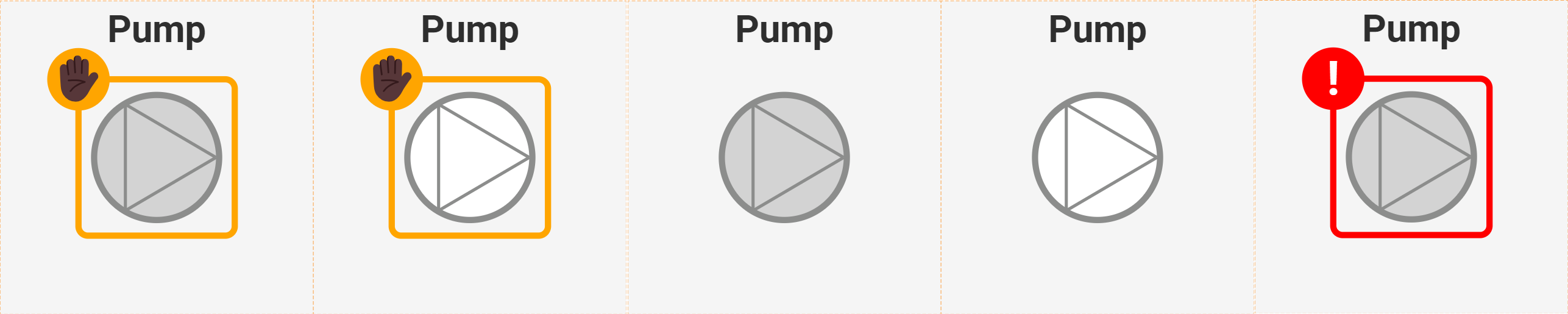
SVG is a markup language based on XML, so its structure follows XML conventions. Here is the code for this particular example:
<svg width="100" height="100" preserveAspectRatio="xMidYMid meet">
  <text id="textName" x="50%" y="10%" text-anchor="middle" alignment-baseline="middle" fill="#818180"
    font-family="Roboto" font-size="9" font-weight="bold">Pump 1</text>
  <circle id="innerCirc" cx="50%" cy="50%" r="20" stroke="#8c8d8c" stroke-width="2" fill="lightgray" />

  <line x1="40" y1="33" x2="69" y2="50" stroke="#8c8d8c" stroke-width="1" />
  <line x1="40" y1="67" x2="69" y2="50" stroke="#8c8d8c" stroke-width="1" />
  <line x1="40" y1="33" x2="40" y2="67" stroke="#8c8d8c" stroke-width="1" />

  <g id="message">
    <animate attributeName="opacity" dur="1s" values="0;1;0" repeatCount="indefinite" begin="never" />
    <rect id="messageRect" x="25%" y="25%" width="50" height="50" rx="3" ry="3" fill="transparent" stroke="orange" />
    <circle id="messageCirc" cx="25%" cy="25%" r="10" fill="red" />
    <text id="messageText" x="25%" y="30%" text-anchor="middle" alignment-baseline="middle" fill="white"
      font-family="Roboto" font-size="15" font-weight="bold">
      <tspan>✋🏿</tspan>
    </text>
  </g>
</svg>
The following is a detailed explanation of the code:
<svg width="100" height="100" preserveAspectRatio="xMidYMid meet">
This line initializes an SVG element with a width of 100 units, a height of 100 units, and a preserveAspectRatio attribute set to "xMidYMid meet". This attribute ensures that the SVG image is scaled to fit the viewport while preserving its aspect ratio and aligning it to the middle horizontally and vertically.<text id="textName" x="50%" y="10%" text-anchor="middle" alignment-baseline="middle" fill="#818180" font-family="Roboto" font-size="9" font-weight="bold">Pump 1</text>
This line creates a text element with the ID "textName", positioned at 50% of the SVG width and 10% of the SVG height. The text-anchor attribute is set to "middle", aligning the text horizontally at its center. The alignment-baseline attribute is also set to "middle", aligning the text vertically at its middle. The text is filled with the color #818180, using the Roboto font family, size 9, and bold weight. The text content is "Pump 1".<circle id="innerCirc" cx="50%" cy="50%" r="20" stroke="#8c8d8c" stroke-width="2" fill="lightgray" />
This line creates a circle element with the ID "innerCirc", positioned at the center of the SVG (50% of width and height). The circle has a radius of 20 units, a stroke color of #8c8d8c, a stroke width of 2 units, and is filled with the color "lightgray".<line x1="40" y1="33" x2="69" y2="50" stroke="#8c8d8c" stroke-width="1" />
This line creates a line element starting at coordinates (40, 33) and ending at coordinates (69, 50). The line has a stroke color of #8c8d8c and a stroke width of 1 unit.<line x1="40" y1="67" x2="69" y2="50" stroke="#8c8d8c" stroke-width="1" />
This line creates another line element starting at coordinates (40, 67) and ending at coordinates (69, 50). It shares the same stroke color and width as the previous line.<line x1="40" y1="33" x2="40" y2="67" stroke="#8c8d8c" stroke-width="1" />
This line creates a third line element starting at coordinates (40, 33) and ending at coordinates (40, 67). It also has the same stroke color and width.<g id="message">
This line initiates a group element with the ID "message". Group elements are used to logically group SVG elements together.<animate attributeName="opacity" dur="1s" values="0;1;0" repeatCount="indefinite" begin="never" />
This line creates an animation that changes the opacity of the element over time. The animation lasts for 1 second (dur="1s"), transitions from opacity 0 to 1 to 0 (values="0;1;0"), repeats indefinitely (repeatCount="indefinite"), and starts when triggered (begin="never").<rect id="messageRect" x="25%" y="25%" width="50" height="50" rx="3" ry="3" fill="transparent" stroke="orange" />
This line creates a rectangle element with the ID "messageRect", positioned at 25% of the SVG width and height. The rectangle has a width and height of 50 units, rounded corners with a radius of 3 units (rx and ry attributes), is filled with a transparent color, and has an orange stroke.<circle id="messageCirc" cx="25%" cy="25%" r="10" fill="red" />
This line creates a circle element with the ID "messageCirc", positioned at 25% of the SVG width and height. The circle has a radius of 10 units and is filled with the colour "red".<text id="messageText" x="25%" y="30%" text-anchor="middle" alignment-baseline="middle" fill="white" font-family="Roboto" font-size="15" font-weight="bold"><tspan>✋🏿</tspan></text>
This line creates a text element with the ID "messageText", positioned at 25% of the SVG width and 30% of the SVG height. The text is horizontally and vertically centered using the text-anchor and alignment-baseline attributes. It is filled with the color "white", and uses the Roboto font family, size 15, and bold weight. The content of the text consists of a Unicode hand symbol and a star symbol.
This SVG custom component includes 'Custom properties' to access the inner elements of the SVG, which are updated based on the values of these properties. We utilize CSS selectors to access elements by their 'ID' and attribute selectors to modify the elements' attributes with the provided values. These values can be constants or returned by JavaScript expressions within WebVision.
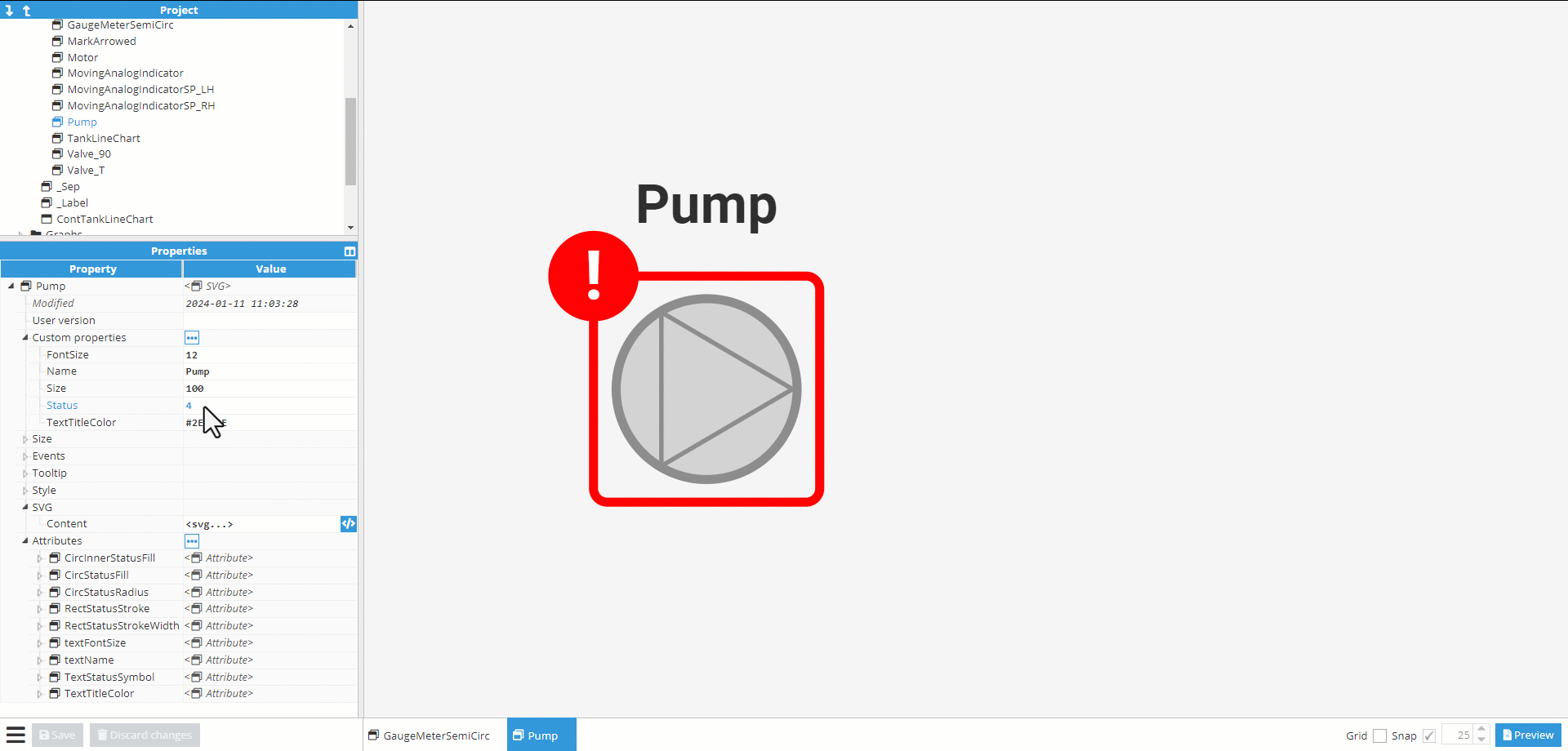
Next, we will explain a couple of attribute properties created specifically for this example; the remaining attributes will follow the same logic. These attributes in WebVision will modify the attributes of components inside the SVG based on their values. CSS selectors will be utilized for this purpose.
CircInnerStatusFill: This attribute controls the color of the inner circle.
Selector: #innerCirc.
Attribute: fill.
Value: Here a Javascript expression is used.
if(parent("custom.Status")===1 || parent("custom.Status")===3) return "white";
return "lightGray";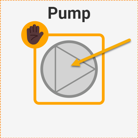
TextStatusSymbol: This attribute controls the symbol displayed to represent the status of the pump.
Selector: #messageText.
Attribute: innerHTML.
Value: Here a Javascript expression is used.
if(parent("custom.Status")===0 || parent("custom.Status")===1) return "<tspan>✋🏿</tspan>";
if(parent("custom.Status")===4) return "<tspan>!</tspan>";
return "<tspan></tspan>";The string "✋🏿" represents an emoticon in Unicode encoding. Specifically, it represents a combination of two Unicode characters: "✋" (U+270B) and "🏿" (U+1F3FF). Together, they may render as a single emoji on devices and platforms that support emoji rendering.
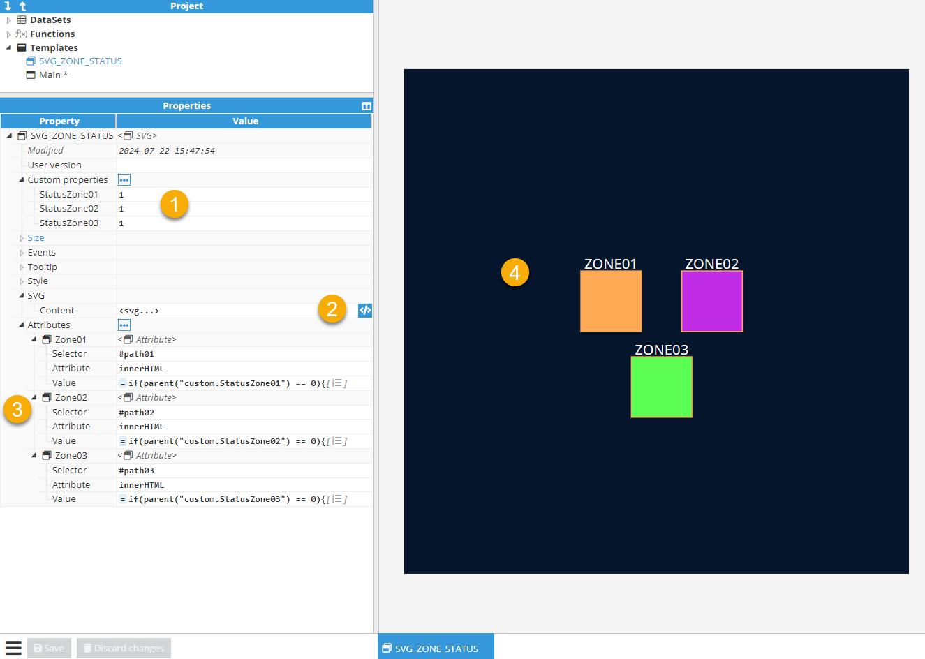
Animated Attributes and innerHTML for Dynamic Visual Effects
In this example, we aim to demonstrate how to dynamically control SVG animations using JavaScript and the innerHTML property. Our objective is to create a visual effect where specific zones within an SVG graphic blink based on their status. By doing so, we can highlight important areas or draw attention to certain elements within the SVG.
The provided JavaScript code dynamically inserts an <animate> element into the SVG based on the status of each zone. The parent("custom.StatusZoneXX") custom property represents the status of "ZONEXX". If the status is 0, indicating that "ZONEXX" should blink, an <animate> element is added to the <path> element. This <animate> element creates a blinking effect by changing the fill color between #800 and #f00 every 0.8 seconds. If the status is not 0, no animation is added, and the zone remains static.
By using this approach, we can control the visual appearance of SVG elements in real time, making the graphics more interactive and responsive to data changes. This technique is particularly useful for creating dynamic dashboards, real-time monitoring systems, and interactive visualizations where certain areas need to be highlighted or animated based on specific conditions.
Here is the SVG code for our custom component, which represents three distinct zones: ZONE01, ZONE02, and ZONE03:
<svg id="svg2" xmlns="http://www.w3.org/2000/svg" version="1.1" xmlns:svg="http://www.w3.org/2000/svg"
xmlns:xlink="http://www.w3.org/1999/xlink" viewBox="0 0 500 500">
<defs>
<style>
.cls-01 {
fill: #fa5;
stroke: #fa5;
}
.cls-02 {
fill: #c12de6;
stroke: #fa5;
}
.cls-03 {
fill: #5bff55;
stroke: #fa5;
}
.zone-text {
font-size: 14px;
fill: white;
text-anchor: middle;
}
</style>
</defs>
<g id="gZone" transform="translate(75 50)">
<g id="gZone01">
<path id="path01" class="cls-01" d="M100,150v60h60v-60h-60Z">
</path>
<text x="130" y="148" class="zone-text">ZONE01</text>
</g>
<g id="gZone02">
<path id="path02" class="cls-02" d="M200,150v60h60v-60h-60Z" >
</path>
<text x="230" y="148" class="zone-text">ZONE02</text>
</g>
<g id="gZone03">
<path id="path03" class="cls-03" d="M150,235v60h60v-60h-60Z" >
</path>
<text x="180" y="233" class="zone-text">ZONE03</text>
</g>
</g>
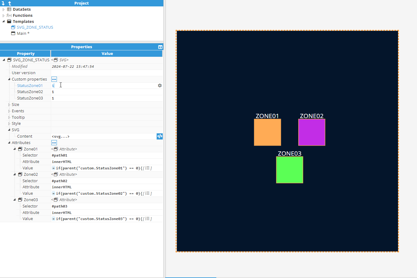
</svg>Custom Properties: This section lists the custom properties used to provide status values. These properties can be linked to attributes within WebVision, tag values, or alarm statuses.
SVG Content: This section contains the SVG code.
Attributes:
Selector: The ID of the component to be modified.
Attribute: The attribute of the component to be accessed. In this case, the <path> inner HTML.
Value: The value of the inner HTML. We use a JavaScript expression to change the value based on the custom property status of the zone.
Here is the JavaScript code. The only change will be the Custom Property being accessed:if(parent("custom.StatusZone01") == 0){ return `<animate attributeType="XML" attributeName="fill" values="#800;#f00;#800;#800" dur="0.8s" repeatCount="indefinite"/>`; }else{ return ''; }
This animated GIF demonstrates the final result and shows how this logic will work in practice.
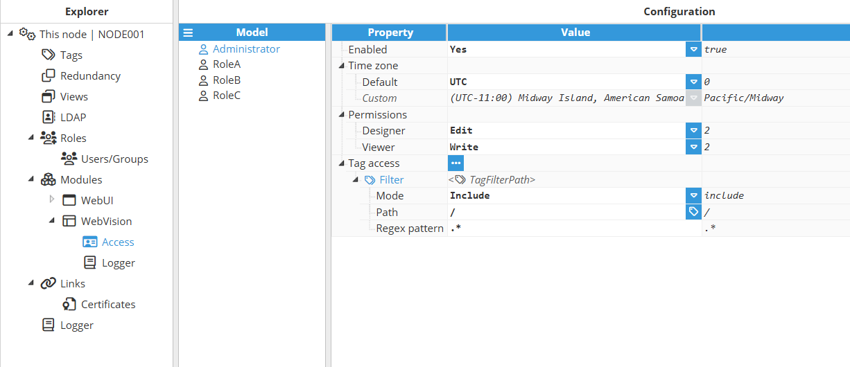
Restricting Access to Specific WebVision Application Sections by Role
To make certain parts of a WebVision application accessible only to specific roles, follow these steps:
Backend Restrictions:
Configure the Access section in WebVision by adding one or more filters to specific parts of the Data Model. These filters will restrict access to designated areas of the application at the backend level.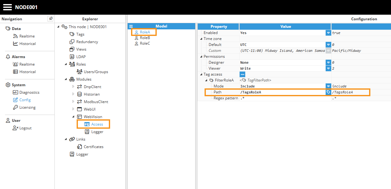
Frontend Restrictions:
Limit access in the WebVision user interface by using the ui("user.roles") expression. This function returns the logged-in user's role, enabling dynamic control over which sections of the interface are displayed based on the user's assigned role.
To customize the user visualization based on their role, start by creating a Region in the StartUp window or any other relevant screen. Within the Region, configure the 'Shown Child' property to include an expression that evaluates the system variable ui("user.roles"). This expression allows you to compare the logged-in user’s role with the client-specific role and dynamically select the appropriate visualization. This approach ensures that each user sees the interface tailored to their assigned role.// Define a mapping object for roles and their corresponding visualizations const roleVisualizationMap = { "RoleA": "ScreenRoleA", "RoleB": "ScreenRoleB", "RoleC": "ScreenRoleC", }; // Get the user's roles const userRoles = ui("user.roles"); // Return the visualization for the first matching role, or a default visualization return roleVisualizationMap[userRoles] || "DefaultVisualization";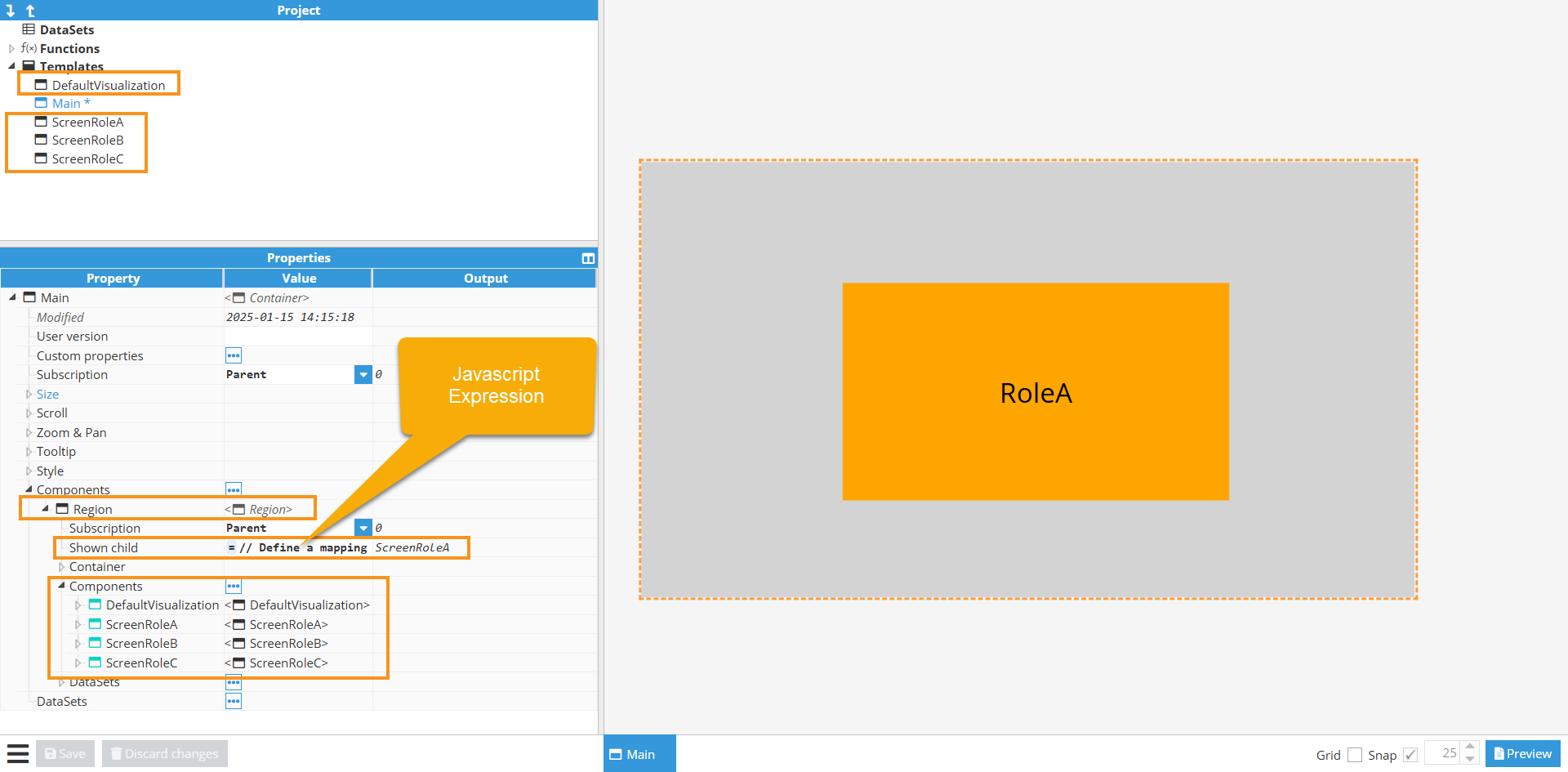
Another option is to directly assign the Region Shown Child property to the return value of ui("user.roles"), and then name the containers instantiated within the Region to match the roles defined in the system.
.png)
Building a Dataset Table step by step
This example builds a live equipment table with one row per machine, numeric KPI columns grouped under shared headers, a color-coded status, and two inline sparklines. The Data property holds one expression that returns a list, and each item in the list becomes one row. The row below is trimmed to the fields explained here; the full template also carries availability, performance, quality, target, and good:
[
 {asset: "FramePress_01",
  area: "Assembly / AssemblyCell",
  status:(tag("/Acme/Plant01/Production/Assembly/AssemblyCell/FramePress_01/oee/OEE.data.value")>=85?"OPTIMAL":(tag("/Acme/Plant01/Production/Assembly/AssemblyCell/FramePress_01/oee/OEE.data.value")>=75?"WATCH": "UNDER")),
  oee:tag("/Acme/Plant01/Production/Assembly/AssemblyCell/FramePress_01/oee/OEE.data.value"),
  availability:tag("/Acme/Plant01/Production/Assembly/AssemblyCell/FramePress_01/oee/Availability.data.value"),
  performance:tag("/Acme/Plant01/Production/Assembly/AssemblyCell/FramePress_01/oee/Performance.data.value"),
  quality:tag("/Acme/Plant01/Production/Assembly/AssemblyCell/FramePress_01/oee/Quality.data.value"),
  rate:tag("/Acme/Plant01/Production/Assembly/AssemblyCell/FramePress_01/metric/Rate.data.value"),
  target:tag("/Acme/Plant01/Production/Assembly/AssemblyCell/FramePress_01/metric/TargetRate.data.value"),
  good:tag("/Acme/Plant01/Production/Assembly/AssemblyCell/FramePress_01/metric/GoodCount.data.value"),
  total:tag("/Acme/Plant01/Production/Assembly/AssemblyCell/FramePress_01/metric/TotalCount.data.value"),
  downtime:tag("/Acme/Plant01/Production/Assembly/AssemblyCell/FramePress_01/maintenance/Downtime_min.data.value"),
  q:tag("/Acme/Plant01/Production/Assembly/AssemblyCell/FramePress_01/oee/OEE.data.quality"),
  ts:tag("/Acme/Plant01/Production/Assembly/AssemblyCell/FramePress_01/oee/OEE.data.ts"),
  trend:dataset("Hist_FramePress"),
  spark:dataset("Hist_FramePress")
  },
  // ... one object per machine
]
Each row is a set of key: value pairs. The key (asset, oee, trend, …) is a name you choose and is what a column's Field points to; the value is what the cell shows. Values can be fixed text, a live tag read with tag(), a calculated expression (the ternary operator ? : is shorthand for "if / otherwise"), or a historical dataset from dataset() that a column draws as a mini-chart.
This image from the Data→Realtime screen displays the structure of the tag model:.png)
Step-by-step configuration
Add a Dataset Table component to the template.
In Table → Data, paste the expression that returns the array of rows (shown above).
Set Table → Row key to asset (the field that is unique for every row). This keeps each sparkline bound to the correct row after sorting.
.png)
Under DataSets, create one historical dataset per machine (e.g. Hist_FramePress) that the sparklines will use: Tag = the machine's OEE tag, Node = This node, Date mode = Current (2 hours), Mode = Aggregated (Average, 10 minutes), and Autoreload = 300 s.
.png)
Under Header Groups, create four groups (leave Parent group blank so they are top-level): Equipment, Live metrics, OEE decomposition, and 2h history.
.png)
Under Columns, add one column per value, mapping each column's Field to a label in the data and assigning its Header group, Renderer, and format:
.png)
Title
Field
Header group
Renderer
Format / Chart
Width
Asset
asset
Equipment
text
%s
150
Area
area
Equipment
text
%s
205
Status
status
Live metrics
text
%s (+ Row & Cell color)
90
Rate
rate
Live metrics
text
%.2f
80
Target
target
Live metrics
text
%.2f
80
Good pcs
good
Live metrics
text
%i
92
Down min
downtime
Live metrics
text
%.1f
92
OEE %
oee
OEE decomposition
text
%.2f
78
Avail %
availability
OEE decomposition
text
%.2f
78
Perf %
performance
OEE decomposition
text
%.2f
78
Qual %
quality
OEE decomposition
text
%.2f
78
Line
trend
2h history
sparkline
line, window 24
145
Area
spark
2h history
sparkline
area, window 24
145
On the Status column, add Row & Cell color filters so OPTIMAL, WATCH, and UNDER each get their own color. OPTIMAL will get the default background color.
.png)
Under Sort, set Sort by = OEE % and Sort direction = Descending. Set Row height = 54 and enable Selection, Header, and Drag-orderable columns as desired.
.png)
.png)
The result is a live, sortable OEE table where the numeric cells and the two sparklines refresh on their own as the tags update and the historical datasets autoreload..png)