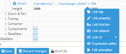
Input helpers provide support for accomplishing tedious tasks, like manually writing tag paths or picking component properties. The Input helpers menu appears when hovering over an input field and clicking on the gear icon.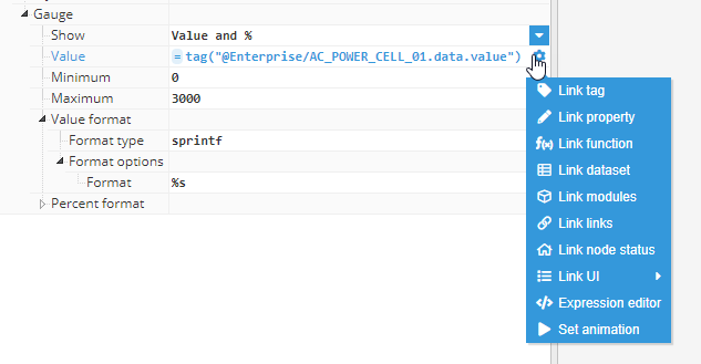
Link tag
Link tag entry allows users to pick a tag and select one of its properties. When selected, a popup will open to allow users to select a tag without needing to know the path from memory. The helper popup also allows users to navigate between previously defined tag aliases.
The helper is divided into two sections:
- The top part allows users to select a tags group.
- The bottom part allows users to select one of the tags inside the selected tag.
- In the button bars, you can toggle between Tags and Alias views.
.png)
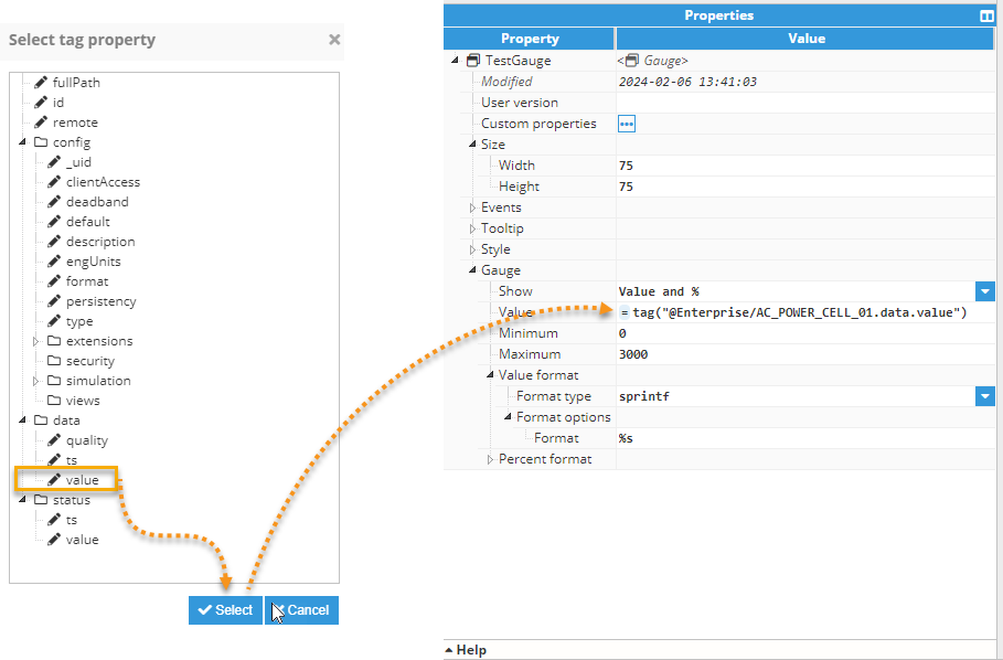
After selecting a tag and clicking on the select tag button, another popup will open to enable users to select a concrete property for the selected tag. After selecting the desired property, the input will be filled with an expression like the following example: =tag(“<tag path>.<property path>”).
In some cases, when the input is expecting a tag path or a group path, the tag properties pop-up window will be omitted.
Link property
Most of the properties in Web Vision can be linked to other properties or tag values. This allows for a greater deal of flexibility. For instance, the color of a component can be changed based on a certain tag value, or the size of a rectangle can change based on the size of the parent container, which can then be used to create a border in the parent container.
The Link Property helper allows users to link one property to another, without needing to know the property path. When selected, a popup will open, which is divided into two sections:
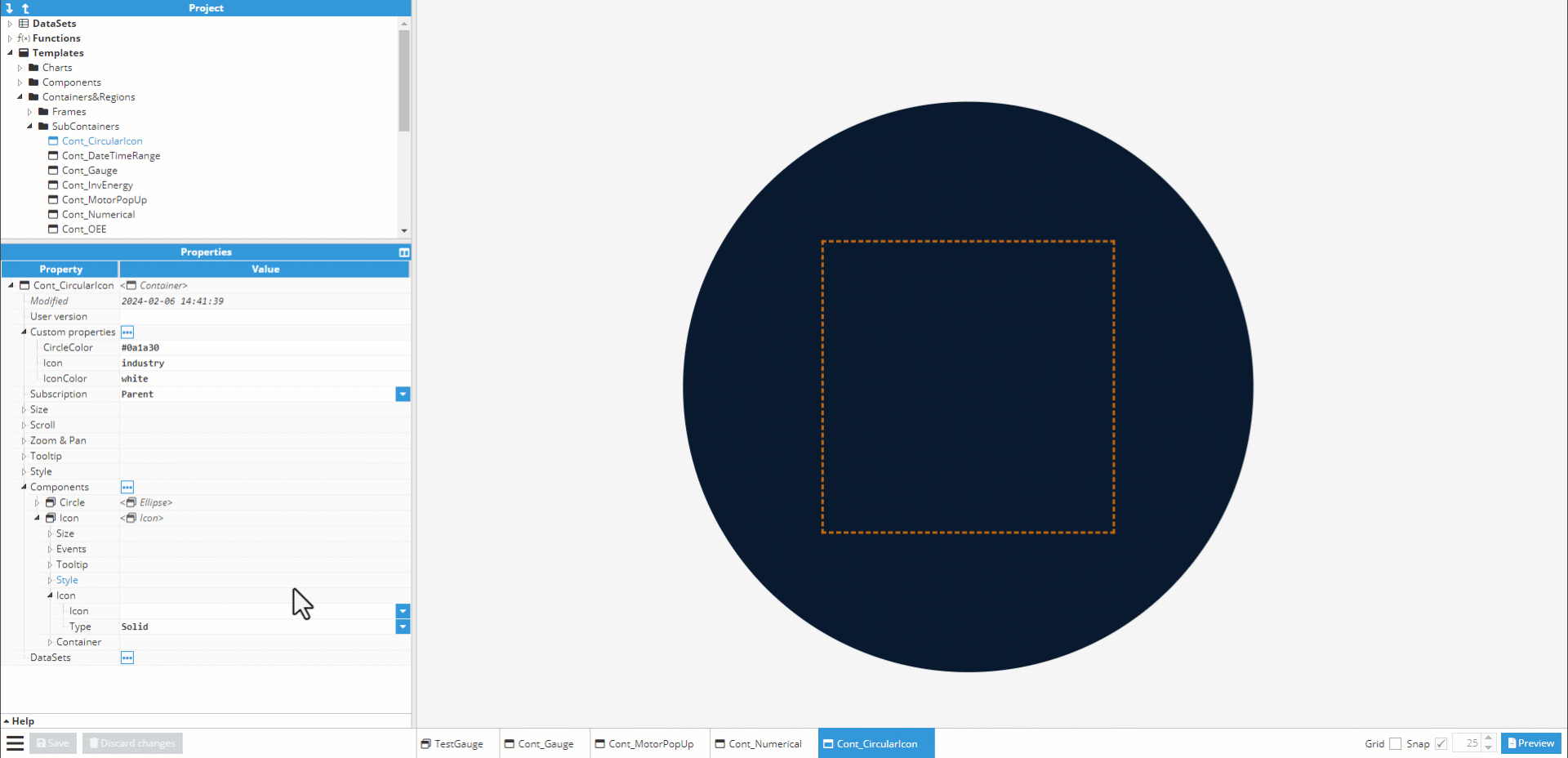
- The top part allows users to search through the elements tree that is directly related to the input parent element. For example, the below animated image shows how 'Cont_CircularIcon' container's siblings, parents, and children can be selected.
- The bottom part allows users to select a property from the selected element.
In this example, the X coordinate or position of '04_ReatimeTemp' is dependent on the X coordinate or position of '01_Temperature'. If a property value is changed, the property values linked to it will automatically update to reflect the new value.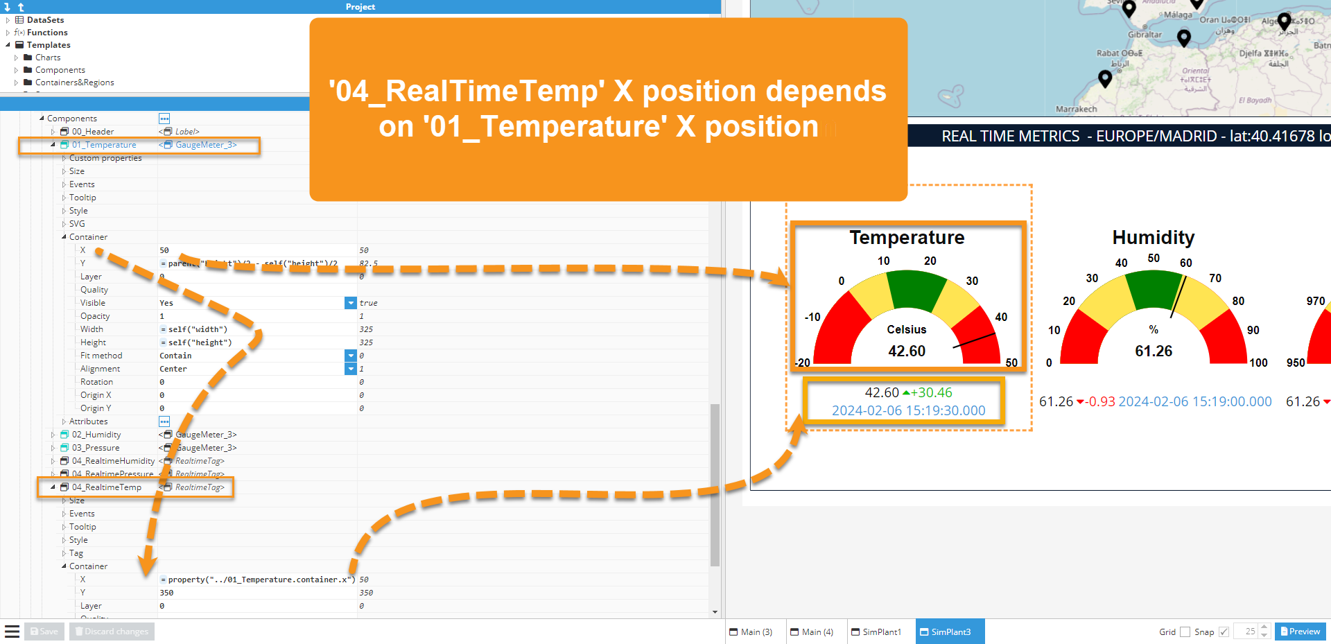
The expression =property() refers to any property but two special expressions can be used to make a more readable expression:
- =self(<path>) is equivalent to =property(.<path>) and points to other properties from the same component. One dot ./, indicates the same folder or level.
- =parent(<path>) is equivalent to =property(../.<path>) and points to a property from the parent component. Two dots../, indicate the folder or level above.
Link function
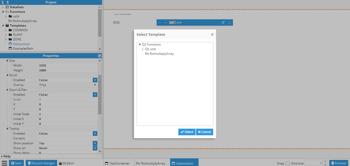
The link function allows elements to be selected inside the Functions project folder. The output is an expression like =func(“<function name>”, parameter1, parameter2). Any parameters required by this function must be written manually, following the function name. For instance; = func("multiplyArray", [1,2,3,4], 3), which multiplies each element of the array by 3 and its return will be 3,6,9,12.

Result from function selection with error message due to missing parameters

Link DataSet
Link DataSet opens a select property popup that only permits DataSet selection in order to generate expressions like =dataset(“<dataset path>”).

Link UI
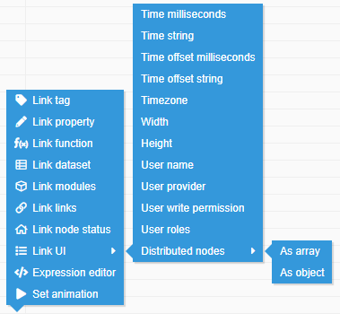
The Link UI helper gives users easy access to a variety of functionalities:
- Time milliseconds: Current milliseconds since epoch. The generated expression is: =ui(“time”)
- Time string: Current date with “<Year-month-day hour:minute:second format>”. The generated expression is: =ui(“timestr”)
- Time offset milliseconds: Offset from GMT in milliseconds. The generated expression is: =ui(“timeoffset”)
- Time offset string: Offset from GMT in text format, for example: “GMT+01:00”. The generated expression is: =ui(“timeoffsetstr”)
- Timezone: Currently selected timezone in text format. The generated expression is: =ui(“timezone”)
- Width: Current window width, the generated expression is: =ui(“width”)
- Height: Current window height, the generated expression is: =ui(“height”)
- User name: Logged user name, the generated expression is: =ui(“user.name”)
- User write permission: Returns true or false, depending on if the user has written permission. The generated expression is: =ui(“user.writePermission”)
- User provider: Logged user provider, whether Local or LDAP. The generated expression is: =ui(“user.provider”)
- User roles: Returns the roles of the current user. The generated expression is: =ui("user.roles")
- Distributed nodes: Returns information about the main and distributed nodes the user is connected to. The generated expressions are: =ui("nodes"), to receive the information as an array; and =ui("nodes.object"), to receive the information as an object.
The following inputs update automatically:
- Time functions continuously update values.
- Timezone and timezone offset automatically update when the timezone changes.
- Width/Height updates when the window is resized.
Expression editor
Sometimes expressions grow to become scripts that cannot be easily written, updated, and edited inside an input writing area. In these cases, the expression editor can be used. The Expression editor is a popup that allows users to edit an expression in a comprehensive editor that includes syntax highlighting, automatic indentation, code folding, line counting, text selection highlighting and other features. Other functionalities available outside the editor:
- Multiple types of syntax highlighting can be applied within the editor. For instance, functions utilize JavaScript syntax, while SVG includes a feature capable of highlighting HTML syntax.
- Right-hand Buttons bar: these buttons are helpers used to append the selected helper result to the expression text as opposed to direct link access, which overwrites the current input value.
- Bottom bar buttons allow users to import a file with the relevant code and open it in the editor area.
The return keyword is optional. If not present, the result from the last line will automatically be returned.
- Line count and code folding markers.
- Expression editor with automatic syntax highlighting.
- Helpers button bar.
- Buttons for loading files, such as JavaScript or SVG code, from an external source. Additionally, there is a button to save the expression and another button to discard the changes.
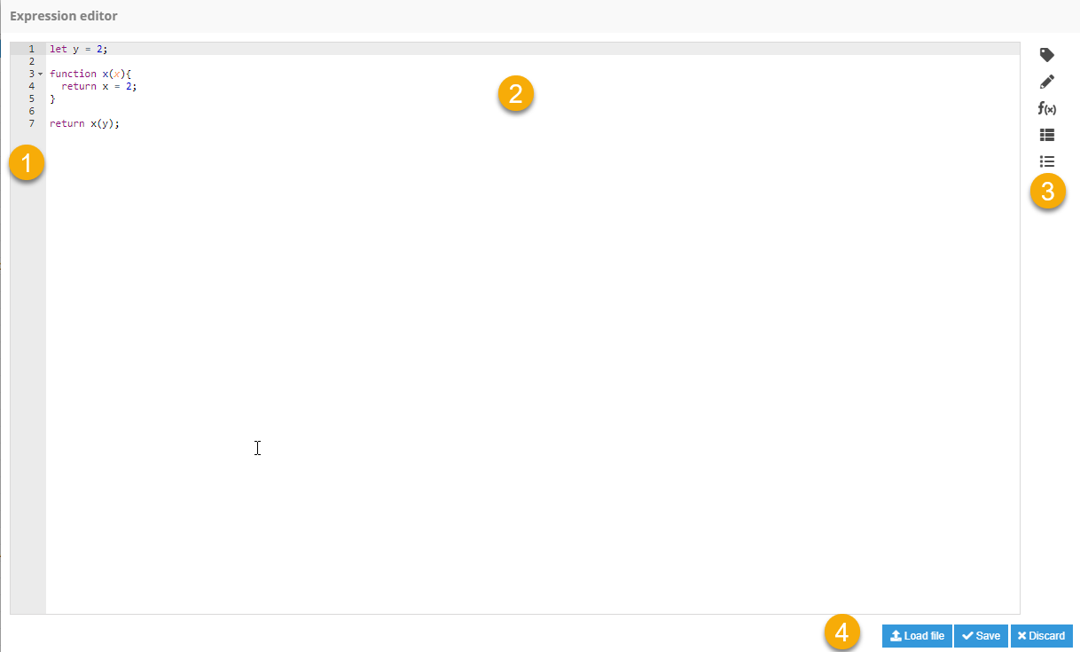
The return value from this toy example will be 2.

Environmental object
For security reasons, environment variables can be accessed if they start with the N3_ prefix. As an example, suppose a Windows system environment variable named N3_MY_VARIABLE is created. This variable can then be accessed in a Label component using the Expression editor with the following expression: =env.N3_MY_VARIABLE.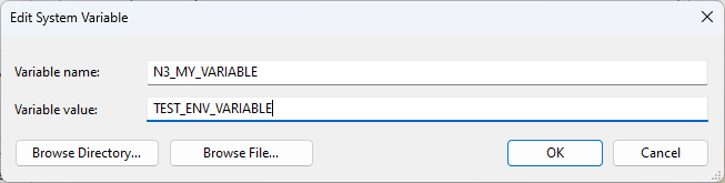
.png)
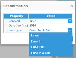
Set animation
Most Web Vision inputs can be accompanied by an animation, which will play whenever the value changes, resulting in a smooth transition between the previous value and the new value. Animations can also be set to custom properties.
Set animation opens a popup that allows users to apply an animation to the selected input. The following options are available:
- Enabled: Activates/deactivates animation.
- Duration: Sets animation duration time.
- Ease type: Used to control how the animation is interpolated between the initial value and the final value, with the following options:
- Linear: Animation speed is constant.
- Ease In: Animation starts slow and gradually picks up speed.
- Ease Out: Animation starts at a normal pace and slows when nearing the end.
- Ease In & Out: Animation is a combination of the two previous animations.
Once the animation has been saved, a play icon is shown before the input label. The animation can be edited using the Input helpers menu.
In the following animated image, we create a rectangle and set its XY coordinates to a Tag with random values. Initially, the rectangle jumps around in a random pattern. However, once we set the animation for both XY coordinates, the rectangle moves around more smoothly.
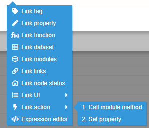
Link action
This input helper is only available on action inputs, as the resultant function receive the response of the specified action called during the trigger of an event, and trying to access to an action out of this context will throw a warning message to the user.
The input helper will display the sorted list of actions configured for a trigger, in ascendent, triggering order. Each action is named after the number of the sequential order in which it is executed, followed by the type of action triggered.
This functions is useful for 'Call Module Method' actions, which will return the same value returned from the method triggered.
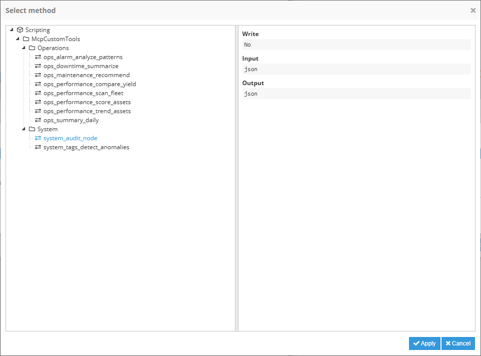
Select method
This input helper is available for 'Call Module Method' action only, where the option of selecting a method is needed.
The input helper will display a popup: on the left side, a list of the available methods is shown; on the right side, extra information about the method is shown:
- Write: Boolean that represent if the method access is configured as Write.
- Input: Input data type configured in method.
- Output: Output data type configured in method.