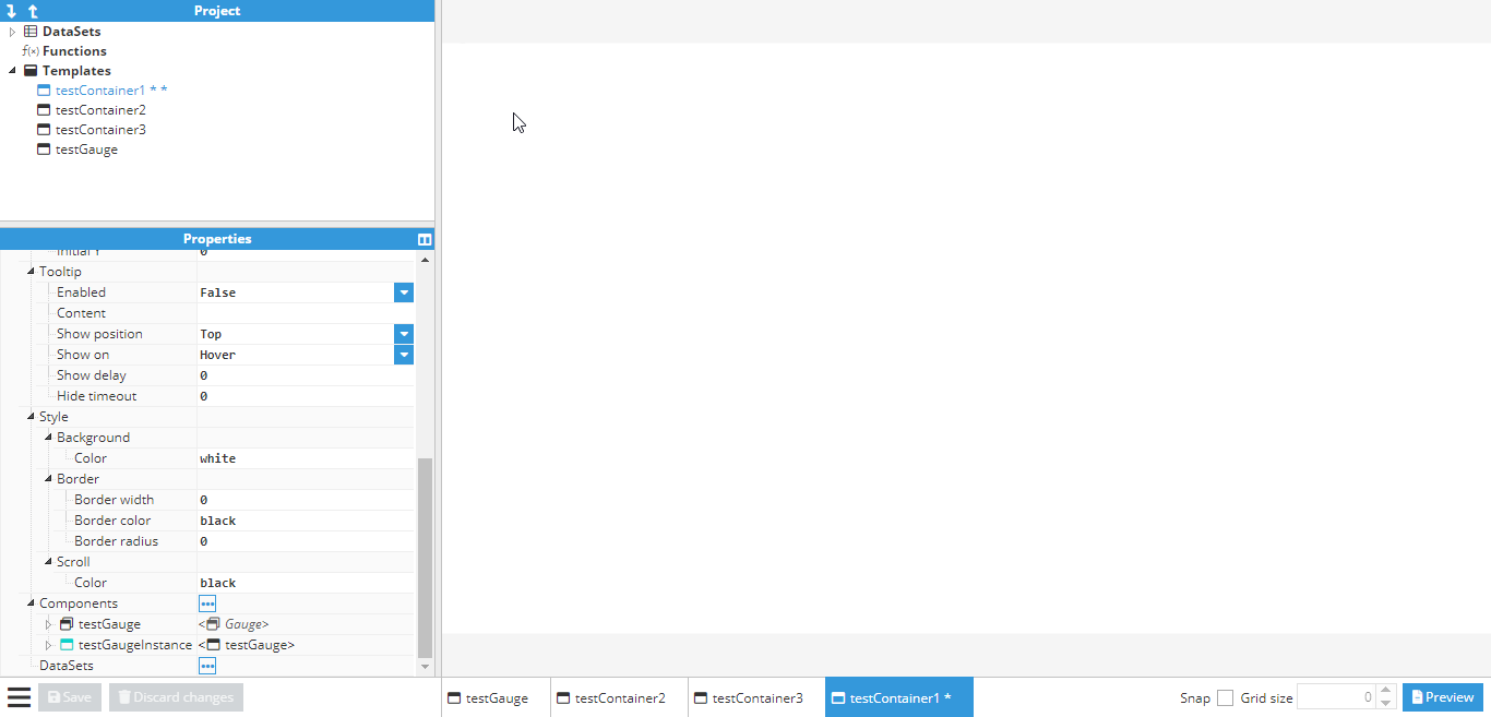
Common properties
All visual elements share the following general properties:
Size
The Size fields enable users to define the dimensions of an element by specifying its width and height. These dimensions can be assigned numerical values, which may consist of simple numbers, expressions referencing other properties, or numerical tags. Users have the flexibility to utilize expressions and arithmetic operations to dynamically calculate these dimensions.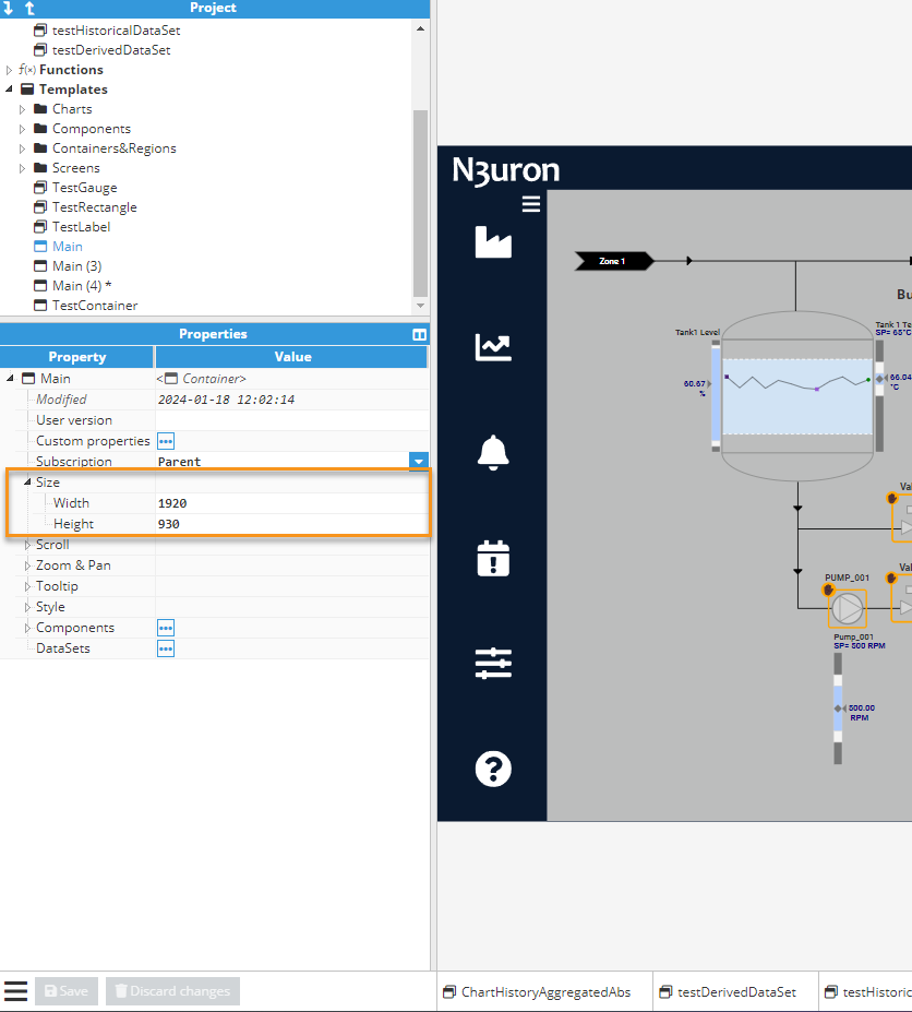
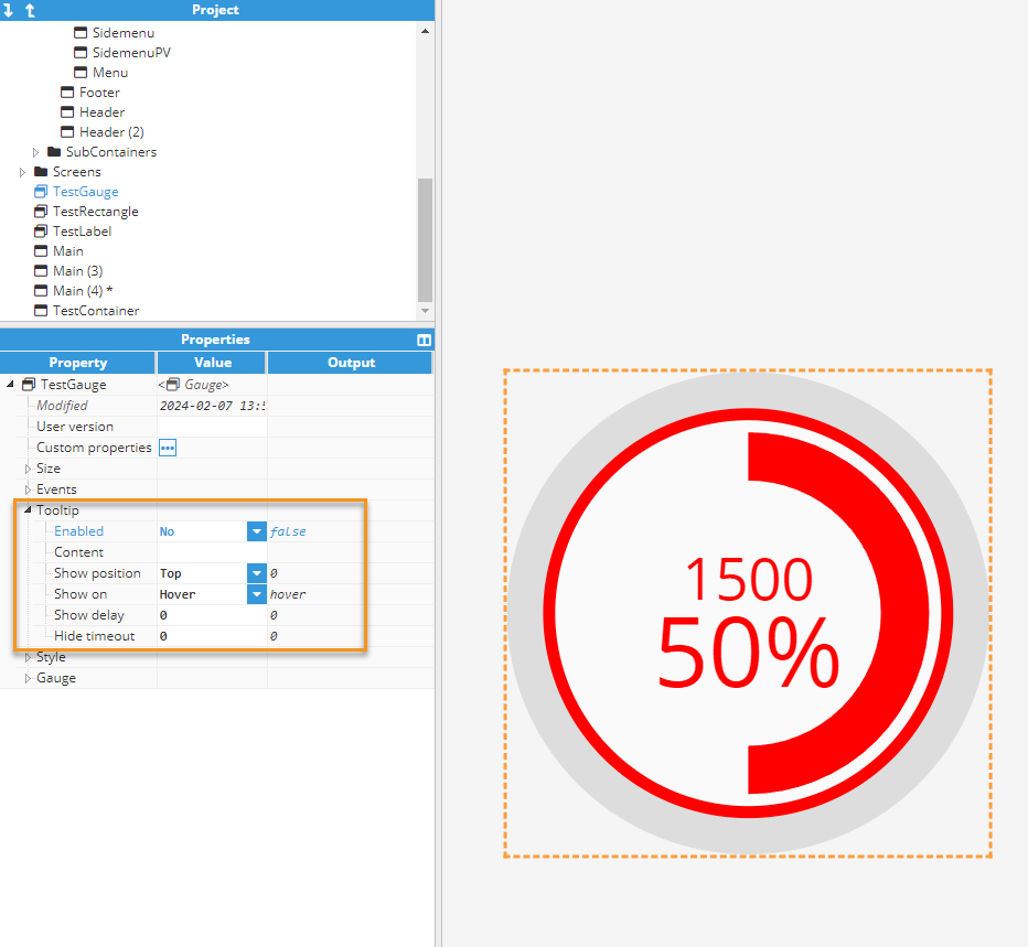
Tooltip
For each component, a tooltip with the following parameters can be displayed.
- Enabled: Boolean value that enables an activate/deactivate tooltip.
- Content: Text displayed inside the tooltip.
- Show position: Relative positioning in relation to the element. Options include Top, Right, Bottom, and Left.
- Show on: Specifies the trigger event for displaying the tooltip, either by hovering over the element or clicking on it.
- Show delay: Time in milliseconds before the tooltip appears after triggering (set to 0 for immediate display).
- Hide delay: Time in milliseconds before the tooltip disappears after triggering (set to 0 to prevent automatic hiding).
.gif)
Style
Allows users to configure basic style elements. In addition to the general style options, each component may include more specific groups of options. General style options include:
- Background color: The color that fills the background area of an element.
- Border: Element border. Border is not affected by padding. Border has 3 options:
- Border width.
- Border color.
- Border radius: roundness of border corners.
- Padding: The space between the border of an element and its content. It allows for adjusting the amount of empty space surrounding the content within the element, with the option to set padding values independently for each side of the element top, right, bottom, and left.
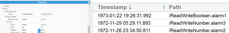
- Scroll color: This property determines the color of the scroll bars that appear when an element contains content that exceeds its visible area and requires scrolling. For instance, in the AlarmTable component, you can adjust the color of the scroll bars using this property.
Container
When a visual element is nested within a container, a dedicated set of properties enables efficient management of its positioning, alignment, and appearance within the container.
- Position (X and Y): Position of the container in pixels. If the parent container is a regular container, X and Y coordinates are the absolute position inside this container in pixels. If the container is a map, the position will be based on latitude and longitude.
- Layer: Layers make it possible to control how different components overlap. Layer 0 (default) is the lower level (backward). As many layers as required can be used to organize the overlay.
- Quality: Used to automatically add an overlay to the component, based on the quality of a tag, in order to provide a quick insight into the quality of the data associated to the component. This property is usually linked to the quality of the tag associated to the component or to an expression in order to manage the quality overlay. Quality codes used by this field are in accordance with the OPC standard:
- Quality overlay disabled: empty field.
- Bad Quality (Red overlay): quality < 64.
- Uncertain Quality (128 > quality >= 64): Orange overlay.
- Good Quality (quality >= 192): No overlay.
- Visible: Enables control over the visibility of the component, allowing it to be displayed or hidden based on events. This feature is commonly utilized to reveal the component upon one event trigger and hide it upon another. For instance, a popup can be made visible upon clicking a specific button and then hidden upon clicking another button.
- Opacity: Controls the opacity of the component. Zero is completely transparent and 1 is completely opaque.
- Rotation: Rotates the component clockwise, in degrees.
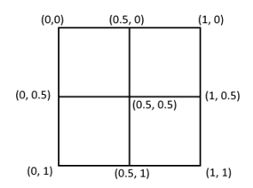
- Origin (X and Y): Points to where the position is applied. The default value is (0,0), meaning the upper-left corner. X equals to 1, meaning the right side of the component and Y equals to 1, meaning the bottom side. The Origin can be set outside the component by using a value that is negative or greater than 1.
- Size: Only available when the parent is a layout. Defines the element’s width/height based on layout orientation.
- Size type: Only available when the parent is a map. Defines how the element size is calculated, relative to container size or geographical longitude.
Instances container fields
When the element is an instance of a template, additional fields will be shown to manage the size and position of the container and determine how the element fits inside its container.
- Width/height: Defines the viewport size, not the element size. The element will fit inside the viewport according to the fit method.
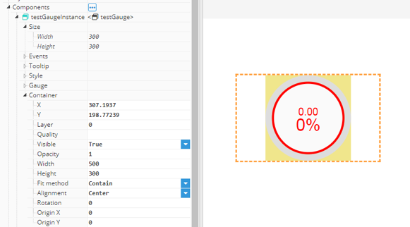
- Fit method: The fit method provides different methods for fitting an element inside its viewport:
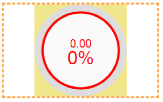
- Contain: The element will be resized to fit the smallest of viewport size components (width or height), resulting in an element that is equal to or smaller in size than the viewport.
- Cover: The element will be resized to fit the largest of the viewport size components (width or height), resulting in an element that is equal to or larger in size than the viewport.
- Stretch: The element will be stretched to exactly match the viewport size, resulting in a deformed element, unless the width/height relation of the element and the viewport is the same.
- Expand: The element size will be resized to exactly match the viewport size, resulting in a larger element.
- Alignment: For Contain and Cover fit methods, the element and viewport size may differ. In these cases, the element can be aligned inside the viewport at start, center, and end.
DataSets
Containers and Chart & Report components include a dataset property. In order to access a dataset that is defined in the Datasets project folder, it must first be instantiated inside the component’s DataSets instance list.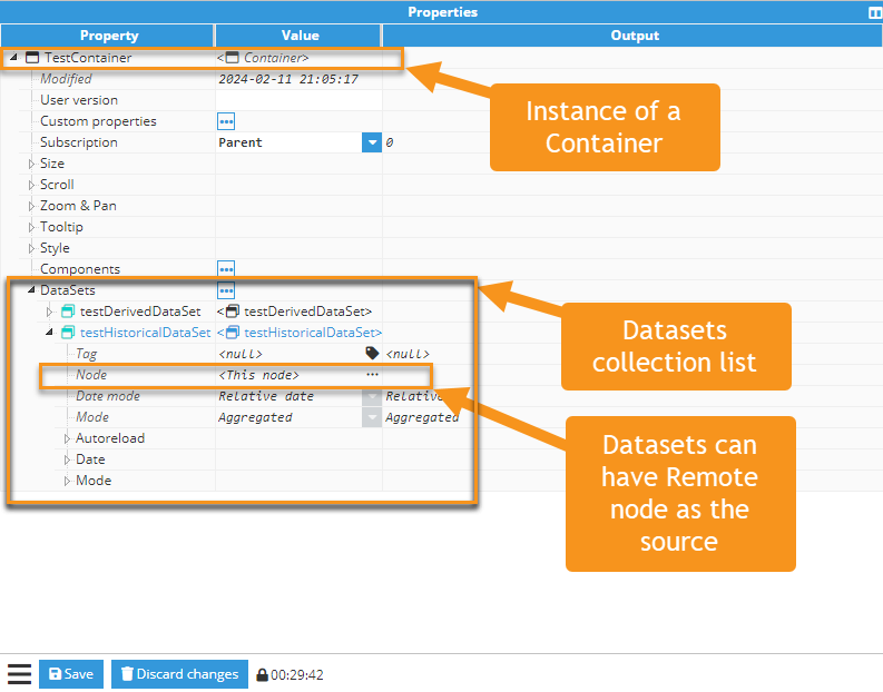
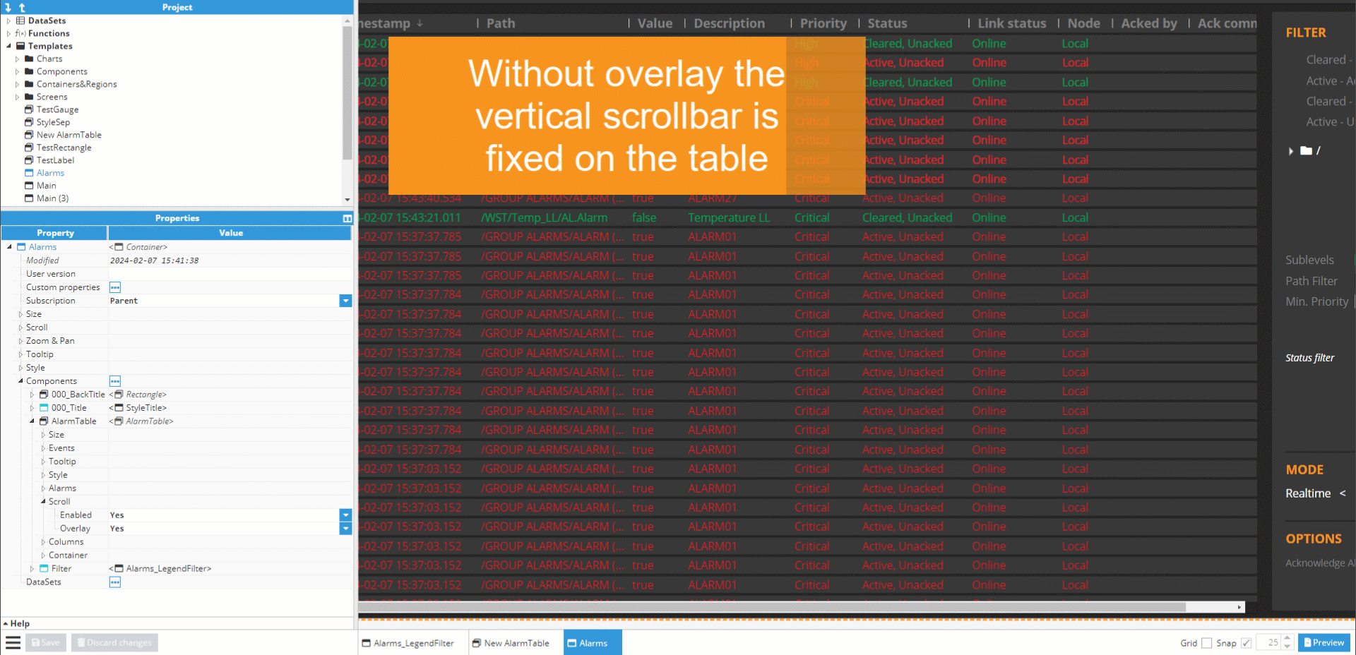
Scroll
Some visual elements include a Scroll property, such as basic containers and tables (Alarm/Realtime). Scroll has two properties:
- Enabled: Enables the activate/deactivate scroll.
- Overlay: Displays scroll as an overlay that is only visible when hovering (if activated). If not, the scroll will be fixed and permanently visible.
Containers
Containers are visual elements designed to contain other visual elements such as components and additional containers. Depending on the container type, the contained elements are displayed in various manners. The behavior of an element within a container is determined by the shared properties within the Container subtree of the element. There are four types of containers:
- Container: The positioning of components within a container is flexible and controlled via container options.
- Layout: Elements within a layout are arranged in either rows or columns, without free movement. The order of rows and columns is determined by their names, arranged alphabetically.
- Map: While similar to a Container in terms of containing visual elements, a Map utilizes an interactive map background that operates with geographical positions instead of absolute positions.
- Region: A specialized container where only one of its child's visual elements can be displayed at a time. This type of container is particularly useful for transitioning between screens within the same visual area.
Common properties for containers
- Subscription: Use this property only when a container is not visible and continuing input updates are unnecessary. Otherwise, leave the default value as Parent so the container follows its parent’s subscription behavior.
The available values are Enabled, Disabled, and Parent. Parent inherits the subscription state from the parent container; if no parent exists, it behaves as Enabled.- Enabled: the container and all descendants continue receiving live updates normally.
- Disabled: the container and all descendants stop receiving further input updates.
- Parent: the container follows the subscription state of its parent container. If there is no parent, the effective state is Enabled.
Except for Regions, all other containers feature a properties group named "Zoom & Pan" for controlling internal zoom and pan functionalities within the container:
- Enabled: Allows modifications to the current zoom and pan using mouse movements, the mouse wheel for zoom and drag & drop for pan. If disabled, it blocks the current position, but the position can still be modified using the corresponding properties.
- Scale/Zoom: For a container, the scale refers to the multiplier of the original size, which means that a value of 1 will result in the original size. On Maps, this behaves like Google Maps or the open street maps zoom, although it is continuous rather than discrete.
- X/Lon: Current pan position on x axis. Or, if the element is a map, the current longitude.
- Y/Lat: Current pan position on y axis. Or if the element is a map, the current latitude.
- Initial Scale/X/Y | Zoom/Lon/Lat: Values used when the web browser loads the container for the first time.
Container
A container is the most basic type of container. It applies no restrictions to an element’s positioning, only positioning relative to its own size. It offers no special functionality outside those explained in Visual Elements, Common Properties, and Container Common Properties..gif)
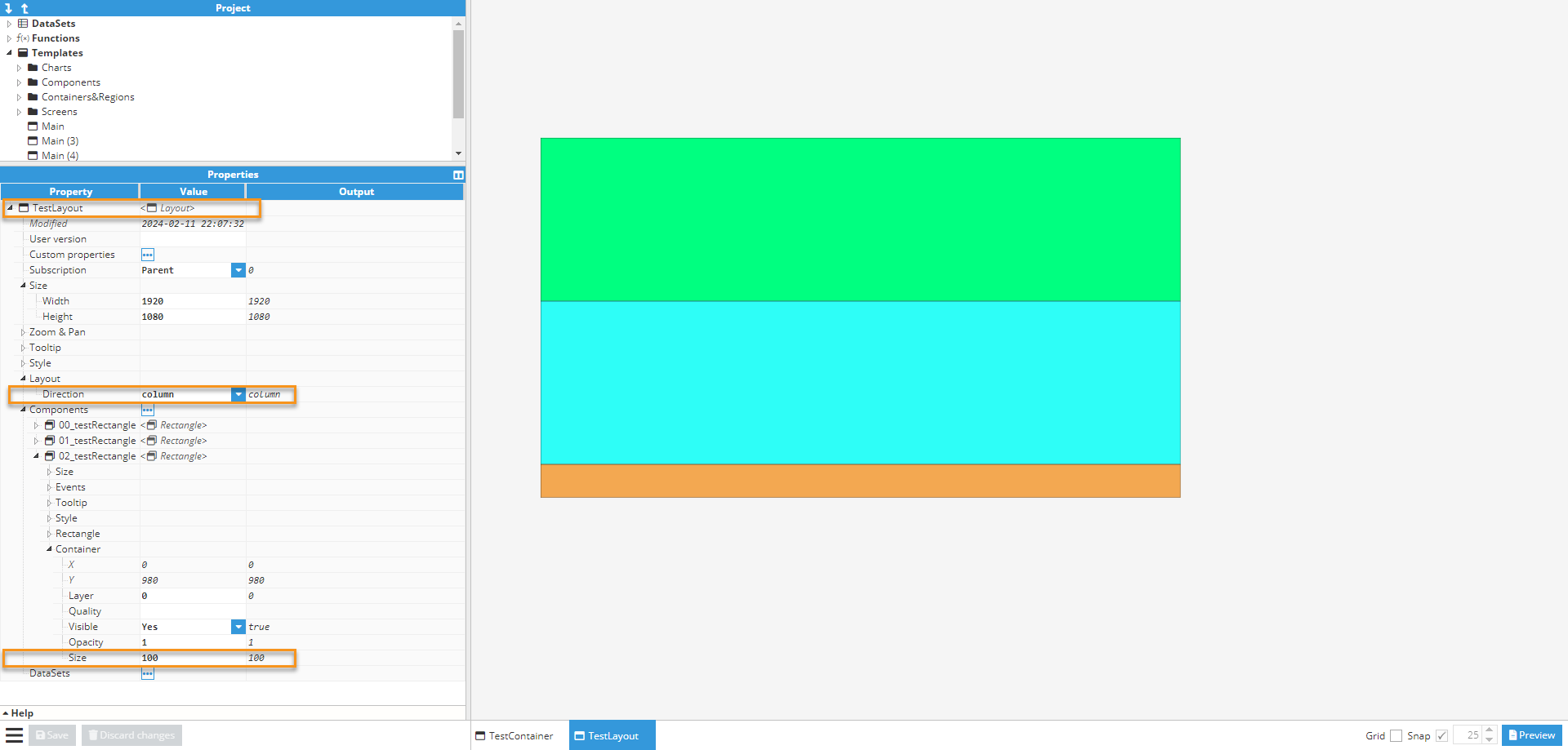
Layout
Layout is a type of container whereby elements inside it are stacked as a series of rows or columns in alphabetical order. Other specific layout properties include:
- Layout direction: Defines if the elements are stacked as rows or columns. Row displays child elements as a row of elements, while column displays them as a column.
.png)
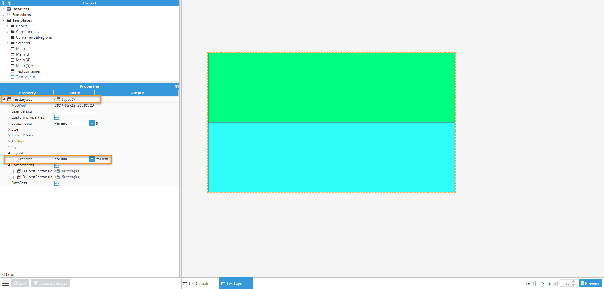
- Children size: Defines the size of each row or column. It can either be absolute in pixels (for instance, 125), relative to the total size (for instance 50%), or it can automatically fill all available space when the value is set to <null>. If several components in the same line are configured as <null>, the available space will be distributed evenly among them.
Region
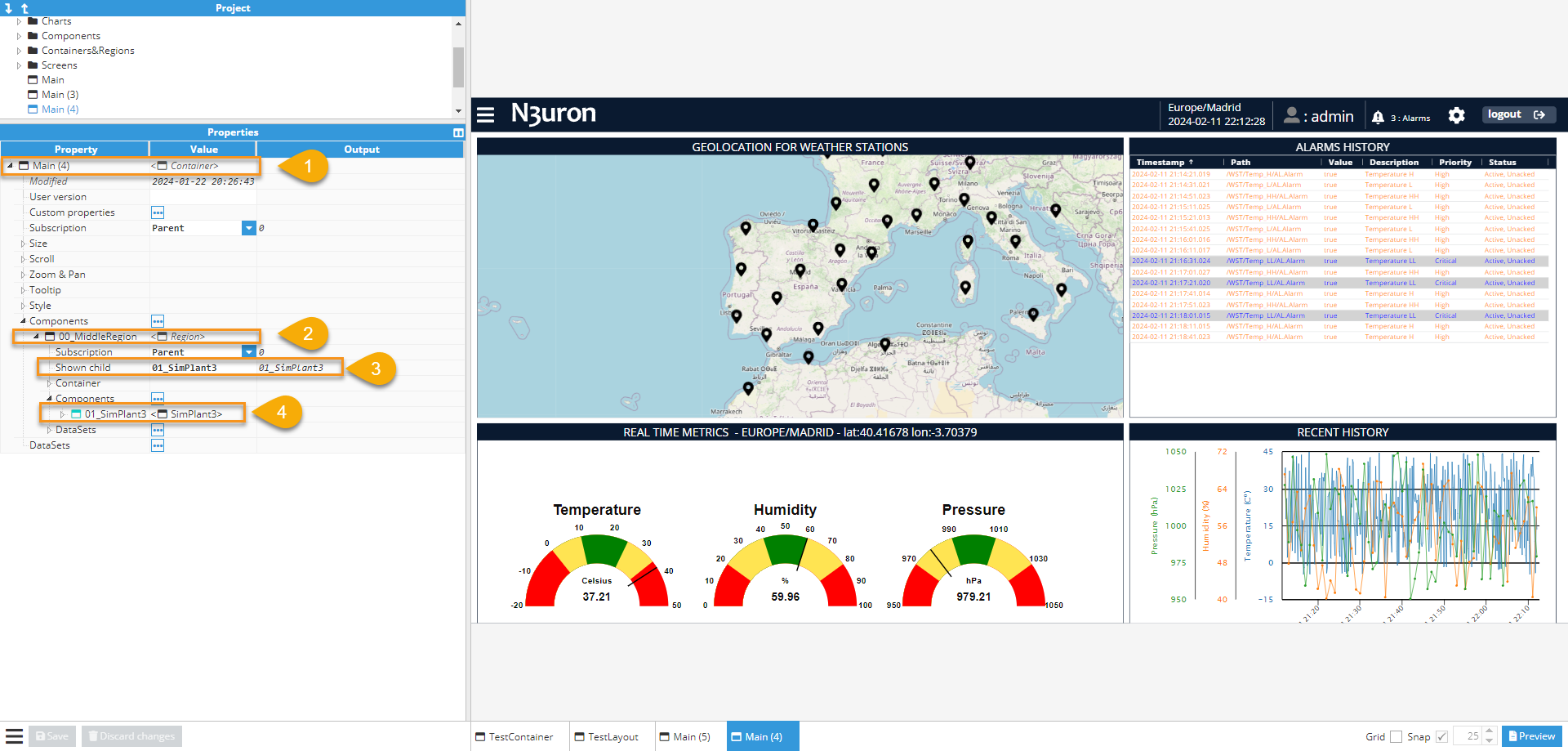
A region container allows different visual components in the same area to be swapped around inside the project by simply pointing to the new component. A region may contain several different visual components (children), but only one of them can be shown at a time and this Child component won't have a Container Properties Group since it is receiving these properties from the Region. The active component is set using the “Shown child” property and must match a child’s name.
The Region container also allows improvements to be made to the viewer’s performance because it only loads components shown at that particular moment. The rest of the components are only loaded when shown for the first time.
The Actions chapter explains how to add a child component to a region and show it in the region area.
A Region’s Child components are instances of template containers that are defined in the project area.
- Main container.
- Region container.
- Selected child container to be shown.
- Child container.
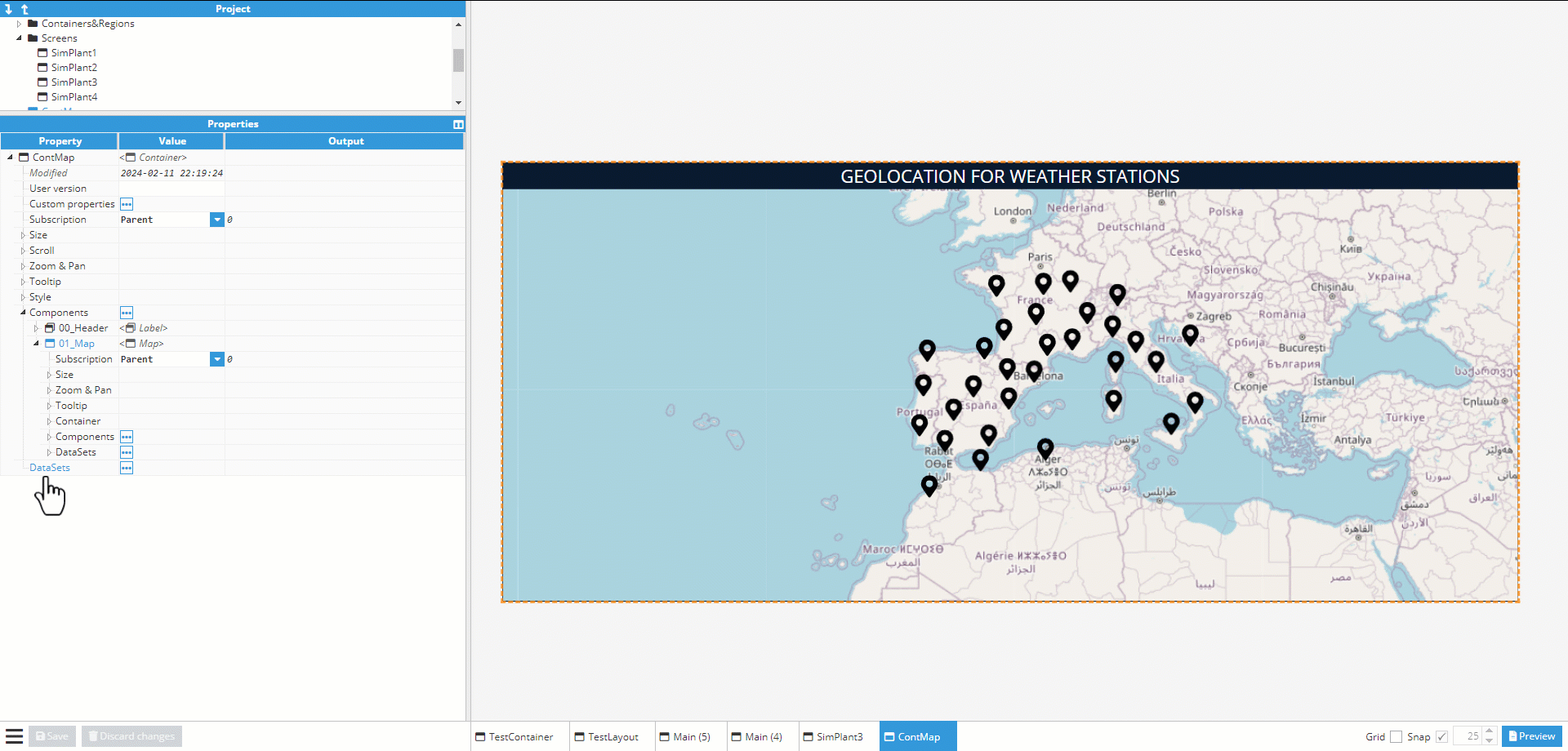
Map
Maps are very similar to basic containers, with some differences:
- The background is a map that can be manipulated in a very similar to the way Google Maps or OpenStreetMap can.
- It uses geographic coordinates (longitude and latitude) instead of positions relative to the container. In this way, components within the map are positioned using longitude and latitude, instead of size units. For instance, a component with a position of 0,0 in a regular container is located in the top-left corner, while as in a map, it’s in the coordinates (-3.70379, 40.41678) (Madrid Capital).
- When zooming in, the map shows more details.
- The “Size type” property, inside the child's Container properties group, specifies whether the width and height of the element are relative to the container size or to the geographical longitude.
.png)
Components
Each component has a unique set of properties that can be set and modified in the Designer. A component property is simply a named variable with a distinct type that affects something about the component's behavior or appearance, such as size, color, name or visibility.
Common properties for components
Events
All components can have an event attached to them. Events have a trigger, such as clicking on the component, and one or more actions that are executed whenever the event triggers. The action can be used to write a value to a tag or to change a property from this or another component, such as the color or the visible property.
All components have the following events:
- Mouse enter: This event is triggered whenever the mouse pointer hovers over the component’s container.
- Mouse leave: This event is triggered whenever the mouse pointer leaves the container after hovering over it.
- Mouse down: This event is triggered whenever the mouse is held down over the container.
- Mouse up: This event is triggered whenever the mouse button is released after being held down on the container.
- Mouse click: This event is triggered whenever the user clicks on a component (first a mouse down, then a mouse up). To detect clicks on a component, it’s recommended to use this event instead of mouse up.
From these events, some components also include more specialized events:
- User input: This event triggers whenever the value of the component changes. This event is only present in Toggle, Input, and Dropdown components.
- Selection change: This event triggers whenever the selection inside the component changes. This event is present in AlarmTable and TagPicker.
Each event can launch a set of consecutive actions. Actions can be any of the following types:
- Write tag: Writes a value to a tag. The value is written directly without a pop-up component.
- Write tag popup: Opens a pop-up component so that the user can choose which values to write to the selected tags.
- Write tag popup static: Opens a pop-up component so that the user can choose a new value from a dropdown list.
- Reload historical DataSet: Forces a historical Dataset to query the data again.
- Set property: Sets a value to a selected instance property.
- User interface: User Interface actions/configurations.
- Wait for completion: Waits for the previous actions to finish before continuing.
- Wait for timeout: Waits for the time to elapse before continuing.
- Break execution: Breaks the execution sequence. If the condition is met, actions after this point will not be executed.
- Ack alarm: Acknowledges the alarms included in a comma-separated list. Alarms are referenced using the entire tag path, followed by a dot and the name of the alarm.
- Open URL: Opens a URL in a new tab.
- Open File: Opens a file in the /config/<WebVision instance name>/docs/ folder. You must create the folder manually if it doesn't exist. Example: manual.pdf.
- Print: Launches the web browser’s printing dialogue to print the selected element.
- Open historical: Opens a pop-up screen with the Historian client tool to access historical data.
- Load report pdf: Force loads the selected PDF report.
- Download report pdf: Downloads the selected PDF reports.
- Download table CSV: Downloads the selected table data in CSV format.
- Open instance: Opens selected instance on a given Region or in a popup.
- Call module method: Triggers the execution of a method from a Scripting module.
A more detailed description of events can be found in the actions chapter.
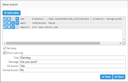
Events can be configured to determine how they interact with the operator:
- Set busy: When enabled, a grey gear is displayed over the top of the component that triggered the event while actions are being executed.
- Show warning: When enabled, a confirmation pop-up dialogue is shown before launching the execution.
Font style
Some components with configurable text, such as Label, Input, or RealtimeTag, have a group of common style properties related to the font:
- Color: Font color. This field supports any valid CSS color. More information is in the CSS color format appendix.
- Size: Font size, in pixels.
- Weight: Font weight; normal or bold.
- Decoration: Font decoration; add lines to text in multiple positions.
- Style: Activates the italics font.
- Align: Allows text to be aligned inside the element’s visual area.
Table styles
Table elements, such as AlarmTable and RealtimeTable, include a set of common styles related to the header, body, and borders. Cell/Row colors can also be configured to act as filters based on regular expressions. This allows certain rows/cells to be colored inside the table. Whilst there are some differences between these two tables, they’re similar enough to be included in this chapter.
- Table header styles
- Resizer color: Color of the resizer anchor for column resizing:
- Font: Font color. This field supports any valid CSS color. More information can be found in the CSS color format appendix
- Background color: Header background color.
- Table body styles
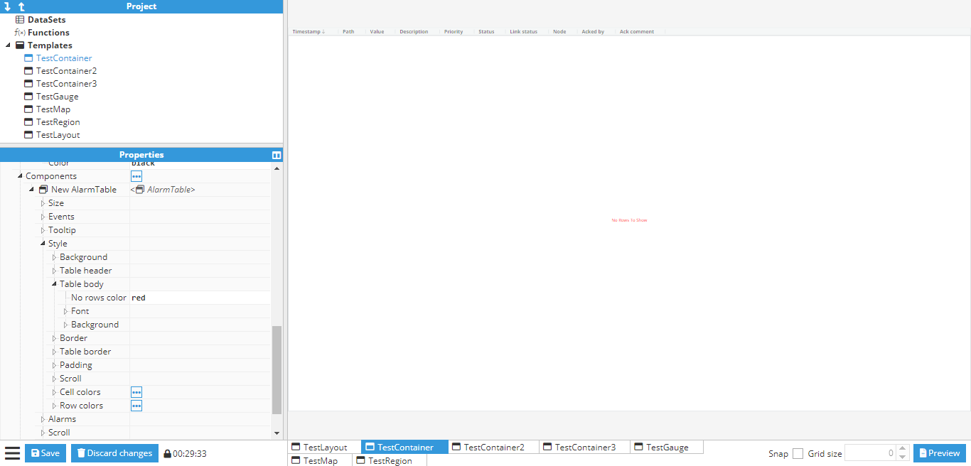
- No rows color: Color for the “No Rows To Show” message. For example, a red message.
- Font: Same as the previous font style section.
- Background
- Color: Background color for the body (not for rows, only the background).
- Selected row color: Color of selected rows.
- Hover row color: Color of rows when hovered over.
- Even row color: Color of even rows when not hovered over or affected by the selection mode style.
- Odd row color: Color of odd rows when not hovered over or affected by the selection mode style.
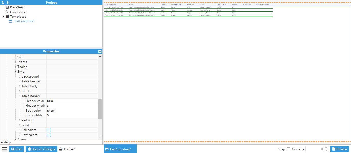
- Table border style
- Header color: Color of the separator between the table header and body.
- Header width: Width of the separator between the table header and body.
- Body color: Color of the separators between rows in the body.
- Body width: Width of the separators between rows in the body.
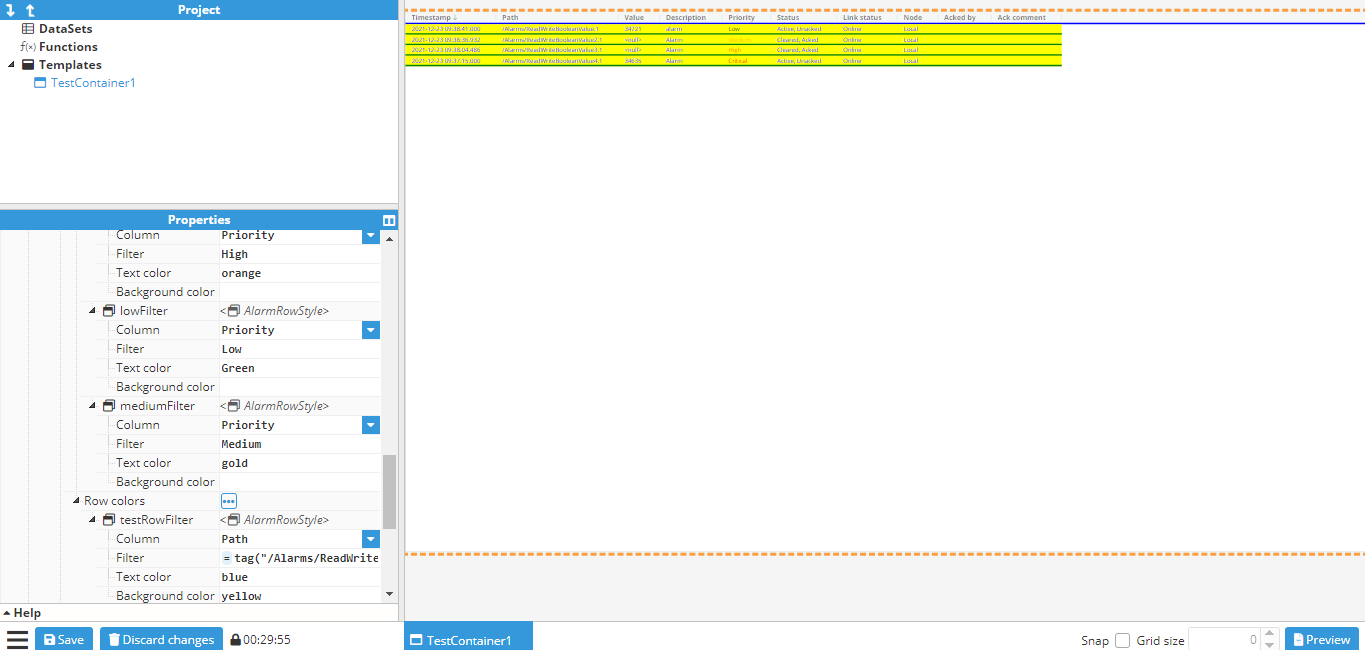
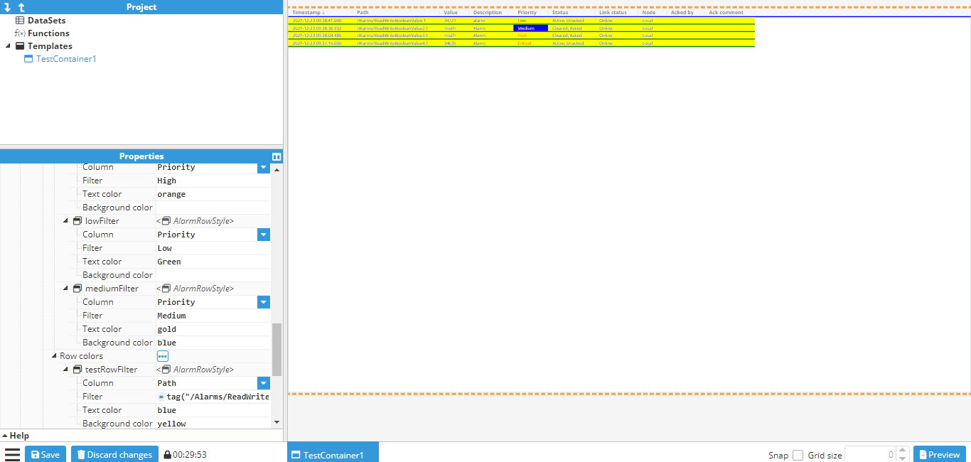
- Row/Cell colors: Row/Cell colors allow filters to be added with text and background color, which will match regular expression patterns for preselected columns. Colors will be applied following a certain set of rules:
- Conflicting filters will be applied in alphabetical order. Two filters affecting the same values will be applied in the order they appear in within the instance list.
- Cell filters have priority over Row filters.
- Hover/selected color has priority over the filter background color.
- Row/cell color properties
- Column: Column for searching for filtered values (these are concrete table columns).
- Filter: Regular expression for checking the selected column.
- Text color: Color of the text that matches the filter.
- Background color: Color of the background that matches the filter.
Alarm counter
The Alarm counter displays the number of alarms matching the configuration of the following filters:
- Path: Filters alarms by tag path. Only tags included in this tag path are included.
- Sublevels: When set to true, filters include all sublevels of the path.
- Filter: Regular expression (regex) applied to the tag path. Only tags matching the regular expression are included.
- Status: Filters the alarm status using a comma-separated list of the following codes:
- Cleared and acked: 0
- Active and acked: 1
- Cleared and unacked: 2
- Active and unacked: 3
- Minimum priority: Filter for excluding low priority alarms.
- Count: This property indicates the number of alarms matching the filters.Note:Starting from N3uron version 1.21.7, flexible column ordering has been implemented for Alarm Table.
Alarm table
The Alarm Table component can be configured to list the current status of alarms (Realtime) or the evolution of alarms through their different statuses within a specific period (Historical Alarms).
Additionally to the generic options, the following Alarm Table options should also be configured:
- Data options: This option allows users to apply rules in order to filter the alarms displayed in the Alarm Table.
- Path: Filters alarms by tag path. Only tags included in this tag path will be included.
- Sublevels: When set to true, filter will include all sublevels of this path.
- Path Filter: Regular expression (regex) applied to the tag path. Only tags matching the regular expression will be included.
- Status: Filters alarm status using a comma-separated list of the following codes:
- Cleared and acked: 0
- Active and acked: 1
- Cleared and unacked: 2
- Active and unacked: 3
- Minimum priority: Filter for excluding low priority alarms.
- Maximum priority: Filter for excluding high priority alarms.
- Type: Realtime displays the current status of alarms, while Historical demonstrates the evolution of alarms throughout each status within a specific period of time (defined in Start and End).
- Start: Retrieval start date for historical alarms.
- End: Retrieval end date for historical alarms.
- Alarms:
- Multiselection: Enables more than one alarm to be selected in the table.
- Selected: This property contains the tag path for all of the selected alarms.
- Sort by: sets the column to be used for ordering the alarms shown.
- Sort direction: sets the direction of the alarms to be sorted: ascendant or descendant.
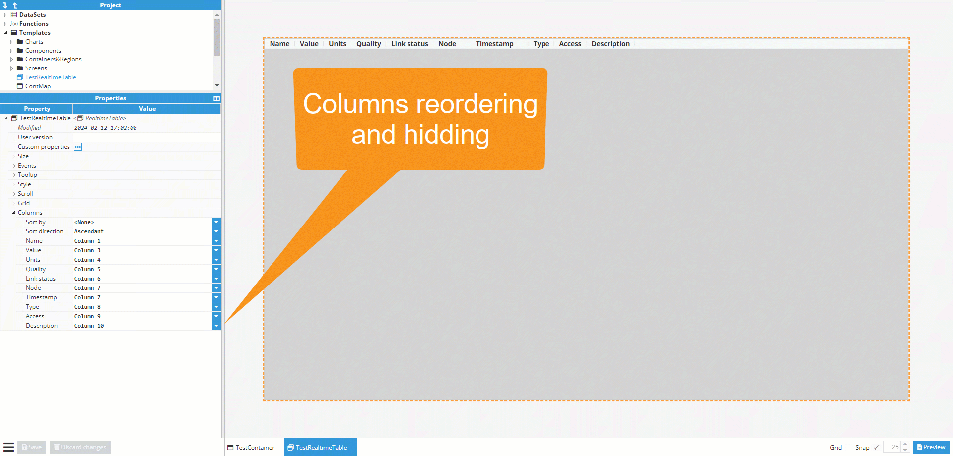
- Columns: Shows available columns and the position or hidden status, and allows to hide and reorder each column.
- Style:
- Row & Cell colors: Allows users to apply styles to specific rows or cells, based on the filters configured for each style.
- Column: Selects the column for which the value filter is applied.
- Filter: Sets the value to filter for the style to be applied.
- Text Color: Sets the color to be applied on the text for the row or cell when the filter matches the value on the column.
- Background Color: Sets the color to be applied on the background for the row or cell when the filter matches the value on the column.
- Row & Cell colors: Allows users to apply styles to specific rows or cells, based on the filters configured for each style.
- Shelved alarms:
- Enable: Enables the visibility of the alarm shelving interface panel.
- Multiselection: Enables more than one alarm to be selected in the table.
- Selected: This property contains the tag path for all of the selected alarms.
- Sort by: sets the column to be used for ordering the alarms shown.
- Sort direction: sets the direction of the alarms to be sorted: ascendant or descendant.
- Columns: Shows available columns and the position or hidden status, and allows to hide and reorder each column.
Realtime mode: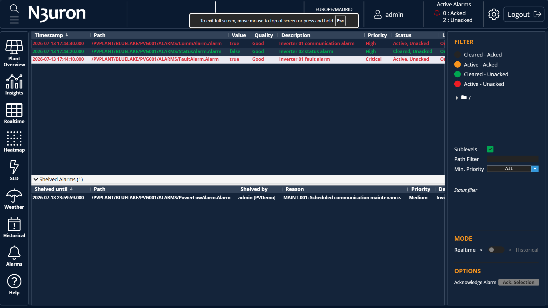 Historical mode:
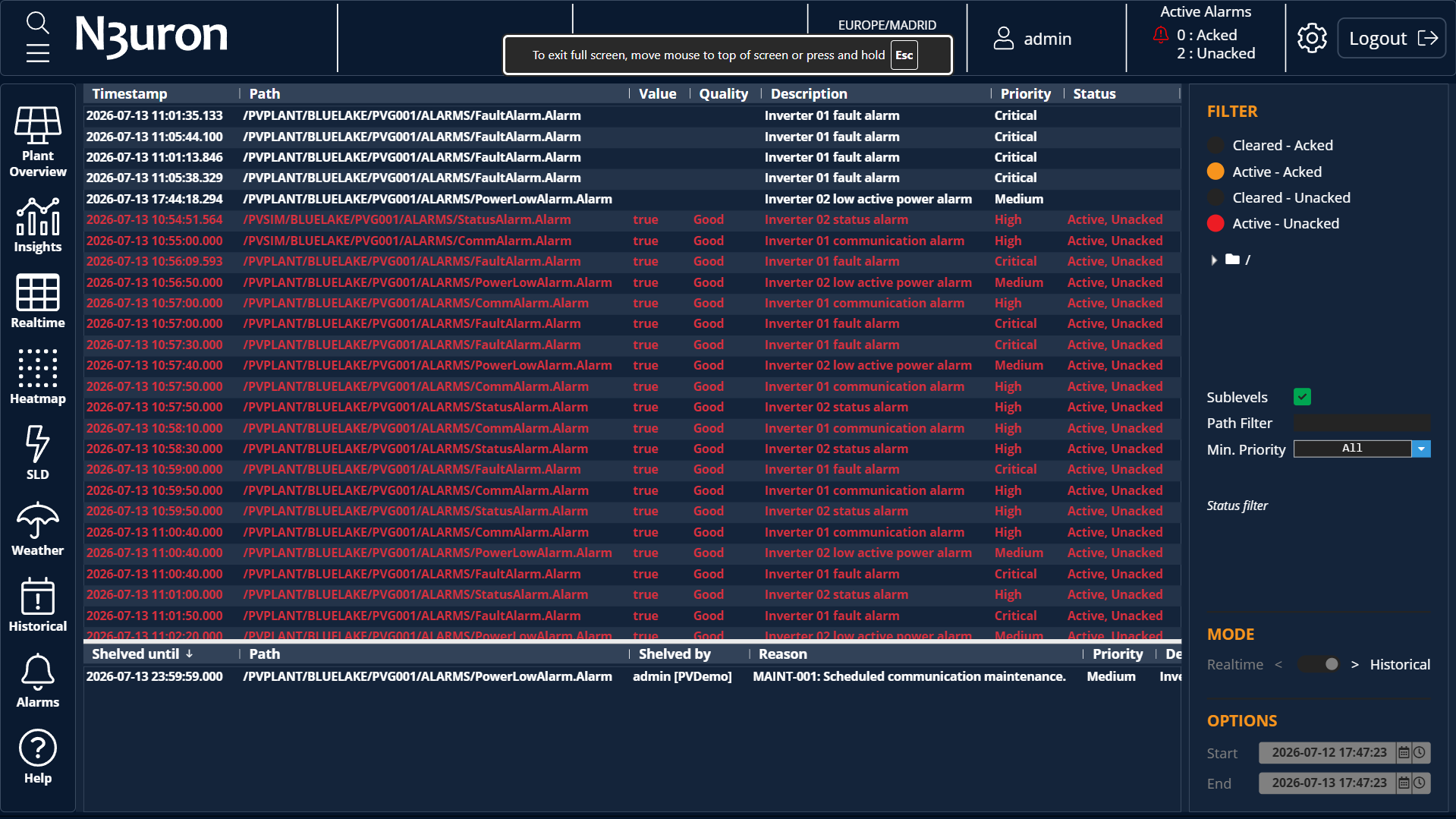 Note:Starting from N3uron version 1.22.4, shelved alarms have been implemented for Alarm Table.
Dataset Table
The Dataset Table component displays user-defined datasets in a customizable table format. It is intended for building dynamic views where rows, columns, headers, sorting, selection, and visual styling are driven by the dataset configuration.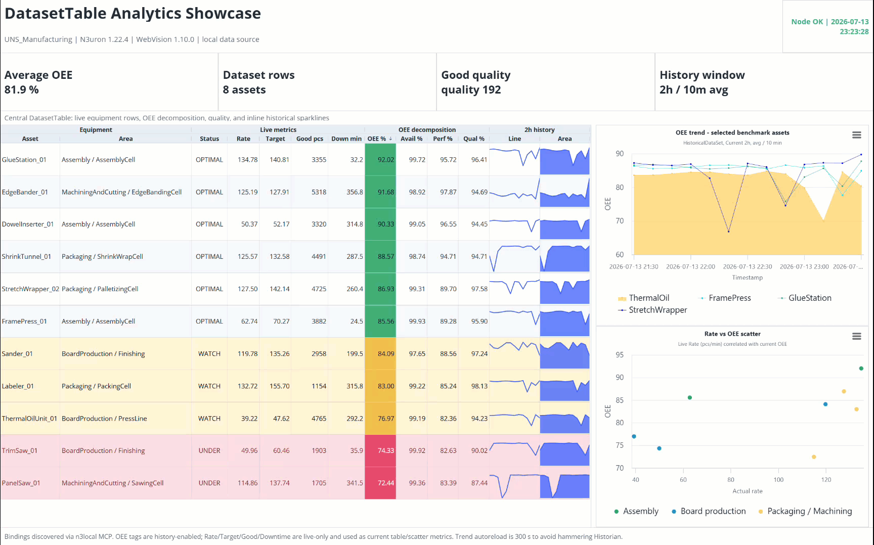
- Style
- Table header
- Resizer Color: Specifies de color of the vertical bar used to resize columns withing table header.
- Table body:
- Message Color: Sets the color for system messages, displayed when a cell is empty or an error occurs during data retrieval.
- Table border:
- Header color: Defines the color of the borders surrounding the table header cells.
- Header width: Defines the thickness of the borders surrounding the table header cells.
- Body color: Defines the color of the borders surrounding the table body cells.
- Body width: Defines the thickness of the borders surrounding the table body cells.
- Row & Cell color: Allows users to apply styles to specific rows or cells, based on the filters configured for each style.
- Column: Selects the column for which the value filter is applied.
- Filter: Sets the value to filter for the style to be applied.
- Text Color: Sets the color to be applied on the text for the row or cell when the filter matches the value on the column.
- Background Color: Sets the color to be applied on the background for the row or cell when the filter matches the value on the column.
- Table header
- Table
- Data: Expression that evaluates to the array of rows used as the table's data source. Row values can be scalar primitives, live real-time tag objects (timestamp, value, quality), or nested historical time-series arrays ([[timestamp, value], ...]).
- Two formats are supported:
- an Array of arrays (position-based mapping, e.g. =[[1,"Madrid"],[2,"BCN"]]).
- an Array of objects keyed to matching column Field identifiers (e.g. =[{id:1,name:"Madrid"},{id:2,name:"BCN"}]).
- Two formats are supported:
- Row key: Field name or index used as the unique identifier for each row. Required when inline editing is active or when using embedded sparkline columns. Leaving it blank forces unstable fallback position-based mapping.
- Header: Shows or hides the table header.
- Drag-orderable columns: Enables users to reorder columns by dragging them.
- Empty message: Text displayed when there is no dataset data to show.
- Row height: Defines the height of each table row.
- Selected row: Stores or defines the currently selected row.
- Row count: Displays the number of rows currently available in the table.
- Data: Expression that evaluates to the array of rows used as the table's data source. Row values can be scalar primitives, live real-time tag objects (timestamp, value, quality), or nested historical time-series arrays ([[timestamp, value], ...]).
- Selection
- Enabled: Enables row selection in the table.
- Multiple: Allows multiple rows to be selected simultaneously.
- Sort
- Sort by: Defines the column or dataset field used to sort the table.
- Sort direction: Defines the sorting direction.
Sort by: Column or dataset field used to sort the table.
Sort direction: Ascending or descending.
- Header Groups: Defines grouped headers that visually organize related columns under a shared top-level heading (for example, grouping several columns under OEE decomposition or Live metrics). Each header group has:
- Title: Defines the text presented for multi-columns grouped header.
- Text color: Sets the font color applied to the header group title.
- Background color:Sets the background color applied to the header group title.
- Parent group: Refers to header group fora multi-tier nested header architecture, or sets as primary group if left blank.
- Columns: Defines the columns displayed in the table and how each dataset field is represented.
- Title: Defines the descriptive text presented within the column header.
- Field: Defines the attribute name or numeric array that maps the source datasets to the referred column.
- Header group: Refers to the headers group property, grouping columns in multi-level top header block. Null value isolates column without a multi-level group.
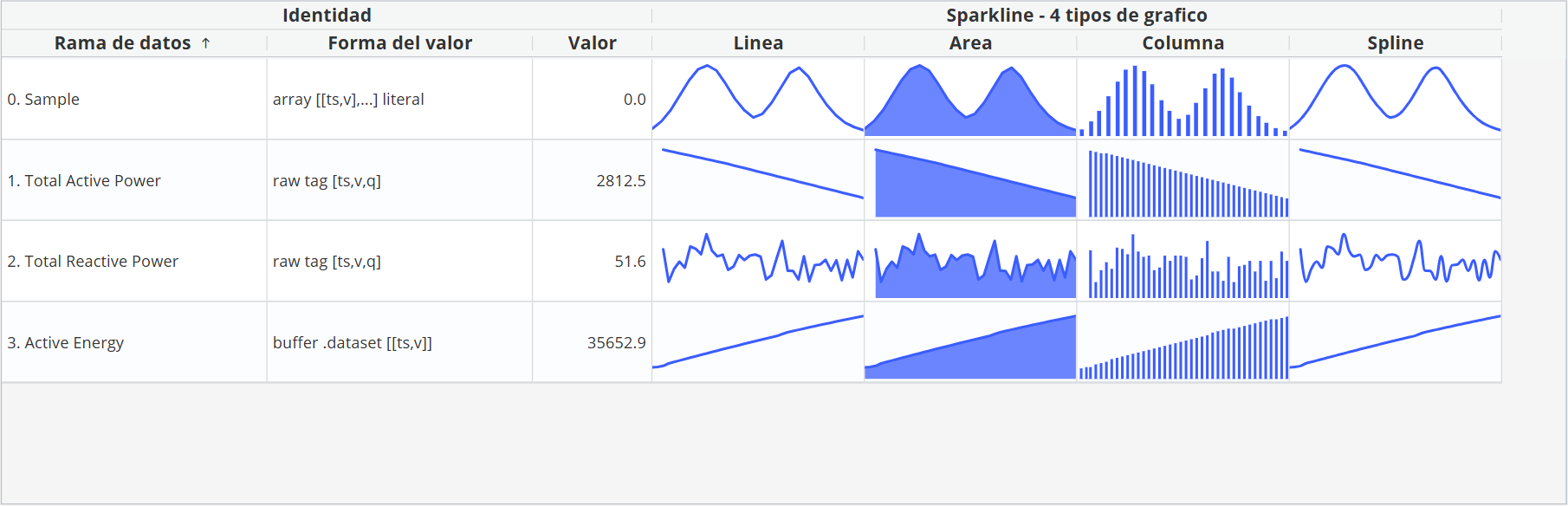
- Renderer: Defines the visual generation engine, as text to present values as scalar strings, or sparkline to render inline time series micro charts.
- Editable: Determines whether users can edit the cell value directly from the table.
- Sortable: Enables or disables sorting for the column.
- Resizable: Allows users to resize the column width interactively.
- Width mode: Defines how the column width is calculated, such as fixed or automatically adjusted to the available space.
- Width: Specifies the column width when a fixed width mode is used.
- Visible: Determines whether the column is displayed in the table.
- Style
- Vertical align: Defines if the column is vertically aligned to the top, to the bottom or to the center.
- Horizontal align: Defines if the column is vertically aligned to the left, to the right or to the center.
- Format
- Format type: Selects the formatting mechanism applied to the value.
- Format options
- sprintf:
- Format: Defines the formatting string. For sprintf, standard format specifiers such as %s, %d, or %.2f can be used.
- Locale:
- Locale: Defines the locale used to format the value using an IETF BCO 47 language tag. Affects how decimal points and separators are displayed.
- Style: Determines the functional formatting for numeric values:
- Decimal: Generic numeric data.
- Currency: Formats the value as monetary amount.
- Percent: Formats the value as a percentage.
- Currency: Sets the 3-character ISO 4217 currency code when the Style is set to currency.
- Currency display: Controls the visual representation of the currency: symbol, code or name.
- Group separator: Show decimal separator, if selected locale and options allows it.
- Min. integer digits: The formatted number will include thousands separators.
- Min. fraction digits: Sets the minimum number of decimals to display, between 0 and 20. If null, defaults value to 0 or the minor unit value defined by ISO 4217.
- Max. fraction digits: Sets the maximum number of decimals to display, between 0 and 20. If null, defaults value to 20 for decimals or balances precision against the defined minimum.
- Prefix: Custom string prepended to the formatted value.
- Suffix: Custom string appended after the formatted value.
- sprintf:
- Datasets: The Dataset Table can instantiate datasets — including Derived and Historical datasets — that feed the table's cells and inline sparkline columns. Each dataset is configured exactly as elsewhere in Web Vision.
For a complete example, see the step-by-step guide: Building a Dataset Table.
Button
This component enables users to associate certain actions with button clicks. All options can be set up statically or dynamically (linked to another property). It’s also possible to enable/disable the entire component. In addition to event properties, which determine the main functionality of the button, the following configuration options are also available:
- Background styles:
- Main color: Button color when not hovered over.
- Hover color: Button color when hovered over.
- Disabled color: Button color when disabled.
- Button:
- Label: Displayed text on button’s visual element.
- Disabled: Enables/disables button functionality (changes button color and blocks the hover color and events disable function).
Iframe
Incorporating iframes into your WebVision can greatly enhance its functionality. By embedding real-time data visualization tools, video streamings or external applications directly within the WebVision interface using iframes, operators can seamlessly monitor and control various processes without the need to switch between multiple software platforms.
 Iframe offers the following particular configuration property, apart from the basic properties shared with other components:
- URL: URL to load in the iframe.
In the following example, an iframe is created with dimensions matching the parent container, and the URL points to https://www.example.com.
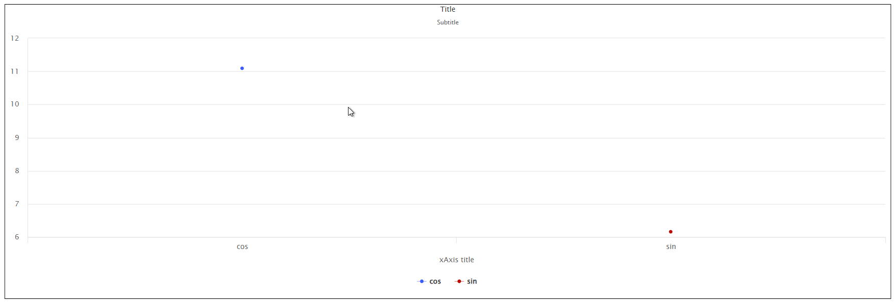
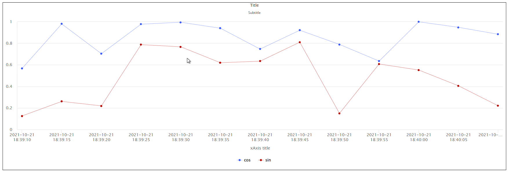
Chart
The Chart component graphically presents DataSets. The general procedure for configuring charts is to create DataSets and populate them with data in a format that the chart can support. Series can then be added to the chart and associated to a dataset. Charts offer the following configuration properties:
- Styles:
- Legend: Legend-related style properties.
- Show: Show/hide legend.
- Legend font size: Font size for legend labels.
- Label color: Label text color
- Disabled color: Label text color when a series is disabled.
- Series: Series-related style properties.
- Tooltip enabled: Enables/disables the tooltip when hovering over a series.
- Tooltip font size: Font size for series border.
- Marker radius: Dot radius on data points when a series is a line or area type.
- Line width: Width of line when series is a line or area type.
- Border color: Border color for series that are a column or bar type.
- Border width: Border width for series that are a column or bar type.
- Title: Chart title style properties.
- Font size: Title font size.
- Color: Title font color.
- Subtitle: Subtitle style properties.
- Font size: Subtitle font size.
- Color: Subtitle font color.
- X axis: X axis related style properties.
- Chart lines width: Vertical chart line (coincident with data points) width.
- Chart lines color: Vertical chart line (coincident with data points) color.
- Line color: Separator line between x axis labels and series area color.
- Line width: Separator line between x axis labels and series area width.
- Tick spacing: Horizontal axis spacing between label ticks. Only applies to datetime types without a label alias.
- Force tick start: When True, a tick is forced at the start of the X axis.
- Force tick end: When True, a tick is forced at the end of the X axis.
- Title font size: Text size of X axis title.
- Labels font size: Text size of X axis labels.
- Text color: Text color of X axis title and labels.
- Y axis: Y axis related style properties.
- Align lines: When True, automatically aligns horizontal grid lines from different series. Must be properly coordinated with Y axis Tick count configuration.
- Axis spacing: Spacing between multiple axes.
- Title font size: Text size of all Y axis titles.
- Labels font size: Y axis label text size.
- Legend: Legend-related style properties.
- Zoom:
- Enabled: When enabled, Zoom functionality will be enabled for the chart
.gif) Note:This feature is available from N3uron version 1.22.0
Note:This feature is available from N3uron version 1.22.0
- Enabled: When enabled, Zoom functionality will be enabled for the chart
- Chart: Configuration properties for the chart.
- Title: Chart title.
- Subtitle: Chart subtitle.
- X Axis: X axis configuration options.
- Text alias: Text alias allows users to display labels instead of values. The first label corresponds to 0 and increments by one for each label in the list. There are 3 ways to define the label list:
- Comma-separated list. Example: Jan,Feb,Mar,Apr alias to values 0,1,2,3
- Array in an expression. Example: =[“Jan”,“Feb”,“Mar”,“Apr”]; alias to values 0,1,2,3.
- Array in an expression with value-label pairs. Example: =[[10, “Jan”],[20, “Feb”],[30, “Mar”],[40, “Apr”]; alias to values 10,20,30,40.
- Title: X axis title.
- Minimum: Sets the minimum value of the X axis, hiding smaller values.
- This option will only be applied when the x axis is a Datetime type or the Text alias field is empty.
- <null> or empty for an automatic limit.
- Maximum: Sets the maximum value of the X axis, hiding larger values.
- This option will only be applied when the x axis is a Datetime type or the Text alias field is empty.
- <null> or empty for an automatic limit.
- Type: There are two X axis types available.
- Text alias: Text alias allows users to display labels instead of values. The first label corresponds to 0 and increments by one for each label in the list. There are 3 ways to define the label list:
- Datetime: X axis values are timestamps and labels are formatted timestamps.
- Categories: A category will be defined for each series, which will include the total cumulative value of the entire series.
- Shared Y axis: Y axis configuration options. As the name suggests, properties are shared between all the series sharing the base Y axis. A series can have its own Y axis, which when set in this way, will share these same properties for configuring the Y axis.
- Text alias: Text alias allows users to display labels instead of values. The first label corresponds to 0 and increments by one for each label in the list. There are 3 ways to define the label list:
- Comma separated list. Example: Jan,Feb,Mar,Apr alias to values 0,1,2,3
- Array in an expression. Example [“Jan”,“Feb”,“Mar”,“Apr”]; alias to values 0,1,2,3.
- Array in an expression with value-label pairs. Example: =[[10, “Jan”],[20, “Feb”],[30, “Mar”],[40, “Apr”]; alias to 10values,20,30,40.
- Values: Y axis value configuration.
- Minimum: Sets the Y axis minimum value, hiding smaller values.
- <null> or empty for an automatic limit.
- Maximum: Sets the Y axis maximum value, hiding larger values.
- <null> or empty for an automatic limit.
- Minimum: Sets the Y axis minimum value, hiding smaller values.
- Padding: Y axis spacing configuration.
- Minimum: Add extra spacing at the start of the axis. Value is expressed as a percentage (a value of 0.05 corresponds to 5%). For an axis ranging from 0 to 100, a value of 0.05 makes the start value -5 instead of 0.
- If Tick Force start is set to True, the actual start will be moved to fit the tick count.
- Maximum: Add extra spacing at the end of the axis. Value is expressed as a percentage (a value of 0.05 corresponds to 5%). For an axis ranging from 0 to 100, a value of 0.05 makes the end value 105 instead of 100.
- If Tick Force end is set to True, the actual end will be moved to fit the tick count.
- Minimum: Add extra spacing at the start of the axis. Value is expressed as a percentage (a value of 0.05 corresponds to 5%). For an axis ranging from 0 to 100, a value of 0.05 makes the start value -5 instead of 0.
- Ticks: Ticks related configuration.
- Count: Number of ticks on this axis. Ignored if Text alias has been set. If set to a specific number, align lines will not work as expected unless all axes are set to the same tick count.
- If the value is left empty, ticks will be selected automatically, otherwise, the number of ticks will be displayed. The minimum permitted is 2 ticks, which corresponds to both minimum and maximum.
- Force start: When set to True, a tick will be forced at the start of the axis.
- Force end: When set to True, a tick will be forced at the end of the axis.
- Count: Number of ticks on this axis. Ignored if Text alias has been set. If set to a specific number, align lines will not work as expected unless all axes are set to the same tick count.
- Style: Specific styles for each Y axis.
- Chart lines width: Width of the grid lines associated to this axis. Input 0 to hide.
- Chart lines color: Color of the grid lines associated to this axis.
- Axis line width: Width of vertical grid lines. Input 0 to hide.
- Axis line color: Color of vertical grid lines.
- Text color: Color of axis title and labels.
- Text alias: Text alias allows users to display labels instead of values. The first label corresponds to 0 and increments by one for each label in the list. There are 3 ways to define the label list:
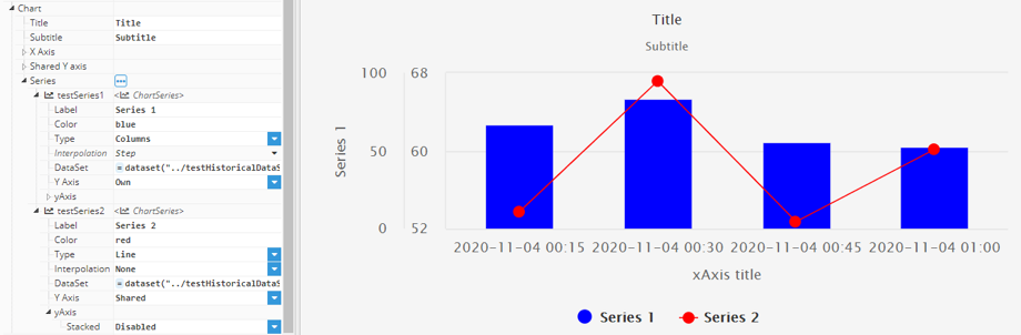
The Chart component defines data based on a series; each series is defined as a sub-element of a chart inside an instance list labeled as “Series”. Each series has multiple configuration properties, which define its behavior and appearance.
- Label: Series label.
- Color: Series color.
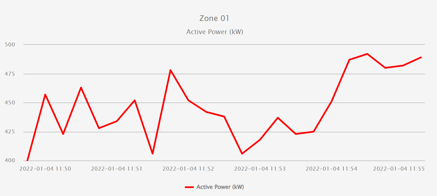
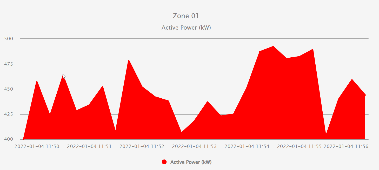
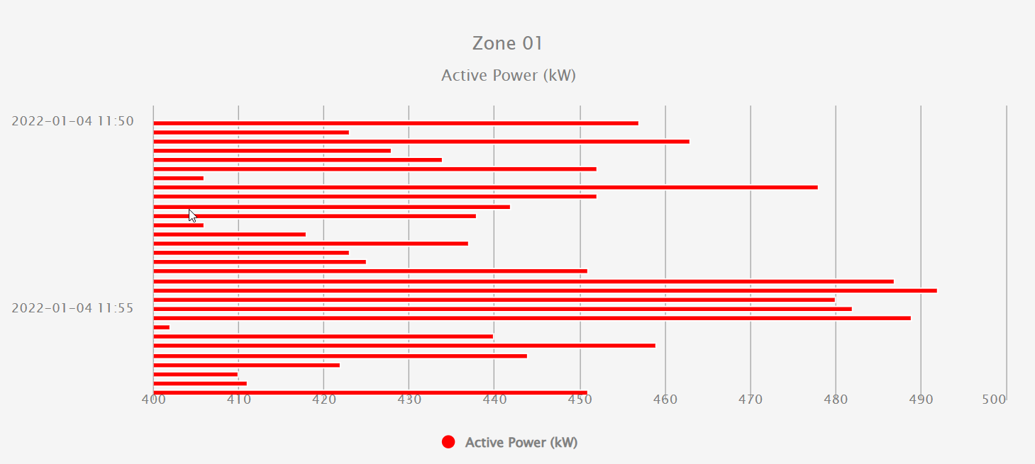
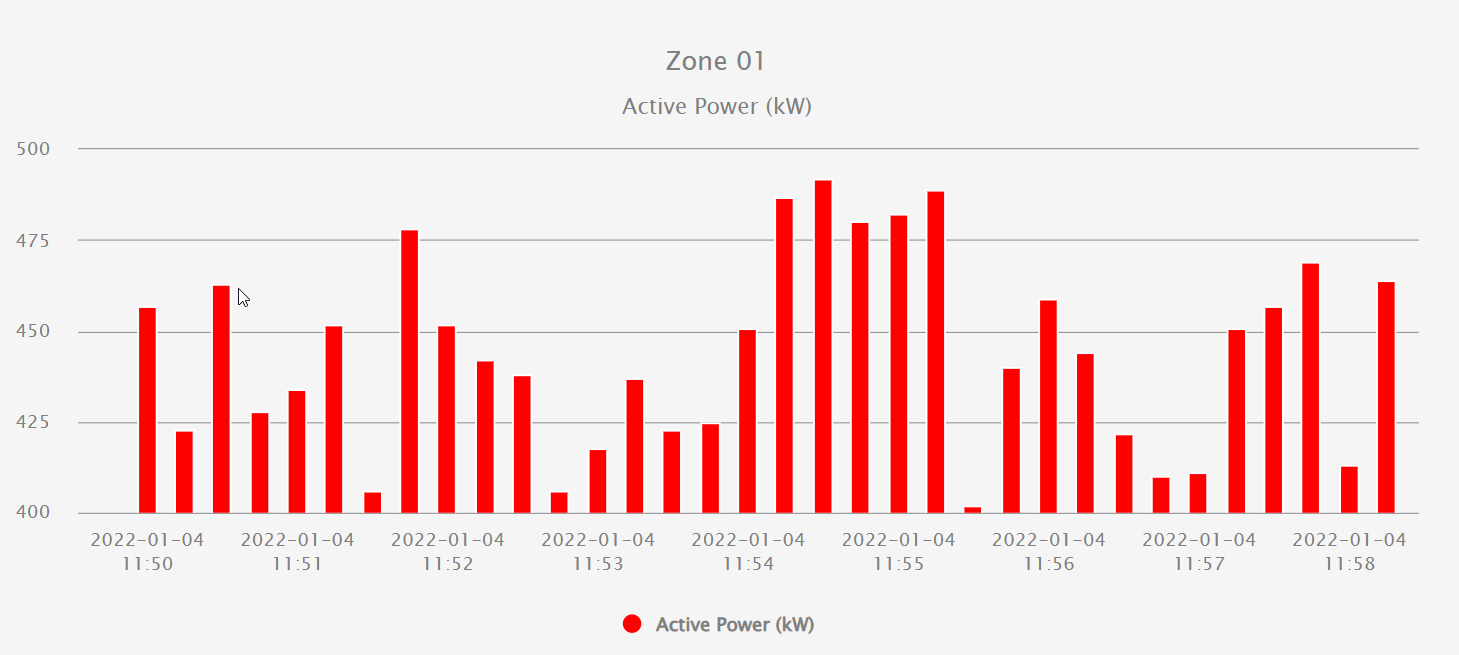
- Type: Series type; can be Line, Area, Bar or Column, as seen in the below images.
- Interpolation: Draw series with a stepped line.
- DataSet: Series data in dataset format.
- Y axis:
- Shared: Series shares Y axis with other series.
- Own: Series uses its own Y axis.
- yAxis: Y axis options based on Y axis type.
- Shared:
- Stacked: When enabled, values of this series will be stacked with other stacked series.
- Own: Includes the same properties as the Shared Y Axis properties group.
- Shared:
ScatterChart
The ScatterChart component displays data points on a two-dimensional chart using X and Y values. It is used in Web Vision to visualize relationships, distributions, correlations, or trends between two numeric variables.
While charts are used to represent the progression of values over time, scatter charts represent points of data pairs using two numeric values: one for the X axis and one for the Y axis. It is useful when the main goal is to analyze the relationship between two variables. For example, comparing OEE with the actual production rate in pieces per minute.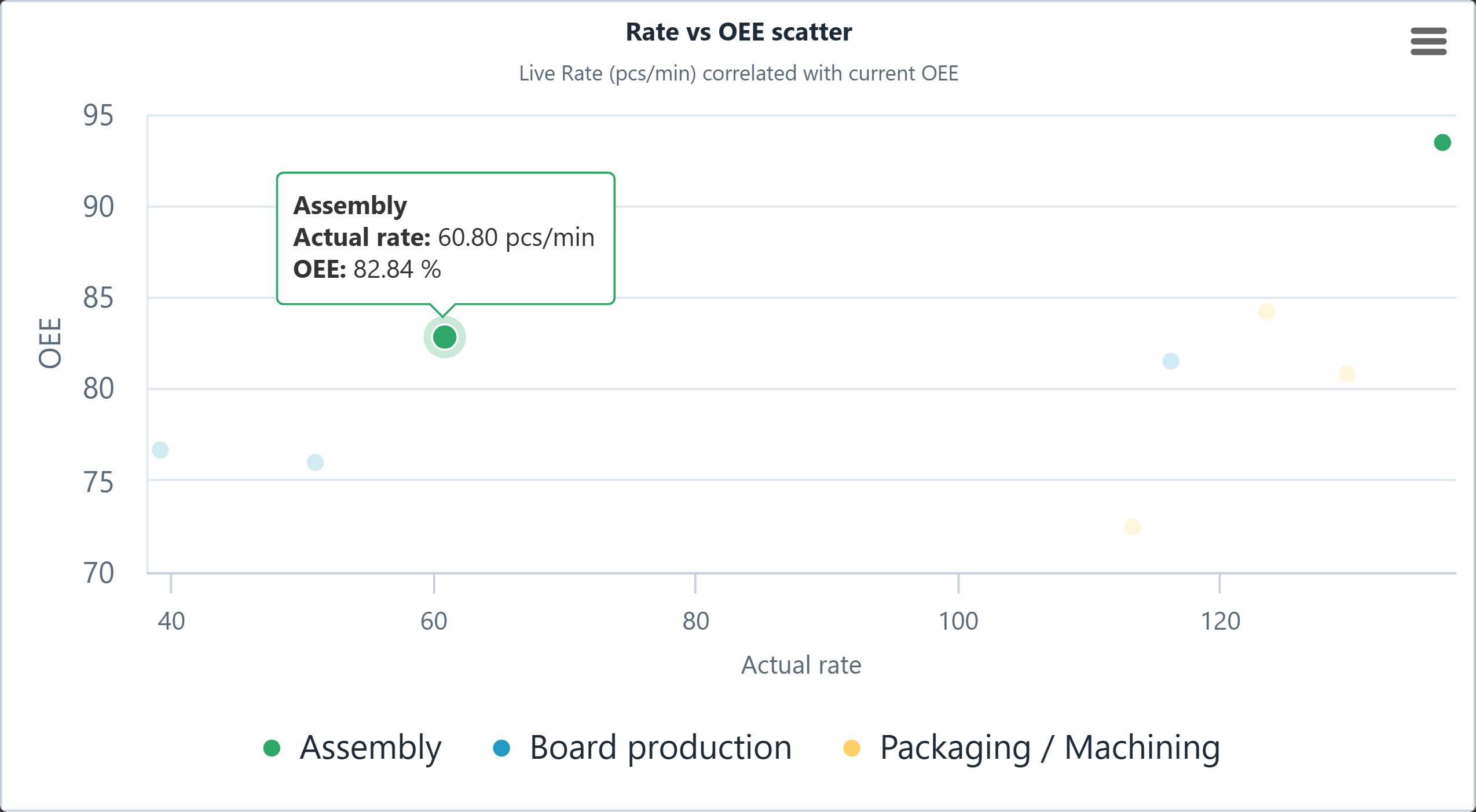
Each point in the chart represents one data item. The horizontal axis defines the X value, while the vertical axis defines the Y value. This makes the component suitable for comparing process values, performance indicators, measurements, or dataset-based information.
- Style:
- Data Labels:
- Enabled: If enabled, the specific value of every data point is displayed on the chart.
- Font Size: Character size of data labels on the chart.
- Font Family: Defines typeface for data labels usinc CSS font-family of data labels on the chart .
- Color: Defines the color of the data labels on the chart.
- Data Labels:
- ScatterChart: Configuration properties for the chart.
- Series:
- Dataset: Series in scatter charts match pairs of values in a single point of the chart, making conventional datasets to pair values on the list with their timestamp on each point. To represent two different values on each point, datasets must have the structure dataset([[x1,y1], [x2,y2], ..., [xn,yn]]), where each x and y represents individual values of the list of values to be represented, matched on pairs following the criterial required on the chart. Derived tags are suggested to simplify the generation of the dataset.
- Shared Y Axis:
- Jitter Y: Specifies the amount of vertical random dispersion applied to data points when sharing Y-axis.
- Series:
Heatmap
A heatmap visual component displays data in a graphical format, typically representing values through colors on a grid. It's commonly used to visualize and analyze data patterns, especially in large datasets. Heatmaps offer an intuitive way to identify trends, correlations, and outliers within the data by providing a visual representation of data density or intensity across different categories or dimensions. Heatmaps offer the following configuration properties:
Styles:
- Legend: Legend-related style properties.
- Show: Show/hide legend.
- Align: Options for alignment of the legend; Bottom, Right and Left.
- Color:
- Low color: The color assigned to the lowest value and will interpolate up to the color in High color.
- High color: The color assigned to the highest value and will interpolate down to the color in Low color.
- Low value: The lowest value assigned to the Low color. Set empty to calculate it automatically based on the series data.
- High value: The highest value assigned to the High color. Set empty to calculate it automatically based on the series data.
- Series: Series-related style properties.
- Tooltip enabled: When enabled the series tooltip is shown in mouse hover.
- Tooltip font size: Text size inside the series tooltip.
- Border color: Series border color. Can be any valid CSS color name or code, for example red, #FF0000 or RGB(255,0,0).
- Border width: Series border width. Zero or empty to hide.
- Title: Heatmap title style properties.
- Font size: Text size for the title.
- Color: Text color for the title.
- Subtitle: Heatmap subtitle style properties.
- Font size: Text size for the subtitle.
- Color: Text color for the subtitle.
- X axis: X axis related style properties.
- Line color: Horizontal axis line color.
- Line width: Horizontal axis line width.
- Tick spacing: Horizontal axis spacing between label ticks. Only applies to datetime types without a label alias.
- Force tick start: When Yes, a tick is forced at the start of the X axis.
- Force tick end: When Yes, a tick is forced at the end of the X axis.
- Title font size: Text size of X axis title.
- Labels font size: Text size of X axis labels.
- Text color: Text color of X axis title and labels.
- Y axis: Y axis related style properties.
- Title font size: Text size of all Y axis titles.
- Labels font size: Y axis label text size.
- Axis line width: Width of vertical gris lines. Input 0 to hide.
- Axis line color: Color of vertical grid lines. Can be any valid CSS color name or code, for example: red, #FF0000 or RGB(255,0,0).
Heatmap:
- Title: Actual text of the Heatmap's title.
- Subtitle: Actual text of the Heatmap's subtitle.
- X axis:
- Text alias: Text alias allows users to display labels instead of values. The data values will be converted to the corresponding labels. There are 3 ways to define the label list:
- Comma-separated list. Example: Jan, Feb, Mar, Apr alias to values 0, 1, 2, 3, so the dataset with a value 1 for this axis will be shown as Feb instead.
- Array in a expression. Example: =["Jan","Feb","Mar","Apr"; alias to values 0, 1, 2, 3, so a dataset with a value 2 for this axis will be shown as Mar instead.
- Array in an expression with pairs-value-label. Example: =[[10,"Jan"],[20,"Feb"],[30,"Mar"],[40,"Apr"]]; alias to values 10,20,30,40, so a dataset with a value 10 for this axis will be shown as Jan instead.
- Title: X axis title.
- Minimum: Sets the minimum value of the X axis, hiding smaller values. This option will only apply in case the X axis is of type Datetime or Text alias field is empty. <null> or empty for automatic limit.
- Maximum: Sets the maximum value of the X axis, hiding smaller values. This option will only apply in case the X axis is of type Datetime or Text alias field is empty. <null> or empty for automatic limit.
- Text alias: Text alias allows users to display labels instead of values. The data values will be converted to the corresponding labels. There are 3 ways to define the label list:
- Y axis:
- Text alias: Text alias allows users to display labels instead of values. The data values will be converted to the corresponding labels. There are 3 ways to define the label list:
- Comma-separated list. Example: Jan, Feb, Mar, Apr alias to values 0, 1, 2, 3, so the dataset with a value 1 for this axis will be shown as Feb instead.
- Array in an expression. Example: =["Jan","Feb","Mar","Apr"; alias to values 0, 1, 2, 3, so a dataset with a value 2 for this axis will be shown as Mar instead.
- Array in an expression with pairs-value-label. Example: =[[10,"Jan"],[20,"Feb"],[30,"Mar"],[40,"Apr"]]; alias to values 10,20,30,40, so a dataset with a value 10 for this axis will be shown as Jan instead.
- Title: Y axis title.
- Text alias: Text alias allows users to display labels instead of values. The data values will be converted to the corresponding labels. There are 3 ways to define the label list:
- Series:
- Active: Active or deactivate the series.
- Label: Text for the series label.
- Dataset: Data loaded for this series.
- Events:
- Click: Event triggered when this series in clicked over the chart plot area.
- Click: Event triggered when this series in clicked over the chart plot area.
Datasets: The Heatmap component allows access to a list of datasets, which can be added without limitation to this section.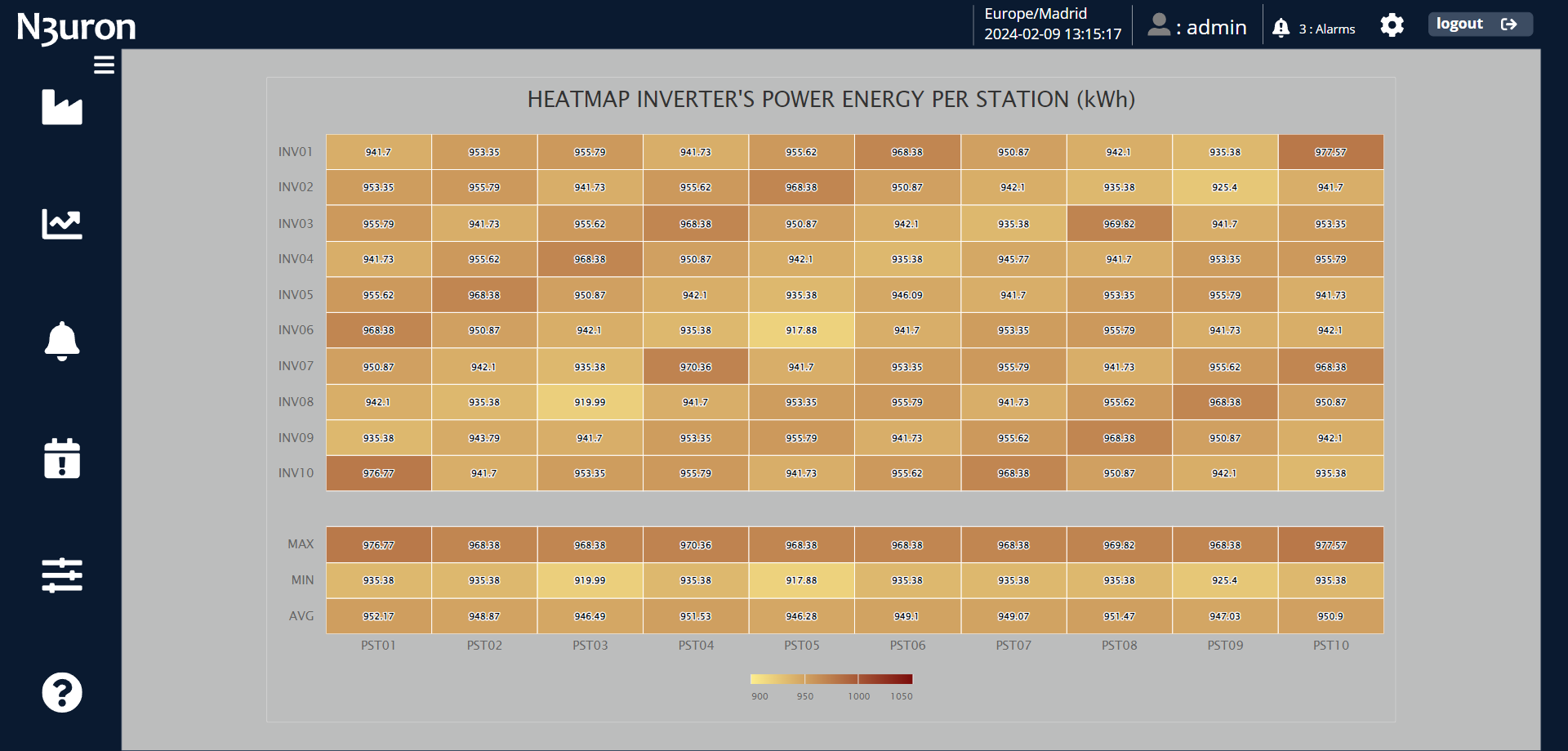
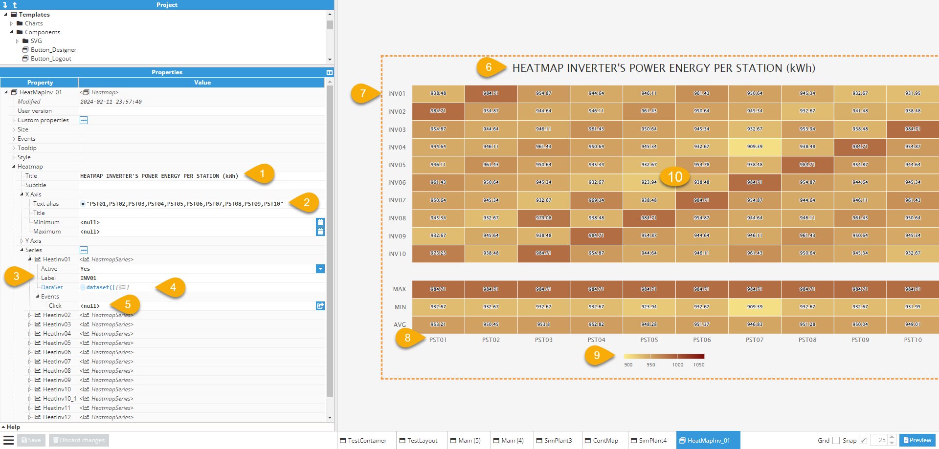
- Heatmap's title. In this example; "HEATMAP INVERTER'S POWER ENERGY PER STATION (kWh)
- Text alias for the X axis. In this example; ="PST01,PST02,PST03,PST04,PST05,PST06,PST07,PST08,PST09,PST10".
- Label of the series. In this example; INV01, INV02, INV03, INV04, INV05, INV06, INV07, INV08, INV09, INV10.
- For the dataset of the series, consider the image below, illustrating the first series in this example.
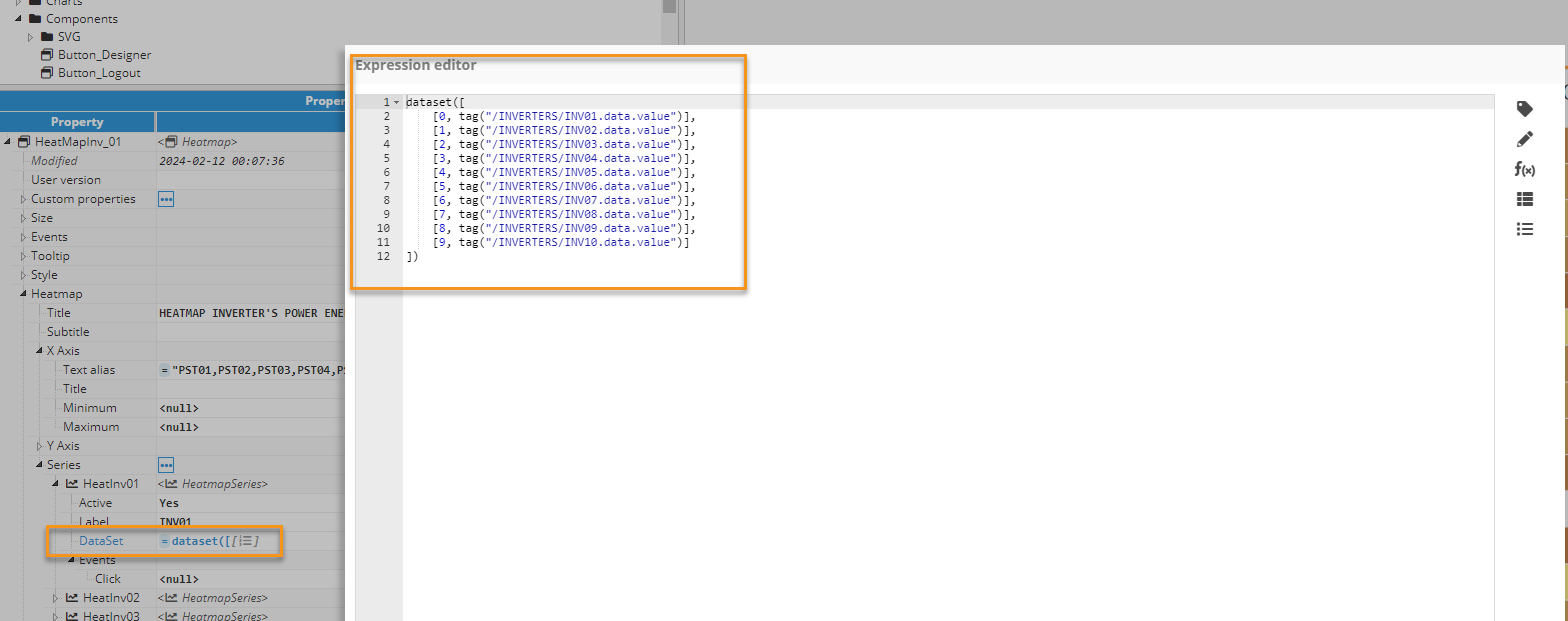
- Field to specify the action event triggered when the series is clicked in the Heatmap's series. In this example, this feature is not utilized.
- Heatmap title displayed in the visualization area.
- Series labels displayed in the visualization area.
- X-axis text aliases displayed in the visualization area.
- Legend displayed in the visualization area.
- Heatmap values with their corresponding interpolated color displayed in the visualization area.
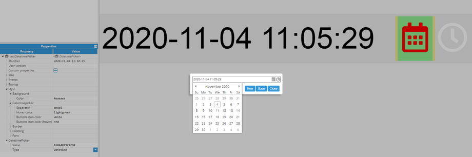
Datetime picker
The Datetime Picker component uses a calendar to select the date and time. Once clicked, a popup will open with a date and time selector available as helpers. The DatetimePicker section contains specific configuration for this component:
- Style:
- Separator: Color of the separator between the calendar and clock buttons.
- Hover color: Color of the separator between the calendar and clock buttons.
- Buttons icon color: Color of the separator between the calendar and clock buttons.
- Buttons icon color (hover): Calendar button icon color when hovering.
- DatetimePicker:
- Value: Displays selected time in epoch format using milliseconds. This format makes this value easier to use in other calculations.
- Type: Allows users to select one of the following options:
- Datetime: Select date and time.
- Date: Select date only.
- Time: Select time only.
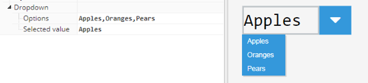
Dropdown
A dropdown component is used to create a list of choices, where only one can be selected at a time. The specific options for this component are listed in the Dropdown section:
- Options: Comma-separated list with all required options. For instance, Apples, Oranges, Pears.
- Selected value: Contains the current selected value. Automatically updates anytime the user chooses a value from the dropdown. If this value is already written, the new value assigned will also be shown in the dropdown as the selected value.
Ellipse
An ellipse component is used to draw a generic ellipse or a circle, providing that the width and height are equal. There is an Ellipse subsection inside the Style section, which includes the following specific properties:
- Fill color: Color of the area inside the ellipse. This value supports any valid HTML/CSS color name, HEX code or RGB code. For more detailed information, see the Color section of this manual.
- Line width: Width in pixels.
- Line color: Color of the line. For more detailed information, see the Color section of this manual.
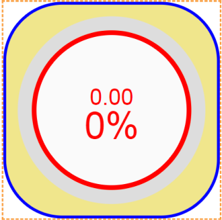
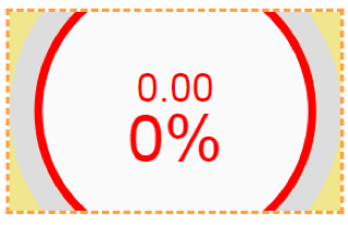
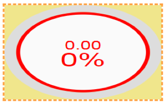
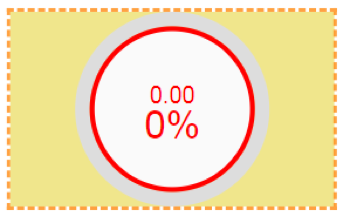
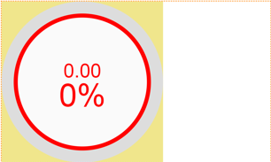
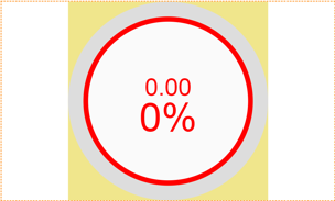
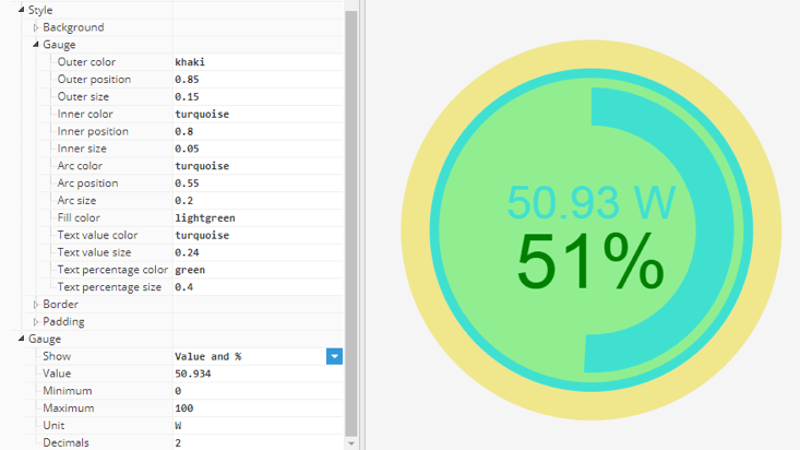
Gauge
A gauge is a visual component that can be used to show the value of a numeric tag. Gauge has multiple configuration properties:
- Style:
- Outer color: Outer circle color.
- Outer position: Outer circle position in a radius percentage from 0 to 1.
- Outer size: Outer circle size in a radius percentage from 0 to 1.
- Inner color: Inner circle color.
- Inner position: Inner circle position in a radius percentage from 0 to 1.
- Inner size: Inner circle size in a radius percentage from 0 to 1.
- Arc color: Arc color.
- Arc position: Arc position in a radius percentage from 0 to 1.
- Arc size: Arc size in a radius percentage from 0 to 1.
- Fill color: Fill (interior) color.
- Text value color: Text value (upper) color.
- Text value size: Text size (upper) relative to radius.
- Text percentage color: Text percentage (lower) color.
- Text percentage size: Text size (lower) relative to radius.
- Gauge:
- Show: Determines whether the gauge will include the total value only, the percentage, or both.
- Value: Current gauge value. Value will be shown on the gauge as an arc.
- Minimum: Minimum value for permitted range of values. Values below this minimum will result in a negative percentage.
- Maximum: Maximum value for permitted range of values. Values above this maximum will result in percentages higher than 100%.
- Unit: Unit displayed alongside the value.
- Decimals: Number of decimals displayed. If the value has fewer decimals than the selected quantity, the value will automatically be filled with zeros.
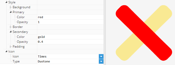
Icon
The icon component inserts any of the 1850 icons from Font Awesome 5.13.0 (except brand icons). The entire list can be found at https://fontawesome.com/v5.13.0/icons?d=gallery. The color of the icon can be configured in the Styles section, while the specific configuration for this component can be found in the Icon section:
- Icon: Name of the icon, as per Font Awesome. The drop-down contains just a few example icons but the name of any other icon from Font Awesome version 5.13.0 can also be used.
- Type: Allows users to choose from four icons in different styles (solid, regular, light and duotone). If duotone is selected, new options will be available in the style properties group. Duotone is also available for all elements with configurable icons, such as Tree.
- Primary: Primary component style configuration.
- Color: Primary color.
- Opacity: Primary opacity
- Secondary: Secondary component style configuration.
- Color: Secondary color.
- Opacity: Secondary opacity.
- Primary: Primary component style configuration.
Image
This component inserts images onto the screen. Supported image formats are .jpg, .png,.svg and gif.
Input
An input component is a text box in which the user can enter a value. When using events associated to this component, the inserted value can be written to a tag or used to change a property in another component.
Label
This component can display any text or value. In this way, its value can be linked to a tag to display any of its properties, such as value, quality, or timestamp.
Line
This component inserts lines onto the screen. The line is defined by the coordinates of the start and end point. Each coordinate is relative to the line container and can be expressed in pixels or as a percentage of the container.
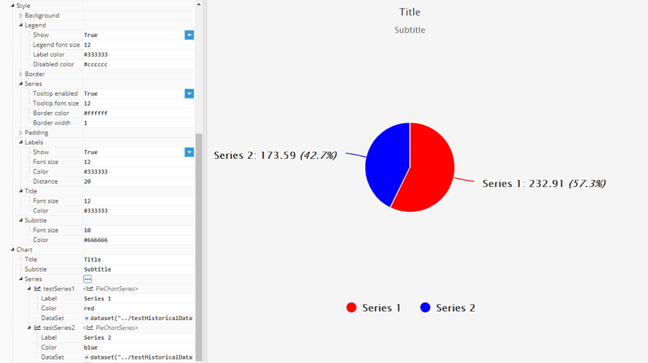
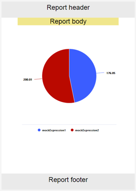
Pie chart
Pie chart displays data as a circular chart divided into different sections, each representing a series, much like the Chart series. The value of these sections is the sum of the total values in the dataset that has been configured in the corresponding series dataset field. Pie charts include the following properties.
- Style:
- Legend:
- Show: Show/hide legend.
- Legend font size: Legend text size in pixels.
- Label color: Legend labels text color.
- Disabled color: Legend labels text color for disabled series.
- Series:
- Tooltip enabled: Enable/disable tooltip when hovering.
- Tooltip font size: Text size for tooltip.
- Border color: Series border color.
- Border width: Series border width.
- Labels: Data labels are labels that are attached to every chart sector to display the series name and value
- Show: Show/hide labels.
- Font size: Labels text size.
- Color: Labels text color.
- Distance: Distance between the chart labels and border. Negative values can be used to place the label inside the chart.
- Title:
- Font size: Title text size in pixels
- Color: Title text color.
- Subtitle:
- Font size: Subtitle text size in pixels.
- Color: Subtitle text color.
- Chart:
- Title: Title displayed as text.
- Subtitle: Subtitle displayed as text.
- Legend:
A Series contains the data represented in each pie chart section. It includes the following configuration properties.
- Label: Series name displayed on the data labels, tooltip and legend.
- Color: Series color.
- DataSet: Series data in dataset format.
Realtime table
This component inserts a table containing the current values from multiple tag properties and shares all the same styles as the Alarm table component. It includes the following specific configuration properties:
- Path: The path to the group of tags to be included in the table. Does not include sublevels.
- Path Filter: Regex filter to be applied to the full tag path.
- Sublevels: When activated, includes tags inside child groups.
- Multiselection: Enables multiselection.
- Show full path: When enabled, the tag name displays the full tag path.
- Selected: Indicates current rows path selection in a comma-separated list.
As for Alarm tables, the Realtime table also includes a columns properties group, which allows users to show/hide individual columns.
Realtime tag
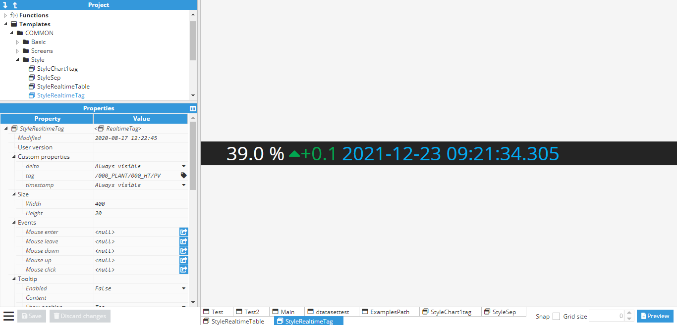
This component is an easy way to show the value of a tag alongside its timestamp and delta indicator. It has the following configuration properties.
- Styles: Realtime tag color configuration
- Delta color increment: Color for the delta, when positive.
- Delta color decrement: Color for the delta, when negative.
- Timestamp color: Timestamp color.
- Error color: Color of error messages. For example, when trying to display a non-existent tag.
- Tag: Tag configuration options.
- Path: Refers to the path of the tag.
- Delta timeout: Time the delta value is displayed for after each change, in milliseconds (“null” or empty to hide, 0 to remain permanently visible).
- Timestamp timeout Time the timestamp value is displayed for after each change, in milliseconds (“null” or empty to hide. 0 to remain always visible).
- Timestamp position: Enables the user to select the timestamp position.
- Top: On top of the value.
- Bottom: Below the value.
- Left: To the left of the value.
- Right: To the right of the delta.
- Middle: Between the value and delta.
Rectangle
This component allows users to draw a rectangle or a square, providing that the width and height are equal. Rectangle allows the color and width of each side to be configured independently. Color can be configured inside the style properties group and width under the Rectangle properties group.
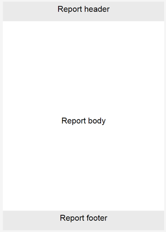
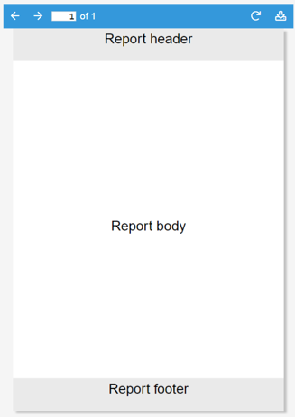
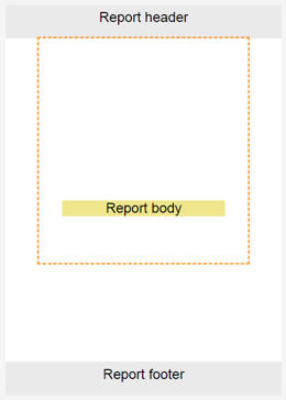
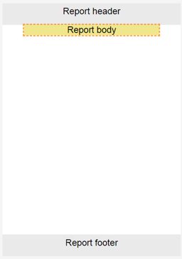
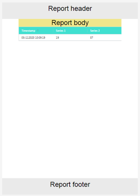
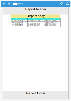
Report
This component allows users to create reports as representations of data inside WebVision.
- It is composed of sub elements called Report components.
- The main functionality of Report is to allow users to create a pdf file with an easily printable layout.
- Report size selection differs from other components, as it’s limited to a collection of standard paper sheet sizes. Whilst multiple pages are permitted in pdf mode, when in designer mode it is displayed as a continuous element with a viewport equal to the selected size.
- The internal components in Report are ordered inside layouts, which are organized into rows and columns, similar to a Layout container.
- It contains three sections, a header and footer that are repeated at the end and start of each page (when in pdf mode) and the body, which will occupy as many pages as necessary in order to display all components included in the report.
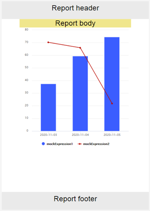
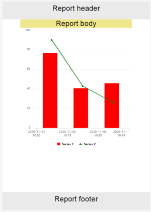
- In designer mode, all data displayed is mock data and is only used as a placeholder to allow users to design the report’s appearance and distribution. PDF mode displays real data.
- It also offers two related actions for generating and downloading PDFs from outside the report element.
- PDFs can only be generated in report instances. Report templates cannot be generated in this case.
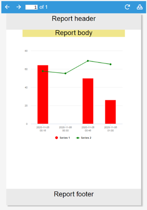
- PDFs are displayed in a pdf viewer, which allows page navigation, pdf generation and pdf download.
Report includes the following configuration properties:
- Style:
- Report background:
- Header color: Header background color.
- Body color: Body background color.
- Footer color: Footer background color.
- Report background:
- Format:
- Page: Dropdown with multiple paper sheet sizes, which are the only permitted report sizes.
- Time zone: The time zone displayed on any report components with timestamp representations.
- Fonts: This group of properties allows you to embed custom font files, enabling enhanced report styling and support for international character sets.
- Normal: Normal font to render the PDF. Defaults to Helvetica.
- Bold: Bold font to render the PDF. Defaults to Helvetica-bold.
- Italics: Italic font to render the PDF. Defaults to Helvetica-italic.
- Bold Italics: Bold italic font to render the PDF. Defaults to Helvetica-bold-italic.Note:Fonts properties are available from N3uron version 1.21.13.
- Margins: General report margins.
- Report: Top, right, bottom and left margins for report body. The top and bottom margins also define the header and footer height.
- Header: Top right, bottom and left margins from report header.
- Footer: Top right, bottom and left margins from report header.
- Report:
- Visualization: Visualization configuration allowing users to toggle between pdf and designer mode and configure the pdf viewer.
- Mode: Designer or pdf.
- Designer: The main function of this mode is to design the report layout. It’s very similar to the design for the Layout component, but only permits report components as children.
- Pdf: This mode offers a pdf viewer for PDFs to be generated using the elements added in designer mode.
- Generate on show: Allows reports to be generated when first shown. For example, a report instance inside a container would be generated when the container was shown.
- Pdf header: Pdf viewer header configuration
- Hide reload: Hide/show pdf load/reload button.
- Hide download: Hide/show pdf download button.
- Pdf style: Pdf viewer styles configuration.
- Header text color: Header text color
- Header background color: Header background color.
- Mode: Designer or pdf.
- Header: Instance list where the header elements will be created.
- Visualization: Visualization configuration allowing users to toggle between pdf and designer mode and configure the pdf viewer.
Report components
There are three instance lists within the Report, which behave similarly to the components instance list inside containers, although they do not accept the same elements. Instead, they support a specific set of elements known as report components.
Common properties
All report components share some properties.
Width
Defines element width. If null, the entire available width will be occupied. If the sum of all widths in the row is larger than the page width, the elements will overflow. Only width is available as a general property, as height is a free element, meaning that it can occupy as much height as necessary.
Format
Much like the General Report, Format defines the element margins, allowing spaces to be set between the different elements to define the layout. Margins will be displayed graphically in designer mode using this selection.
Style
Default styles for all report components.
- Background color: Defines the element's background color. Even when the margin appears inside the element selection, it’s not considered element space, so the background will not be extended to it.
- Border:
- Border width: Width of the border line, in pixels.
- Border color: Border color.
Report layout
All report elements must be included as components in the report layout. The Report layout is very similar to that of a layout container. Although only the width can be controlled, the height will grow along with the component’s height. The report layout includes the following properties.
- Page break: Defines when the page break should be relative to the element. Fit page break will only break the page if the element does not fit inside the page.
- Direction: Defines whether elements are shown as elements of the same row or elements of the same column.
Report chart
Report chart graphically presents DataSets. The general procedure for configuring the chart is as follows:
- Create DataSets and populate them with data in a format that the report chart supports. Series should be added to the report chart and associated to a dataset.
- When no series has been added, mock series will be added as placeholders. These series will not show on the pdf.
Chart has the following configuration properties:
- Height: Unlike layout, table, and label, chart has a defined height.
- xAxis format:
- Datetime: X axis values are timestamps and labels are formatted timestamps.
- Categories: A category will be defined for every series, which will show the total cumulative value of the entire series.
- xAxis/yAxis text alias: Text alias allows users to display labels instead of values. The first label corresponds to 0 and increments by one for every label in the list. There are 3 ways to define the label list:
- Comma separated list. Example: Jan,Feb,Mar,Apr alias to values 0,1,2,3
- Array in an expression. Example =[“Jan”,“Feb”,“Mar”,“Apr”]; alias to values 0,1,2,3.
- Array in an expression with value-label pairs. Example: =[[10, “Jan”],[20, “Feb”],[30, “Mar”],[40, “Apr”]; alias to values 10,20,30,40.
- Series: Instance list where the series sub-elements will be instantiated.
Report chart series
Report chart series are Report chart sub-elements that define the properties of a series. Each series is shown as a succession of time points or as a category depending on the chart mode. It has the following properties.
- Label: Series label.
- Color: Series color.
- Chart type: Series type; can be Line, Area, Bar or Column, as seen in the following images:
- Stacked: When enabled, values of this series will be stacked with other stacked series.
- DataSet: Series data in dataset format.
Report image
This report component inserts images onto the screen. Supported Image formats are .jpg, .png, .svg and gif. Unlike layout, table, and label, Report image has a defined height.
Report label
Report label allows labels to be added to the report. Labels are just static text that can be added like any other report component. As per the label component, different font styles can be set.
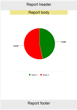
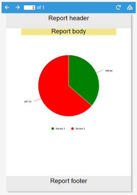
Report pie chart
Report pie chart displays data as a circular chart divided into sections, each representing a different series, much like the Report chart series. The value of these sections is the sum of the total value of the DataSets configured in the corresponding series dataset field.
- As per the Report chart, if no series have been added to the Report pie chart, mock series will be displayed as placeholders.
The Report pie chart includes the following properties:
- Height: Report pie chart height.
- Percentage: If true, displays data labels as percentages. If not, data labels are shown as absolute values.
- Label decimals: Number of decimals shown in data labels.
- Series: Instance list where the series sub-elements will be instantiated.
Report pie chart series
Report pie chart series are Report pie chart sub-elements that define the properties of a series. Each series is shown as a sector of the chart. It has the following properties:
- Label: Series label.
- Color: Series color.
- DataSet: Series data in dataset format.
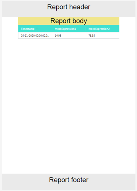
Report table
Report table allows the DataSets data to be displayed in a table format.
- As per the Report chart and Report pie chart, Report table uses series to show data.
- When no series exists, a placeholder will be shown. Placeholders will not be shown in pdfs.
- Each series is either a column or row of the table, depending on its configuration.
- In PDF mode, the table will occupy as much height as necessary.
Report table includes the following properties:
- Expressions as rows: When true, instead of showing as columns in the table, series will be displayed as rows, with the leftmost column set as the series name.
- Timestamp format: Timestamp format, as seen in the timestamp formatting appendix.
- Style:
- Font:
- Body text color: Text color for table body cells.
- Header text color: Text color for table header cells.
- Table background:
- Header color: Background color for header. Body color can be defined by the general report component background color.
- Font:
- Series: Instance list where the series sub-elements will be instantiated.
Report table series
Report table series are Report table sub-elements that define the properties of a series. Each series is displayed as a row or column of the table. It includes the following properties.
- Label: Series label.
- Value format: Value format based on the Sprintf format specification; more information can be found in the Sprintf format specification appendix.
- DataSet: Series data in dataset format.
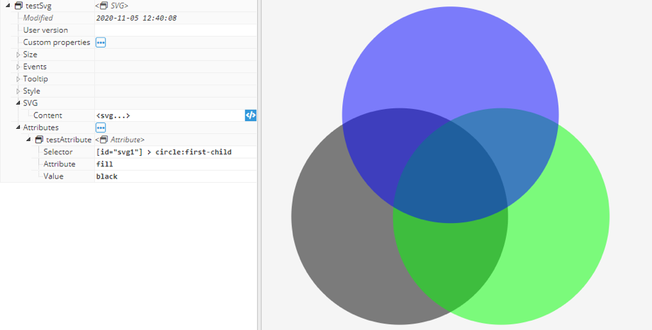
SVG
This is a powerful component that inserts any Scalable Vector Graphics (SVG) image onto the screen. This format is very convenient since it gradually resizes while maintaining quality. There are also many SVG graphics available online to avoid users having to create them from scratch.
To import an SVG into the project, users can copy the graphic code in the SVG section, or, it can be uploaded as a file using the expression editor helper.
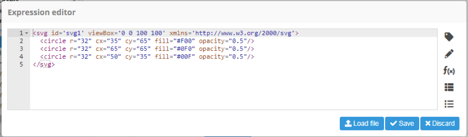
Once the SVG has been imported, the value of any attribute in the Attributes section can be changed.
- Selector: Selects the element within the SVG using the CSS selector syntax. More information about CSS selectors syntax is available in w3schools and examples.
- Attribute: Specifies the attribute to change.
- Value: Specifies the value for the attribute.
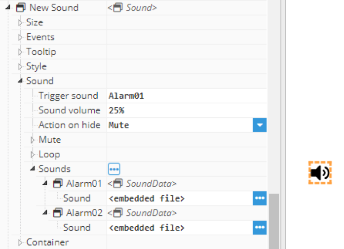
Sound
The Sound component enables audio playback in the client’s web browser. Each Sound component has one or more sound clips associated with it and plays that clip-on demand. There is a built-in triggering system, as well as specific facilities for looping the sound while the trigger is set. The sound clip can be any .mp3 or .m4a file. The clip will be embedded within the container where the sound player is located. Clients do not need access to a shared sound file. It includes the following properties:
- Trigger sound: When the content of this field matches the name of any of the sounds associated with this component (see sounds section below).
- Sound volume: The volume to use for playback, from 0% to 100%.
- Action on hide: Specifies the behavior of the component when the screen containing it is hidden. It’s important to note that the sound is loaded for the first time when its container is loaded, so it won’t play any sound until the screen containing it is loaded.
- Mute: Playback is muted while the container is hidden but will continue to play.
- Play: Playback continues while the component is hidden.
- Pause: Playback is paused while the component is hidden and resumed when shown again.
- Restart: Playback is stopped while hidden and re-started from the beginning when shown again.
- Mute: Different options for controlling the mute function.
- Mute: When True, clip is muted during playback.
- Unmute on trigger: When True, Mute returns to False in case a new sound is triggered (Trigger sound changes).
- Toggle mute on click: When True, the user can mute/unmute by clicking on the sound icon.
- Loop: Allows users to control clip playback.
- Loop count: How many times the sound is played when triggered. For continuous loop, set this parameter to 0.
- Loop delay: Time between reproductions in milliseconds.
- Sounds: List of clips added to the component. The sound is played when the name of the sound is added and the Trigger value sound matches. Sound clips may be .mp3 and .m4a.
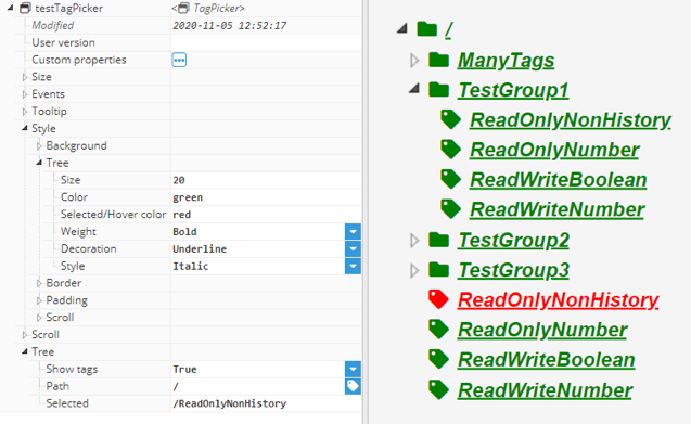
TagPicker
This component allows users to pick a tag from a tree. The tree is the tags hierarchy descendant for the selected tags group. It has the following properties.
- Styles:
- Size: Tree text and icon size.
- Color: Tree text and icon color.
- Selected/Hover color: Tree text and icon color when hovered over or selected.
- Weight: Allows font to be set to bold.
- Decoration: Allows lines to be added to text in multiple positions.
- Style: Allows text to be set to italics.
- Tree:
- Show tags: Allows tags to be shown/hidden. If hidden, only groups will be shown.
- Path: Root path of the Tags to be loaded.
- Filter: Regex filter. This will apply to the tag model, not to aliases.Note:This feature is available from N3uron version 1.21.5.
- Selected: Path of the current selected tag/group. If this property is filled with a valid path, the corresponding node will be selected inside the tree.
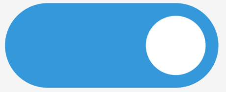
Toggle
The Toggle component represents a switch with two positions.
- Users can choose between different colors for selected and not selected options.
- The default color for selected switches is blue and grey when unselected.
- It can also be displayed with or without round borders and switches.
- The switch state on/off can be accessed using the checked property, inside the toggle group.

Tree
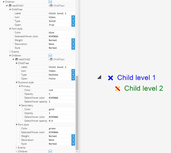
The Tree component defines a hierarchical view of information that can be configured to expand submenu branches and menu items. The sub-items can be expanded further to expose more sub-items if any exist or collapsed to hide sub-items. The typical use of a tree is to allow users to navigate pages within the graphical application. The current path selected can be obtained from the selected property.
The tree is built by recursively adding children. All nodes in the same level are ordered by the instance name. For each child created, the following options are available:
- ChildTree: Allows users to choose how each tree entry is presented.
- Hidden: Hide this node and its children from the tree.
- Label: Text shown on tree node.
- Icon: Icon shown on tree node. Has the same functionality as the Icon component.
- Type: Solid, Regular, Light or duotone. Has the same functionality as Icon component. If duotone is selected, duotone options will be shown.
- Open: Current tree node status open/closed. If saved, the tree will be loaded again. Node status will be the one in this property.
- Font style:
- Color: Text and icon color, unless icon type is duotone, in which case it will be configured inside duotone options.
- Selected/Hover color: Text and icon color in hover/select state, unless icon type is duotone, in which case it will be configured inside duotone options.
- Weight: Allows font to be set to bold.
- Decoration: Allows lines to be added to text in multiple positions.
- Style: Allows text to be displayed in italics.