Linking tags to a property
Some components such as the gauge component are used to display tag values, in order for this component to work in this way, the value of the component must be linked to the tag that will be displayed. Any tag property can be linked, not just the value. The below example links the tag value of a tag to the value of a gauge, the EU of the same tag to the EU of the gauge, and the quality of the tag to the quality of the gauge’s container.
Firstly, a gauge component should be created in the container. Once created, the value field should be selected and the input options button clicked to select the “link tag” option, as shown in the below screenshot:
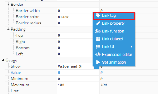 Figure 122: Link tag option
After clicking the link tag button, a popup will appear with a list of tags to link to:
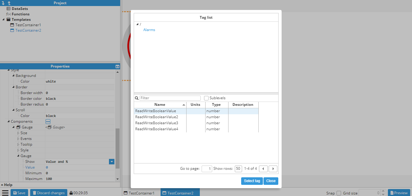 Figure 123: Tag selector
In this example, the tag is “/ReadOnlyNumber”. After selecting the tag, another popup allows users to select the property:
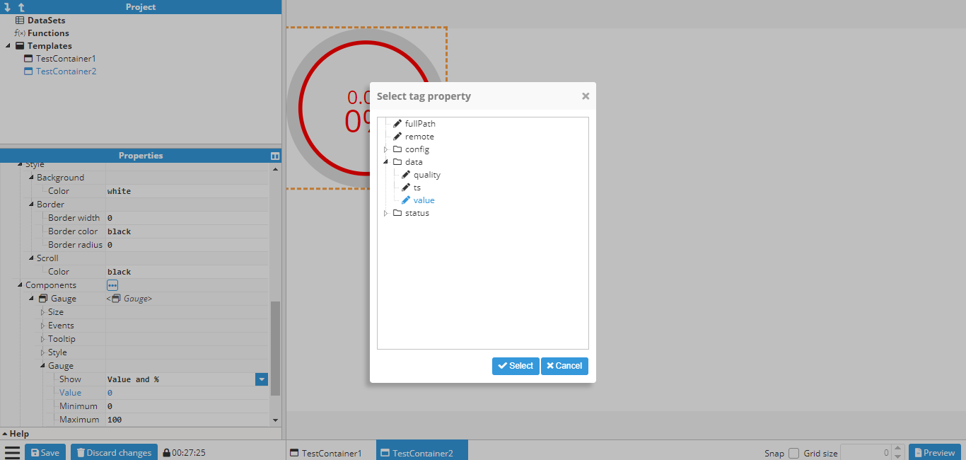 Figure 124: Tag property selector
After selecting the tag value, the value field changes to =tag(“/ReadOnlyNumber”), which is how a tag is linked internally (More information in Tag function).
Follow the same procedure to link the engineer units to the tag’s engineer units and the same for the quality section (located in the container section) in order to link the tag. The resulting gauge will look like this:
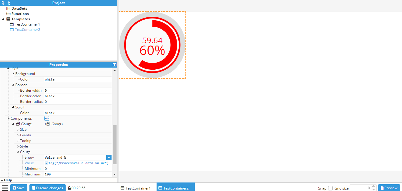 Figure 125: Final values after tag linking
Writing values to tags based on an event
The following screenshot shows the available events for an input component:
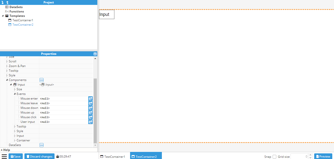 Figure 126: Writing values to tags based on an event
By clicking on the button indicated with an arrow, a popup is displayed to allow users to create actions for that event. In this case, for binding the User input event to a write tag action. By clicking on the “add action” button, a new popup will appear to allow the user to select which action to execute. In this case, write tag has been selected to bind the value to be written to input text:
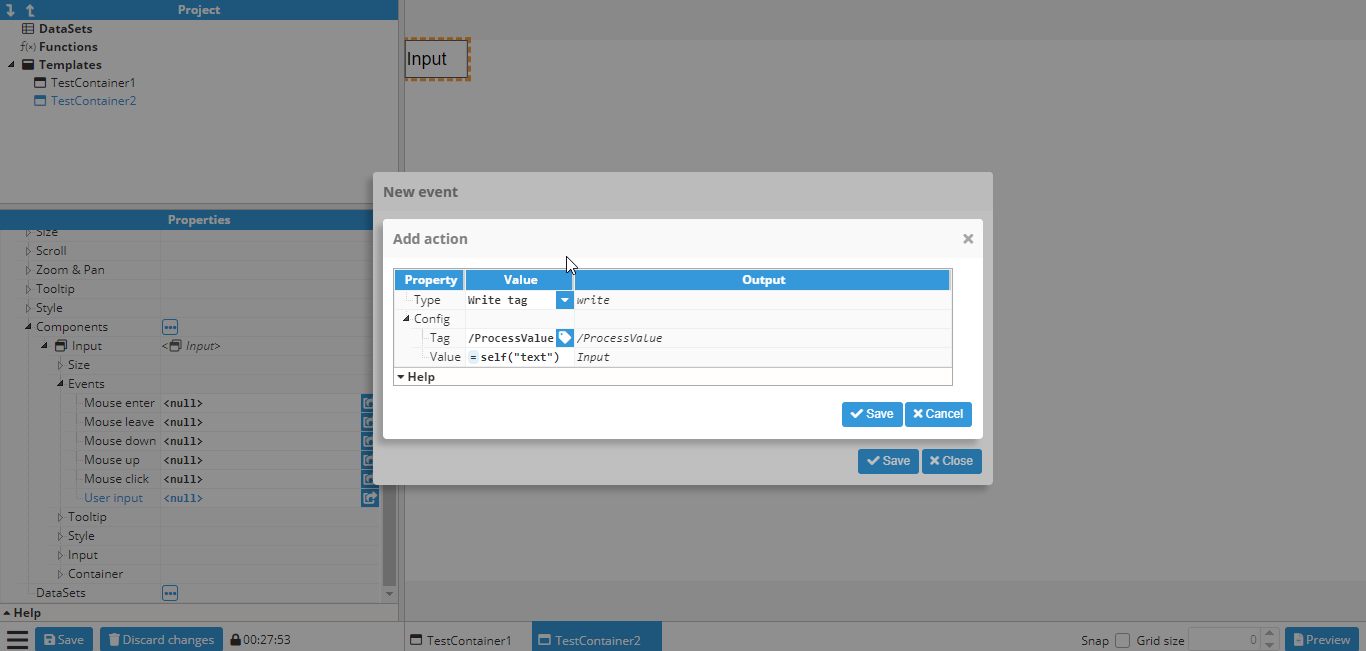 Figure 127: Popup
A write tag action is shown with “/ReadWriteNumber” as the tag and =self(“text”) as the value. More information about the “self” function can be found here.
Adding markers to a map
The following example adds fixed markers to a map, which will always remain in the same coordinates regardless of the map’s pan or zoom settings.
Firstly, a map container should be created and if needed, the initial longitude, latitude and zoom levels should be set up.
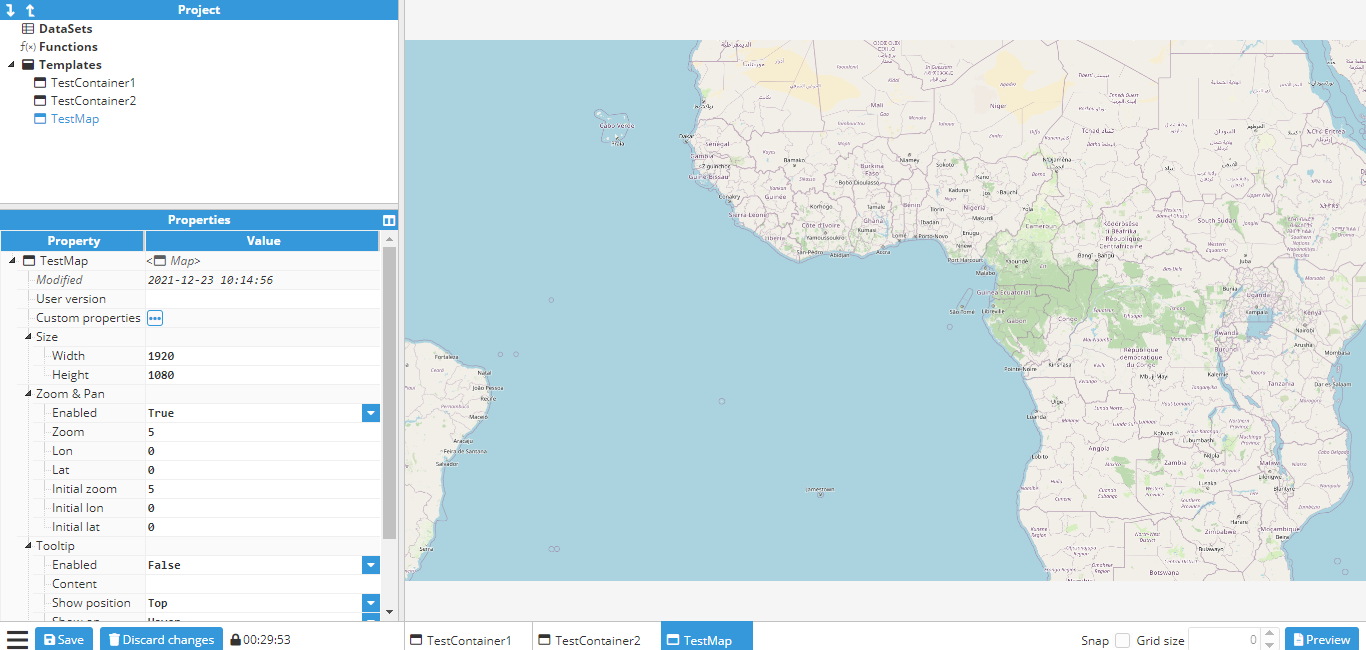 Figure 128: Creating a map
Next, the markers are created. This requires the use of an Icon component, since an icon called a marker is available to use, which is perfect for this purpose. When creating new components, the origin is set to (0,0) by default, which means that it will be positioned using the top left corner as the reference point. Since the bottom of the marker needs to be fixed in position, the origin must be changed to the bottom center, which is (0.5, 1). The marker is now placed in its final location, which in this case is Madrid.
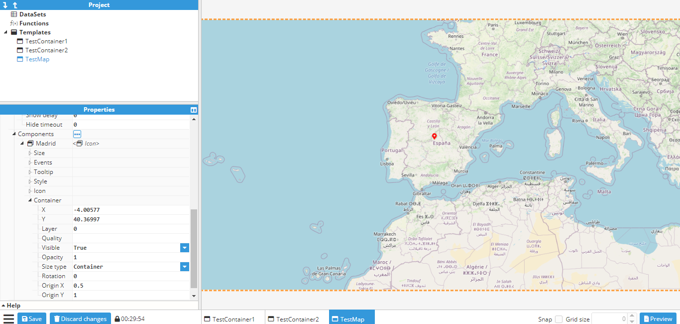 Figure 129: Creating a Madrid marker
The icon can be duplicated by either right clicking and selecting duplicate, or alternatively, clicking on the icon, using CTRL+D and then placing it in the new coordinates. To finish this example, two more markers are created; one in Berlin and one in London. The final map will be as follows:
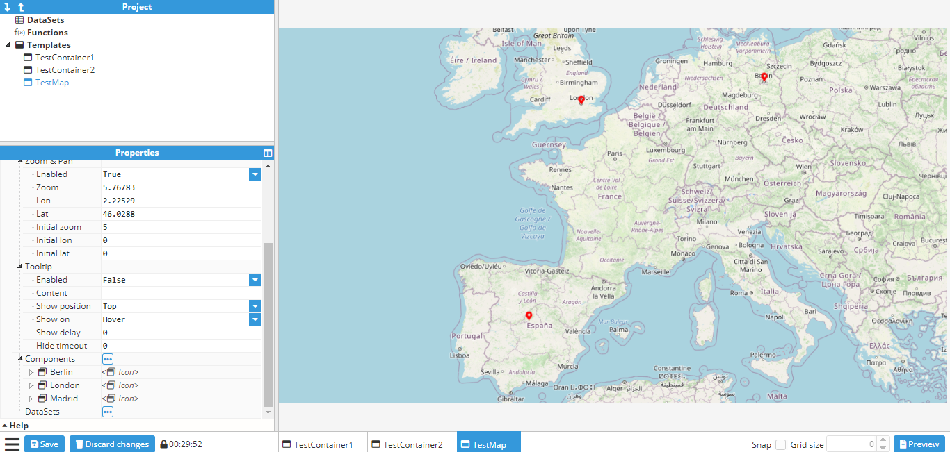 Figure 130: Final map
By default, these markers won’t do anything. However, just like any other component, events can be attached to them and as such, markers can be used to display a popup (as seen in the Creating a parameterized popup).
Click to display popup
This example shows how to create a popup with a gauge that can be opened and closed by pressing a button. In order to do this, the first step is to create a popup template by creating a new empty container of 500x500 pixels and then adding a gauge and label inside of it. The gauge will point to a tag called /ReadOnlyNumber, which in this example is a memory tag. The label will display the tag name.
The properties of the container, gauge, and label can be seen in the following screenshots:
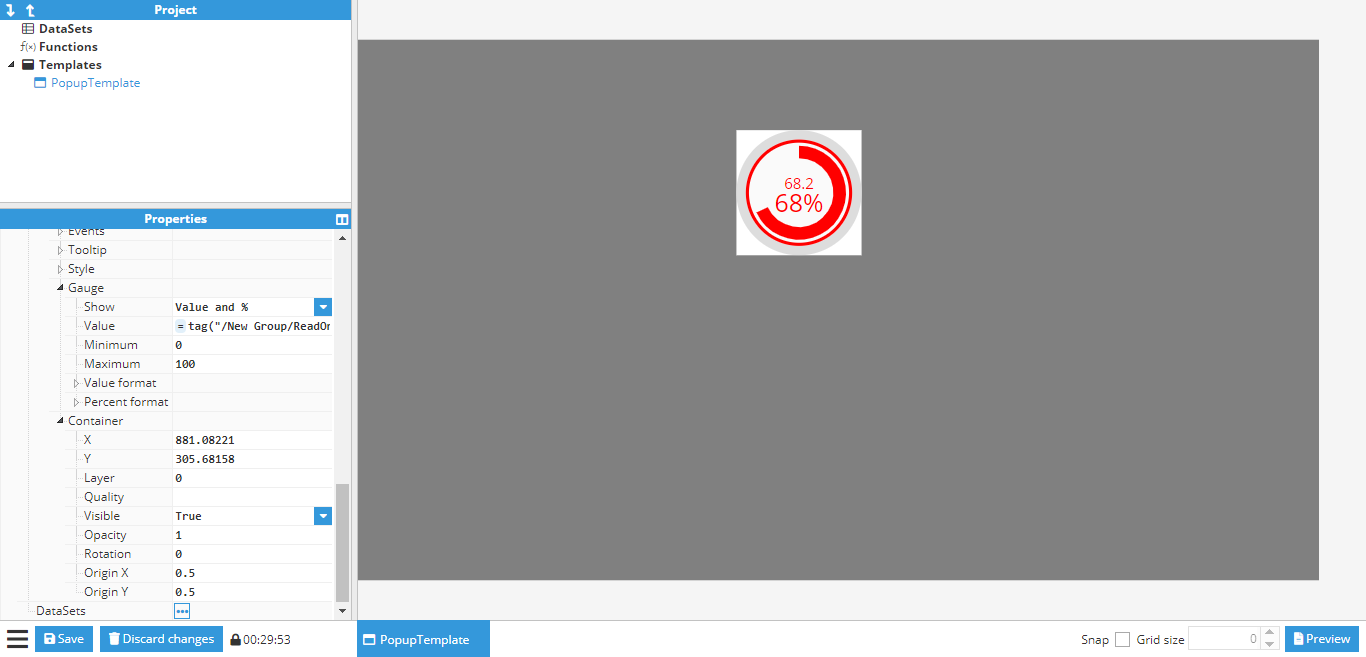 Figure 131: Container and gauge options
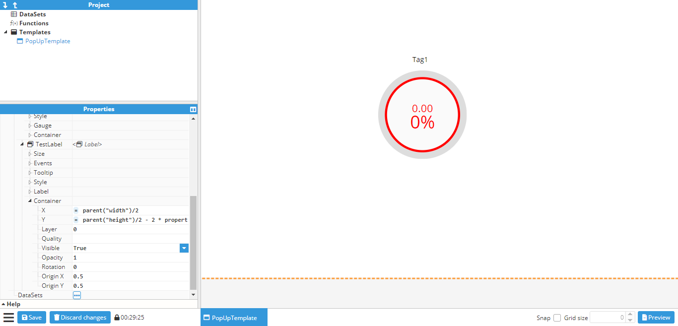 Figure 132: Gauge label options
As seen in the example, the position of the gauge and the label are relative to the container size, which is done by using the property function to obtain the height and width of the container.
Once the desired popup has been created, it’s time to create the main window where the popup will be displayed. This window will be a 500x500 container named Main and will contain a button called ShowButton. To view the popup that has been created, the background color of the main window can be changed to gray, as shown in the following screenshot:
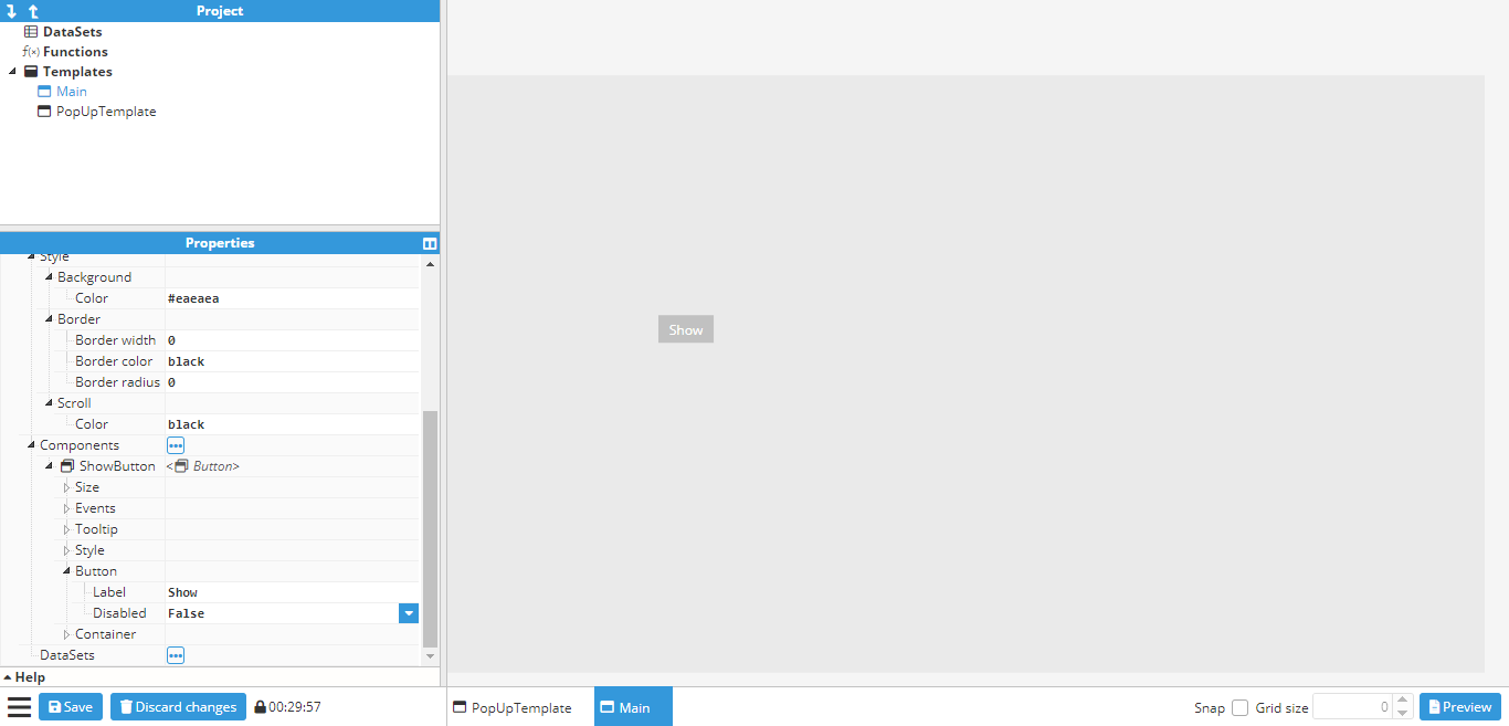 Figure 133: Main template
Next, an instance of the popup template needs to be added as a component. Once added, it can be placed in the desired position for display, before changing the visible property under the container to false. This will hide the popup, although the outline of where it is located will still be visible, as shown in the below screenshot:
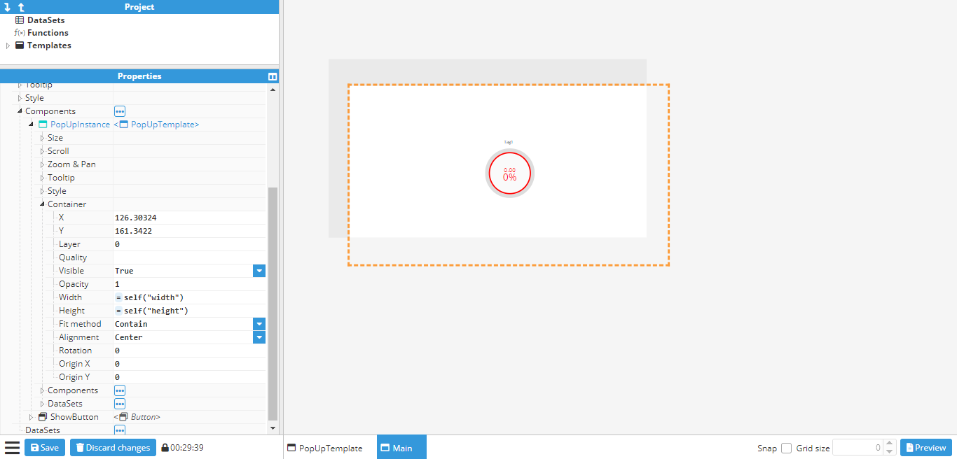 Figure 134: Popup positioning
To display the popup, an action needs to be attached to the click event on the button. This will set the visible property of the popup to the inverse value, which means it will be shown when hidden and closed when visible:
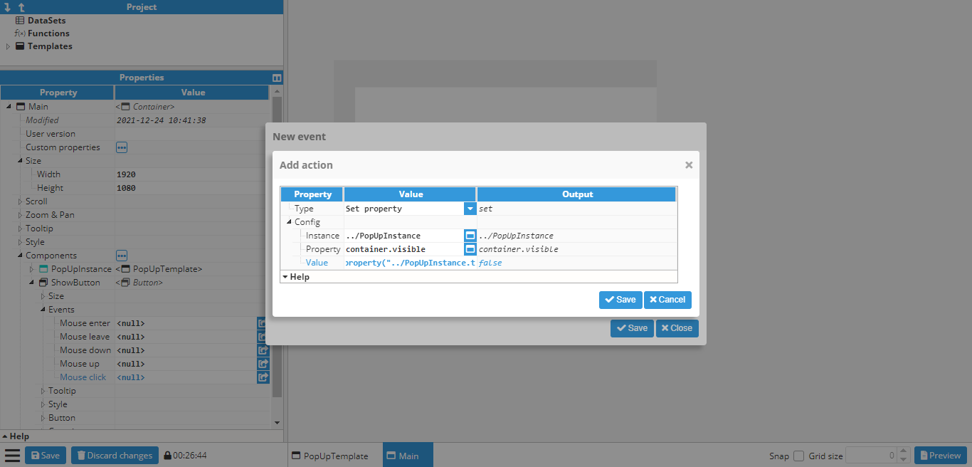 Figure 135: Show popup action
Since the value needs to be the opposite of the current visibility value, the following expression is used:
=!property(“../Popup.container.visible”)One more action still needs to be added in order to change the text property of the button to “Show” or “Hide”, depending on whether the popup is visible or not:
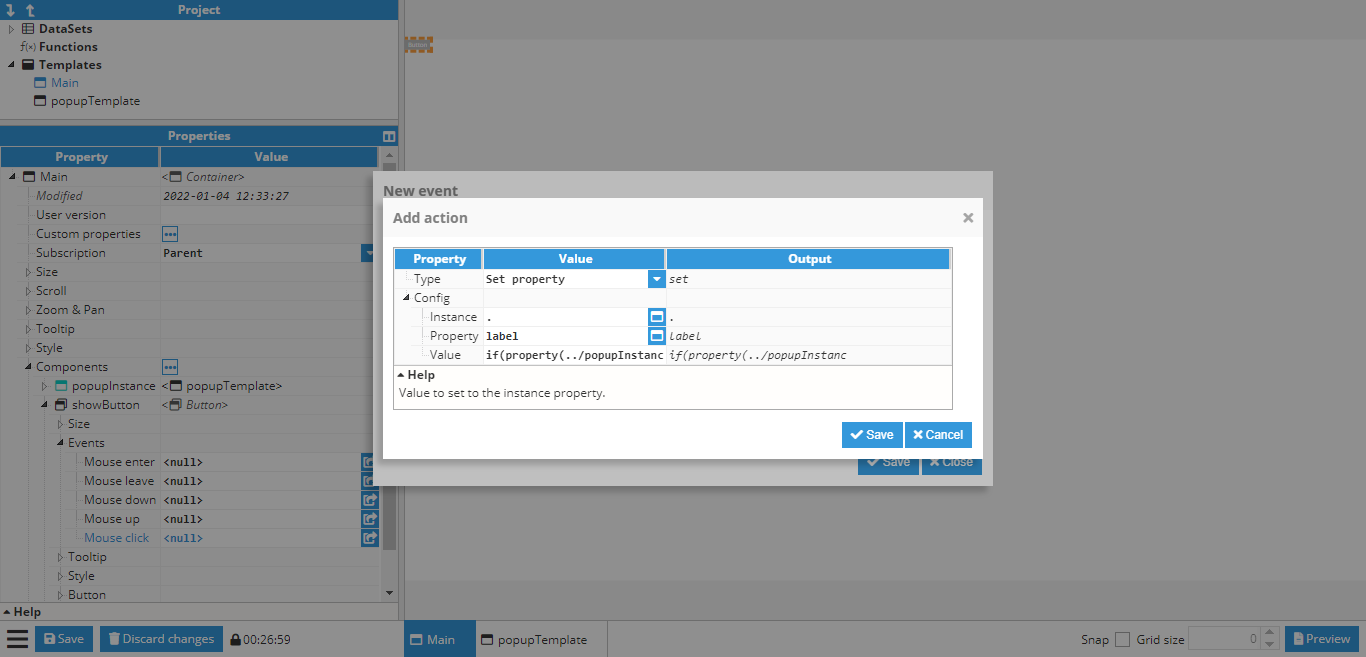 Figure 136: Changing the button text action
In this case, the value to be set to the following expression is as follows:
=if(property(“../Popup.container.visible”))“Hide”; else “Show”;Finally, the popup is ready to be tested, either by pressing CTRL+Click on the button while the button is not selected, or by going to the preview mode and clicking the button:
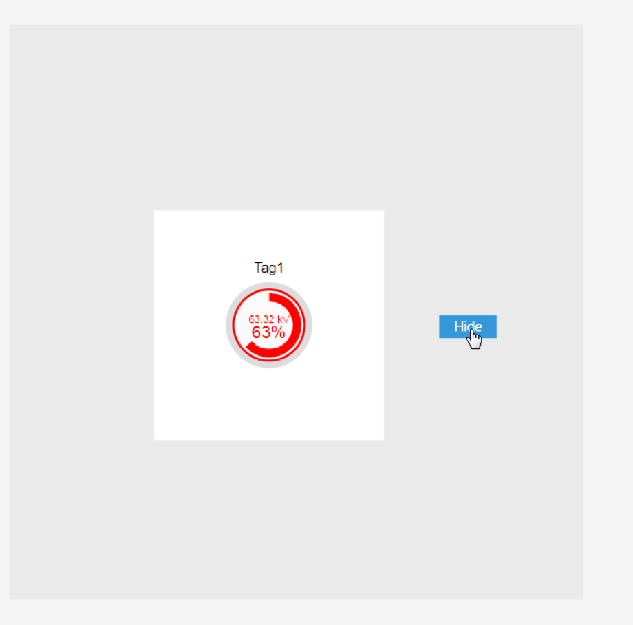 Figure 137: Final appearance
Creating a parameterized popup
This is a follow up of the previously shown examples. In the previous example, a popup was created and set to always display the value of the same tag using a gauge. In this example, a parameterized popup will be created to slide open by clicking on a map marker and show a different tag depending on which marker was clicked on.
First of all, the popup window needs to be created. In this case, it is a 400x1080 window with a text custom property called basepath.
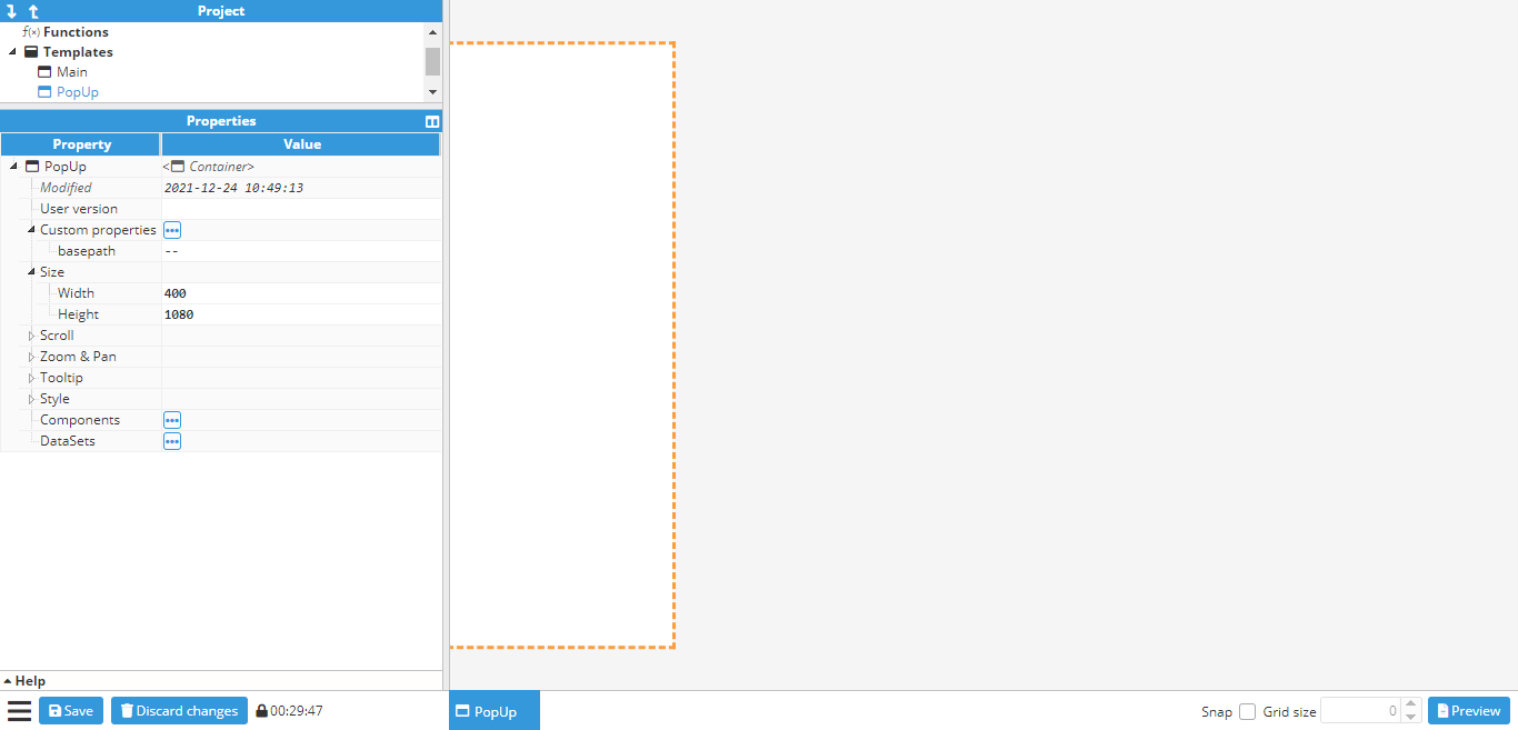 Figure 138: Popup template with custom property
Next, a border is added to the container using general style properties. After creating the border, the close button needs to be created in order to close the popup when clicked on. To do so, an Icon component should be used, which in this case will be the times icon. It is positioned in the upper right corner of the popup:
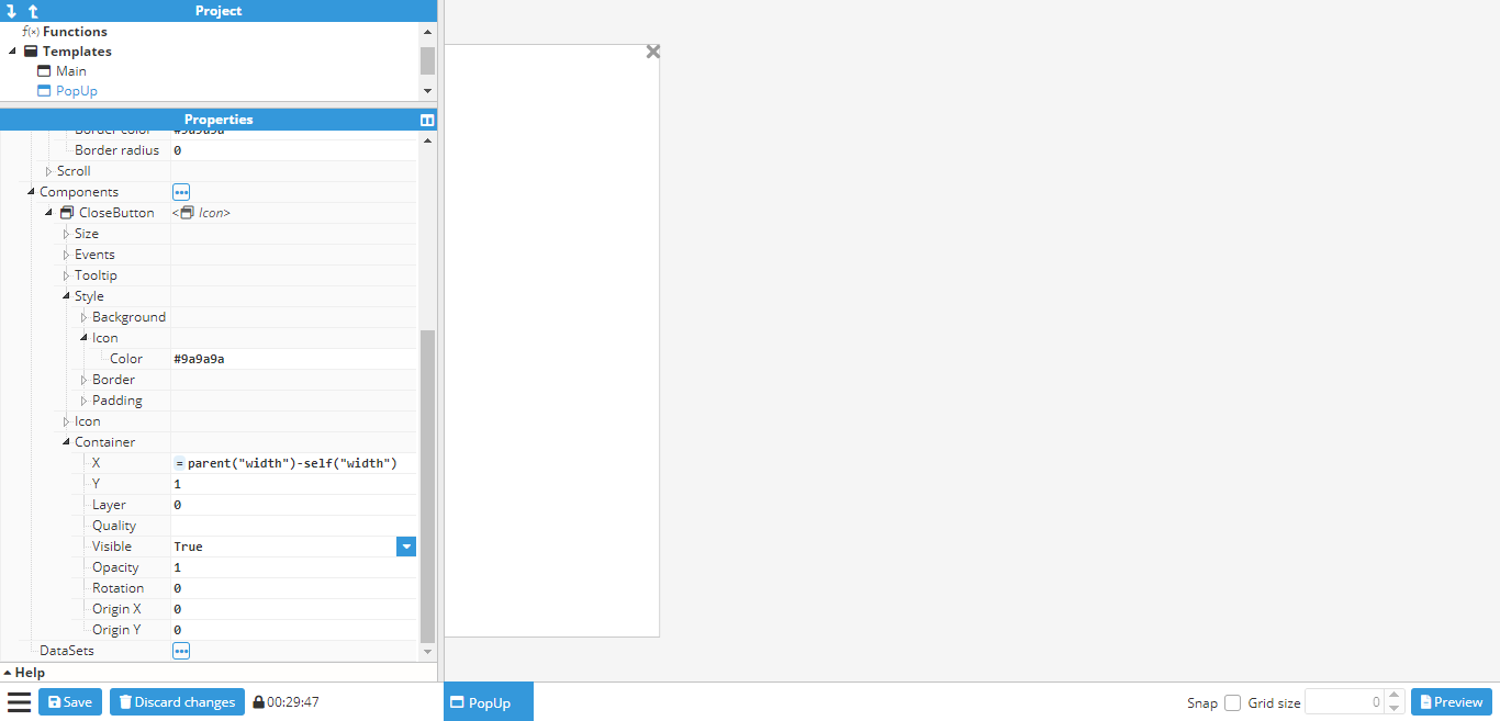 Figure 139: Border and close button
A click event needs to be attached to the close button in order to close the popup. However, the helper popup cannot be used to select the x property for sliding it out of view as there is no container section in the popup. This happens when the container is a template and not an instance. However, container properties can still be applied by inputting them manually. In this case, the x property should be set to -400 (since 400 is the width of the popup, meaning that -400 will set it out of view. Alternatively, the width of the container can be linked). To do so, the following settings are applied:
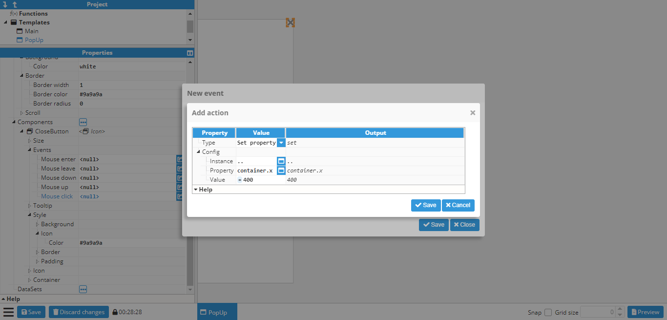 Figure 140: Close button close event
The last step is to add in the gauge and link it to a tag. However, in this case, the tag path is not static, as it depends on the basepath dynamic property. This example assumes the following tags are used:
/Madrid/Temperature
/London/Temperature
/Berlin/Temperature
Since the tags all follow the same structure (/<city>/Temperature), the basepath property can be used as the first part of the tag name, which corresponds to the city. To do so, the following expression is used in the gauge value (and in the units too, if the same EU and tag needs to be used):
=tag("/"+parent("custom.basepath")+"/Temperature") -> Value of tag
=tag("/"+parent("custom.basepath")+"/Temperature.config.engUnits")-> Units of tag
The final popup will look as follows:
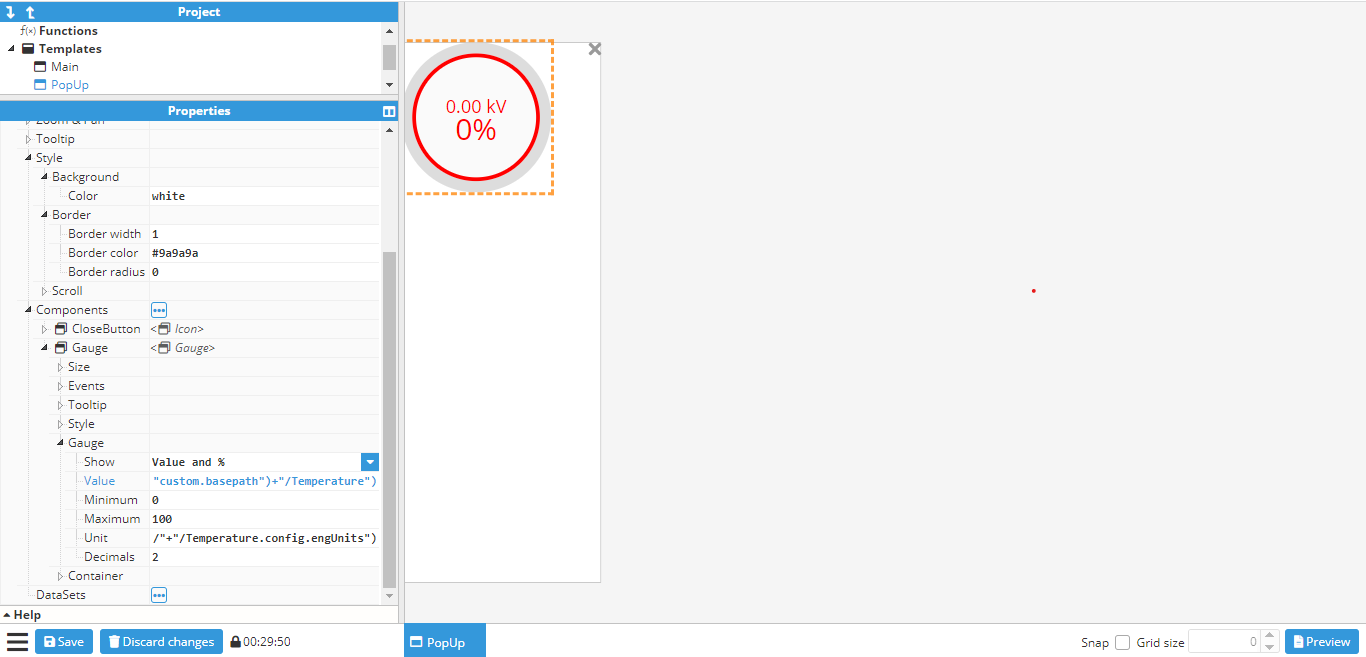 Figure 141: Final popup result
Now that the popup has been finished, the main container can be created. In this case, instead of the steps used to add markers to a map, the main container needs to be a blank container, rather than a map. The reason being that if it were a map, the popup would be instantiated as a component of the map, and would be positioned at a latitude and longitude, which is not the desired outcome in this example. In this case, the popup needs to be set in an absolute position on the screen. This can be accomplished by creating a blank container and adding a map and the popup as components, as shown in the below screenshot:
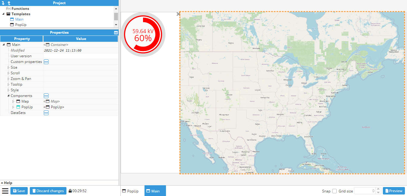 Figure 142: Map and popup
In this example, the popup will be shown by sliding from left to right using an animation. In order to achieve this, the popup’s initial X position needs to be set to -400 (since the popup is 400 pixels wide). An animation also needs to be added to the X property. In this case, it will be set to last 1000ms and ease in & out.
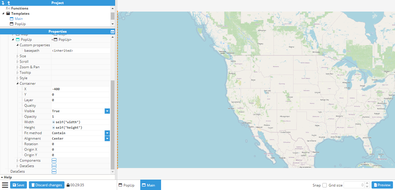 Figure 143: Animating the X property
Once the popup is in place, markers can also be added to the map and events can start to be setup in for opening the popup. Map markers are created for Madrid, Berlin, and London. After creating the markers, three actions need to be added to the click events for each marker:
- One action to set the basepath custom property to either Madrid, Berlin or London, depending on which marker was clicked upon.
- One action sets the X position of the popup to 0.
The event popup for the Madrid marker is shown in the following screenshot:
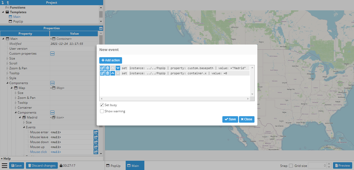 Figure 144: Event helper popup for the Madrid marker
The same is done for the Berlin and London marker. To save time, since only one of the three actions needs to change, depending on the marker (the one that sets the custom property), this marker can be duplicated (CTRL+D after selecting the marker in the configuration window, or right click and click the duplicate option) and the action deleted and created again with the new value.
The next stage is to test that everything works by clicking on a marker (either in preview mode, or by using CTRL+Click while the marker is not selected). The different markers can now be clicked on to see if the value of the basepath changes accordingly. Finally, click the close button on the popup to ensure that it slides back off the screen.
Creating a progress bar
By default, WebVision only comes with a Gauge for displaying tag values, as well as any labels, which can also be linked to a tag. However, links can also be used to create custom components. In this example, a progress bar will be created and linked to a tag.
This first step is to create a new blank container. In this case, a 100x10 container is sufficient. Next, a custom property called tag is added to the container. This will be the tag that provides the value to the progress bar. Since this one will be a tag, the tag picker control will be used and limited to tag only.
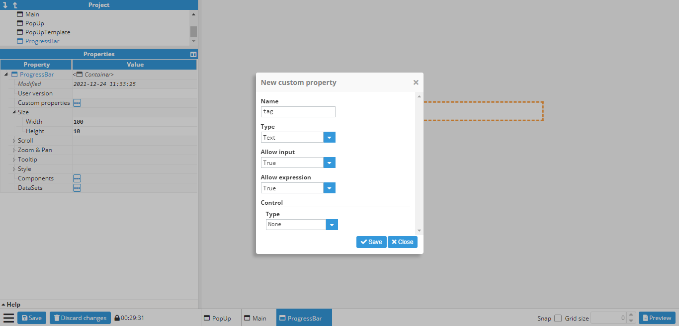 Figure 145: Tag picker custom property
Afterwards, a general styles border is added to the ProgressBar container.
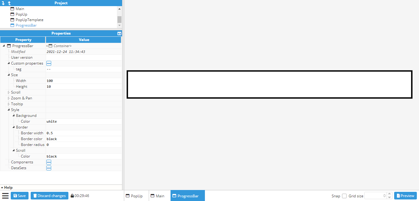 Figure 146: Border properties
The next step is to create the progress bar itself. For this, a line component is used and set to a size of 99x9 (the same as the container, minus borders). The line width is also set to 9 in order to fill the entire container. The container X/Y is also set to 0.5 to avoid any overlapping with the border, which can be colored red (to contrast against the border) in order to make sure that the line has been positioned correctly. Its two points are then set to (0,0) and (50%,0), which gives the following result:
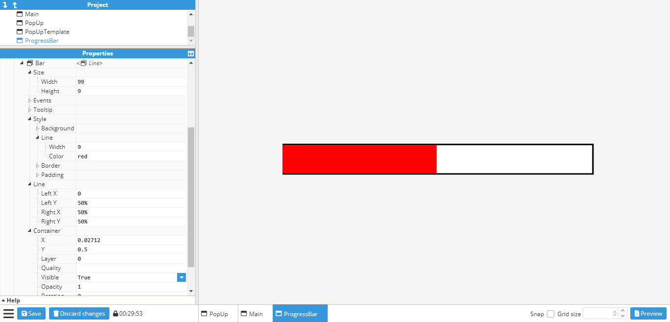 Figure 147: Line properties
Finally, the Right X (the x coordinate of the line’s right-side point) needs to be linked to the newly created
tag custom property. For this, the following expression is used:
=tag(parent(“custom.tag”)) + “%”“%” is also added to the end of the expression in order to transform the second point into a relative value, instead of an absolute one. The value of the tag custom property can be changed to a tag in order to ensure that the setup has been carried out correctly. In this example, “/ReadOnlyNumber” is used. If the line changes when the value changes, the progress bar is working as intended.
While this is enough for a working progress bar, it can also be configured in a way that the colors change according to the tag value. Animations can also be added for smoother transitions between each change in values.
First of all, it’s configured to change color from red when below 25, yellow until 50, green until 75 and finally to blue. To do this, a conditional expression needs to be added to the line color property by using the expression editor helper to make it easier to input the expression:
 Figure 148: Line properties
If the expression is written correctly (no syntax errors), users can check that the colors work by changing the tag value:
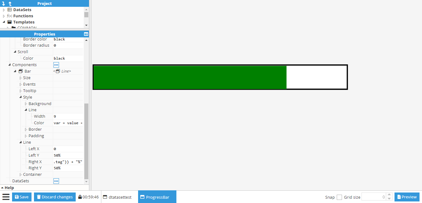 Figure 149: Green color with tag value = 60
Finally, an animation can be added to the Right X coordinate for smoother transition between values. To do so, the Set animation helper can be used on the Right X” coordinate to input the animation settings. Once configured, the icon next to Right X should indicate that the animation is enabled. More information about animations can be found in the animation section.
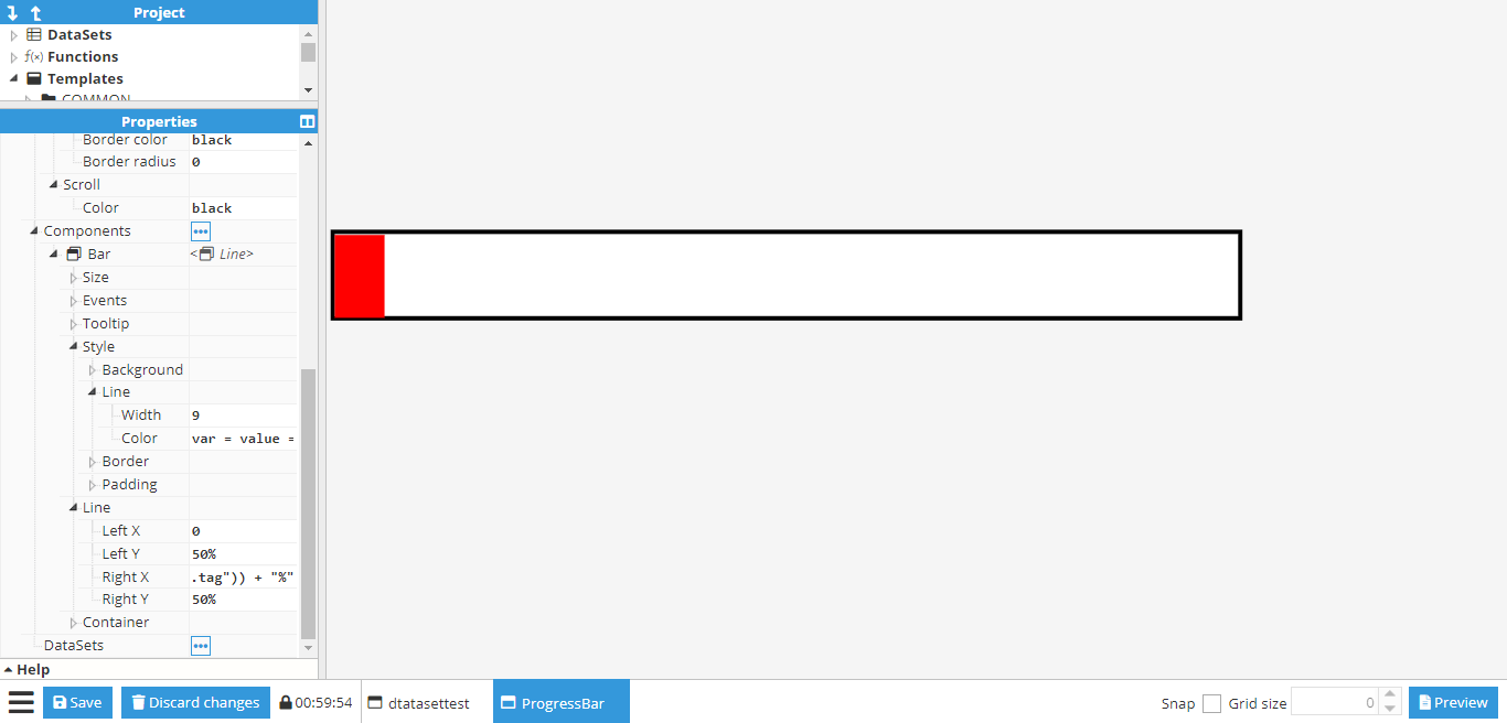 Figure 150: Right X coordinate animation