Container types
Container type | Recommended use |
|---|---|
Container | Screens and graphical areas where components need free positioning using X and Y coordinates. |
Layout | Automatically arranging elements in rows or columns, particularly for structured and responsive interfaces. |
Map | Displaying geographically distributed assets using longitude and latitude coordinates. |
Region | Switching between different screens or template instances while keeping them inside the same visual area. |
Container
The Container is the most basic and flexible container type in Web Vision. Elements placed inside it can be positioned freely relative to the container, making it suitable for HMI screens where components must be placed at specific graphical coordinates.
How to use it
Elements within a Container can be sized and positioned freely. This feature gives freedom to the user to configure each element individually as desired, but significantly augmenting the difficulty of the creation of a screen. This section will explain in detail how to easily create and customize our Container using the next example as a reference:
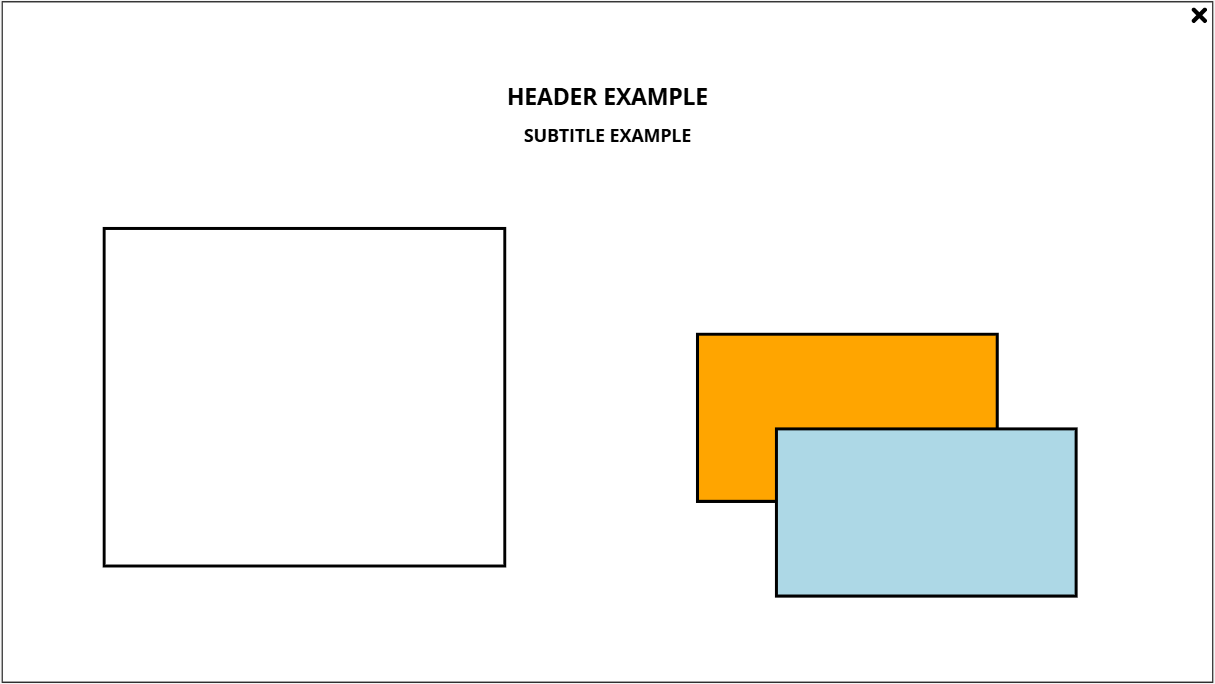
The elements inside our container are an ‘x’ icon, a header and subtitle for the screen, and some elements freely positioned on the screen. Let’s see how each element was configured:
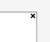
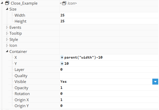
The icon is configured with a fixed size using the exact values in pixels, and it is positioned relatively to parent width, with a fixed padding using the exact values in pixels. Additionally, the X origin is set to 1, moving the start of the X axis of the element to the end of itself.
|
|
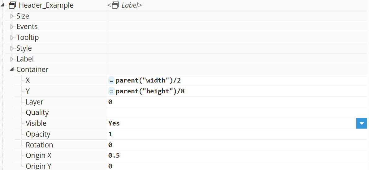
Then we have the title and subtitle of the containers, which are positioned in the middle of the template:

These elements are centered using different calculations:
The header uses the parent’s width to set its X axis to the middle of the parent’s width, and setting X Origin to 0.5 to center itself moving its X position to the middle of the element. Y coordinates are calculated relatively to parent’s height for a responsive design.
The subtitle uses the header’s width and coordinates to locate itself in the container. It is not centered to the container, but to the header instead, which is centered to the container. If the header position changes, it will adjust itself to the new position.
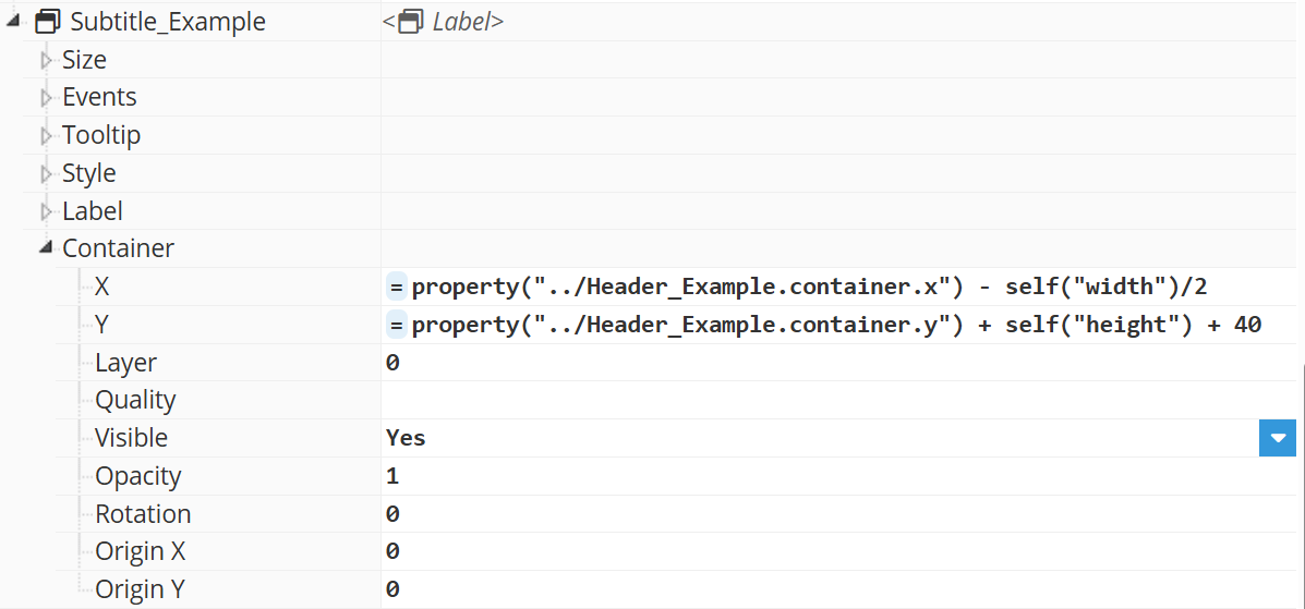
The elements located at the bottom are positioned strategically for a proper distribution of the screen.
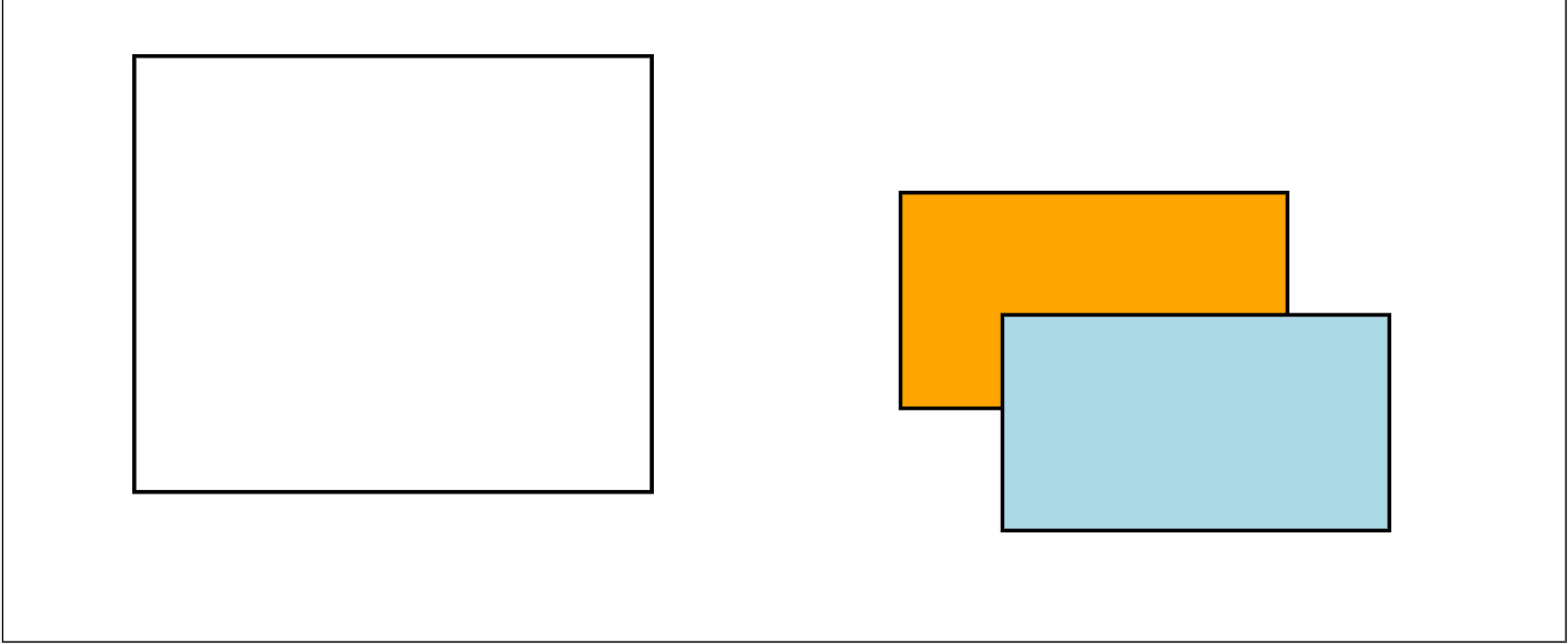
The white square is centered to the first quarter of the X axis, while its Y axis is calculated by centering the square inside the space between the subtitle element and the bottom of the container, using the y axis and the height of the elements to calculate the correct position.
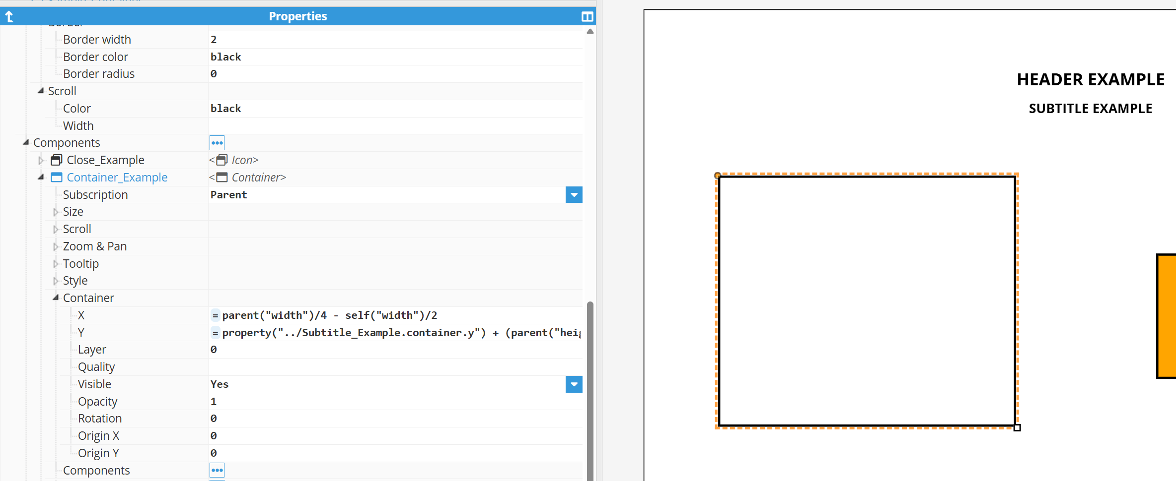
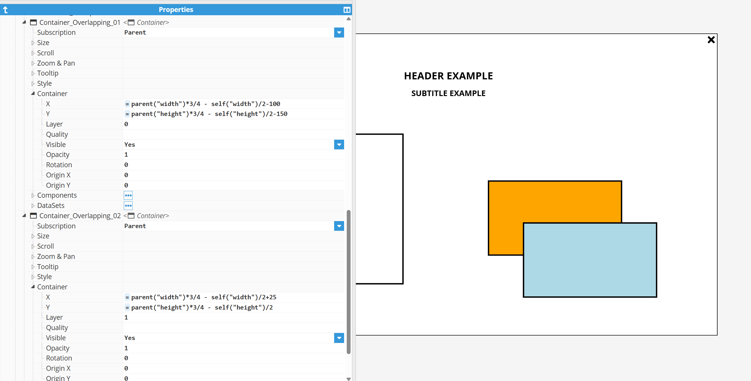
property("../Subtitle_Example.container.y") + (parent("height") - (property("../Subtitle_Example.container.y") + property("../Subtitle_Example.height")))/2 - self("height")/2The colored squares are positioned at the last quarter of the X and Y axis, with a slight displacement assuring a partial overlapping. Overlapped elements are printed following the order stablished on “Layer” property. Blue square prevails over orange square by setting its layer property to 1, forcing the square to be printed on screen after orange. Then we have the title and subtitle of the containers, which are positioned in the middle of the template:
Tip:
Use a Container when the graphical relationship between the components is more important than automatically adapting their distribution. For user interfaces composed primarily of panels, rows or columns, consider using a Layout instead.
Recommendation:
Use a Layout, even within Containers, when the spatial relationship between multiple components must be preserved. Positioning components with expressions is useful for specific cases, but complex relationships can quickly become difficult to understand and maintain.
Layout
A Layout automatically arranges its child elements as rows or columns. Unlike a standard Container, children cannot be freely positioned with X and Y coordinates because their position is determined by the Layout and by the order of the child elements.
How to use it
Elements within a Layout calculates their position and size comparing themselves to other elements. The elements are sorted within rows or columns based on the configuration of the Layout and the names of the child elements of it, and the size is equally distributed between each child unless a specific absolute or relative sizing is specified.
This feature makes Layouts very restrictive to generate screens freely, but simplifies the generation of screens with a structured composition. Let’s see in detail how can we easily create and customize our Layout from the next example:
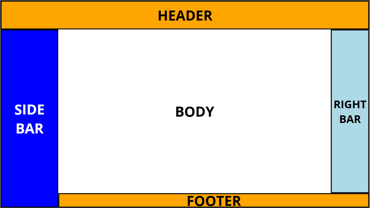
This screen is configured following a simple tree structure where the main space of each layout into a lateral bar (right and left bar, header and footer), and the new main space or body of the remaining layout:
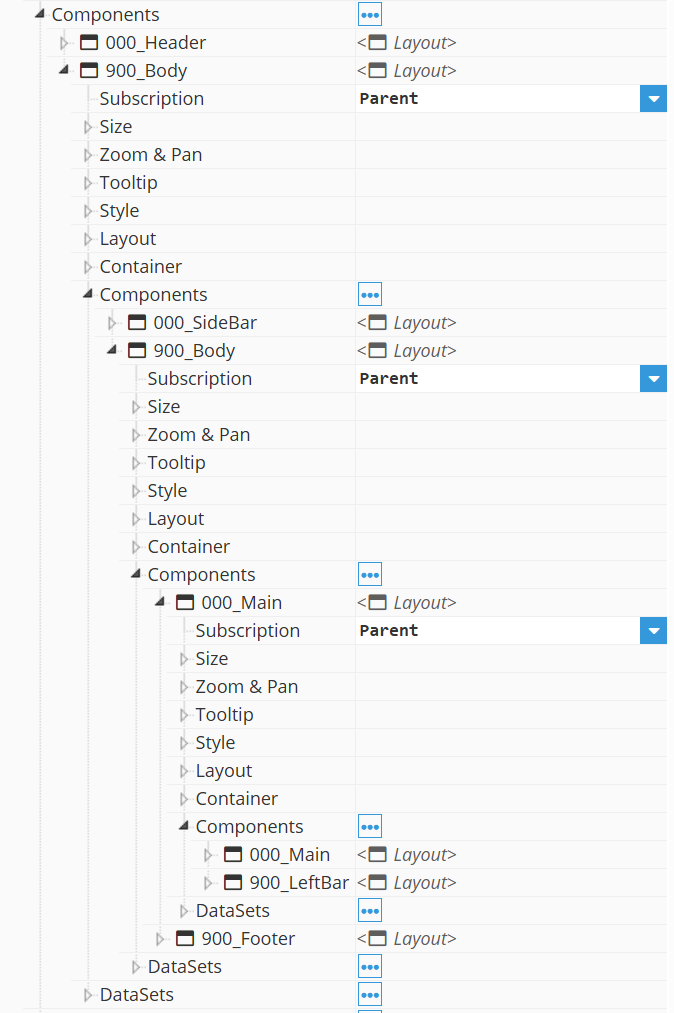
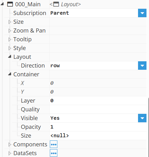
Each “Main” element is configured with the Layout direction for organizing the elements in rows and columns, and has its size set to null to expand itself to the remaining space of the parent element:
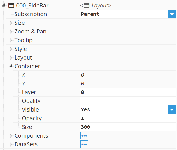
Each “bar” element has its size configured to occupy the required space for the element.
Recommendation:
Layouts can be nested. Combining vertical and horizontal Layouts is an effective way to create structured HMI dashboards without having to manually calculate the position of every component.
Map
A Map behaves similarly to a standard Container but uses an interactive geographical map as its background. Instead of positioning child elements using X and Y coordinates relative to the container, elements are positioned using longitude and latitude.
How to use it
Maps are preloaded with a world map on its background, and Zoom & Pan properties allows to specify the maximum, minimum, and default values for the coordinates and zooming of the map.
Any element within a map container is located using the longitude and latitude in the map as values for the X and Y coordinates in the container.
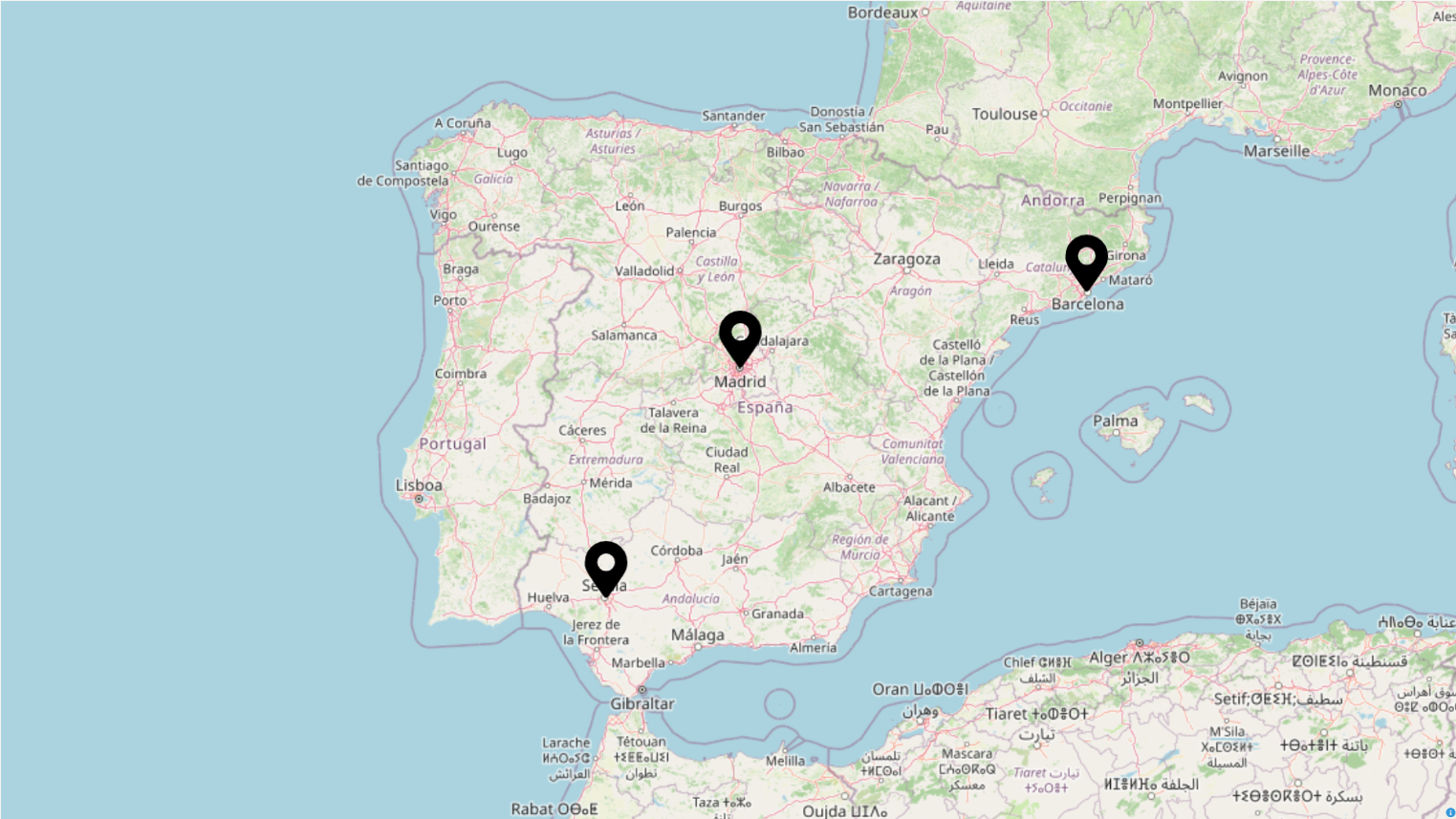
For our example, lets set a Map Marker Icon in Madrid City.
As Madrid’s coordinates are 40.4165, -3.70256, those will be our values for the Y and X axis, respectively. In order to center our marker to the coordinates, we will be setting the X Origin value to 0.5 and Y Origin to 1, forcing the element to use the x, y axis point for the middle of the bottom of the marker. Configure the child's Size type according to whether its dimensions should remain relative to the container or to geographical longitude.
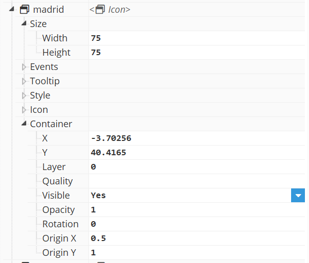
Tip:
Template instances can be used as map markers to create reusable graphical representations of sites or equipment. Their properties can then be linked to Tags to dynamically display status, alarms, production or other operational information.
Region
A Region is a specialized container designed to display one child visual element at a time. It allows several screens or template instances to share the same visual area without having to create separate Viewer pages.
How to use it
Region elements use itself as a container to show one of the containers or elements contained within it.
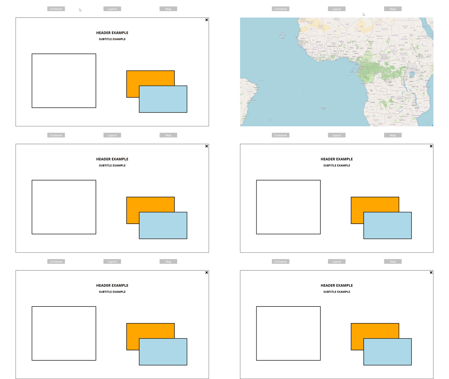
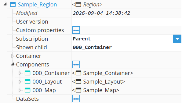
On this region, we have created elements with the templates of the three previously developed examples inside a region container.
This region is included in a Container, allowing the user to navigate through the screen and call for the required container interactively
Each button has a Set Property Event configured, which is called when the user clicks on int, and updates the value of the Shown Child property of the Region to each of the different children it has.
Recommendation:
For applications containing several operational screens, use a Region as the main content area instead of creating independent copies of common elements such as headers, navigation menus or status bars.