Visual area
The Visual area is the UI preview panel located to the right of the Project and Properties Tree. The Visual area displays a graphical representation of each different visual element and enabled users to manipulate the elements shown with these interactions.
Select and manipulate elements
When selecting an area, an orange-colored dotted area will surround the selected element. If the selected element is located inside a container, the Properties Tree will display its root node as selected. Selecting an element on the properties tree will trigger the same effect on the visual area.
The selection tool also allows users to drag & drop elements to change their position within a container.
Pan, drag, & drop
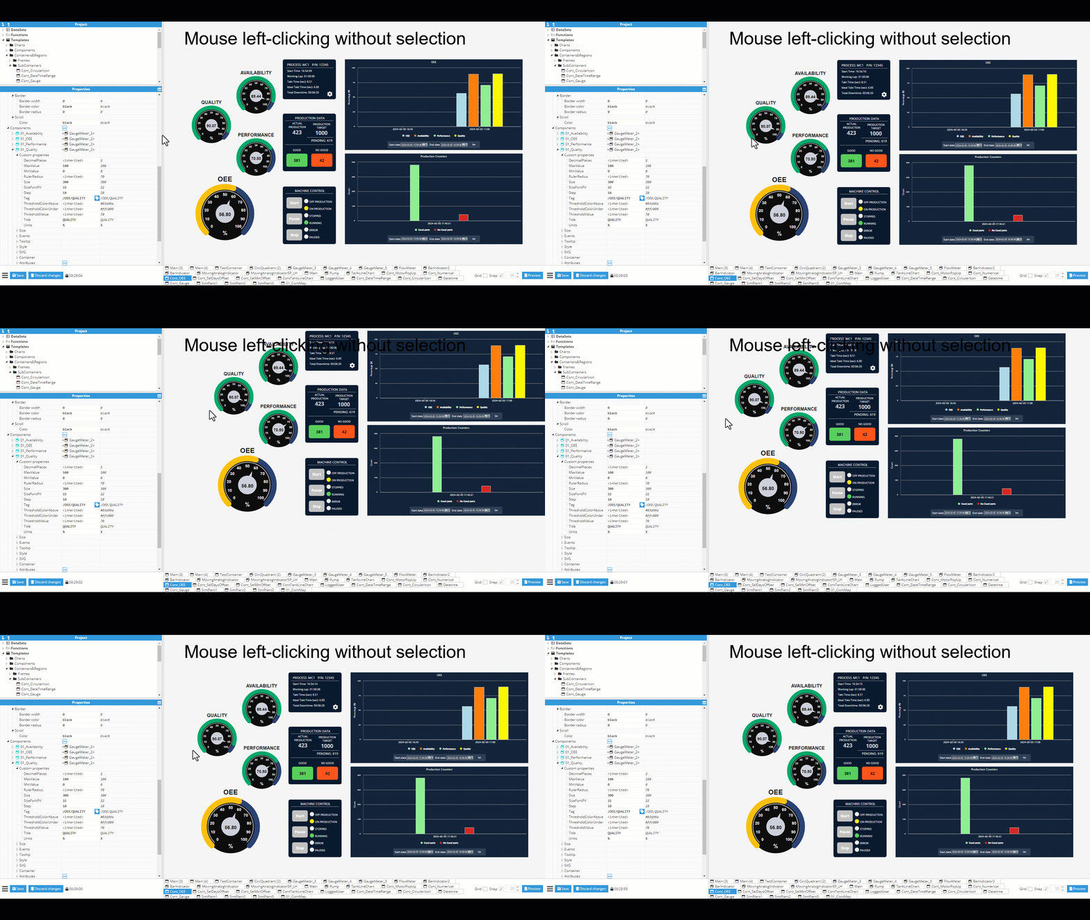
Left-clicking an element with your mouse will activate the drag & drop functionality, allowing users to drag & drop a selected element or an unselected one, resulting in different behaviors:
Dragging a selected element inside a container: Users can drag & drop to set its position within the container. If the selected element has its own internal pan, dragging it will result in the internal pan being modified. In these cases, the control key must be pressed before dragging the element in order to move it.

Dragging an element without selection: If the element has an internal pan, the pan will also be moved. Pressing the control key will move the parent element, if possible. For example, when in viewer mode, we cannot move the root container.
Zoom
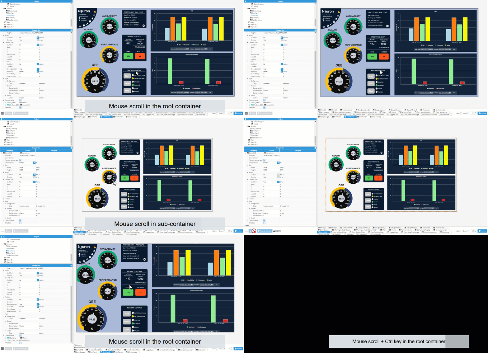
The mouse scroll wheel can be used to change the zoom on an item. The designer permits two kinds of zoom functionalities:
Functionality | Description |
|---|---|
Designer zoom | Allows parent visual elements to be manipulated. This zoom function is only intended as a visual help for large elements where the user may need to zoom in order to edit the visual element, but where minimal changes are required. |
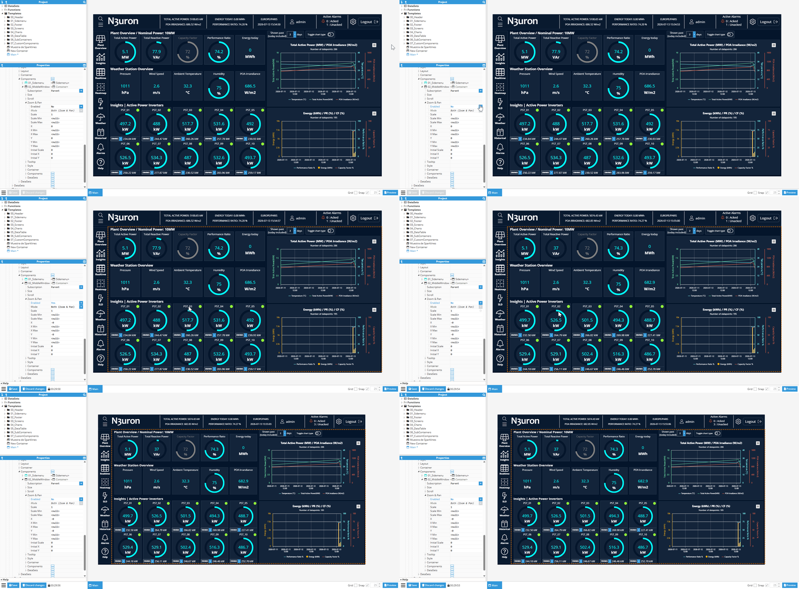
Container zoom | Zooming is available inside container type templates, allowing to zoom inside a container without changing containers’ size. This feature is disabled by default, but can be enabled inside container’s properties. |
Pressing the control key while zooming will deactivate the zoom for the selected element, passing the zoom functionality to its parent, or changing to a designer zoom if no parent exists.
Interaction with visual elements
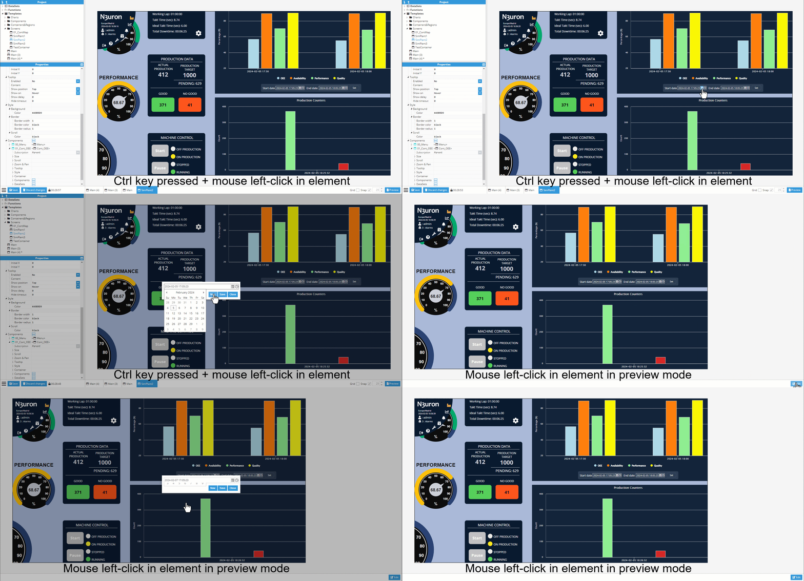
If when in the designer, the user deselects the element and presses the control key, the element can be interacted with as if in production mode. The user can normally interact with the UI if on preview mode. Any action triggered by these actions that imply a change in any modifiable property will affect its current status.
For example, setting a value to a visual input or selecting a value in a dropdown component.
Move controls - Designer canvas
The Designer supports direct manipulation of components using the mouse. You can select, move, resize, rotate, and adjust anchors and line endpoints by dragging the corresponding handles. Modifier keys (Shift/Ctrl) change snapping or constrain the operation.
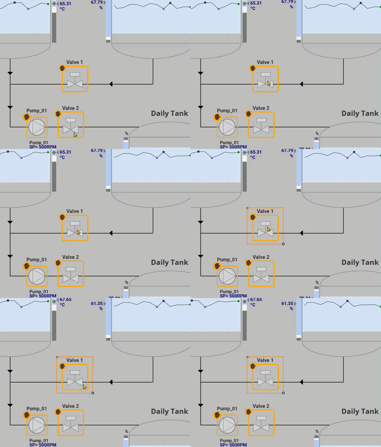
Select
Click a component to select it (handles become visible).
Move
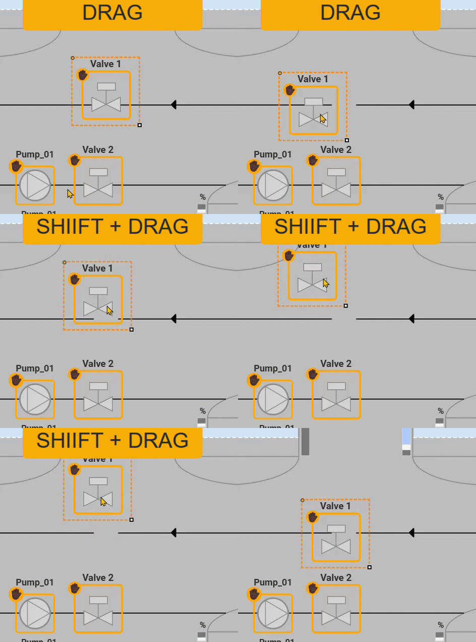
Click and drag the component to reposition it.
Shift + drag: toggles snap-to-grid for the component’s anchor.
Resize
Drag a corner/edge handle to resize.
Shift + drag: toggles snap-to-grid for the dragged corner.
Ctrl + drag: toggles orthogonal resize (constrains to width or height only).

Rotate
Drag the rotation handle to rotate the component.
Shift + drag: toggles rotation snapping in 15° increments.

Anchor (for components that expose an anchor/origin)
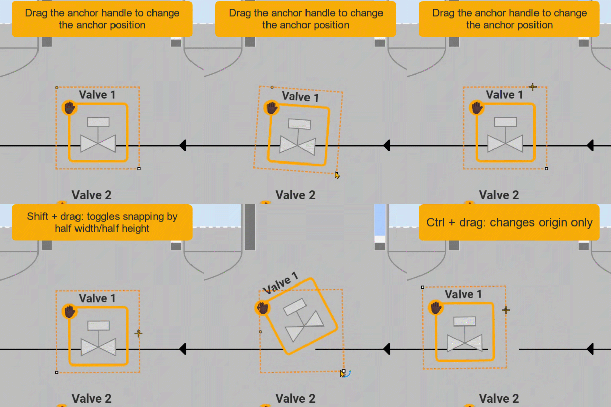
Drag the anchor handle to change the anchor position.
Shift + drag: toggles snapping by half width/half height.
Ctrl + drag: changes origin only (moves the anchor without repositioning the element).
Line Endpoints (for line/connector elements)
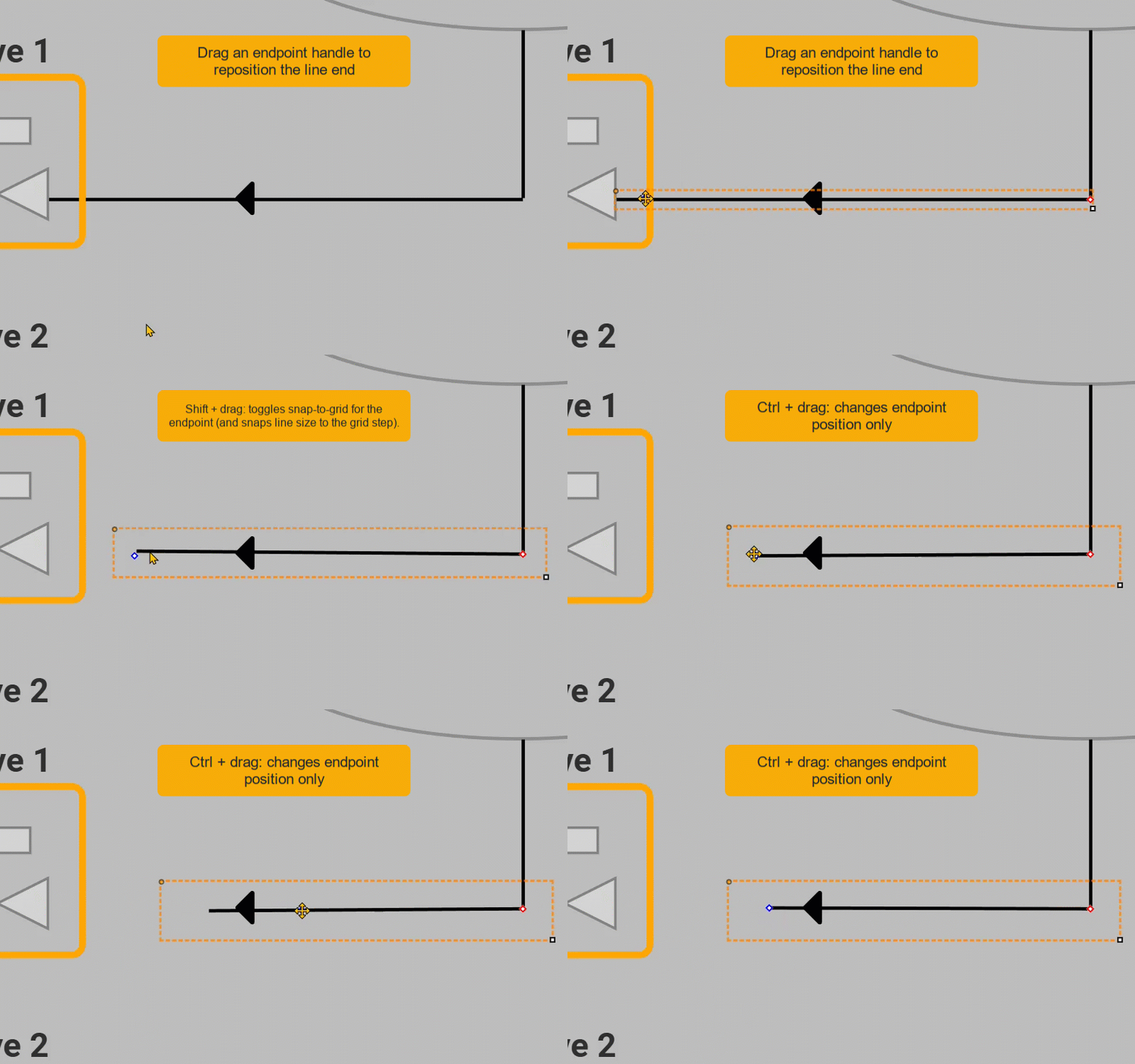
Drag an endpoint handle to reposition the line end.
Shift + drag: toggles snap-to-grid for the endpoint (and snaps line size to the grid step).
Ctrl + drag: changes endpoint position only.
Note:
This feature is available from N3uron version 1.22.0.
Preview Mode and Testing in Designer
Preview Mode in Designer allows engineers to validate screens during development before opening the project in Viewer. It is useful for checking layout, bindings, expressions, actions, navigation, and visual behavior while building the HMI.
Testing should be performed progressively. First, validate each screen in Designer to confirm that the design behaves as expected. Then, use Viewer to verify the final runtime experience from the operator perspective.
When to Validate in Designer
Use Designer during the development phase to validate individual screens, templates, visual elements, expressions, and actions before moving to runtime testing.
Validation area | What to check |
|---|---|
Layout | Verify alignment, spacing, element size, visibility, grouping, and responsive behavior. |
Bindings | Confirm that visual elements are connected to the correct Tags, Datasets, expressions, or function outputs. |
Expressions | Check calculated values, visibility rules, colors, status labels, and conditional behavior. |
Actions | Test navigation, popups, command buttons, value writes, refresh actions, and interface updates. |
Templates | Validate that reusable objects behave correctly when used with different instances, parameters, or data paths. |
When to Move to Viewer
Move to Viewer once the screen has been validated in Designer and the basic behavior is working as expected. Viewer testing should focus on the complete runtime experience.
Runtime check | Purpose |
|---|---|
Operator workflow | Confirm that users can navigate and operate the HMI as expected. |
Live data | Verify that Tags update correctly in the running application. |
Historical data | Check trends, charts, and historical views that depend on Historian data. |
Permissions | Validate access rights, user roles, restricted controls, and runtime visibility rules. |
Device display | Test the HMI on the target screen size, browser, workstation, panel, or mobile device. |
Concept:
Use Designer to validate the screen while it is being built, and use Viewer to validate the final runtime experience.
Recommended Testing Workflow
A structured testing workflow helps detect issues early and reduces the number of corrections required during final validation.
Open the screen in Designer and check the layout, naming, grouping, and visual hierarchy.
Validate all Tag bindings, Dataset references, expressions, functions, and template parameters.
Enable Preview Mode and interact with the screen as a user would.
Test navigation buttons, popups, menus, tabs, command buttons, and any action assigned to visual elements.
Check dynamic behavior such as colors, visibility, animations, alarms, status labels, and calculated values.
Open the project in Viewer and repeat the test from the runtime user perspective.
Validate the screen using real operating conditions, live tags, historical data, user permissions, and the target display environment.
Testing Checklist
Before considering a screen complete, review the following checklist in both Designer and Viewer where applicable.
Item | Description |
|---|---|
Screen loading | The screen opens without errors or missing elements. |
Navigation | Buttons, menus, links, breadcrumbs, and popups open the expected targets. |
Data binding | Values are connected to the correct tags or data sources. |
Dynamic behavior | Expressions, colors, labels, visibility, and animations respond correctly. |
Commands | Buttons and write actions are tested carefully and only where permitted. |
Historian data | Trends and historical components show the expected time range and values. |
Responsiveness | The screen remains usable on the intended display sizes. |
Permissions | Restricted actions and views are only available to authorized users. |
Recommendation:
Always test write actions, commands, and control buttons in a safe environment before using them in production. Confirm that the target Tags, permissions, and expected operating conditions are correct.