Click to display a popup
This example shows how to create a popup with a gauge that can be opened and closed by pressing a button. In order to do this, the first step is to create a popup template by creating a new empty container of 500x500 pixels and then adding a gauge and label inside the container. The gauge will point to a tag called /ReadOnlyNumber, which in this example is a memory tag. The label will display the tag name.
The properties of the container, gauge, and label can be seen in the following screenshots:
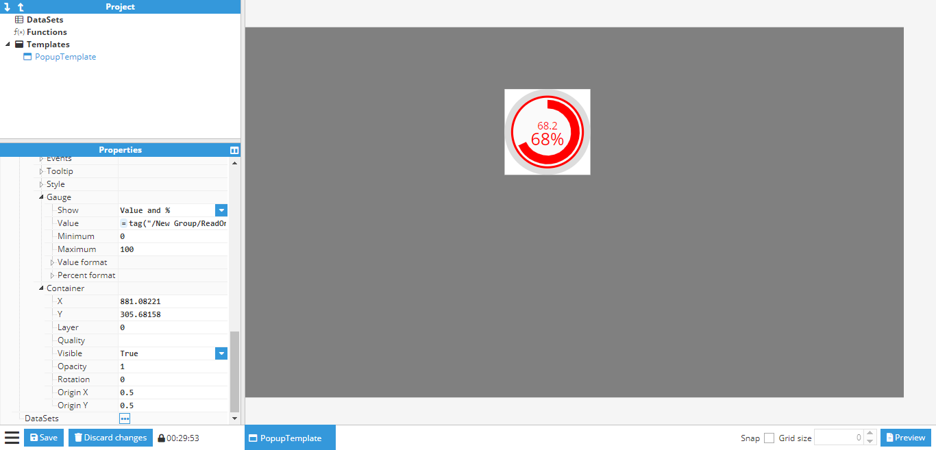
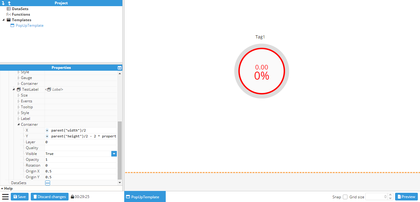
As seen in the example, the position of the gauge and the label are relative to the container size, this is achieved by using the property function to obtain the height and width of the container.
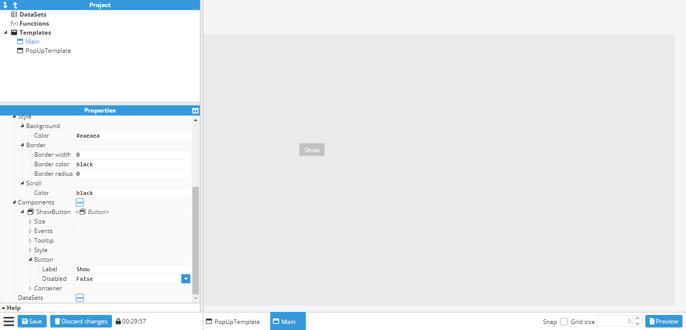
Once the desired popup has been created, it’s time to create the main window where the popup will be displayed. This window will be a 500x500 container named Main and will contain a button called ShowButton. To view the popup that has been created, the background color of the main window can be changed to gray, as shown in the following screenshot:
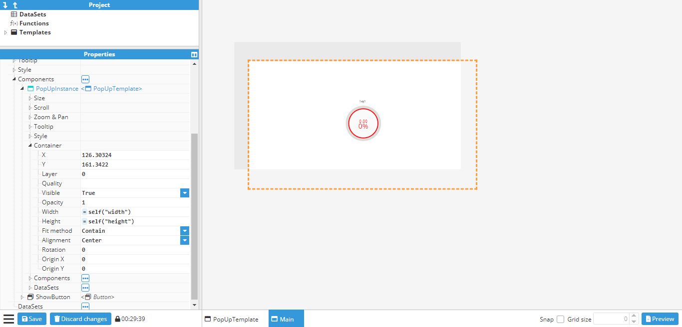
Next, an instance of the popup template needs to be added as a component. Once added, it can be placed in the desired position for display, before changing the visible property under the container to false. This will hide the popup, although the outline of its location will still be visible, as shown in the below screenshot:
To display the popup, an action needs to be attached to the click event on the button. This will set the visible property of the popup to the inverse value, which means it will be shown when hidden and closed when visible:
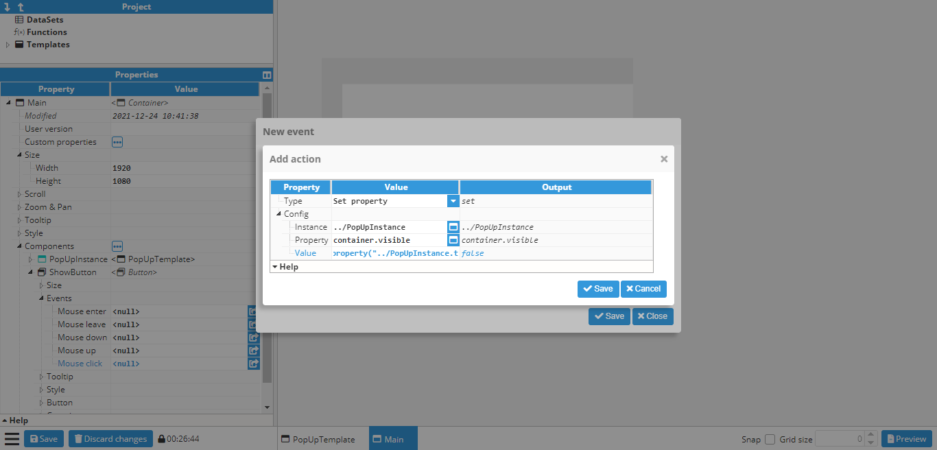
Since the value needs to be the opposite of the current visibility value, the following expression is used:
=!property(“../Popup.container.visible”)One more action still needs to be added in order to change the text property of the button to “Show” or “Hide”, depending on whether the popup is visible or not:
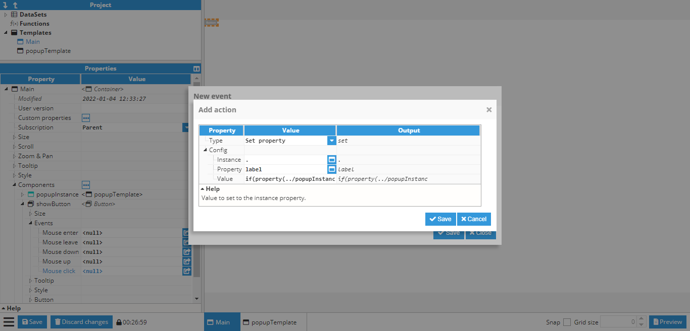
In this case, the value to be set to the following expression is as follows:
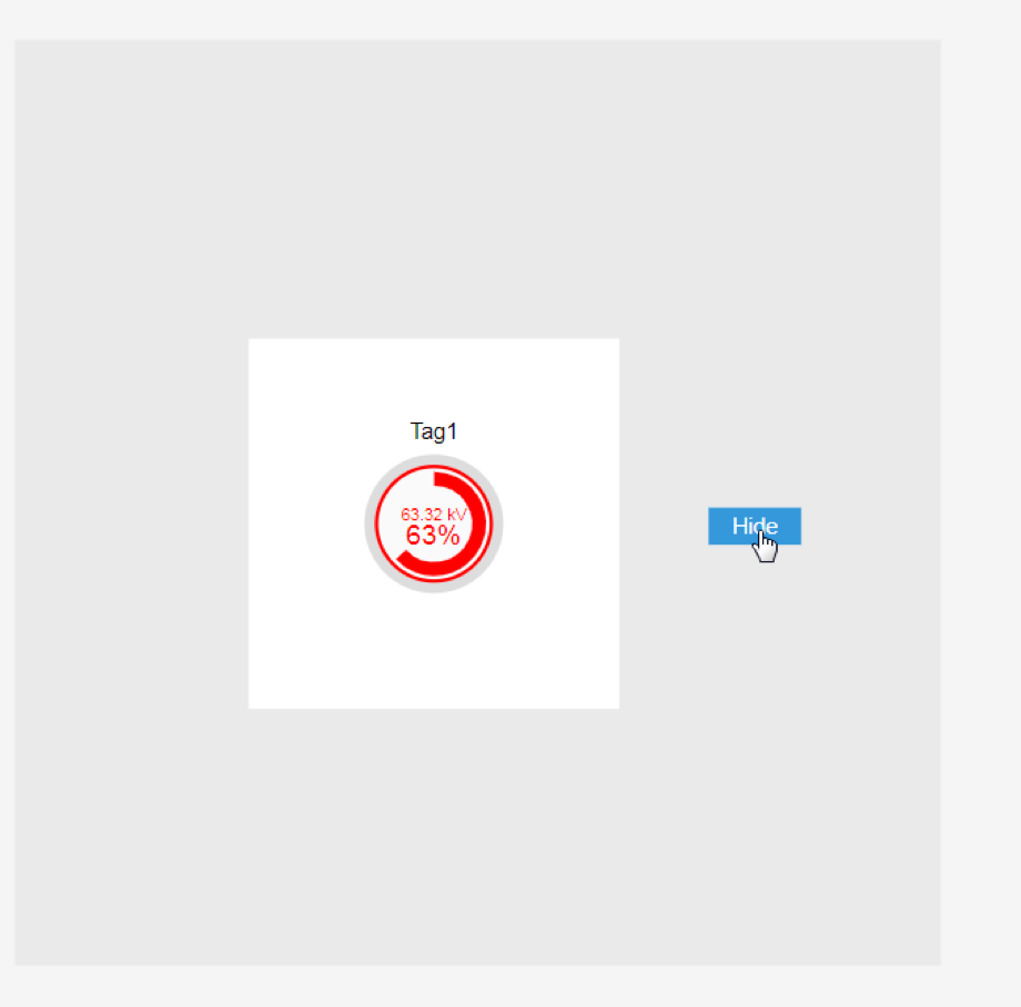
=if(property(“../Popup.container.visible”))“Hide”; else “Show”;Finally, the popup is ready to be tested, either by pressing CTRL+Click on the button while the button is not selected or by going to the preview mode and clicking the button:
Creating a parameterized popup
This is a follow-up to the previously shown examples. In the previous example, a popup was created and set to always display the value of the same tag using a gauge. In this example, a parameterized popup will be created to slide open by clicking on a map marker and show a different tag depending on which marker was clicked on.
First of all, the popup window needs to be created. In this case, it is a 400x1080 window with a text custom property called basepath.
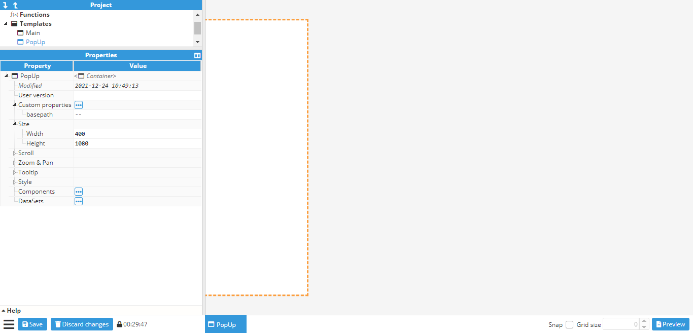
Next, a border is added to the container using general-style properties. After creating the border, the close button needs to be created in order to close the popup when clicked on. To do so, an Icon component should be used, which in this case will be the times icon. It is positioned in the upper right corner of the popup:
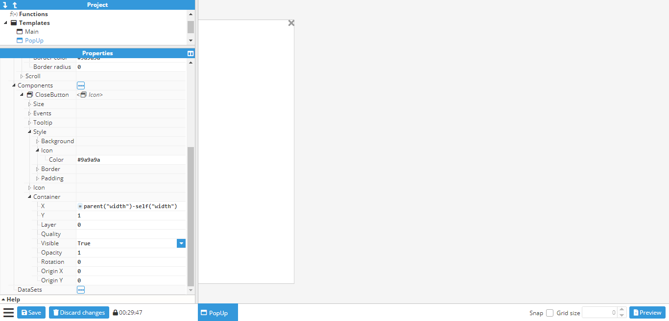
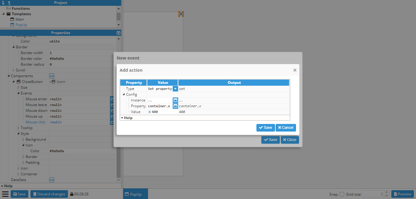
A click event needs to be attached to the close button in order to close the popup. However, the helper popup cannot be used to select the x property for sliding it out of view as there is no container section in the popup. This happens when the container is a template and not an instance. However, container properties can still be applied by inputting them manually. In this case, the x property should be set to -400 (since 400 is the width of the popup, meaning that -400 will set it out of view. Alternatively, the width of the container can be linked). To do so, the following settings are applied:
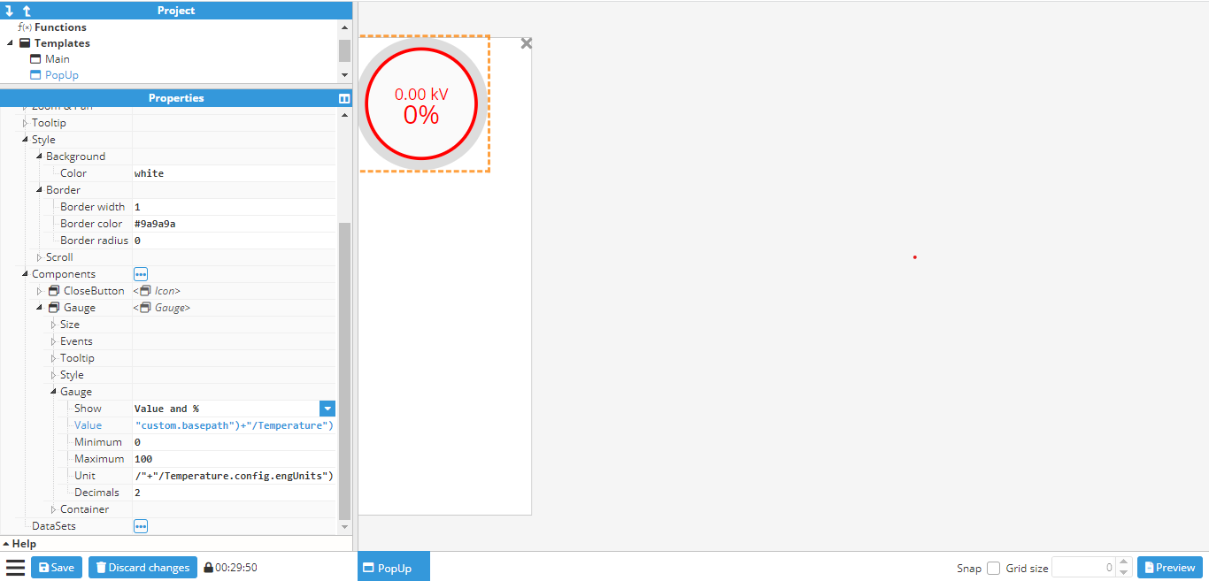
The last step is to add in the gauge and link it to a tag. However, in this case, the tag path is not static, as it depends on the basepath dynamic property. This example assumes the following tags are used:
/Madrid/Temperature
/London/Temperature
/Berlin/Temperature
Since the tags all follow the same structure (/<city>/Temperature), the basepath property can be used as the first part of the tag name, which corresponds to the city. To do so, the following expression is used in the gauge value (and in the units too, if the same EU and tag need to be used):
=tag("/"+parent("custom.basepath")+"/Temperature") -> Value of tag
=tag("/"+parent("custom.basepath")+"/Temperature.config.engUnits")-> Units of tag
The final popup will look as follows:
Now that the popup has been finished, the main container can be created. In this case, instead of the steps used to add markers to a map, the main container needs to be a blank container, rather than a map. The reason is that if it were a map, the popup would be instantiated as a component of the map, and would be positioned at a latitude and longitude, which is not the desired outcome in this example. In this case, the popup needs to be set in an absolute position on the screen. This can be accomplished by creating a blank container and adding a map and the popup as components, as shown in the below screenshot:
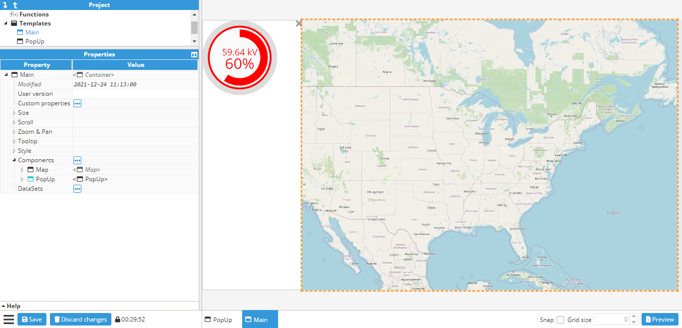
In this example, the popup will be shown by sliding from left to right using an animation. In order to achieve this, the popup’s initial X position needs to be set to -400 (since the popup is 400 pixels wide). An animation also needs to be added to the X property. In this case, it will be set to last 1000ms and ease in & out.
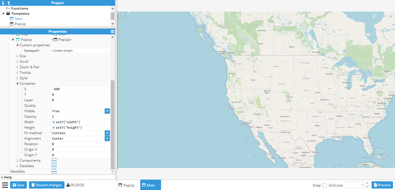
Once the popup is in place, markers can also be added to the map and events can start to be set up for opening the popup. Map markers are created for Madrid, Berlin, and London. After creating the markers, three actions need to be added to the click events for each marker:
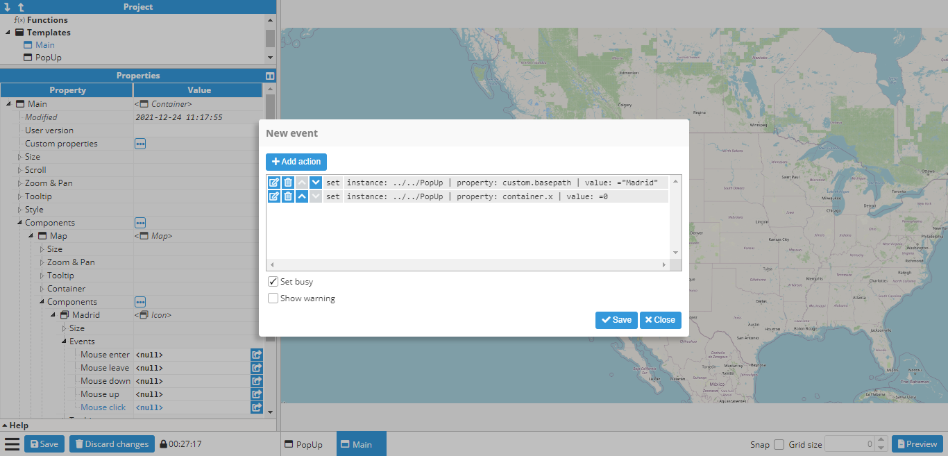
One action to set the basepath custom property to either Madrid, Berlin or London, depending on which marker was clicked upon.
One action sets the X position of the popup to 0.
The event popup for the Madrid marker is shown in the following screenshot:
The same is done for the Berlin and London markers. To save time, since only one of the three actions needs to change, depending on the marker (the one that sets the custom property), this marker can be duplicated (CTRL+D after selecting the marker in the configuration window, or right-click and clicking the duplicate option) and the action deleted and created again with the new value.
The next stage is to test that everything works by clicking on a marker (either in preview mode or by using CTRL+Click while the marker is not selected). The different markers can now be clicked on to see if the value of the basepath changes accordingly. Finally, click the close button on the popup to ensure that it slides back off the screen.