The following article provides a practical example of how to build a responsive interface whose layout adapts automatically to the viewport size and orientation. Instead of configuring each component independently, the example centralizes the responsive logic in a reusable responsive function and consumes its results from the different Layout properties.
Responsive design example
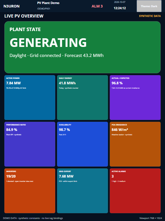
The main principle of the example is to avoid hard-coding different screens for desktop, tablet, and mobile devices. The responsive function reads the current dimensions using ui("width") and ui("height"), classifies the viewport, and returns the values required by the rest of the interface.
Desktop View
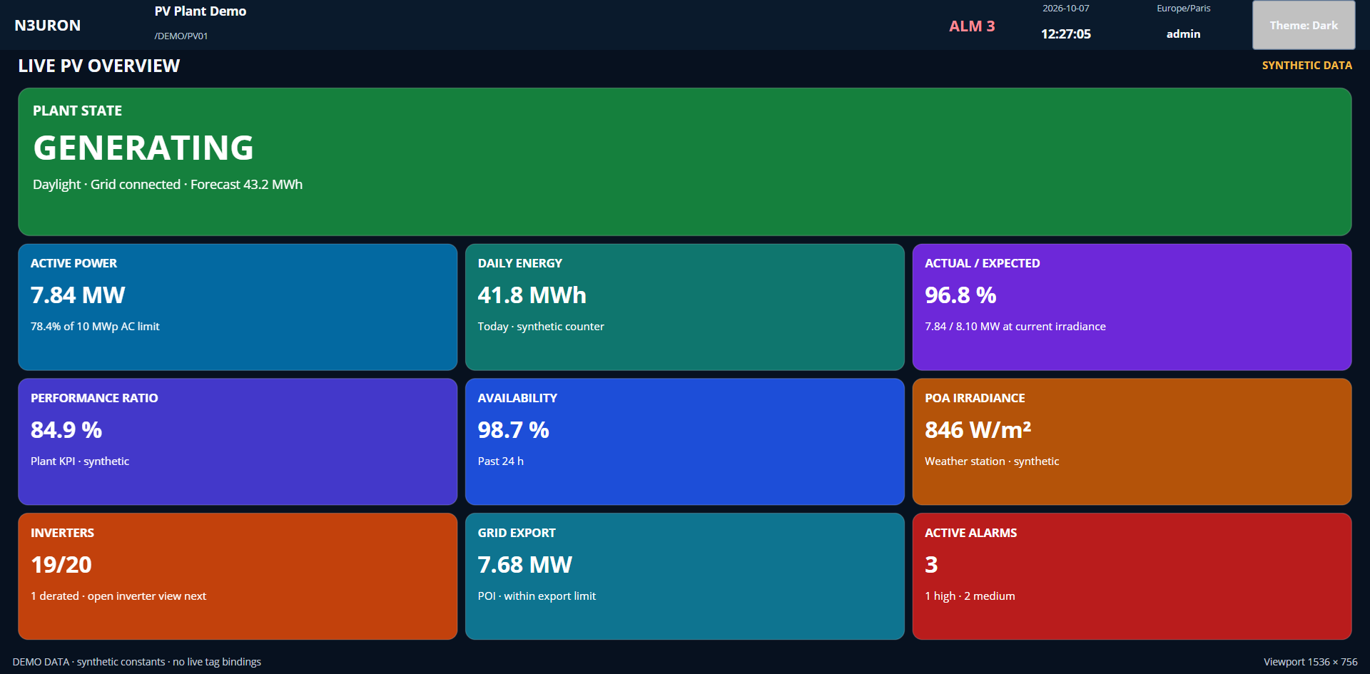
Tablet View - Vertical
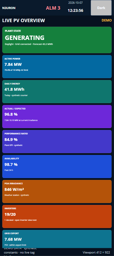
| Phone View - Vertical(scroll available)
|
1. Centralize the responsive logic
In the example, all calculations are centralized in the “responsive” function.
On the first section of code shown below, several constants and variables are configured. These values are used to define the sizing of the screen in which the user is currently working, and then calculate the portrait to be used by Web Vision and the sizing and distribution of the elements within the window.
These values will be used on the second section on the coded, explained in a following section.
const key = String(argv[0] || "");
const w = Number(ui("width")) || 0;
const h = Number(ui("height")) || 0;

const headerH = 56;
const footerH = 28;
const bodyH = Math.max(0, h - headerH - footerH);

const portrait = h >= w;
const phonePortrait = w < 600 && portrait;
const compactLandscape = h < 500 && w > h;
const narrow = w < 650;
const inset = phonePortrait ? 8 : 20;

let headH = 34;
let gap = 8;
let heroH = 140;
let rowH = 100;
let rowDirection = "row";

if (phonePortrait) {
    headH = 34; gap = 6;
    heroH = 96; rowH = 264;
    rowDirection = "column";
} else if (compactLandscape) {
    headH = 24;
    gap = 4;
    heroH = 54;
    let compactFree = bodyH - headH - (gap * 5) - heroH;
    rowH = Math.max( 64, Math.floor(compactFree / 3) );
}
else {
    let usable = Math.max(0, bodyH - headH - (gap * 5));
    heroH = Math.max(140, Math.floor(usable * 0.28));
    let  rowsFree = bodyH - headH - (gap * 5) - heroH;
    rowH = Math.max(100, Math.floor(rowsFree / 3));
}

const requiredH = headH + (gap * 5) + heroH + (rowH * 3);
const contentH = Math.max(bodyH, requiredH);

[...] // Continues on - 3. Return reusable layout values
The function therefore combines viewport dimensions, orientation, minimum component sizes, spacing, and available height. This makes the responsive rules reusable throughout the project instead of duplicating conditional expressions in every component.
2. Define the responsive states
The example distinguishes several states. Some conditions control the overall content arrangement, while others simplify individual components such as the header when less horizontal space is available.
Condition | Behavior |
|---|---|
Phone portrait | Activated when the width is below 600px and the viewport is in portrait orientation. Metric rows change from row to column, reducing horizontal spacing and stacking the tiles vertically. |
Compact landscape | Activated when the height is below 500px and the viewport is wider than it is tall. The horizontal layout is preserved while the header, gaps, hero area, and rows are compressed vertically. |
Narrow viewport | Activated below 650px. Header spacing and controls become smaller, the plant identity is hidden and the page title uses a smaller font. |
Wide viewport | The session information becomes visible from 1000px. The standard horizontal dashboard structure is maintained and the available vertical space is distributed dynamically between the hero area and the metric rows. |
3. Return reusable layout values
After calculating the responsive state, the function exposes individual values through a key-based interface. Components request only the value they require.
The first argument passed to the function identifies the value that the component needs, such as the viewport width, content width, row direction, or visibility of a header element, from the following list of possible values:
[...] // Starts on - 1. Centralize de responsive logic
switch (key) {
  case "viewportWidth": return w;
  case "viewportHeight": return h;
  case "bodyHeight": return bodyH;
  case "contentX": return inset;
  case "contentWidth": return Math.max(0, w - (inset * 2));
  case "contentHeight": return contentH;
  case "headSize": return String(headH);
  case "gapSize": return String(gap);
  case "heroSize": return String(heroH);
  case "rowSize": return String(rowH);
  case "rowDirection": return rowDirection;
  case "isPhonePortrait": return phonePortrait;
  case "isCompactLandscape": return compactLandscape;
  case "isNarrow": return narrow;
  case "showIdentity": return w >= 650;
  case "showSession": return w >= 1000;
  case "outerGapSize": return narrow ? "8" : "16";
  case "headerGapSize": return narrow ? "6" : "12";
  case "logoSize": return narrow ? "92" : "145";
  case "identitySize": return narrow ? "0" : (w < 1000 ? "220" : "300");
  case "alarmSize": return narrow ? "64" : "76";
  case "clockSize": return narrow ? "86" : "110";
  case "sessionSize": return w < 1000 ? "0" : "130";
  case "themeSize": return narrow ? "76" : "116";
  case "demoSize": return narrow ? "72" : (compactLandscape ? "96" : "170");
  case "demoLabel": return narrow ? "DEMO" : "SYNTHETIC DATA";
  default: return 0;
}
4. Bind Layout properties to the responsive function
The calculated values are then used directly in Web Vision expressions. For example, the Main template obtains its complete dimensions from the viewport:
func("responsive","viewportWidth")
func("responsive","viewportHeight")
The overview screen follows the same approach for the content area, vertical spacing, hero section, and metric rows.
Property | Expression used in the example |
|---|---|
Content width | func("responsive","contentWidth") |
Content position | func("responsive","contentX") |
Row direction | func("responsive","rowDirection") |
Row height | func("responsive","rowSize") |
Spacing | func("responsive","gapSize") |
Component visibility | func("responsive","showIdentity") func("responsive","showSession") |
5. Change the content direction on mobile devices
Each of the three metric rows in the overview contains three instances of the reusable demo tile template. In a normal viewport, the rows use the row direction, so the tiles are displayed horizontally.
When phonePortrait becomes true, rowDirection changes to column. Because the tiles use the flexible container method in the example, the same components are redistributed vertically without creating a separate mobile screen.
direction = func("responsive","rowDirection")
container.size = func("responsive","rowSize")
6. Adapt the header independently
Responsive behavior does not need to be limited to the main content area. The header template also uses the same function to modify the logo width, gaps, alarm area, clock, theme control, identity information, and session information.
Plant identity: Visible at widths of 650px or more.
Session information: Visible at widths of 1000px or more.
Logo: Reduced from 145px to 92px in a narrow viewport.
Theme control: Reduced from 116px to 76px in a narrow viewport.
This allows secondary information to be progressively removed while keeping the primary controls available.
7. Allow scrolling when the stacked content exceeds the viewport
On a phone in portrait orientation, stacking the metric tiles increases the required height of the page. The function calculates contentHeight as the greater of the available body height and the minimum height required by all sections.
var requiredH = headH + (gap * 5) + heroH + (rowH * 3);
var contentH = Math.max(bodyH, requiredH);
The overview has scrolling enabled, so content that no longer fits vertically remains accessible instead of being compressed below its intended minimum size.
Recommendation:
When creating a responsive Web Vision project, keep breakpoint decisions and calculated dimensions in a common function whenever possible. Components can then reference semantic values such as rowDirection, contentWidth, or showSession instead of implementing independent viewport checks.
8. Test the design at different viewport sizes
The footer included in the example displays the current viewport dimensions using the same responsive function. This makes it easier to resize the Viewer and verify when each responsive rule becomes active.
="Viewport " + func("responsive","viewportWidth") + " × " + func("responsive","viewportHeight")For example, a viewport of 390 × 844px activates the phone portrait layout: the content inset becomes 8px, the metric rows switch to columns, the identity and session sections are hidden, and the content becomes vertically scrollable.
A viewport of 844 × 390px, on the other hand, activates the compact landscape layout. The rows remain horizontal, while the heading, hero section, gaps, and row heights are reduced to make better use of the limited vertical space.
Note:
The values and breakpoints shown are examples and can be adjusted in the responsive function to suit each Web Vision project while keeping the responsive logic centralized.