A trigger defines the user input interaction with Web Vision Viewer when for an event to be executed. Each trigger can be associated with one or more actions that determine what Web Vision does after the event occurs. By combining triggers and actions, you can create dynamic visualizations that respond to process data and user inputs.
Tip:
Choose the trigger that best represents when the event should run, and then configure its properties and associated actions. The available triggers may vary depending on the selected Web Vision element.
Mouse triggers
These events are triggered after different mouse interactions with the UI, and are shared by most of elements and templates on WebVision.
Event | Description |
|---|---|
Mouse enter | When the mouse enters visual element boundaries. |
Mouse leave | When the mouse leaves visual element boundaries. |
Mouse down | When the mouse button is held over a visual element. |
Mouse up | When the mouse button is released over a visual element. |
Mouse click | When the visual element is clicked on. Configuring this event will force the mouse icon to swap to ‘Hand’ icon when over the element area. |
Changes and inputs triggers
These triggers are specific interactions the user can do with certain elements and templates.
Event | Description | Element | |
|---|---|---|---|
User input | When the user modifies the input value. | Input, DatetimePicker, Dropdown | |
Selection change | When the user selects a different element from the previously selected. This action updates the property ‘Selected’ from the current element, no needing to previously configure any event. | AlarmTable, DataSetTable, LinksTable, ModulesTable, RealtimeTable,TagPicker | |
Shelve selection change | When the selection within the shelved alarms list changes | AlarmTable | |
On cell action | When a user clicks or edits an individual cell. | DataSetTable | |
$.value | Returns the raw data value of the cell. | ||
$.formattedValue | Returns the cell value after running through text formatting, or #ERROR if formatter fails. | ||
$.row | Returns the complete row data structure of parent row. | ||
$.columnName | Returns the technical identifier name of the cell’s column. | ||
$.rowIndex | Returns the zero-based index position of parent row. | ||
User toggle | When the user interacts with the toggle, changing its state. | Toggle | |
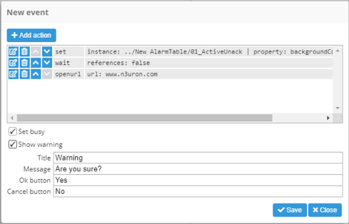
Events can be configured to determine how they interact with the operator:
Property | Description | |
|---|---|---|
Set busy | When enabled, a grey gear is displayed over the top of the component that triggered the event while actions are being executed. | |
Show warning | When enabled, a confirmation popup dialogue is shown before launching the execution. | |
Title | Label for the title of the popup. | |
Message | Text shown inside the popup box. | |
Ok button | Text shown on confirmation button. | |
Cancel button | Text shown on cancelation button. | |