This article describes the main container elements available in Web Vision: Container, Layout, Region, and Map. Containers are used to organize screens, host visual elements, build responsive structures, and control how content is displayed in the Viewer.
In Web Vision, containers can include components, template instances, or other containers as children. Selecting the right container type is important when designing scalable HMI screens, navigation structures, dashboards, and reusable templates.
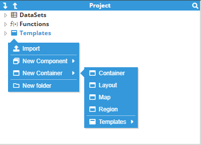
Container overview
Containers are structural elements that define how other visual elements are grouped, positioned, displayed, or loaded at runtime. They provide the foundation for building complete Web Vision screens.
The following table summarizes the main purpose of each container type.
Container type | Description |
|---|---|
Container | A basic container used to group and position child elements using absolute coordinates. |
Layout | A responsive composition container used to arrange children in rows or columns. |
Region | A dynamic content host used to show different template instances at runtime. |
Map | A geographic container used to display map-based visualization content. |
Tip:
Use Layout containers for the main screen structure and use standard Container elements inside them when absolute positioning is required.
Container properties
Size
Size fields define the dimensions of an element by specifying its width and height, in pixels.
Subscription
This property should be used only when a container is expected to not to be visible and its’ inputs updates are unnecessary. Otherwise, this property can be set as it’s default value or as Parent so the container follows its parent’s subscription behavior.
The available values are Enabled, Disabled, and Parent. Parent inherits the subscription state from the parent container; if no parent exists, it behaves as Enabled.
Value | Description |
|---|---|
Enabled | The container and all descendants continue receiving live updates normally. |
Disabled | The container and all descendants stop receiving further input updates. |
Parent | The container follows the subscription state of its parent container. If there is no parent, the effective state is Enabled. |
Zoom & Pan
Property | Description |
|---|---|
Enabled | Allows modifications to the current zoom and pan using mouse movements, the mouse wheel for zoom and drag & drop for pan. If disabled, it blocks the current position, but the position can still be modified using the corresponding properties on Designer view, but cannot be modified from UI. |
Scale || Zoom | For Container containers, the scale refers to the multiplier of the original size, which means that a value of 1 will result in the original size. For Map containers, this behaves like an open street maps zoom, zooming inside the map to the destination location. |
X || Lon | Current pan position on x axis. For Map containers, the current longitude. |
Y || Lat | Current pan position on y axis. For Map containers, the current latitude. |
Initial Scale | X | Y || Zoom/Lon/Lat | Zooming configuration applied when the current container is opened. |
Tooltip
Property | Description |
|---|---|
Enabled | Boolean value that enables the tooltip. |
Content | Text displayed inside the tooltip. |
Show position | Relative positioning in relation to the element. Options include Top, Right, Bottom, and Left. |
Show on | Specifies the trigger event for displaying the tooltip, either by hovering over the element or clicking on it. |
Show delay | Time in milliseconds before the tooltip appears after triggering (set to 0 for immediate display). |
Hide delay | Time in milliseconds before the tooltip disappears after triggering (set to 0 to prevent automatic hiding. |
Style
Property | Description | |
|---|---|---|
Background color | The color that fills the background area of an element. More information is in the CSS color format appendix. | |
Border | Element border. Border is not affected by padding. | |
Border width | Thickness of the borders in pixels. | |
Border color | Color of the border lines. More information is in the CSS color format appendix. | |
Border radius | Curvature of the container’s corners. | |
Scroll | Scroll bar that appears when an element contained exceeds the visible area of the container. | |
Scroll color | Defines the color of the scroll bar. More information is in the CSS color format appendix. | |
Scroll width | Defines the width of the scroll bar in pixels. | |
Container
The Container element is used to group visual elements and position them using absolute coordinates inside the container area.
A Container is useful when the screen area requires precise positioning, such as placing indicators, images, buttons, SVG elements, labels, or groups of components at specific coordinates.
Common use cases
Grouping related components into a single visual block.
Creating fixed-position areas inside dashboards or process screens.
Building reusable visual sections inside templates.
Hosting popup windows or nested visual areas.
Behavior
Child elements inside a Container are positioned according to their own coordinates. This means that the container does not automatically reorder, resize, or distribute its children. Use the Container element when the position needs to be explicitly controlled.
For responsive screen composition, use a Layout container instead. A standard Container should be used when fixed positioning is required.
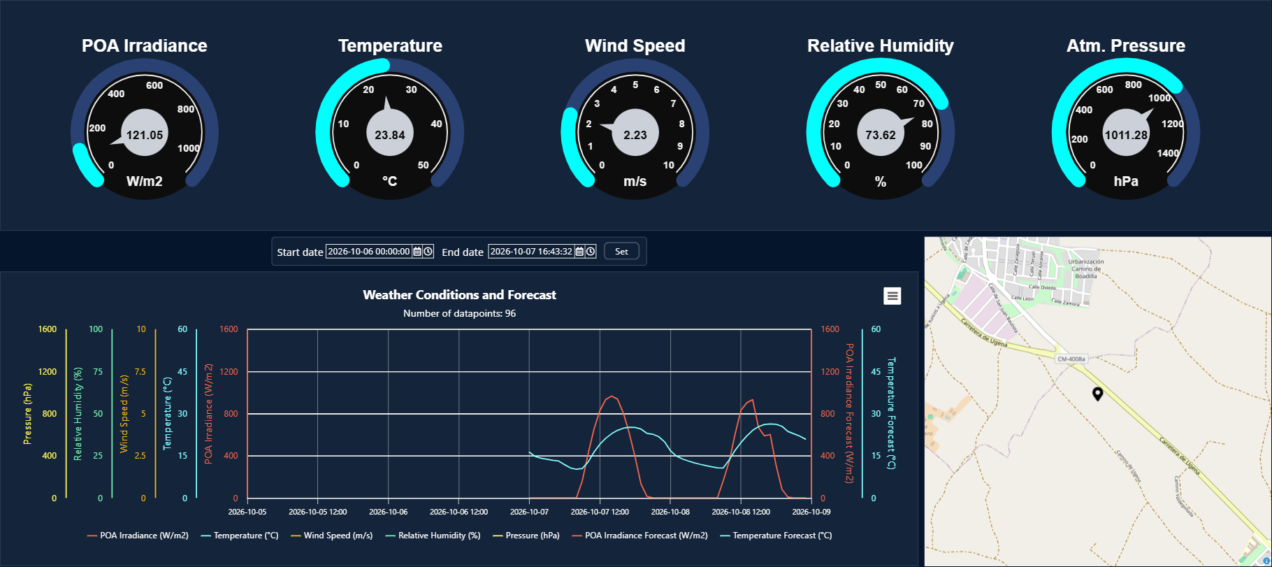
Recommendation:
Avoid using a standard Container as the main page structure when the screen must adapt to different resolutions. Use Layout for the main screen skeleton and reserve Container for fixed-position content.
Child elements’ properties
Property | Description | |
|---|---|---|
Position (X and Y) | Position of the container in pixels. X and Y coordinates are the absolute position inside this container in pixels. | |
Layer | Layers control the order in which each element is printed on screen. Layer 0 (default) is the first layer to be printed, being on lowest level (backward) as result. | |
Quality | Used to add an overlay to the component, based on the quality of a tag. Quality codes used by this field are in accordance with the OPC standard. | |
Quality overlay disabled | Empty field | |
Bad Quality (Red overlay) | Quality < 64 | |
Uncertain Quality (Orange overlay) | 128 > Quality >= 64 | |
Good Quality (No overlay) | Quality >= 192 | |
Visible | Enables control over the visibility of the component. | |
Opacity | Controls the opacity of the component. 0 is completely transparent and 1 is completely opaque. | |
Rotation | Rotates the component clockwise, in degrees. | |
Origin (X and Y) | Points to where the position is applied. The default value is (0,0), meaning the upper-left corner. X equals to 1, meaning the right side of the component and Y equals to 1, meaning the bottom side. The Origin can be set outside the component by using a value that is negative or greater than 1. | |
Size | Defines the width and height of each element inside the container. | |
Layout
Layout container is used to create responsive screen structures. It arranges child elements in a defined direction and distributes the available space according to each child’s size configuration.
A Layout can be configured as a horizontal row or a vertical column. This makes it suitable for building headers, sidebars, content areas, footers, dashboards, and navigation-based applications.
Direction
The direction defines how the child elements are arranged inside the Layout.
Direction | Description |
|---|---|
row | Arranges child elements horizontally from left to right. The child size controls the width. |
column | Arranges child elements vertically from top to bottom. The child size controls the height. |
Child size behavior
Each child inside a Layout can define how much space it occupies in the layout axis. This behavior is controlled by the child container size. Use the Layout element for building structured interfaces that must maintain a consistent distribution when their available space changes.
Size value | Behavior |
|---|---|
null | The child fills the remaining available space. The remaining space available is equally distributed for each child element with this size value. |
0 | The child is collapsed in the layout axis. |
Positive number | The child uses a fixed size in pixels in the layout axis. |
Recommended screen structure
A common approach is to use a root Layout in column direction, with a fixed header, a flexible body, and an optional footer. Inside the body, another Layout in row direction can be used to create a sidebar and a main content area.
Root Layout (column)
  01_Header  [size: 56]
  02_Body    [size: null]
    Layout (row)
      01_Sidebar [size: 240]
      02_Content [size: null]
  03_Footer  [size: 56]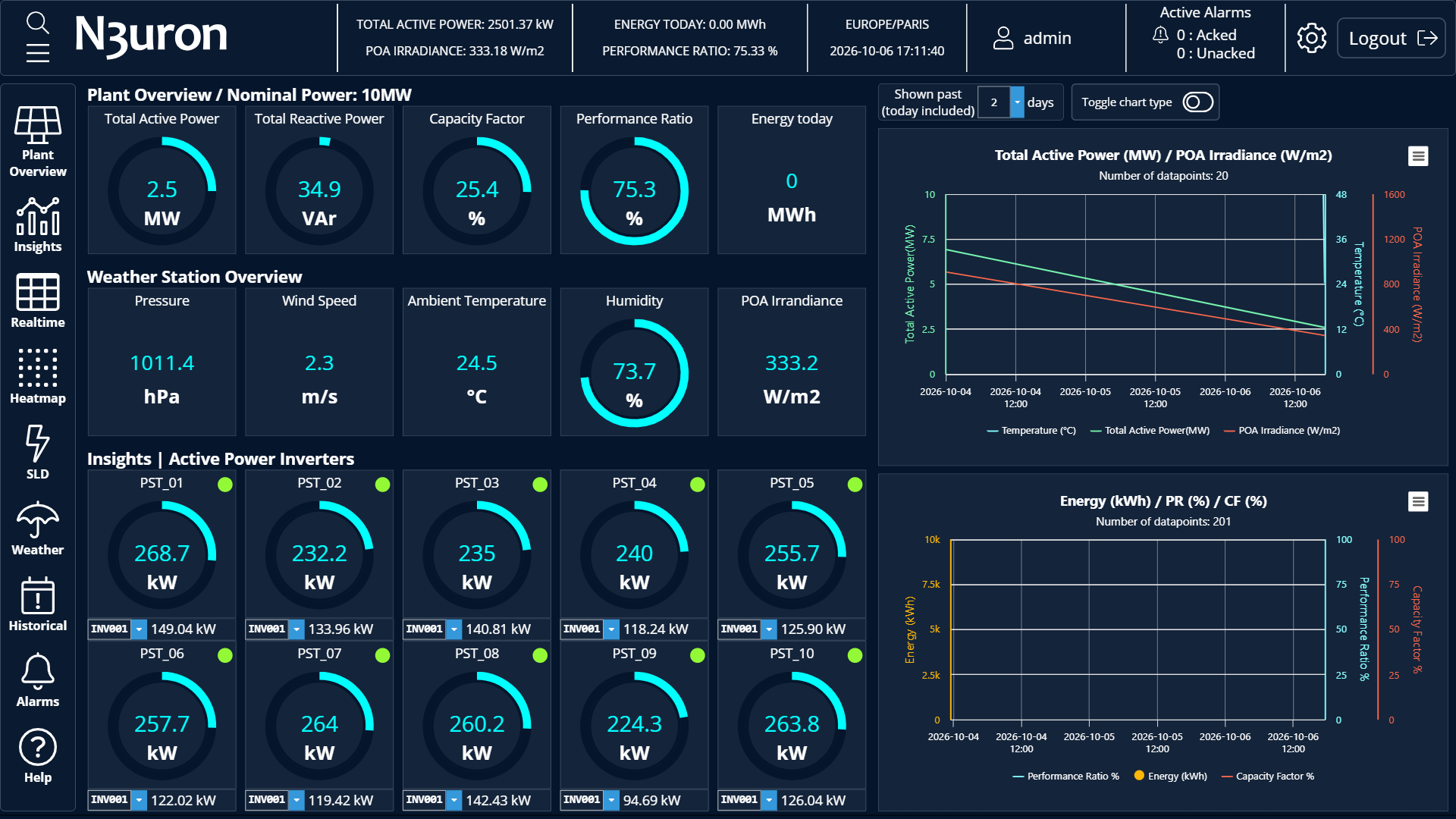
Note:
Children inside a Layout are ordered alphabetically by their key name. Use prefixes such as 01_, 02_, and 03_ to keep the order deterministic.
Child elements’ properties
Property | Description | |
|---|---|---|
Layer | Layers control the order in which each element is printed on screen. Layer 0 (default) is the first layer to be printed, being on lowest level (backward) as result. | |
Quality | Used to add an overlay to the component, based on the quality of a tag. Quality codes used by this field are in accordance with the OPC standard. | |
Quality overlay disabled | Empty field | |
Bad Quality (Red overlay) | Quality < 64 | |
Uncertain Quality (Orange overlay) | 128 > Quality >= 64 | |
Good Quality (No overlay) | Quality >= 192 | |
Visible | Enables control over the visibility of the component. | |
Opacity | Controls the opacity of the component. 0 is completely transparent and 1 is completely opaque. | |
Size | Defines the element’s width/height based on layout orientation. | |
Region
Region container is used to display dynamic content, showing different template instances depending on user actions, URL parameters, or runtime expressions. Several visual components and views can be configured for a single template, but only one is shown at a time and only the displayed views are loaded in memory, increasing performance while enabling multiple views with low effort and maintenance.
This makes Region especially useful for applications that require navigation, multi-screen layouts, role-based views, or reusable content areas.
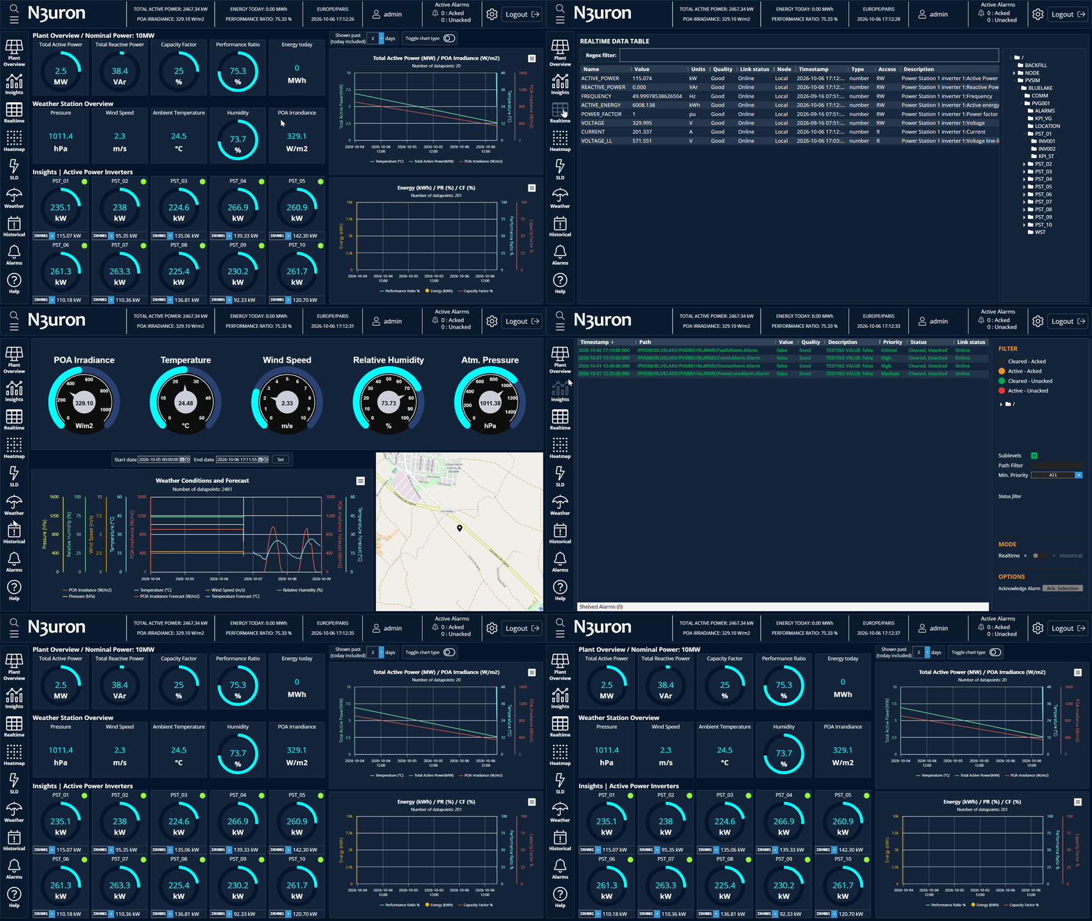
How Region works
Regions do not display multiple child elements like other container templates. Instead, Region elements will show only the child element referred inside Shown child property, loading in memory only the required screen while having accessible the rest of the required views for the user.
As the displayed element is chosen from a property, the methods to choose what to be displayed on opening, as well as during runtime, are the same as the methods to change properties values, such as dynamic values based on custom expressions, value from nested properties or changes based on Set properties actions.
The Region contains child template instances.
The shown property defines which child instance is currently displayed.
Actions can open a template instance inside a target Region, by using Set Property to update Shown child property to the required child name.
Expressions can be used to switch the visible content dynamically.
Region’s properties
Property | Description | |
|---|---|---|
Shown child | Name of the child element to be shown on the Region. | |
Layer | Layers control the order in which each element is printed on screen. Layer 0 (default) is the first layer to be printed, being on lowest level (backward) as result. | |
Quality | Used to add an overlay to the component, based on the quality of a tag. Quality codes used by this field are in accordance with the OPC standard. | |
Quality overlay disabled | Empty field | |
Bad Quality (Red overlay) | Quality < 64 | |
Uncertain Quality (Orange overlay) | 128 > Quality >= 64 | |
Good Quality (No overlay) | Quality >= 192 | |
Visible | Enables control over the visibility of the component. | |
Opacity | Controls the opacity of the component. 0 is completely transparent and 1 is completely opaque. | |
Size | Defines the width and height of each element inside the container. | |
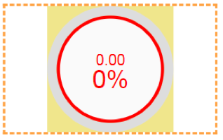
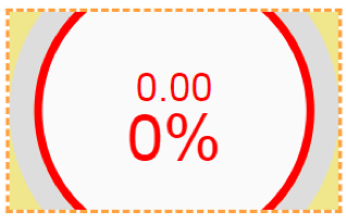
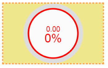
Fit method | Contain | The element will be resized to fit the smallest of viewport size components (width or height), resulting in an element that is equal to or smaller in size than the viewport. |
| ||
Cover | The element will be resized to fit the largest of the viewport size components (width or height), resulting in an element that is equal to or larger in size than the viewport. | |
| ||
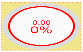
Stretch | The element will be stretched to exactly match the viewport size, resulting in a deformed element, unless the width/height relation of the element and the viewport is the same. | |
| ||
Expand | The element size will be resized to exactly match the viewport size, resulting in a larger element. | |
| ||
Alignment | Only available for fit method Contain and Cover. Defines the alignment of the element when it is not fitted to container. | |
Map
The Map container is used to create geographic visualizations. It is intended for applications where assets, sites, stations, devices, or process areas need to be represented on a map-based interface.
Typical examples include renewable energy portfolios, water networks, distributed industrial assets, utilities, remote facilities, and multi-site monitoring applications.
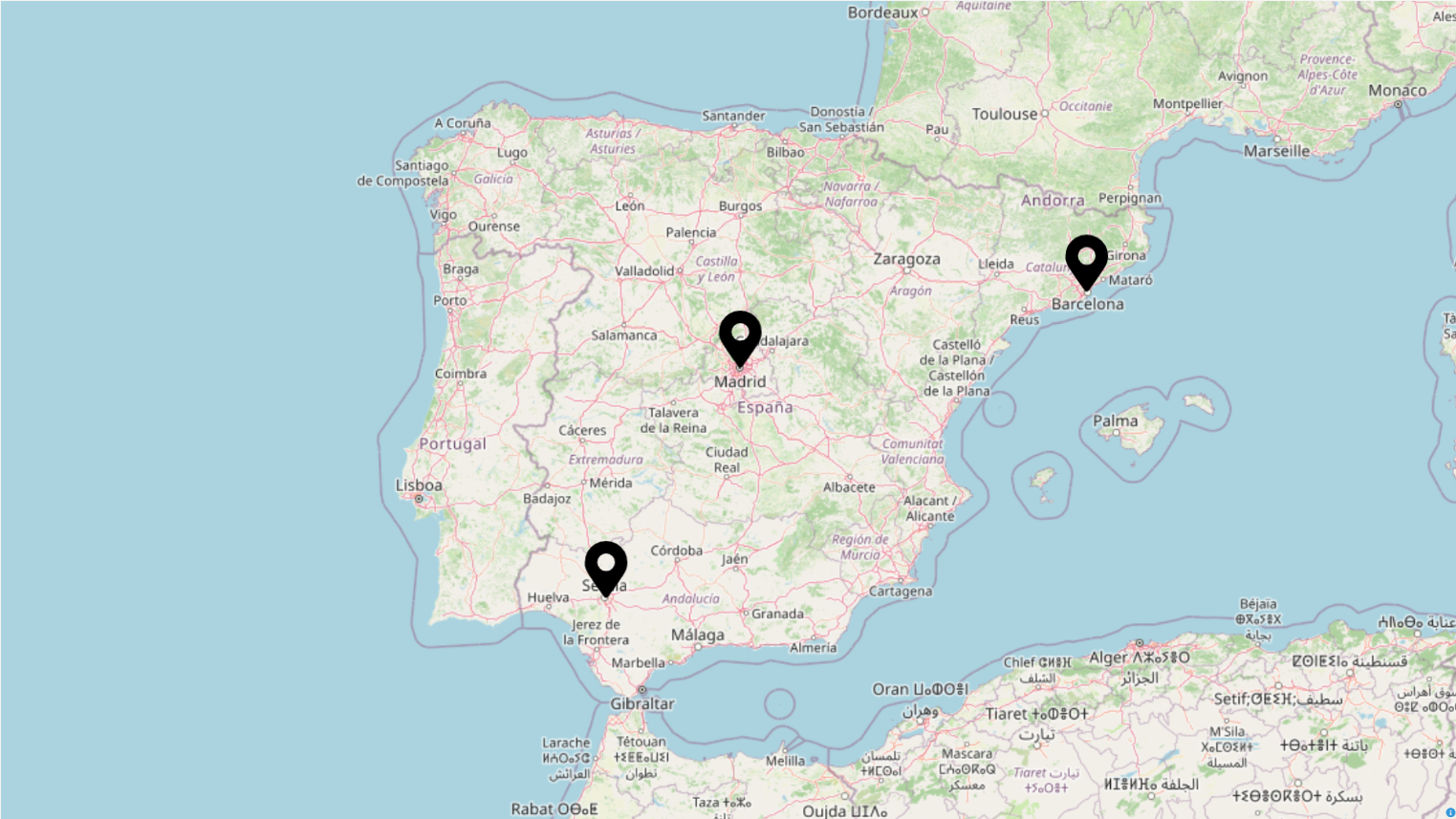
It uses geographic coordinates (longitude and latitude) instead of positions relative to the container. In this way, components within the map are positioned using longitude and latitude, instead of size units. For instance, a component with a position of 0,0 in a regular container is located in the top-left corner, while as in a map, it’s in the coordinates (-3.70379, 40.41678).
Common use cases
Displaying geographically distributed assets.
Creating a landing page for multi-site monitoring applications.
Combining site location with status, alarms, or production indicators.
Opening detailed screens when the operator selects a site or asset.
Child elements’ properties
Property | Description | |
|---|---|---|
Position (X and Y) | Position of the container in pixels. X and Y coordinates are the absolute position inside this container in pixels. | |
Layer | Layers control the order in which each element is printed on screen. Layer 0 (default) is the first layer to be printed, being on lowest level (backward) as result. | |
Quality | Used to add an overlay to the component, based on the quality of a tag. Quality codes used by this field are in accordance with the OPC standard. | |
Quality overlay disabled | Empty field | |
Bad Quality (Red overlay) | Quality < 64 | |
Uncertain Quality (Orange overlay) | 128 > Quality >= 64 | |
Good Quality (No overlay) | Quality >= 192 | |
Visible | Enables control over the visibility of the component. | |
Opacity | Controls the opacity of the component. 0 is completely transparent and 1 is completely opaque. | |
Rotation | Rotates the component clockwise, in degrees. | |
Origin (X and Y) | Points to where the position is applied. The default value is (0,0), meaning the upper-left corner. X equals to 1, meaning the right side of the component and Y equals to 1, meaning the bottom side. The Origin can be set outside the component by using a value that is negative or greater than 1. | |
Size | Defines the width and height of each element inside the container. | |
Size type | Specifies whether the width and height of the element are relative to the container size or to the geographical longitude. | |
Recommended composition patterns
Most Web Vision applications use several container types together. The recommended approach is to use each container for its intended purpose instead of relying on a single container type for the entire project.
Goal | Recommended container |
|---|---|
Responsive page structure | Use Layout. |
Fixed-position visual group | Use Container. |
Dynamic screen navigation | Use Region. |
Geographic overview | Use Map. |
Example: navigation-based HMI screen
The following example combines the four container types in a typical HMI application structure.
Root Layout (column)
  01_Header
  02_Body
    Layout (row)
      01_Sidebar
        Container
          Navigation buttons
      02_Content
        Region
          home
          dashboard
          alarms
          map
            Map
  03_Footer
In this structure, the root Layout controls the responsive composition, the sidebar uses a Container for fixed-position navigation buttons, the main content area uses a Region for dynamic screen loading, and one of the Region children can include a Map for geographic visualization.
Best practices
Use Layout for screen structure: Create the main page skeleton with Layout containers instead of absolute-positioned containers.
Use deterministic child names: Prefix children with names such as 01_, 02_, and 03_ to control ordering inside Layout.
Use Region for navigation: Avoid duplicating complete screens. Load templates dynamically inside a Region.
Keep templates reusable: Pass custom properties to template instances instead of hardcoding paths or labels whenever possible.
Validate in the Viewer: After saving changes in the Designer, validate the behavior in the Viewer to confirm navigation, sizing, and runtime expressions.
Recommendation:
When designing a new Web Vision application, start with the layout hierarchy first. Define the header, sidebar, content area, and footer before adding individual visual components.
Web Vision Full Product Details